
Introduuction
Visual Weight in Interior Spaces | A room can contain beautiful furniture, expensive finishes, carefully selected colors, and attractive accessories and still feel somehow “off.” One side may feel too heavy, another may look empty, the sofa may dominate the entire room, or a dark cabinet may pull your attention away from everything else.
In many cases, the problem isn’t the furniture itself. It’s visual weight in interior spaces.
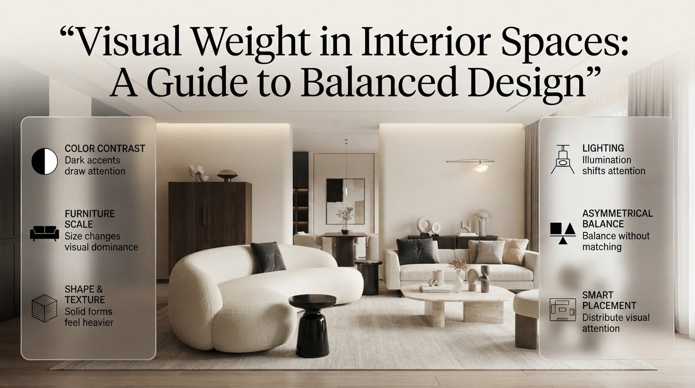
Visual weight is the amount of attention an object, surface, color, shape, texture, or architectural feature appears to carry. It isn’t the same thing as physical weight. A small black table can sometimes look more visually dominant than a much larger cream-colored sofa because of contrast, color, shape, and placement.
Understanding this principle can completely change the way you approach interior design. Instead of buying more decoration to make a room feel finished, you can learn to distribute visual attention more intelligently.
This guide explains how visual weight works, what makes furniture appear heavy or light, how color and lighting change perceived weight, how to balance large rooms and small rooms, how to use asymmetrical balance, and how to correct common mistakes without unnecessarily replacing everything.
For broader practical ideas about planning and improving residential interiors, you can also explore DesignMode24 Interior Design as a wider source of room-planning and home-design inspiration.
What Is Visual Weight in Interior Spaces?
Visual weight is the perceived amount of attention, importance, density, or presence that an element contributes to a room. Large objects, dark colors, strong contrast, dense shapes, bold patterns, and heavily textured materials generally carry more visual weight than small, pale, open, or low-contrast elements.
Physical size is only one part of the equation.
A large white sofa against a white wall may visually recede, while a small black cabinet against the same wall may immediately attract attention.
Several characteristics influence visual weight:
- Size
- Color
- Contrast
- Shape
- Material
- Texture
- Pattern
- Lighting
- Position
- Density
- Proportion
- Surrounding negative space
This is why visual weight is such an important part of professional interior planning. A designer isn’t simply asking whether a piece fits physically. They’re also considering what that piece will do to the visual balance of the entire room.
Why Does Visual Weight Matter?
Visual weight matters because people don’t experience rooms by looking at every object with equal attention. The eye naturally moves toward certain elements first.
A successful interior gives the eye a logical path.
You might notice:
Fireplace → sofa → artwork → side table → window
Another room might create a less comfortable sequence:
Dark cabinet → black TV → patterned rug → bright artwork → dark curtains
When too many high-weight elements compete, the room can feel chaotic.
When everything is equally quiet, the room may feel flat or unfinished.
Good design sits somewhere between those extremes.
The objective isn’t to make everything visually equal. It’s to create hierarchy and equilibrium.
What Makes Something Look Visually Heavy?
An object tends to appear visually heavy when several strong visual characteristics are combined. Dark color, large scale, solid construction, high contrast, dense texture, and limited negative space can make even a relatively modest object dominate its surroundings.
The following factors are especially important.
1. Size
Large objects naturally attract more attention.
A seven-foot sectional will usually carry more visual weight than a small accent chair. A large dining table will command more attention than a narrow console.
But size should always be considered alongside the room.
A large sofa in a large room may feel perfectly proportioned.
The same sofa in a small apartment may consume both physical and visual space.
2. Color
Dark colors generally feel heavier than light colors.
Consider these examples:
| Element | Typical visual impression |
|---|---|
| Black cabinet | Very heavy |
| Dark walnut furniture | Heavy |
| Charcoal sofa | Medium-heavy |
| Warm gray chair | Medium |
| Beige sofa | Light |
| White shelving | Very light |
This doesn’t mean dark colors are bad.
Dark furniture can provide grounding, sophistication, and contrast. The issue appears when too many dark elements are concentrated in the same location.
3. Contrast
Contrast can make an object visually powerful.
A black pendant against a white ceiling is immediately noticeable.
A beige pendant against a beige ceiling may almost disappear.
This principle is particularly useful when designing focal points.
If you want people to notice an architectural feature, artwork, or statement piece, contrast can help.
If you want something to recede, lower contrast can make it visually quieter.
4. Shape
Solid shapes often feel heavier than open shapes.
Compare:
Solid form
████████████
with:
Open form
│ │ │
A closed cabinet has greater visual density than an open shelf.
A thick upholstered chair can look heavier than a slim metal-frame chair even if their overall dimensions are similar.
5. Texture
Texture adds visual information.
A smooth wall doesn’t demand the same attention as exposed brick, heavily veined marble, textured plaster, or a large boucle sofa.
Texture becomes especially powerful when combined with strong color or contrast.
6. Pattern
Patterns can increase visual weight significantly.
A large geometric rug with strong contrast may dominate the floor.
A subtle tone-on-tone rug may provide texture without becoming the main focal point.
The more complex and contrasting the pattern, the more carefully it should be balanced against surrounding elements.
How Do You Measure Visual Weight in a Room?
There isn’t a precise mathematical formula that tells you how many “visual weight points” each object contains. Instead, evaluate visual weight by looking at scale, contrast, density, position, and the amount of surrounding space.
A useful professional-style assessment is:
Visual Weight = Scale + Contrast + Density + Color + Position + Texture
This isn’t a scientific measurement. It’s a practical way to train your eye.
For example:
Large + dark + textured + high contrast + central position = high visual weight
Whereas:
Small + pale + open + low contrast + surrounded by negative space = low visual weight
This explains why a small black lamp can become surprisingly important in a pale room.
How Does Visual Weight Create Balance?
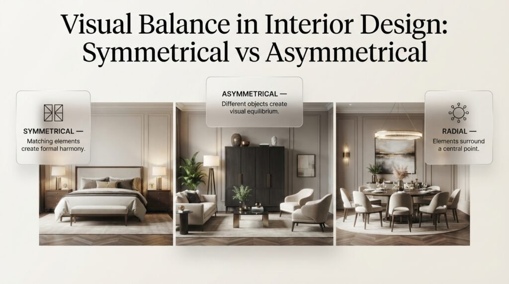
Balance occurs when visual weight is distributed so the room feels stable and intentional. Balance doesn’t require identical objects on opposite sides of a room. Different elements can balance each other when their combined visual presence is similar.
There are three common approaches.
Symmetrical Balance
Symmetry uses matching or similar elements.
For example:
- Two matching bedside tables
- Two identical lamps
- Matching chairs
- A centered artwork arrangement
Symmetry creates a formal and predictable feeling.
It’s particularly effective in:
- Traditional interiors
- Classic bedrooms
- Formal dining rooms
- Hotel-inspired spaces
Asymmetrical Balance
Asymmetrical balance uses different objects that create comparable visual impact.
For example:
One large dark cabinet might be balanced by:
- A floor lamp
- A large plant
- Two lighter chairs
- A substantial artwork
The objects aren’t identical, but the composition can still feel stable.
Asymmetrical balance is particularly useful in contemporary interiors because it feels less rigid.
Radial Balance
Radial balance organizes elements around a central point.
Dining tables are an obvious example.
A round table with chairs positioned around it naturally creates radial balance.
Circular chandeliers, round rugs, and radial seating arrangements can reinforce this effect.
How Does Furniture Influence Visual Weight?
Furniture usually contributes more visual weight than small accessories because it occupies substantial physical space.
A sofa isn’t visually defined only by its width.
Its appearance also depends on:
- Seat depth
- Arm thickness
- Back height
- Upholstery color
- Fabric texture
- Leg design
- Base structure
- Distance from the floor
- Relationship to nearby furniture
A low-profile sofa with exposed legs generally looks lighter than a deep sectional with thick arms and a solid base.
This is one reason furniture selection should be based on more than dimensions.
For example, two sofas may both be 90 inches wide, but one can appear considerably heavier because of its dark fabric, thick arms, tall back, and solid base.
If you’re evaluating seating, Sofa Seat Depth Selection can help you understand why usable depth and proportion matter rather than simply choosing the deepest sofa available.
How Can You Make Heavy Furniture Look Lighter?
You don’t always need to replace a large piece.
Try:
- Adding visible floor space beneath it
- Using lighter surrounding furniture
- Reducing clutter nearby
- Introducing a lighter rug
- Improving lighting
- Using open side tables
- Keeping wall decoration controlled
- Creating more negative space
A large sofa can become much easier to live with visually when everything around it isn’t competing for attention.
💡 Pro Tip: Before replacing a visually heavy sofa, photograph the room from the entrance and from the opposite corner. Sometimes the problem is the surrounding composition rather than the sofa itself.
How Does Proportion Affect Visual Weight?
Proportion describes the relationship between elements.
A room can contain individually attractive furniture and still feel wrong if the pieces aren’t proportionate to each other.
For example:
- Huge sectional + tiny coffee table
- Large bed + miniature bedside tables
- Tall wardrobe + tiny artwork
- Large dining table + very small pendant
- Oversized sofa + narrow rug
The problem isn’t necessarily that any one item is wrong.
The problem is the relationship between them.
This is closely connected with broader Interior Design principles because proportion influences both visual harmony and everyday usability.
The “Anchor and Support” Approach
A useful way to think about proportion is:
Anchor → Supporting elements → Details
For a living room:
Anchor: sectional
Supporting: rug, coffee table, chairs
Details: lamps, cushions, artwork, accessories
The supporting elements should be large enough to relate to the anchor without overpowering it.
How Does Color Change Visual Weight?
Color can completely change the perceived balance of a room.
Dark shades usually create stronger visual weight, while light shades tend to recede. Highly saturated colors can also become visually dominant even when they’re used sparingly.
For example, a small red chair in a neutral room may become more noticeable than a large beige sofa.
This is because color isn’t just about light versus dark.
It’s also about saturation and contrast.
Dark Doesn’t Always Mean Bad
Dark walls, cabinetry, and furniture can create depth.
The problem occurs when dark elements are concentrated without visual support.
Suppose a room contains:
- Black TV unit
- Dark sofa
- Dark coffee table
- Black curtains
- Dark rug
All of these elements may visually merge into one heavy zone.
Instead, distribute the dark tone.
For example:
- Black sofa legs
- Black picture frames
- Dark lamp base
- Small black side table
The repetition creates rhythm without making the room feel overloaded.
How Can Paint Color Affect Visual Balance?
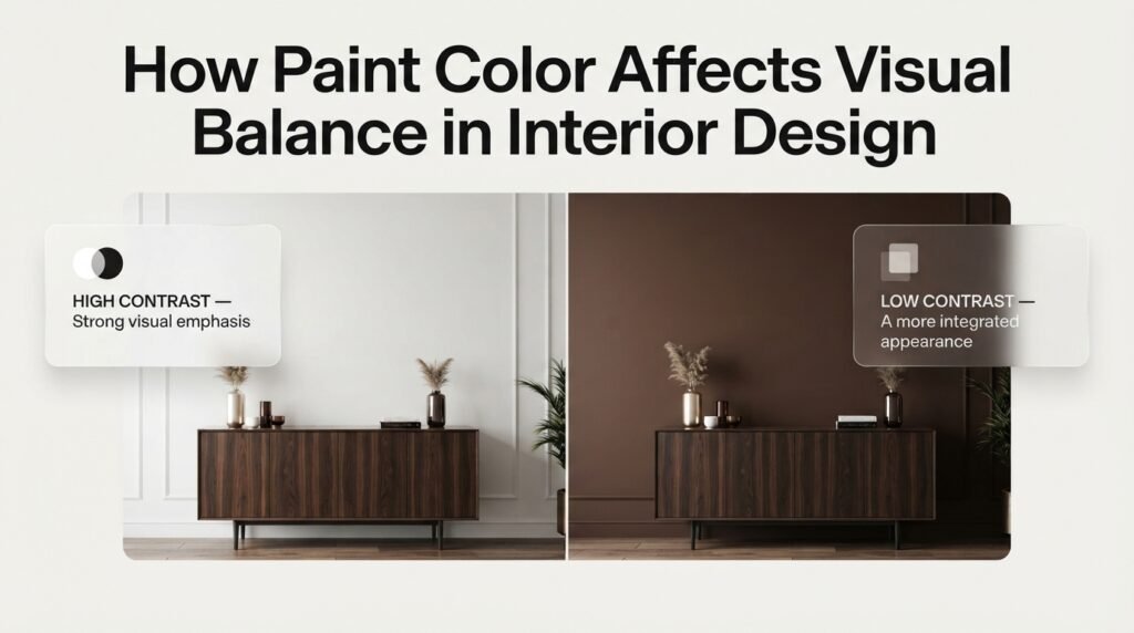
Wall color provides one of the largest visual surfaces in a room, so it can significantly change the perceived weight of furniture and architecture.
A dark wall can make a large piece of furniture blend into its surroundings.
A light wall can make the same furniture appear much more prominent.
This is why paint shouldn’t be selected independently from furniture.
If you’re working on color planning, the Paint Color category can provide additional ideas for coordinating wall colors with furniture and other interior elements.
Example
Imagine a dark walnut cabinet.
Against a white wall:
High contrast → strong visual weight
Against a dark brown wall:
Low contrast → more integrated appearance
The cabinet hasn’t changed.
The background has.
That’s an important lesson in visual composition.
How Does Negative Space Reduce Visual Weight?
Negative space is the area intentionally left open around objects.
It may be empty floor, an unfilled section of wall, space between furniture, or breathing room around artwork.
Negative space is one of the most underestimated design tools.
Without it, even beautiful objects can begin to merge into one large visual mass.
For example, imagine a wall with:
- Large artwork
- Floating shelves
- Mirror
- Wall sconces
- Plants
- Frames
- Decorative objects
Each item might look attractive independently.
Together, they may create visual overload.
Removing two or three elements could make the remaining pieces look more expensive and intentional.
📌 Quick Tip: If you’re unsure whether a room needs another decorative item, leave the area empty for a week. If the room still feels unfinished, add something deliberately rather than automatically filling the space.
How Should You Balance a Large Sofa?
A large sofa can become the strongest visual element in a living room.
You don’t need another sofa to balance it.
Instead, distribute visual interest around the room.
For example:
Left side
Large dark sectional
Right side
- Two light chairs
- Tall floor lamp
- Large plant
- Artwork
- Small side table
The right side contains more objects, but they are visually lighter.
This is a classic example of asymmetrical balance.
The same principle applies to large beds, dining tables, entertainment units, and built-in cabinetry.
How Do Rugs Affect Visual Weight?
Rugs are often treated as decorative accessories, but they actually influence the visual structure of an entire room.
A large rug can connect furniture into one visual group.
A small rug can make furniture appear disconnected.
Pattern also matters.
A heavily patterned rug can become a major focal point.
A plain neutral rug usually supports the furniture rather than competing with it.
When a Room Feels Disconnected
Suppose you have:
- Large sofa
- Two chairs
- Coffee table
- Side tables
but the rug sits only under the coffee table.
The furniture may appear like separate objects.
A correctly scaled rug can visually unify the entire seating group.
How Does Lighting Change Visual Weight?
Lighting is one of the most powerful tools for controlling visual weight because illumination changes what the eye notices.
A brightly illuminated feature naturally becomes more prominent.
A poorly illuminated corner recedes.
This means lighting can change visual hierarchy without changing furniture.
A textured wall under directional light may become dramatic.
The same wall under flat ambient light may become quiet.
Layered lighting can therefore be used as a visual-weight tool.
Useful layers include:
- Ambient lighting
- Task lighting
- Accent lighting
- Decorative lighting
For more advanced ideas about controlling brightness, mood, and focal areas, see Intelligent Lighting.
Use Light to Correct Imbalance
Suppose one side of a room feels too dark and heavy.
You might not need to repaint it.
Try adding:
- Floor lamp
- Wall light
- Table lamp
- Accent lighting
- Indirect illumination
The objective isn’t simply to make the room brighter.
It’s to create better visual distribution.
⭐ Expert Tip: Don’t illuminate everything equally. If every object receives the same intensity, you lose hierarchy. Lighting should help tell the eye where to look.
How Does Wall Decor Influence Visual Weight?
Walls are large visual surfaces, so artwork and decoration can dramatically change a room.
A small picture on a large wall can appear insignificant.
A huge dark artwork can dominate the room.
The correct scale depends on:
- Wall size
- Furniture below
- Ceiling height
- Viewing distance
- Color contrast
- Frame thickness
If a wall is visually empty, adding one appropriately scaled artwork may work better than covering the wall with many small pieces.
Can Wall Shelves Make a Room Feel Lighter?
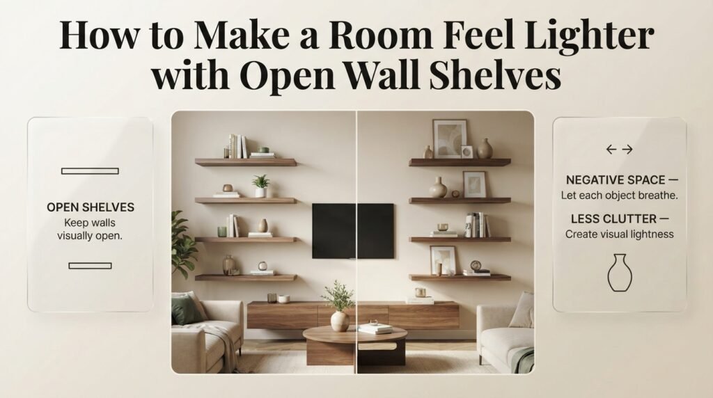
Yes, especially when compared with large closed cabinets.
Open shelving allows the wall behind the objects to remain visible, which creates more visual breathing room.
However, shelves can become heavy when overloaded.
For useful display and storage ideas, see Wall Shelves Ideas.
A balanced shelf might contain:
- Books
- One plant
- A small artwork
- Ceramic object
- A few personal pieces
Then leave some shelf space empty.
Avoid the “Filled Shelf” Problem
Beginners often believe every shelf must be full.
But the empty sections are what separate one visual group from another.
Think:
Object → space → object → space → object
rather than:
Object → object → object → object → object
How Does Visual Weight Work in Small Rooms?
Small rooms require more control because every object has a stronger effect on the overall composition.
A large cabinet that might look reasonable in a 400-square-foot room can dominate a compact bedroom.
Useful strategies include:
- Furniture with exposed legs
- Wall-mounted storage
- Light-colored large surfaces
- Reduced clutter
- Glass or open-frame tables
- Vertical storage
- Controlled contrast
- Strategic mirrors
- Clear circulation paths
The goal isn’t to make every object tiny.
Instead, select fewer pieces with appropriate scale.
Small Room Rule
Don’t ask, “How much furniture can fit?”
Ask:
“How much furniture can the room support while still feeling comfortable?”
That’s a much better design question.
How Does Visual Weight Work in Large Rooms?
Large rooms have the opposite challenge.
They can feel empty because the furniture is too small relative to the architecture.
A tiny sofa against a huge wall can disappear.
Several small decorative objects may also fail to create enough presence.
Large rooms often need:
- Larger rugs
- Bigger artwork
- Substantial furniture
- Taller plants
- Stronger lighting
- Larger curtains
- More defined zones
However, adding furniture randomly isn’t the solution.
Instead, create functional zones.
For example:
Living zone
Sofa + chairs + coffee table
Reading zone
Chair + side table + floor lamp
Dining zone
Table + chairs + pendant
Entry zone
Console + mirror + storage
This creates visual structure without filling every empty area.
How Does Visual Weight Work in Open-Plan Homes?
Open-plan interiors need especially careful hierarchy because multiple rooms are visible simultaneously.
A kitchen island, dining table, sectional, fireplace, and TV could all become competing focal points.
Instead, determine which feature should dominate.
For example:
Primary focal point: fireplace
Secondary: dining pendant
Supporting: kitchen island
Background: cabinetry
This hierarchy makes the entire open-plan space easier to understand visually.
Consistent finishes also help.
You might repeat:
- Oak
- Matte black
- Warm white
- Natural stone
across different zones.
This creates continuity without making every area identical.
How Can Storage Change Visual Weight?
Storage has a major effect on visual density.
Open storage exposes objects.
Closed storage hides them.
Therefore, a large closed cabinet can create physical mass, while an open shelf can create object density.
Neither is automatically better.
The correct choice depends on what you need to store and how much visual activity the room can handle.
In an entryway, for example, everyday shoes, bags, coats, and accessories can quickly create visual clutter.
Thoughtful entryway storage capacity planning helps determine how much storage the space actually needs instead of simply adding another cabinet.
Closed Storage Is Useful When:
- Objects are visually messy
- The room already has strong focal points
- You need to hide everyday clutter
- The space has many small belongings
Open Storage Is Useful When:
- You want display space
- Objects are attractive
- You need easy access
- The wall needs visual structure
The best interiors often combine both.
How Do DIY Projects Affect Visual Weight?
DIY projects can change visual balance surprisingly quickly.
A new shelf, painted accent wall, decorative panel, gallery wall, or handmade feature can become a significant visual element.
Before starting a project, ask:
- What visual weight will this add?
- Is another part of the room already dominant?
- Will the new feature compete with the furniture?
- Does the material repeat anything already in the room?
- Can I remove something if the result feels too busy?
If you’re planning a practical upgrade, DIY Home Projects can help you approach improvements with a more structured mindset.
For smaller projects that can be completed without turning the house upside down, Easy Weekend DIY Projects for Your Home can also be useful.
How Do Decorative Crafts Affect Visual Balance?
Decorative objects can provide personality, but too many small objects create cumulative visual weight.
For example, ten small colorful objects may have more visual impact than one large neutral sculpture.
This is why grouping is important.
Instead of scattering small objects across a room, create intentional clusters.
Useful groupings include:
- Three ceramics
- Books + plant
- Artwork + lamp
- Bowl + candle + small sculpture
- Photo + object + greenery
For creative styling ideas, DIY Home Decor Crafts can provide inspiration for adding personality without automatically filling every available surface.
How Does Kitchen Design Use Visual Weight?
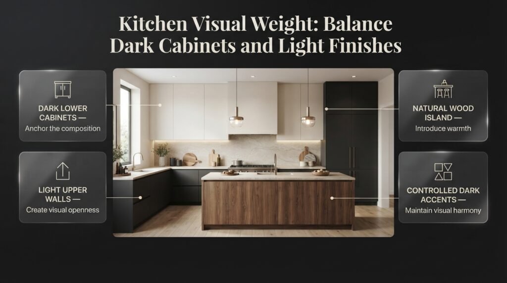
Kitchens often contain substantial visual mass:
- Cabinets
- Island
- Appliances
- Countertops
- Backsplash
- Pendant lights
- Open shelving
Because of this, kitchen design benefits greatly from visual hierarchy.
Imagine a kitchen with:
- Dark lower cabinets
- Dark upper cabinets
- Dark island
- Dark backsplash
- Dark countertops
The entire room may become visually dense.
A more balanced approach could use:
Dark lower cabinetry
Light upper walls
Natural wood island
Controlled dark accents
This creates variation while maintaining cohesion.
When thinking about kitchen composition, Celebrity Kitchen Layout Features can also provide useful inspiration for how statement islands, cabinetry, lighting, and architectural features can become focal elements without making the entire kitchen compete for attention.
How Can You Use Visual Weight During Renovation?
Renovation decisions can dramatically alter the visual balance of a room because you’re changing permanent surfaces.
Examples include:
- Removing a wall
- Adding built-ins
- Changing flooring
- Installing stone
- Repainting
- Adding ceiling details
- Installing larger windows
- Changing cabinetry
Before making a major change, evaluate the entire composition.
A dramatic stone wall may look incredible alone but could become overwhelming if the room already contains strong flooring, dark cabinetry, and bold furniture.
Renovation should therefore be treated as composition, not a collection of isolated upgrades.
If you’re making broader changes to improve how a home works and looks, the Home Improvement category can provide additional practical direction.
How Does an Interior Designer Control Visual Weight?
Professional designers usually don’t solve visual imbalance by adding random decoration.
They first identify the dominant element.
Then they ask:
- Is the dominance intentional?
- Should it remain the focal point?
- What needs to support it?
- What needs to recede?
- Where is the eye stopping?
- Where is there too much density?
- Where is there too little structure?
This is why professional interior design often feels calmer even when it contains many materials and objects.
There is a hierarchy.
The Designer’s Basic Sequence
1. Establish the anchor
Choose the main visual feature.
2. Add supporting elements
Introduce furniture and architectural features that relate to it.
3. Create contrast
Use selected differences to create interest.
4. Add repetition
Repeat materials, colors, or shapes.
5. Introduce texture
Layer tactile and visual materials.
6. Edit
Remove anything that competes unnecessarily.
This final step is often the most important.
Why Contracts and Planning Matter Before Design Changes
Visual balance is affected not only by aesthetic decisions but also by how a design project is managed.
If multiple people are involved in a renovation or interior project, unclear responsibilities can lead to inconsistent decisions.
For anyone hiring a professional, understanding Interior Designer Contract Essentials can help clarify important project details before work begins.
A clear agreement can establish:
- Scope of work
- Deliverables
- Materials
- Responsibilities
- Timelines
- Revisions
- Payment terms
- Communication expectations
This matters because a visually cohesive room usually requires coordinated decisions rather than disconnected purchases.
Common Visual Weight Mistakes to Avoid
Mistake 1: Making Every Wall a Feature
If every wall contains:
- Wallpaper
- Artwork
- Shelves
- Mirrors
- Lighting
- Decorative objects
the room loses hierarchy.
Better approach
Choose one or two major focal surfaces and allow other walls to remain quieter.
Mistake 2: Grouping All Dark Furniture Together
A dark sofa beside a dark cabinet and dark rug can create one enormous visual block.
Better approach
Distribute darker elements throughout the room.
Mistake 3: Choosing Furniture Only by Dimensions
Two sofas with identical measurements can look completely different.
Better approach
Evaluate:
- Color
- Base
- Arm thickness
- Back height
- Fabric
- Shape
- Surrounding space
Mistake 4: Filling Every Empty Space
Empty space isn’t automatically a problem.
Better approach
Use negative space intentionally.
Mistake 5: Ignoring Lighting
A room can look balanced during daylight and heavy at night.
Better approach
Evaluate the room under both natural and artificial lighting.
Mistake 6: Using Too Many High-Contrast Objects
Every black, bright, patterned, or highly saturated object becomes another attention point.
Better approach
Create one primary focal point and let other accents support it.
Mistake 7: Making Everything Match
Matching isn’t the same as cohesion.
A room containing identical wood, identical colors, identical shapes, and identical furniture styles can feel flat.
Better approach
Use relationships rather than exact duplication.
A Step-by-Step Method for Fixing Visual Imbalance
Step 1: Photograph the Room
Take photos from:
- Entrance
- Main seating position
- Opposite corner
- Doorway
- Side angle
Photos reveal problems you may not notice while standing inside the room.
Step 2: Find the Heaviest Element
Ask:
What do I notice first?
Then ask whether that attention is intentional.
Step 3: Find the Weakest Area
Look for a wall, corner, or zone that feels disconnected.
Step 4: Remove Before Adding
Take away unnecessary accessories.
This is usually the cheapest design improvement.
Step 5: Adjust Furniture
Try:
- Moving the sofa
- Rotating chairs
- Changing table positions
- Repositioning rugs
- Pulling furniture away from walls
Step 6: Adjust Lighting
Use light to strengthen or soften specific areas.
Step 7: Add Repetition
Repeat a color, material, shape, or finish somewhere else.
Step 8: Stop
Don’t continue decorating simply because you still have empty space.
A room can be finished before every surface is occupied.
Visual Weight Decision Table
| If the room feels… | The likely issue | Try this |
|---|---|---|
| Too heavy | Too much dark/dense furniture | Add lighter elements |
| Empty | Furniture too small | Increase scale |
| Chaotic | Too many focal points | Remove competing elements |
| Flat | Little contrast | Add controlled contrast |
| Crowded | Too little negative space | Remove or reposition pieces |
| Disconnected | Elements don’t relate | Repeat colors/materials |
| Dark | Poor light distribution | Layer lighting |
| Unbalanced | Weight concentrated in one zone | Distribute visual emphasis |
How Can You Use Visual Weight in a Bedroom?
The bed usually acts as the primary visual anchor.
Its size, headboard, bedding, wall treatment, and lighting determine much of the bedroom’s visual hierarchy.
A large upholstered headboard can carry considerable visual weight.
You can support it with:
- Matching-scale bedside tables
- Pendant lights
- Artwork
- A substantial rug
- Curtains
- Balanced accessories
If the bed is visually dominant, smaller elements should support rather than compete.
A large bedroom may require more visual weight because excessive empty space can make the room feel unfinished.
A smaller bedroom usually benefits from a lighter composition.
How Can You Use Visual Weight in an Entryway?
Entryways are often overlooked, but they create the first visual impression of a home.
A large mirror can become the focal point.
A console can provide horizontal weight.
A bench can provide low visual grounding.
Hooks, baskets, and shelves can add vertical activity.
The challenge is preventing everyday clutter from becoming the dominant visual feature.
Shoes, bags, coats, keys, and packages naturally create high visual density.
That’s why functional storage is part of visual design, not merely organization.
How Can Visual Weight Create a More Cohesive Home?
A cohesive home doesn’t require every room to look identical.
Instead, use repeated visual relationships.
For example:
Living room: black lamp
Dining room: black pendant
Bedroom: black picture frames
The black finish becomes a visual thread.
Similarly:
Living room: oak coffee table
Kitchen: oak stools
Bedroom: oak nightstands
The repetition makes separate spaces feel connected.
This is particularly valuable in open-plan homes where rooms need individual identities without looking unrelated.
How do you balance visual weight in a room
Balancing visual weight means distributing large, dark, bold, or visually dense elements so that one area doesn’t overpower the rest of the room. You don’t need matching furniture on both sides. Instead, consider the combined impact of size, color, contrast, texture, shape, and placement. For example, a large dark sofa can be balanced with two lighter chairs, a floor lamp, artwork, and a substantial plant on the opposite side.
A professional approach is to first identify the room’s strongest visual element and then decide what needs to support it rather than compete with it.
Practical points:
Use lighter furniture to balance dark or bulky pieces.
Repeat strong colors in smaller amounts around the room.
Leave negative space around major focal points.
Use lighting to strengthen weaker areas.
Don’t try to make every object equally noticeable.
What makes furniture look visually heavy or light?
Furniture looks visually heavy when several characteristics make it appear dense or dominant. Dark upholstery, thick arms, solid bases, tall backs, bulky proportions, heavy textures, and strong contrast against the surrounding walls can all increase its visual weight. Furniture with slim legs, open frames, lighter colors, and visible floor underneath generally feels lighter.
This is particularly important in smaller rooms because a physically appropriate piece can still look overwhelming if its visual density is too high.
Look for these differences:
Visually heavy: dark fabric, thick arms, solid base, deep profile.
Visually light: slim legs, open frame, pale upholstery, raised base.
Heavy in a small room: oversized sectional with minimal surrounding space.
Lighter alternative: raised sofa with visible floor and simpler silhouette.
When choosing furniture, don’t ask only whether the dimensions fit. Ask whether the visual presence of the piece fits the room.
How does color affect visual weight in interior design?
Color has a major influence on visual weight because darker and highly contrasting colors usually attract attention more strongly than pale, low-contrast colors. A black cabinet against a white wall, for example, will usually feel more visually prominent than a beige cabinet against the same wall.
However, dark colors aren’t something you need to avoid. Designers often use them deliberately to ground a room, define a focal point, or add depth. The key is controlling where that visual weight appears.
Useful ways to manage color weight:
Repeat a dark color in several smaller details rather than concentrating it in one area.
Use lighter surrounding surfaces to prevent dark furniture from becoming a solid visual block.
Balance saturated accent colors with quieter backgrounds.
Consider natural and artificial lighting before judging a color.
Use contrast intentionally rather than everywhere.
A dark sofa can look sophisticated and balanced when supported by lighter walls, a controlled rug, natural textures, and enough breathing room.
How can you make a small room feel less visually heavy?
A small room feels visually heavy when too many large, dark, dense, or high-contrast elements compete within limited space. The solution isn’t necessarily to use only small furniture. Instead, reduce visual density and give the furniture more breathing room.
Furniture with exposed legs, open frames, lighter upholstery, wall-mounted storage, and controlled decoration can make a noticeable difference. Good lighting also helps prevent corners from visually disappearing.
Try these changes before replacing furniture:
Remove unnecessary decorative objects.
Choose furniture with visible floor beneath it.
Use one strong focal point instead of several.
Keep pathways visually clear.
Reduce unnecessary high-contrast patterns.
Use mirrors or reflective surfaces selectively.
Improve lighting in dark corners.
Leave some wall and floor space intentionally empty.
The goal isn’t to make the room look empty. It’s to make the available space feel visually breathable.
What is the difference between visual weight and visual balance?
Visual weight describes how much attention an individual element appears to carry, while visual balance describes how those different amounts of visual weight are distributed throughout the room. A large dark sofa may have high visual weight, but the room can still feel balanced if other elements provide enough visual presence elsewhere.
Visual balance can be symmetrical, where similar objects are placed on opposite sides, or asymmetrical, where different objects create equilibrium through their combined size, color, shape, and density.
For example:
A large dark cabinet can be balanced by a lighter seating group.
A large artwork can be balanced by a tall plant and floor lamp.
A heavy fireplace can be supported by appropriately scaled furniture.
A dark kitchen island can be visually connected through smaller dark accents elsewhere.
The important point is that balance doesn’t mean equality. A professionally designed room often contains elements with very different visual weights, but they work together because there is a clear hierarchy and intentional distribution.
Conclusion
Understanding visual weight in interior spaces helps you create a home that feels balanced, comfortable, and thoughtfully designed. A room does not need matching furniture, expensive decorations, or perfectly symmetrical arrangements to look attractive. What matters is how each element relates to the others through size, color, contrast, shape, texture, lighting, and placement.
A large sofa, dark accent wall, oversized artwork, or heavy wooden cabinet can become the visual center of a room. However, when these elements are balanced with lighter furniture, open space, complementary colors, and well-planned lighting, the entire space feels more harmonious. Even small changes, such as repositioning a chair, simplifying a shelf, changing a lampshade, or introducing a lighter-colored rug, can make a noticeable difference.
Before purchasing new furniture or starting a renovation, take time to observe how your room feels. Identify areas that appear too crowded, corners that feel empty, and objects that compete for attention. Then make gradual adjustments rather than trying to change everything at once. Whether you are designing a compact bedroom, refreshing a living room, or improving an open-plan interior, the goal is to distribute visual attention in a way that feels natural.
Ultimately, visual weight is about creating balance without sacrificing personality. When furniture, colors, decorative accessories, and negative space work together, your home becomes more cohesive, functional, and inviting. Focus on thoughtful proportions, intentional placement, and a clear sense of balance to create interiors that look beautiful and feel right for everyday living.