
Introduction
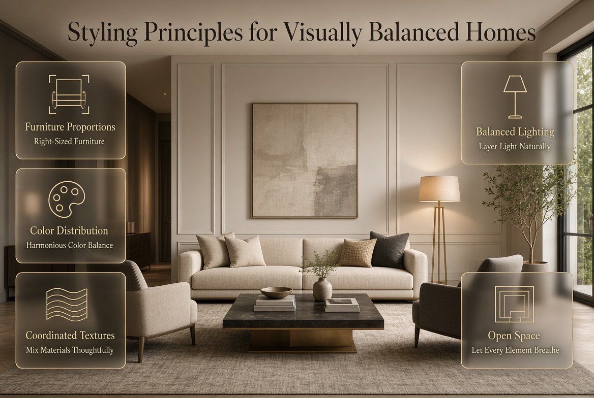
Styling Principles for Visually Balanced Homes | A home can have beautiful furniture, attractive paint colors, and carefully chosen decorations yet still feel uncomfortable or unfinished. Sometimes, the sofa looks too large for the living room, the bedroom feels crowded, or one side of a space appears heavier than the other. These problems often come down to how different elements work together rather than the quality of individual items.
Understanding the styling principles for visually balanced homes helps you create interiors that feel harmonious, comfortable, and thoughtfully arranged without spending a fortune on new furniture. Visual balance is not about making everything identical. It involves choosing suitable proportions, distributing colors, combining textures, planning lighting, and leaving enough open space for each element to stand out.
Whether you live in a small apartment, a traditional family house, or a modern home, these principles can help you improve your surroundings. The ideas in this guide will help you make practical decorating decisions using the furniture and accessories you already own. You can explore more inspiration and practical decorating guidance through Design Mode 24 Interior Design while learning how to create a home that feels naturally coordinated.
What Are the Styling Principles for Visually Balanced Homes?
Visual balance is the distribution of furniture, colors, textures, lighting, and decorative elements in a way that makes an interior feel comfortable and cohesive. A balanced room allows the eye to move naturally around the space without being distracted by an oversized object, excessive decoration, or an awkward furniture arrangement.
The most important principles include proportion, scale, symmetry, asymmetry, color coordination, texture, repetition, lighting, and negative space. Each principle solves a different design problem, but they work best when considered together.
For example, a large sectional sofa may look appropriate in a spacious living room but overwhelm a narrow apartment. Even if its color matches the walls, its size can disrupt the room’s overall balance. Similarly, a small painting above a wide sofa may appear disconnected because the artwork does not relate to the furniture beneath it.
Visual balance also depends on how people use a room. A beautiful arrangement is not successful if it blocks a doorway, makes everyday activities difficult, or leaves insufficient space for comfortable movement.
Why Does Visual Balance Matter in Interior Design?
Balanced interiors feel more intentional because furniture and decorations appear to belong together. They can also make everyday activities easier by reducing clutter, improving circulation, and helping people understand how a room is organized.
The benefits extend beyond appearance.
- Improved comfort: Furniture arrangements support conversation, relaxation, and movement.
- Better use of space: Suitable proportions prevent rooms from feeling unnecessarily crowded.
- Stronger visual cohesion: Repeated colors, materials, and shapes connect different elements.
- More effective lighting: Thoughtful placement reduces harsh contrasts and uncomfortable dark corners.
- Greater decorating flexibility: A coordinated foundation makes it easier to introduce new accessories without redesigning the entire room.
The objective is not to follow every design rule rigidly. Instead, understand why a particular arrangement works and adapt the principle to your own space.
1. Start With Furniture Scale and Proportion
Furniture scale and proportion form the foundation of a visually balanced interior. Scale describes how large an object appears in relation to the room, while proportion describes how its dimensions relate to other objects and architectural features.
A room can contain attractive furniture yet feel awkward if the pieces are too large, too small, too tall, or too deep for their surroundings.
How Do You Choose Furniture That Fits the Room?
Begin by measuring the room before purchasing or rearranging major furniture pieces. Record the dimensions of the walls, ceiling height, windows, doorways, and existing furniture. Also consider how much space you need to walk around each item.
For example, a deep sectional sofa may work beautifully in a spacious family room. In a narrow living room, however, a compact sofa with a shallower profile may provide comfortable seating while preserving walking space.
Use these practical guidelines when evaluating furniture:
- Compare the furniture’s dimensions with the room rather than relying on showroom appearance.
- Consider the visual mass of a piece, including its color, material, and shape.
- Avoid blocking windows, doors, radiators, or frequently used storage.
- Check whether cabinet doors and drawers can open comfortably.
- Choose coffee tables and side tables that relate to the height and length of the seating.
- Maintain clear circulation routes between the room’s main activity areas.
As a starting point, a coffee table around one-half to two-thirds the length of a sofa often creates a pleasing relationship. Its height should also be convenient for reaching from the seats. The ideal dimensions depend on the sofa, the room layout, and the way the furniture will be used.
Practical example: Imagine a living room with a large sofa, a bulky armchair, an oversized coffee table, and a narrow walkway. Replacing the coffee table with a smaller round design and moving the armchair slightly can improve circulation without requiring new seating.
For more detailed advice, read Understanding Furniture Proportions.
Why Should You Consider Furniture Height?
Height affects how visual weight is distributed vertically. A tall wardrobe beside a very low bed can look dominant, while a room filled with low furniture may appear empty near the ceiling.
Create variation by combining appropriately scaled low, medium, and tall elements. A low sofa can work with a floor lamp, a medium-height side table, and artwork positioned at a suitable level.
The aim is to establish a comfortable relationship between furniture and the surrounding architecture rather than making every piece the same height.
2. Distribute Visual Weight Throughout the Room
Visual weight describes how much attention an object attracts. A large object usually carries more visual weight than a small one, but size is only part of the equation. Dark colors, strong patterns, heavy materials, unusual shapes, and dramatic finishes can also make an object stand out.
Understanding visual weight helps explain why two different furniture arrangements can feel equally balanced even when their objects do not match.
How Can You Tell Whether a Room Is Visually Unbalanced?
Stand at the entrance and look across the entire room. Notice whether one side feels crowded, whether a single object dominates the view, or whether the arrangement seems to pull your attention toward an unintended area.
A large dark cabinet, for example, may make one side of a room feel heavier. You could balance its presence with a substantial chair, artwork, or another carefully positioned element on the opposite side.
However, adding more objects is not always the best solution. Sometimes the cabinet needs to be moved, its surroundings simplified, or its visual prominence reduced.
Try this simple assessment:
- Identify the largest and darkest objects.
- Observe where strong patterns and bright accents appear.
- Check whether all decorative attention is concentrated in one area.
- Look for empty areas that feel accidental rather than intentional.
- Remove or reposition items until the arrangement feels more natural.
Expert tip: Take a photograph of the room from the doorway. A photograph can make uneven visual weight easier to recognize because it allows you to assess the arrangement as a whole rather than focusing on individual objects.
3. Use Symmetry and Asymmetry With Purpose

Symmetry and asymmetry are two effective methods of creating visual balance. Symmetrical arrangements use similar elements on either side of a central point, while asymmetrical arrangements use different elements that still create a convincing overall composition.
Neither approach is automatically better. The right choice depends on the room’s architecture, intended atmosphere, and practical requirements.
When Does Symmetrical Styling Work Best?
Symmetry often creates a calm, formal, and orderly appearance. It is especially useful when a room has a natural central feature, such as a bed, fireplace, or prominent window.
A symmetrical bedroom might feature a centered bed, matching bedside tables, and identical lamps. The repeated arrangement gives the room a clear structure and makes decorating decisions easier.
In a living room, matching chairs placed opposite one another can establish a conversation area. Matching wall sconces on either side of a mirror can also create a deliberate architectural effect.
Symmetry is particularly useful when:
- You want a traditional or formal appearance.
- The room has a strong central architectural feature.
- You prefer a predictable and orderly furniture arrangement.
- You need a straightforward way to coordinate accessories.
The main disadvantage is that excessive matching can make a room feel repetitive. Introduce subtle differences through books, artwork, plants, or textiles to keep the space personal.
How Does Asymmetrical Balance Work?
Asymmetrical balance creates harmony through differences in size, shape, color, and visual weight. Instead of matching objects exactly, you arrange different elements so that their combined presence feels balanced.
For example, a large floor lamp and a small side table might balance a substantial plant on the other side of a sofa. The objects are different, but their heights, shapes, and positions create a pleasing relationship.
Asymmetry works particularly well in contemporary, relaxed, and eclectic interiors.
To use it successfully, avoid placing objects randomly. Consider the combined visual effect of the arrangement, including the surrounding wall, furniture, and empty space.
A useful approach is to begin with one large object, then introduce smaller supporting elements. Step back after each addition to check whether the composition still feels comfortable.
4. Build a Coordinated Color Palette
Color affects the atmosphere of a room and the way its furniture is perceived. Light shades often create a more open impression, while dark or saturated colors can draw attention toward specific features.
A balanced color palette provides consistency without requiring every object to match.
How Many Colors Should You Use in a Room?
Start with a dominant color, one or two supporting colors, and a small number of accent shades. This approach creates a manageable foundation that can be adjusted according to the room’s size, lighting, and architectural character.
For example, a living room might use warm white walls, a beige sofa, medium-tone wooden furniture, and muted green accents. The neutral foundation creates continuity, while the green adds personality.
You can distribute these colors through:
- Upholstery and cushions
- Curtains and rugs
- Artwork and decorative accessories
- Wooden finishes and furniture
- Ceramic pieces and lamps
- Plants and natural materials
Repeat important colors in different parts of the room. A dark green cushion might relate to a green detail in artwork, while a black lamp base could connect with cabinet handles or picture frames.
This repetition creates a visual thread that makes separate objects feel related.
For additional inspiration, explore Paint Color.
How Do You Balance Warm and Cool Colors?
Warm colors, including many reds, oranges, yellows, and warm neutrals, can create an inviting atmosphere. Cool colors, including blues, greens, and cool grays, often create a calmer impression.
You do not need to choose only one temperature. The important consideration is how the shades relate to the lighting and materials in the room.
A warm beige sofa can work with muted blue cushions, while natural wood can help connect the two. Similarly, a cool gray room may feel more welcoming when you introduce warm timber, soft lighting, and textured fabrics.
Always test paint samples in the actual room. Daylight, artificial lighting, and nearby finishes can change how a color appears throughout the day.
Common mistake: Selecting paint, flooring, curtains, and furniture separately without checking them together. Each item may look attractive alone, yet the finished room can feel disconnected.
Better approach: Gather small samples or create a simple palette before committing to major purchases.
5. Establish a Clear Focal Point
A focal point is the feature that naturally attracts attention when someone enters a room. It might be a fireplace, a large window, a striking artwork, a statement headboard, or a distinctive architectural detail.
A focal point gives the rest of the room a visual reference. Without one, furniture and decorations can compete for attention.
How Do You Choose a Focal Point?
Begin by identifying the room’s strongest existing feature. If a living room has an attractive fireplace or a garden-facing window, that feature may already provide enough visual interest.
If the room lacks a natural focal point, introduce one through a substantial artwork, a carefully styled wall, or a distinctive piece of furniture.
Once you have chosen the focal point, arrange supporting elements around it.
For example, a large artwork above a sofa can anchor a living room. The cushions, rug, and nearby accessories can echo some of its colors without competing with the artwork’s overall presence.
In a bedroom, the bed and headboard often form the main visual feature. Bedding, bedside lighting, and wall decorations should support that arrangement.
Avoid creating several equally dominant features in the same small room. A dramatic wallpaper wall, oversized mirror, bold rug, and multiple large artworks may compete rather than complement one another.
Practical tip: If your eye keeps moving between unrelated objects, simplify the strongest competing features before adding anything new.
6. Layer Textures for Depth and Interest
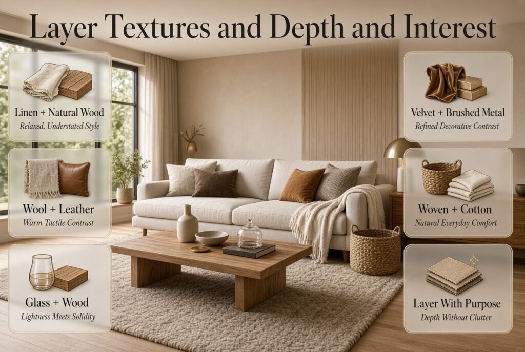
Texture adds depth to an interior by creating differences between smooth, rough, soft, reflective, and natural surfaces. It allows a room to feel interesting even when the color palette is relatively restrained.
A room containing only smooth finishes can feel flat, while excessive texture can make the space appear busy.
Which Textures Work Well Together?
Start with a few complementary materials rather than introducing every available finish. For example, a linen sofa, wool rug, wooden table, and ceramic accessories can create a comfortable combination without requiring bold patterns.
Consider these pairings:
| Materials | Overall effect | Suitable use |
|---|---|---|
| Linen and natural wood | Relaxed and understated | Living rooms and bedrooms |
| Wool and leather | Warm with noticeable contrast | Seating areas |
| Glass and wood | A balance of visual lightness and solidity | Contemporary interiors |
| Velvet and brushed metal | Refined and decorative | Accent chairs and selected accessories |
| Woven baskets and cotton | Casual and natural | Storage and everyday organization |
The goal is to create contrast while maintaining a connection between the materials.
You should also consider the room’s practical requirements. Textured surfaces may require more cleaning, while delicate fabrics may not be suitable for busy family areas.
For more ideas, explore Layering Textures Without Overcrowding.
How Can You Add Texture Without Overcrowding?
Use texture where it improves comfort, visual depth, or functionality. A textured throw can soften a plain sofa, while a woven basket can provide practical storage.
Avoid adding several heavily patterned textiles if the rug and wallpaper already attract considerable attention.
A useful method is to combine one dominant texture with two or three supporting materials. Repeat selected materials elsewhere in the room so the design feels connected rather than fragmented.
7. Balance Natural and Artificial Lighting
Lighting affects how colors appear, how textures are perceived, and whether a room feels welcoming. Even a carefully furnished room may look unbalanced if the center is brightly illuminated while the corners remain dark.
A successful lighting plan considers natural daylight, general illumination, task lighting, and accent lighting.
What Are the Three Main Layers of Lighting?
Ambient lighting provides general illumination. Ceiling fixtures and suitable recessed lights commonly serve this purpose.
Task lighting supports specific activities. Desk lamps, reading lights, and under-cabinet kitchen lighting are examples.
Accent lighting highlights selected features, such as artwork, architectural details, and shelving.
Combining these layers creates more flexibility than relying on one central fixture.
For example, a living room might use a ceiling light for general illumination, a floor lamp beside a reading chair, and a table lamp on a console. Each fixture has a purpose, but together they create a more comfortable distribution of light.
How Should You Use Natural Light?
Observe how daylight enters the room before deciding where to place furniture or additional lighting.
Avoid positioning large furniture where it unnecessarily blocks a window. Sheer curtains may soften strong daylight, while mirrors can reflect light when placed thoughtfully.
A mirror should reflect something attractive or visually useful whenever possible. Reflecting a cluttered corner may simply make the clutter more noticeable.
Consider how the room looks in the morning, afternoon, and evening. A color that appears soft in daylight may look much stronger under warm artificial lighting.
Expert tip: Choose bulbs according to the room’s activities and desired atmosphere. A reading area needs comfortable, adequate illumination, while ambient bedroom lighting may benefit from a softer appearance.
8. Use Wall Decorations According to Scale
Walls influence the balance of a room just as much as furniture. An undersized picture above a large sofa may look disconnected, while an oversized arrangement can overwhelm a narrow wall.
The best wall styling considers the dimensions of the wall, nearby furniture, ceiling height, and the amount of visual activity elsewhere in the room.
How Do You Choose the Right Artwork Size?
Measure the furniture or wall area that the artwork will relate to before selecting a frame.
As a starting point, artwork above a sofa often looks balanced when its total width is approximately two-thirds to three-quarters of the sofa’s width. This is a flexible guideline rather than a fixed rule.
A gallery wall can also work well if the individual pieces form a coherent overall arrangement.
Before hanging anything, place the frames on the floor or create paper templates. This lets you test the spacing and overall dimensions without repeatedly drilling holes.
Consider these details:
- Keep spacing between frames reasonably consistent.
- Align selected edges or establish an intentional overall shape.
- Mix frame sizes without making the arrangement feel random.
- Allow some open wall space around the display.
- Position artwork at a comfortable viewing height.
Mirrors can provide similar benefits when their size and placement suit the architecture. A mirror above a console, for example, can connect the furniture to the wall and help create a finished entryway.
If you want to combine storage with wall decoration, explore Wall Shelves Ideas.
9. Treat Negative Space as an Important Design Element
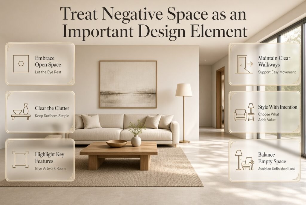
Negative space is the open area around furniture, decorations, and architectural features. It gives the eye room to rest and prevents important objects from competing for attention.
Empty space is not automatically wasted space. In many interiors, it is what allows furniture and accessories to stand out.
How Much Empty Space Should a Room Have?
There is no universal percentage that works for every home. The appropriate amount depends on room dimensions, furniture size, circulation requirements, and personal preferences.
Instead of trying to fill every corner, ask whether the space serves a useful purpose.
A clear section of wall can emphasize an artwork. An uncluttered coffee table can make a seating area easier to use. Open floor space near a doorway can improve circulation.
However, too much empty space may make a large room feel unfinished. In that situation, a suitably sized rug, an additional seating arrangement, or a carefully selected floor lamp might improve the composition.
The key is intentionality.
Quick tip: Remove a few decorative objects from a crowded surface and live with the simpler arrangement for a day. If the room feels calmer without losing its personality, the extra objects probably weren’t necessary.
10. Choose Rugs, Curtains, and Soft Furnishings Carefully
Soft furnishings connect separate pieces of furniture and help establish a room’s overall character. Rugs define activity zones, curtains frame windows, and cushions can introduce color or texture.
Their proportions matter as much as their appearance.
How Can a Rug Improve Visual Balance?
A rug can visually connect a sofa, chairs, and coffee table into one seating arrangement. If it is too small, the furniture may appear disconnected. If it is too large or strongly patterned, it may dominate the room.
In many living rooms, placing the front legs of the main seating pieces on the rug creates a cohesive arrangement. In smaller rooms, a different placement may be more practical.
For dining rooms, consider whether chairs remain on the rug when pulled away from the table. A rug that constantly catches chair legs can become frustrating, even if it looks attractive.
How Should Curtains Relate to the Room?
Curtains should suit the window dimensions, ceiling height, and overall decorating style.
Hanging the curtain rod above the window frame can create a sense of height when the architecture allows it. Wider placement may also help the curtains frame the window without covering too much glass when open.
Select fabric according to the room’s needs. Light-filtering curtains can preserve daylight, while heavier window treatments may offer greater privacy and light control.
Coordinate curtains with the rest of the palette without making them identical to every other textile.
A patterned rug, for example, may work best with simpler curtains, while a neutral rug can provide a quieter foundation for more expressive window treatments.
11. Create Rhythm Through Repetition
Repetition connects individual design elements and creates visual rhythm. It allows different objects to feel related without requiring them to come from the same collection.
A room may repeat a wood finish through furniture, use the same metal finish in lighting and cabinet handles, or echo a curved shape in a mirror and an accent chair.
How Do You Repeat Design Elements Naturally?
Choose a few characteristics worth repeating and use them selectively.
For example:
- Repeat a muted green accent in cushions, artwork, and a small plant.
- Use a consistent wood tone in the coffee table and sideboard.
- Echo a curved shape through a mirror, chair, or lamp.
- Repeat a metal finish in two or three carefully chosen details.
- Introduce a geometric pattern in a rug and a smaller accessory.
Repetition creates continuity, but too much can make a room look overly coordinated.
The objective is to create relationships rather than identical combinations. A modern sofa and a vintage side table can work together if their proportions, finishes, or colors provide a meaningful connection.
12. Adapt Balance to the Needs of Each Room
Every room serves a different purpose, so visual balance must support both appearance and function.
Living Room: Balance Seating and Conversation
The living room usually benefits from a clear focal point, comfortable seating, and a logical circulation route.
Arrange the sofa and chairs to support conversation rather than focusing entirely on the walls. Make sure the coffee table is accessible and that the main walking paths remain clear.
A large television may dominate a small room. If it is necessary for daily use, reduce competition from surrounding decorations and organize cables and media equipment neatly.
Bedroom: Balance Comfort and Visual Calm
The bed usually acts as the main visual feature. Its size, headboard, bedding, and bedside furniture influence the entire arrangement.
Matching bedside tables can create symmetry, but an asymmetrical layout may be more practical if the room has a narrow corner or an unusual doorway.
Avoid using so many cushions and decorative layers that making the bed becomes inconvenient. Soft textures and suitable lighting can create comfort without excessive decoration.
Kitchen and Dining Room: Balance Appearance With Function
Kitchens need accessible preparation areas, practical storage, and sufficient clearance around appliances.
Keep frequently used items within reach and avoid allowing decorative objects to occupy essential working surfaces. If open shelves are part of the design, mix useful items with selected decorative pieces rather than treating every shelf as a display area.
Dining areas require enough room for chairs to move comfortably. Choose lighting that relates to the table’s dimensions and position.
Bathroom: Keep the Design Clean and Coordinated
Bathrooms often benefit from restrained decoration because storage and counter space are limited.
Coordinate towels, organize toiletries, and choose accessories that suit the vanity and mirror. A large decorative item may look out of place on a narrow counter, while wall-mounted storage can preserve useful floor space.
Prioritize moisture resistance, ease of cleaning, and safe placement of electrical fixtures.
Home Office: Support Concentration and Comfort
A home office should feel organized without becoming visually sterile.
Choose a desk that accommodates your equipment, position the monitor comfortably, and provide suitable task lighting. Keep frequently used supplies accessible while moving unnecessary objects out of the main working area.
For more detailed workstation guidance, read Ergonomic Desk Depth Requirements.
13. Make Small Rooms Feel More Open and Balanced

Small rooms require careful planning because oversized furniture and unnecessary accessories can quickly reduce usable space.
The solution is not to make every object tiny. Instead, select furniture that fits the room, preserve circulation, and use visual contrast thoughtfully.
Which Styling Techniques Work Best in Small Homes?
Begin with the largest furniture pieces. If the sofa, bed, or dining table consumes most of the available floor area, rearranging accessories will not solve the underlying problem.
Try these strategies:
- Select furniture that leaves comfortable walking routes.
- Consider pieces with visible legs when they suit the design.
- Use mirrors where reflections improve the sense of depth.
- Keep windows relatively clear to preserve natural light.
- Choose vertical storage that does not overwhelm the wall.
- Maintain a coordinated color palette.
- Avoid filling every corner with decorative objects.
- Use multifunctional furniture when it genuinely improves daily life.
A narrow console, for example, may provide useful entryway storage without taking up the space of a deep cabinet.
For more ideas, explore Entryway Storage Capacity Planning.
Small rooms can still accommodate statement pieces. A colorful chair or distinctive artwork may create personality, provided the surrounding elements remain relatively restrained.
14. Make Large Rooms Feel Comfortable Rather Than Empty
Large rooms present the opposite challenge. Furniture that is too small or widely separated may make the space feel unfinished, even when the individual pieces are attractive.
The solution is to create purposeful zones and distribute visual weight across the room.
How Can You Style an Oversized Living Room?
Divide the room according to its activities. A large living area might contain a main seating arrangement, a reading corner, and a small desk or games area.
Use rugs, lighting, and furniture placement to define each zone. The zones should feel connected through a consistent color palette and related materials.
Avoid scattering individual chairs and tables around the room without a clear relationship. Instead, create groupings that support specific activities.
Artwork also needs to relate to the room’s scale. A small picture can disappear on a large wall, while a substantial artwork or a carefully planned collection may provide a stronger focal point.
You do not need to fill every available area. Preserve open space where it improves movement and allows the main furniture arrangements to stand out.
15. Use Storage to Reduce Visual Clutter
Clutter disrupts balance because it introduces many competing shapes, colors, and objects into a space. Even a well-designed room can appear chaotic when everyday items lack convenient storage.
Good storage design makes it easier to maintain a balanced appearance over time.
How Can You Organize a Room Without Hiding Everything?
Start by identifying the objects that genuinely need to remain accessible. Frequently used items should have convenient storage, while occasional-use items can be placed in less prominent locations.
Closed cabinets can help reduce visual noise, particularly in living rooms and bedrooms. Open shelves work well for books, selected accessories, and attractive everyday objects, provided they are not overloaded.
In an entryway, assign specific places for shoes, keys, bags, and outerwear. In a home office, organize cables, stationery, and paperwork so the working surface remains usable.
The best storage solution is one that matches your daily habits. A complicated organization system may look attractive initially but is unlikely to remain effective if it takes too much effort to maintain.
For practical improvements around the home, explore Home Improvement.
16. Combine Personal Style With a Cohesive Interior
A balanced home should reflect the people who live in it. Personal photographs, meaningful objects, inherited furniture, and collected artwork can add character that a perfectly coordinated showroom cannot reproduce.
The challenge is to incorporate these items without making the room feel crowded or disconnected.
How Can You Display Personal Items Without Overwhelming the Room?
Choose a few meaningful objects for prominent display and rotate others when you want a change.
Group photographs into a planned arrangement, display collections together when their relationship is clear, and give distinctive objects enough surrounding space to be appreciated.
Personal belongings do not need to match the furniture perfectly. Their colors, shapes, or materials simply need to work reasonably well within the wider composition.
For example, an inherited wooden cabinet can become an attractive feature in a contemporary living room when its position, surrounding lighting, and nearby accessories are considered carefully.
If you prefer a sophisticated appearance without replacing expensive furniture, explore Sophisticated Interiors Without Luxury Furniture.
A home feels complete when its design supports real life rather than requiring everyone to keep the space looking untouched.
17. Common Styling Mistakes That Disrupt Visual Balance

Understanding common mistakes can save money and prevent unnecessary decorating changes.
Buying Furniture Before Measuring
Why it happens: People often choose furniture based on appearance, comfort, or showroom presentation.
Why it causes problems: The piece may be too large for the room or prevent doors and drawers from opening properly.
How to avoid it: Measure the room and furniture. Mark the proposed footprint on the floor and test the walking routes before making a purchase.
Using Too Many Accent Colors
Why it happens: Individual accessories look attractive, so several are purchased without considering the existing palette.
Why it causes problems: The room begins to feel fragmented because every object attracts attention in a different direction.
How to avoid it: Establish a main palette and repeat a small number of supporting colors.
Choosing Accessories That Are Too Small
Why it happens: Smaller decorations may seem easier to fit anywhere.
Why it causes problems: Tiny artwork or accessories can appear disconnected from substantial furniture and large walls.
How to avoid it: Consider the scale of the surrounding furniture and group smaller pieces when appropriate.
Pushing Every Piece of Furniture Against the Walls
Why it happens: People assume that perimeter placement automatically creates more space.
Why it causes problems: The center can feel empty while conversation areas become awkward.
How to avoid it: Test different furniture groupings. In rooms with sufficient clearance, bringing seating slightly inward may create a more cohesive arrangement.
Ignoring Lighting Conditions
Why it happens: Paint colors and fabrics are often selected under store lighting or from photographs.
Why it causes problems: The materials may appear significantly different in the actual room.
How to avoid it: Test samples in natural and artificial light before committing to major changes.
Filling Every Shelf and Empty Corner
Why it happens: Empty space may be mistaken for unfinished decorating.
Why it causes problems: Excessive objects reduce breathing room and create visual competition.
How to avoid it: Display meaningful items selectively and leave some areas intentionally clear.
Prioritizing Appearance Over Everyday Use
Why it happens: A photograph-ready arrangement may seem like the ideal outcome.
Why it causes problems: Furniture becomes difficult to use, walkways become obstructed, or cleaning becomes inconvenient.
How to avoid it: Test the room during normal activities before considering the arrangement finished.
18. Practical Expert Advice for Styling a Balanced Home
Professional-looking interiors are usually the result of a series of thoughtful decisions rather than one expensive purchase. A useful approach is to solve the biggest visual problems first and make smaller adjustments afterward.
Step 1: Identify the Main Problem
Decide whether the room feels crowded, empty, dark, disconnected, or poorly organized. Naming the problem prevents unnecessary purchases.
Step 2: Establish a Focal Point
Choose the feature that should attract attention first. Arrange supporting furniture and decorations around it.
Step 3: Evaluate the Largest Furniture Pieces
Check the scale and placement of the sofa, bed, dining table, storage units, and other dominant objects.
Step 4: Review Visual Weight
Look at the room from the entrance and notice whether dark furniture, strong patterns, or oversized decorations dominate one area.
Step 5: Coordinate the Color Palette
Choose a manageable combination of dominant, supporting, and accent colors. Repeat selected shades in different areas.
Step 6: Improve Lighting and Texture
Introduce suitable task lighting, ambient illumination, and complementary materials where they improve comfort and depth.
Step 7: Remove Unnecessary Objects
Clear crowded surfaces and simplify decorations that do not contribute to the room’s function or appearance.
Step 8: Test the Arrangement
Use the room normally for several days. Check whether furniture remains comfortable, storage works properly, and the space is easy to maintain.
Step 9: Make Small Adjustments
Move a lamp, change the artwork position, reposition a rug, or remove an accessory if the room still feels unbalanced.
Step 10: Keep the Design Flexible
Your needs may change over time. Choose arrangements that can adapt rather than relying on a rigid setup that works only under ideal conditions.
For homeowners planning more extensive changes, Questions to Ask an Interior Design Consultant can help clarify design goals, budgets, and project expectations.
If your plans involve professional services, review Interior Designer Contract Essentials before agreeing to a project’s scope, fees, or responsibilities.
19. Make Decorating Decisions That Support Long-Term Comfort
Visual balance should continue to work after the initial styling is complete. A room may look excellent immediately after decorating but become difficult to maintain if it relies on too many delicate accessories or inconvenient storage arrangements.
Consider how each decision will affect daily life.
Choose fabrics that suit the household’s activity level. Select storage that accommodates real belongings rather than an idealized version of the room. Keep frequently used objects accessible, and avoid placing decorative items where they obstruct practical tasks.
When selecting furniture, consider durability, repairability, and flexibility alongside appearance. A well-proportioned piece that serves several purposes may provide more value than an elaborate item that fits only one specific arrangement.
For people planning changes around windows and daylight, Automated Window Treatment Planning offers a relevant starting point for considering window-treatment needs.
For a broader overview of room styling, furniture placement, and decorating possibilities, visit the Room-by-Room Design Hub.
If you are considering a Japanese-inspired, minimalist approach, Japandi Furniture Proportions can help you explore how furniture scale and simplicity contribute to a cohesive interior.
You can also return to Design Mode 24 Interior Design for further home styling and interior design inspiration.
How Do You Create Visual Balance in a Home Without Buying New Furniture?
Creating visual balance doesn’t always require new furniture or expensive decorations. In many homes, the real problem is how existing items are arranged. A sofa may dominate one side of the living room, decorative objects may crowd a shelf, or furniture may be positioned without considering the available space. Rearranging these elements can make the entire room feel more coordinated.
Start by identifying the largest furniture pieces and deciding which feature should attract attention first. Move smaller items to balance the arrangement, remove unnecessary decorations, and leave enough open space around important features. You can also repeat existing colors through cushions, throws, artwork, or accessories to create a stronger connection between separate elements.
Practical ways to improve visual balance on a budget:
Rearrange furniture to improve proportions and walking space.
Remove accessories that make tables or shelves feel overcrowded.
Group decorative objects instead of scattering them randomly.
Reposition lamps to improve lighting in darker areas.
Use existing cushions, rugs, and curtains to connect the room’s color palette.
The most important step is to solve the actual problem before spending money. A thoughtful furniture arrangement often creates a more noticeable improvement than adding another decorative item.
What Are the Most Important Interior Design Principles for a Visually Balanced Living Room?
A visually balanced living room combines appropriate furniture proportions, a clear focal point, coordinated colors, layered lighting, and comfortable circulation. These elements work together to create a space that feels organized without looking overly formal or carefully staged.
Begin with the sofa because it usually carries the greatest visual weight. Choose a coffee table that relates to its size, position additional seating where conversation feels natural, and use a rug to connect the furniture grouping. If a fireplace, television, or large artwork serves as the focal point, arrange the surrounding elements so they support rather than compete with it.
Key principles to prioritize:
Furniture scale: Make sure the sofa, chairs, and tables suit the room’s dimensions.
Visual weight: Avoid concentrating all the darkest or bulkiest objects on one side.
Color coordination: Repeat a few selected colors through furniture and accessories.
Layered lighting: Combine general lighting with task and accent lighting.
Negative space: Preserve clear pathways and leave some surfaces uncluttered.
A balanced living room doesn’t need matching furniture on both sides. Different pieces can work equally well when their size, shape, color, and placement create a comfortable overall composition.
How Can You Balance Colors, Textures, and Patterns Without Making a Room Look Cluttered?
The best way to combine colors, textures, and patterns is to give each element a clear role. A dominant color establishes the foundation, supporting shades create continuity, and selected accents introduce personality. Textures add depth, while patterns provide movement and visual interest.
Problems arise when every element competes for attention. For example, a strongly patterned rug, bold wallpaper, colorful curtains, and several contrasting cushions may overwhelm a small room. Keeping some surfaces visually quiet allows the more distinctive features to stand out.
A practical approach to combining design elements:
Choose one dominant color and a limited number of supporting shades.
Repeat accent colors in different parts of the room.
Combine contrasting textures, such as linen, wood, wool, and ceramic.
Let one major pattern lead while keeping nearby patterns less dominant.
Leave open areas between decorative objects to create breathing room.
Before buying new accessories, assess the colors and materials already present in the room. Often, repeating an existing shade or introducing one complementary texture is enough to make the interior feel more cohesive.
How Do You Make a Small Home Look More Spacious and Visually Balanced?
A small home feels more spacious when furniture fits the available area, natural light remains unobstructed, and unnecessary visual clutter is reduced. The goal isn’t to remove every decorative item or choose only miniature furniture. It’s to create an arrangement that makes the available space easy to navigate and comfortable to use.
Start by measuring the main furniture pieces and checking whether they interfere with doorways, windows, or walking routes. Consider furniture with visible legs, compact storage, and multifunctional designs when they suit your needs. Mirrors can also help create a sense of depth when they reflect natural light or an attractive part of the room.
Useful styling techniques for smaller spaces:
Choose furniture according to room dimensions rather than showroom appearance.
Keep frequently used walking routes clear.
Use vertical storage to make better use of wall space.
Select a coordinated color palette instead of introducing too many competing shades.
Avoid filling every corner with plants, baskets, or decorative accessories.
Use rugs and lighting to define separate areas in open-plan rooms.
Remember that visual spaciousness comes from both appearance and function. A room will feel more comfortable when you can move around easily, access storage without difficulty, and enjoy the furniture without constantly working around it.
What Are the Most Common Mistakes That Make a Home Look Visually Unbalanced?
The most common mistakes include choosing furniture that is too large or too small, concentrating visual weight in one area, using too many competing colors, and decorating every available surface. These problems often happen because people select individual items without considering their relationship to the room as a whole.
Another frequent mistake is prioritizing appearance over everyday function. A seating arrangement may look attractive but still feel uncomfortable if the coffee table is difficult to reach or the walking routes are obstructed. Similarly, an oversized artwork can overpower a wall even when its colors complement the furniture.
Mistakes to watch for and how to correct them:
Oversized furniture: Measure the room and check circulation before purchasing.
Too many focal points: Choose one dominant feature and reduce competition around it.
Uncoordinated colors: Establish a consistent palette and repeat selected accents.
Overdecorated surfaces: Remove unnecessary objects and preserve open space.
Poor lighting distribution: Combine ambient, task, and accent lighting according to the room’s needs.
Ignoring proportions: Compare artwork, rugs, and accessories with the furniture they accompany.
The most effective correction is often simplification. Instead of adding more furniture or decorations to fix an awkward room, reconsider the arrangement, remove competing elements, and allow the strongest features to stand out.
Conclusion
Creating a visually balanced home is not about buying expensive furniture or following every interior design trend. It is about understanding how furniture, colors, lighting, textures, patterns, and decorative accessories work together to create a comfortable and harmonious space. Even small adjustments, such as rearranging furniture, reducing clutter, improving lighting, or introducing a complementary color, can make a room feel more organized and inviting.
The most effective approach is to start with the purpose of each room and identify what feels visually out of place. Pay attention to furniture proportions, the distribution of colors, the placement of decorative objects, and the amount of open space. Instead of filling every corner, allow the room to breathe and give important features enough attention. A well-balanced interior should look attractive while remaining practical for everyday living.
Remember that balance does not require perfect symmetry. Different furniture pieces, contrasting materials, and varied decorative elements can work beautifully together when their visual weight is distributed thoughtfully. Experiment with your existing belongings before purchasing anything new, and make gradual changes based on how the space looks and feels.
With a clear understanding of these styling principles, you can create interiors that feel cohesive, functional, and timeless. Focus on thoughtful choices rather than unnecessary decoration, and your home can reflect your personal style while maintaining the visual harmony that makes a space genuinely comfortable.