
Introduction
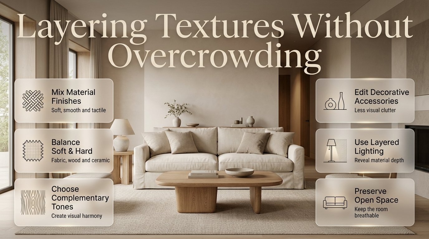
Layering Textures Without Overcrowding | A room can have beautiful furniture, carefully selected colors, and expensive accessories yet still feel unfinished. Sometimes, the problem isn’t what the room lacks. It’s that the materials don’t work together. Smooth surfaces can make a space feel flat, while too many patterns, fabrics, and decorative finishes can create visual clutter.
The solution is layering textures without overcrowding. This approach combines different materials, surface finishes, and fabrics to create depth while keeping the room comfortable, functional, and visually balanced. Instead of filling every corner with accessories, you learn to make a smaller number of carefully chosen materials work harder.
For example, a living room with a linen sofa, a natural wood coffee table, a wool rug, and a ceramic lamp can feel warm and sophisticated without displaying dozens of decorative objects. Each material contributes a different quality, while the overall arrangement remains calm.
At DesignMode24 Interior Design, the goal is to help homeowners make practical design decisions that improve both appearance and everyday living.
This guide explains how to choose complementary textures, balance soft and hard materials, decorate small rooms, coordinate patterns, work with existing furniture, and identify the point at which additional decoration becomes unnecessary. You’ll also learn how lighting, furniture proportions, maintenance, and room layout influence the final result.
What Does Layering Textures Without Overcrowding Mean?
Layering textures without overcrowding means combining materials with different surface qualities while maintaining visual order and enough open space for each element to be appreciated. It involves balancing rough and smooth finishes, soft and hard materials, and subtle and prominent patterns without allowing any one element to overwhelm the room.
Texture describes how a surface looks or feels. Linen has a visible weave, wool can feel soft and substantial, wood displays grain, stone may have natural variation, and glass creates a smooth, reflective finish.
When these materials are arranged thoughtfully, they create visual depth even when the color palette is relatively simple.
Overcrowding happens when too many elements compete for attention. A room may contain patterned curtains, textured wallpaper, a heavily woven rug, velvet cushions, boucle upholstery, decorative baskets, and several contrasting accessories. Each item might look attractive individually, but the combination may feel chaotic.
The objective is not to eliminate variety. It is to establish a clear relationship between the materials.
Why Is Texture Important in Interior Design?
Texture gives a room character, warmth, and dimension. Without it, even a carefully coordinated color scheme can feel flat. Too much texture, however, can make a room visually tiring.
A balanced texture scheme can help you:
- Introduce depth without adding more colors.
- Make neutral interiors feel interesting and inviting.
- Soften rooms dominated by glass, metal, or stone.
- Create contrast between furniture and architectural features.
- Give inexpensive furnishings a more considered appearance.
- Make different design elements feel connected.
- Establish a focal point without excessive decoration.
Consider a white living room with plain walls, a smooth sofa, and a glass coffee table. The space might feel clean but slightly cold. Adding a wool rug, linen curtains, and a natural wood accessory can introduce warmth without changing the main color scheme.
This is why texture should be considered alongside furniture, lighting, color, and spatial planning rather than treated as a final decorative step.
How Many Textures Should You Use in One Room?
Three to five noticeable textures can be a useful starting point for a small or medium-sized room. However, this is a flexible guideline, not a strict design rule. Larger rooms and interiors with a carefully coordinated material palette can accommodate considerably more variety.
Instead of counting every material, organize your choices according to their visual importance.
| Texture role | Examples | Purpose |
|---|---|---|
| Dominant texture | Linen sofa, oak flooring, stone feature wall | Establishes the room’s character |
| Supporting texture | Wool rug, cotton curtains, wooden furniture | Creates depth and balance |
| Accent texture | Ceramic vase, woven basket, metal lamp | Adds small points of interest |
| Background texture | Painted plaster, subtle wallpaper, matte cabinetry | Provides a quieter visual foundation |
A bedroom, for example, might already have cotton bedding, a wooden headboard, and a wool rug. You could introduce a knitted throw as an accent without adding several more fabrics.
Remember that flooring, cabinetry, wall finishes, and large furniture pieces contribute to the overall texture of a room. You don’t need to add numerous accessories simply because the space appears undecorated.
Pro Tip: Before buying anything, identify the three most noticeable materials already present. Your next purchase should complement those materials or solve a specific design problem.
How to Choose Textures That Complement Each Other
Successful texture layering depends on contrast, coordination, and proportion. Two materials don’t need to look identical to work together. They need to share enough common ground to feel intentional.
1. Combine Smooth and Rough Surfaces
Smooth and rough surfaces create contrast because their different qualities make each other more noticeable.
A smooth glass vase can look attractive on a natural wood console. A polished stone countertop can complement a woven runner, while a sleek metal lamp can balance a chunky wool throw.
Useful combinations include:
- Smooth plaster walls with textured linen curtains.
- Polished stone with natural timber.
- Sleek metal hardware with woven storage baskets.
- Smooth cotton bedding with a knitted blanket.
- Glass accessories against a subtly textured wall.
- Matte furniture finishes with a small polished accent.
The important factor is controlling how much contrast you introduce.
If your living room already has a prominent stone fireplace, reclaimed wood furniture, and a deeply textured rug, you probably don’t need several additional rough finishes. A smooth ceramic lamp or simple cotton cushion can provide the necessary balance.
2. Balance Soft Fabrics With Hard Materials
Soft furnishings make a room comfortable, while harder materials give the arrangement structure.
A room dominated by glass, metal, stone, and polished surfaces may feel cold. Conversely, a room filled with thick upholstery, cushions, blankets, and plush rugs may look heavy.
Try combining materials with different functions.
Soft materials:
- Linen and cotton upholstery.
- Wool rugs and throws.
- Velvet cushions.
- Boucle chairs.
- Woven fabric curtains.
Hard materials:
- Oak or walnut furniture.
- Ceramic lamps.
- Stone tabletops.
- Glass accessories.
- Brushed metal fixtures.
For example, a beige sofa, oak coffee table, wool rug, and ceramic lamp create a balanced arrangement. The sofa and rug soften the room, while the table and lamp introduce definition.
When selecting materials, consider comfort as well as appearance. A rough decorative fabric may photograph beautifully but feel unpleasant against the skin. A heavily textured tabletop may also be difficult to clean.
3. Use Color to Connect Different Materials
Color is one of the easiest ways to make different textures feel cohesive.
Imagine a room containing a cream boucle chair, beige linen curtains, an ivory wool rug, and light oak furniture. The materials have distinct surface qualities, but their related tones create continuity.
You can use this approach with many palettes.
| Color palette | Suggested textures | Overall effect |
|---|---|---|
| Warm white and sand | Linen, oak, wool, ceramic | Relaxed and natural |
| Grey and charcoal | Matte metal, wool, glass, dark wood | Contemporary and understated |
| Sage and oatmeal | Cotton, natural timber, woven fabric | Calm and organic |
| Cream and walnut | Velvet, wood grain, brushed brass | Refined and warm |
| Terracotta and beige | Clay, linen, textured plaster | Earthy and welcoming |
However, matching every surface too closely can make the room look flat. Introduce subtle differences in tone, weave, grain, or finish so the materials remain distinguishable.
For additional inspiration, explore Paint Color ideas when deciding how wall colors can support your chosen materials.
4. Mix Matte and Glossy Finishes Carefully
Matte and glossy surfaces interact differently with light.
Matte finishes generally create a softer, quieter appearance. Glossy finishes reflect light and often attract attention, particularly near windows or artificial light sources.
A balanced arrangement might include matte-painted walls, a natural timber table, brushed metal hardware, and a small glass accessory.
Problems arise when every surface is highly reflective. Glossy cabinets, polished stone, mirrored furniture, metallic accessories, and reflective artwork can compete for attention.
Choose one or two reflective accents and let the remaining surfaces provide a quieter backdrop.
5. Repeat Materials to Create Continuity
Repeating a material can make a room feel intentionally designed.
For example, a walnut coffee table might be complemented by a walnut picture frame or a small wooden accessory elsewhere. The pieces do not need to match exactly; they simply need to share a recognizable quality.
The same principle works with metal finishes, ceramic objects, and woven materials.
However, avoid repeating every material in every corner. Excessive repetition can make a room feel predictable, while too many unrelated finishes can make it feel disconnected.
The best approach is to repeat selected materials while allowing other elements to provide contrast.
How to Layer Textures in Different Rooms
Texture should support the purpose of the room. A living room needs comfortable seating, a bedroom should encourage relaxation, and a kitchen requires surfaces that can withstand everyday use.
Living Room: Create Comfort Without Visual Clutter
Living rooms often contain the greatest variety of furniture and accessories, making them particularly vulnerable to overcrowding.
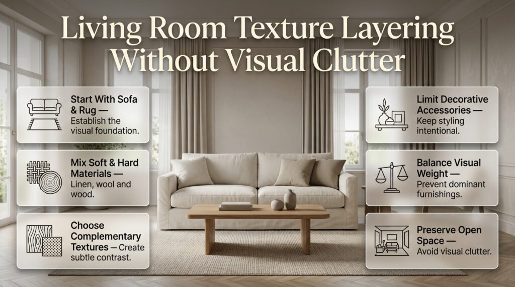
Start with the sofa and rug because these are usually among the largest textile surfaces in the room. Their colors, patterns, and textures establish the foundation for smaller decorative choices.
A balanced living room might include:
- A linen or cotton sofa.
- A wool or low-pile textured rug.
- A wooden coffee table.
- Two complementary cushions.
- Simple curtains.
- One or two ceramic or metal accessories.
You don’t need a boucle chair, velvet cushions, a knitted throw, fringed curtains, a shag rug, and multiple woven baskets all at once.
Choose the elements that provide the most useful contrast. If the rug already has a pronounced pattern and deep pile, simple cushions may be sufficient.
Also consider visual weight. A dark, heavily textured object can attract more attention than a small, light-colored accessory. The Visual Weight in Interior Spaces guide can help you understand why some furnishings dominate a room and how their placement affects balance.
Bedroom: Layer Bedding With Restraint
Bedrooms benefit from tactile materials, but excessive bedding can make the bed look bulky and inconvenient.
Start with a comfortable foundation: sheets, a duvet cover, and pillows. Then introduce one or two additional layers if they improve the appearance or comfort.
For example:
- Washed cotton sheets provide a relaxed base.
- A quilted duvet adds subtle surface variation.
- A knitted throw introduces a heavier texture.
- A wooden headboard brings warmth.
- Linen curtains soften the surrounding space.
Keep decorative bedding proportional to the bed. Oversized cushions may look attractive in photographs but become inconvenient when they need to be removed every night.
If your bedroom already has patterned wallpaper or a heavily upholstered headboard, choose quieter bedding. This allows the existing feature to remain prominent.
The same principle applies to bedside tables, lamps, and rugs. Their textures should support the room’s overall atmosphere rather than compete with one another.
Kitchen: Combine Practical and Decorative Materials
Kitchen textures must look attractive while supporting cleaning, food preparation, and daily maintenance.
A practical combination might include smooth cabinet fronts, a stone or stone-look countertop, a wooden cutting board, and a matte ceramic accessory.
Natural wood can soften a kitchen dominated by hard finishes. Brushed metal hardware can introduce contrast without becoming overly decorative.
Be selective with porous or deeply textured surfaces around cooking areas. Their maintenance requirements may outweigh their visual benefits, especially near grease, moisture, and food splashes.
Before choosing a countertop, backsplash, or cabinet finish, check the manufacturer’s specifications for sealing, cleaning, and durability.
Bathroom: Keep the Palette Calm
Bathrooms already contain numerous hard materials, including tile, glass, porcelain, mirrors, and metal fixtures.
Adding several more competing finishes can make a small bathroom feel fragmented.
Try combining:
- Smooth ceramic or porcelain tiles.
- A timber vanity or wood-look cabinet.
- Textured cotton towels.
- One stone or ceramic accessory.
- A restrained metal finish for fixtures.
If the walls feature bold patterned tiles, keep the towels and countertop accessories relatively simple.
Texture can create warmth in a bathroom, but it should never compromise slip resistance, moisture management, or ease of cleaning.
Dining Room: Balance the Table and Seating
Dining rooms often combine a large tabletop, multiple chairs, lighting, and decorative accessories.
A natural wood table can pair well with upholstered chairs and a simple ceramic centerpiece. If the chairs already have a pronounced woven texture, the table decoration can remain understated.
Avoid using an elaborate runner, patterned placemats, heavily textured upholstery, and multiple decorative objects unless the overall palette is particularly restrained.
The dining table should remain practical. Texture layering is successful when the space still supports comfortable seating, serving, and cleaning.
How to Layer Textures in a Neutral Interior
Neutral interiors depend on subtle differences to create depth. When most of a room uses beige, white, grey, or brown, the surface qualities of each material become especially important.
Create a Material Plan Before Shopping
Write down the main materials already present in your room.
For example:
| Element | Existing material | Possible addition |
|---|---|---|
| Floor | Light oak | Wool rug |
| Sofa | Beige linen | Two textured cushions |
| Coffee table | Smooth wood | Matte ceramic vase |
| Curtains | Plain cotton | Keep the fabric simple |
| Lighting | Brushed metal | Warm, diffused light |
This simple exercise prevents unnecessary purchases by identifying what the room already has and what it genuinely needs.
Introduce Texture at Different Heights
Texture is often more effective when distributed vertically rather than concentrated in one area.
A living room might have a textured rug at floor level, upholstered seating in the middle, and a woven pendant or textured artwork above.
This creates a natural visual progression without requiring every surface to be decorated.
However, don’t feel obliged to fill every wall. Empty space helps textured objects stand out and allows the room to feel less crowded.
Use Contrast Within a Limited Palette
A neutral room does not need to rely on identical shades.
You might combine warm white walls, a sand-colored sofa, medium-toned oak, and a darker brown accessory. The differences create definition while maintaining a cohesive appearance.
Pay attention to undertones. A warm beige fabric may clash with a cool grey surface even when both appear neutral in isolation.
Whenever possible, compare material samples in the actual room under both natural and artificial lighting.
How Lighting Changes the Appearance of Texture

Lighting can make the same material look dramatically different. Side lighting often emphasizes raised surfaces and woven fabrics, while diffuse lighting produces softer shadows and a calmer appearance.
A textured wall, for example, may appear subtle in daylight but much more pronounced when a light is positioned close to its surface.
| Lighting approach | Effect on texture | Best application |
|---|---|---|
| Diffused ambient lighting | Softens shadows and contrast | Bedrooms and relaxed living spaces |
| Directional side lighting | Highlights grain and surface relief | Feature walls and artwork |
| Accent lighting | Draws attention to selected details | Shelves and architectural features |
| Natural daylight | Reveals color and surface variation | Assessing fabrics and finishes |
Avoid directing strong accent lights at every textured surface. Doing so can make the room feel fragmented and draw attention away from its focal point.
A useful approach is to choose one or two areas where texture deserves additional emphasis. Leave the remaining surfaces under softer lighting.
For more ideas about integrating illumination into a cohesive room design, explore Intelligent Lighting.
How to Layer Textures in a Small Room
Small rooms require careful editing because every large surface contributes to the overall impression.
The answer isn’t to eliminate texture. It’s to concentrate it in a few deliberate places.
Keep Large Surfaces Relatively Quiet
Choose relatively simple curtains, upholstery, and wall finishes if the room already contains prominent flooring or architectural details.
Then introduce texture through a small number of accents, such as a knitted throw, a woven basket, or a natural wood bedside table.
This approach gives the room character without overwhelming its limited visual space.
Choose Texture Without Unnecessary Bulk
Flat-woven rugs, subtle fabric weaves, natural wood grain, and matte finishes can add depth without occupying additional physical space.
By contrast, numerous oversized cushions, thick blankets, and bulky decorative accessories can make furniture feel crowded.
The distinction is important: visual richness does not require physical volume.
Use Storage to Reduce Visual Clutter
Visible everyday items can overwhelm even a carefully coordinated material palette.
Use closed storage for items you need regularly but don’t want on display. Reserve open shelving for a small selection of useful or attractive objects.
For practical storage ideas, explore Wall Shelves Ideas and Entryway Storage Capacity Planning.
Consider Furniture Scale Before Adding Accessories
A small room with oversized furniture can feel crowded before you introduce a single decorative object.
Check the proportions of your sofa, coffee table, side tables, and storage units. A large, visually heavy piece may need quieter surrounding materials.
The guide to Understanding Furniture Proportions provides additional context for selecting pieces that suit the room.
How to Work With Existing Flooring and Furniture
One common decorating mistake is choosing new accessories without considering the materials that cannot easily be changed.
Flooring, fitted cabinetry, built-in shelving, and large furniture pieces often determine which textures will work best.
Let the Flooring Guide Your Choices
A strongly grained wood floor already introduces visual movement. A patterned tile floor may contain enough contrast to influence the entire room.
If the flooring is visually prominent, consider simpler upholstery and understated accessories.
If the flooring is plain, you have more freedom to introduce a textured rug or distinctive furniture finish.
You can find further guidance in Decorating Around Existing Flooring, particularly when you want to refresh a room without replacing permanent finishes.
Avoid Competing With Statement Furniture
A sculptural chair, heavily grained console, or upholstered headboard may already function as the room’s main visual feature.
Instead of adding multiple equally prominent pieces, allow supporting materials to create contrast.
For example, a sculptural wooden chair may look more effective against a simple wall with restrained textiles than beside several elaborate accessories.
Measure Before Purchasing Replacement Pieces
Texture alone cannot compensate for furniture that is too large, too small, or difficult to move through the room.
Before ordering new furniture, measure the item and check doorways, staircases, lifts, corridors, and other access points.
The guide to Choosing Furniture Delivery Dimensions can help you avoid practical problems when introducing new furnishings.
Common Mistakes That Make Texture Layering Look Overcrowded
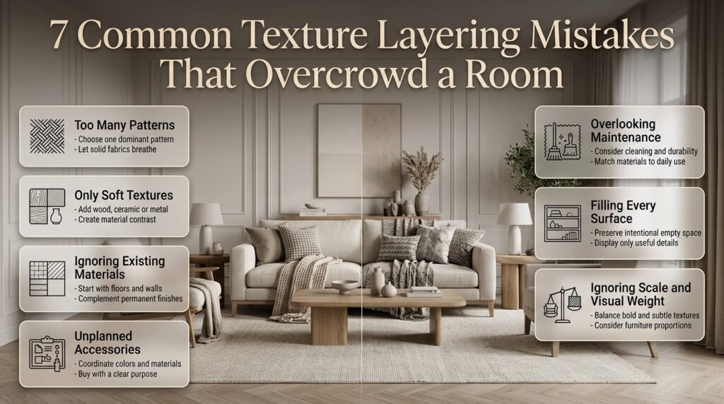
Mistake 1: Mixing Too Many Patterns
Why it happens: Different patterns look attractive individually, so it is tempting to combine all your favorites.
Why it causes problems: Patterns have their own visual movement. When several compete at similar scales, the room can feel restless.
How to avoid it:
- Choose one dominant pattern.
- Add a smaller or more subtle pattern only if needed.
- Use solid fabrics to create breathing room.
- Keep the colors of patterned materials related.
A botanical cushion can work with a striped throw if both share a color and the surrounding surfaces remain relatively quiet.
Mistake 2: Using Only Soft Textures
Why it happens: Soft furnishings make rooms feel comfortable, so people keep adding cushions, blankets, and rugs.
Why it causes problems: Without hard-surface contrast, the room may lose definition and appear visually heavy.
How to avoid it: Introduce a wooden side table, ceramic lamp, metal frame, or glass accessory. One well-chosen material may provide enough contrast.
Mistake 3: Ignoring Existing Materials
Why it happens: People often focus on accessories rather than assessing flooring, cabinetry, walls, and large furniture.
Why it causes problems: A heavily grained timber floor or textured stone wall already contributes significant visual information.
How to avoid it: Begin with permanent materials. Then choose furnishings that complement them instead of competing with them.
Mistake 4: Buying Accessories Without a Plan
Why it happens: Small objects seem inexpensive and easy to add, so they are purchased individually.
Why it causes problems: The result may contain attractive pieces that do not work together.
How to avoid it:
- Select a small group of core colors.
- Identify the dominant materials.
- Choose accessories that fill a specific gap.
- Check how the pieces look together before purchasing.
If you want to refresh a room without making expensive changes, DIY Home Projects offers ideas for practical improvements.
Mistake 5: Choosing Materials Without Considering Maintenance
A thick, high-pile rug may look luxurious but collect more dust than a low-pile alternative. Delicate velvet may require more care than a durable everyday upholstery fabric.
Before buying, consider cleaning instructions, household traffic, pets, children, moisture exposure, and fabric durability.
Beautiful materials should suit the way you actually live.
Mistake 6: Filling Every Empty Surface
An empty side table or quiet wall does not automatically need decoration.
Adding objects simply to fill space can weaken the room’s visual hierarchy and make it harder to appreciate the main materials.
Instead, assess whether the room needs additional function, contrast, or warmth. If none is missing, leave the surface alone.
Mistake 7: Ignoring Scale and Visual Weight
A large dark object may attract more attention than several smaller, lighter pieces. Similarly, a chunky woven throw has a stronger visual presence than a fine cotton cushion.
When several items have similarly strong textures and large patterns, the arrangement can feel crowded even if their colors match.
Balance prominent surfaces with quieter materials and consider how the objects appear from the doorway.
A Step-by-Step Method for Layering Textures Without Overcrowding
Use this process when decorating a new room or improving an existing one.
Step 1: Identify the Dominant Surfaces
Start with the floor, walls, large furniture, and window treatments.
Ask which surfaces already attract attention. A room with patterned flooring and textured wallpaper needs a different approach from one with plain walls and smooth floors.
Example: If your living room has a rough stone fireplace, avoid introducing several other rough surfaces immediately around it.
Step 2: Choose One Main Texture
Select a material that establishes the room’s character.
This might be linen upholstery, natural wood, a wool rug, or a distinctive stone surface.
The main texture doesn’t have to cover the largest area, but it should provide a clear starting point for your material choices.
Step 3: Introduce Two Complementary Materials
Choose materials that contrast with the main texture without competing with it.
For a linen sofa, you might add a wool rug and a wooden coffee table. For a smooth leather chair, a wool cushion and matte ceramic side table could provide balance.
Step 4: Check Color and Pattern
Place samples or objects together in the actual room.
Check whether their undertones work together and whether the patterns compete. Natural and artificial lighting can change how colors appear, so don’t rely exclusively on online product photographs.
Step 5: Add Small Accents Selectively
Introduce one or two accessories only if the arrangement still needs interest.
A ceramic vase, woven basket, or metal lamp may be sufficient. Don’t add an object simply because a surface looks empty.
Step 6: Evaluate the Whole Room
Stand at the doorway and assess the entire arrangement.
Check whether the eye has a clear focal point, textures are distributed throughout the room, and the furniture remains easy to use.
Also make sure walkways, working surfaces, and seating areas remain practical.
Step 7: Remove Anything That Doesn’t Contribute
Once the room is arranged, remove unnecessary accessories and compare the result.
If the room feels calmer without losing warmth, the edit has probably improved the design.
This final step is essential because successful layering often depends as much on what you remove as on what you add.
How to Layer Textures on a Budget
You don’t need to replace your furniture to create a more tactile interior. Small, strategic changes can make an existing room feel noticeably different.
Start by rearranging what you already own.
- Move a wooden stool into a room that feels overly soft.
- Fold an existing throw neatly across a sofa.
- Group ceramic accessories instead of scattering them.
- Remove decorative pieces that compete with one another.
- Reuse baskets or wooden trays where they solve a practical problem.
- Change the placement of existing lamps to reveal interesting surface details.
If you want to purchase something, choose the item that will make the greatest difference.
A well-sized rug may improve the whole living room more than several small ornaments. Similarly, a pair of complementary cushions can refresh a sofa without requiring new upholstery.
Before purchasing, consider whether the new item will work with your current flooring, furniture, and lighting.
For broader planning advice and improvement ideas, visit Home Improvement.
Expert Advice for a Professionally Layered Interior
Professional-looking interiors usually result from editing, not from continuously adding more materials.
Design Around a Clear Focal Point
Choose the feature you want people to notice first. It could be a fireplace, sofa, artwork, or statement headboard.
Let supporting textures reinforce that feature instead of competing with it.
If every object demands attention, the room loses its hierarchy. A clear focal point gives the surrounding materials a purpose.
Consider Scale as Well as Material
A chunky woven throw has a stronger visual presence than a fine cotton cushion. A large stone coffee table can dominate a room more than a small ceramic accessory.
When several items have similarly strong textures and large patterns, the arrangement may feel crowded.
Balance a prominent surface with quieter materials.
Test Samples Before Committing
Order or borrow material samples whenever possible. Place them beside the flooring, paint, and upholstery under different lighting conditions.
This is especially important for wood, stone, textured paint, and fabrics with noticeable undertones.
A sample viewed in a showroom may look different at home because of changes in daylight, artificial lighting, and surrounding colors.
Prioritize Touch and Everyday Use
Texture should work for more than appearance.
A beautiful fabric may be uncomfortable against the skin, a rough surface may snag clothing, and an uneven finish may be difficult to clean.
Choose materials that feel good and suit the room’s practical purpose.
Plan Before Hiring a Professional
If you are working with an interior designer, discuss the material palette, maintenance requirements, budget, and expected deliverables before committing.
A written agreement should clarify the scope of work, fees, timelines, purchasing responsibilities, and revision process.
The guide to Interior Designer Contract Essentials can help you understand the practical details to review.
You can also prepare for an initial consultation by reviewing Questions to Ask an Interior Design Consultant.
These preparations help ensure that the final design reflects your lifestyle instead of focusing only on appearance.
Review the Room After Removing Accessories
Once the main furniture and materials are in place, live with the arrangement before adding the final decorative layer.
You may discover that the room already has enough contrast.
If it does, stopping is the better design decision. A thoughtfully layered room should feel complete without requiring every shelf, corner, and tabletop to be filled.
How do you layer textures in a room without making it look cluttered?
The best way to layer textures without creating clutter is to start with the materials already present in the room and introduce new textures selectively. Instead of combining multiple patterned fabrics, heavily textured furniture, and decorative accessories at once, choose a few materials that contrast naturally, such as linen, wood, wool, and ceramic. Keep the color palette coordinated so the different surfaces feel connected rather than competing for attention.
For example, a living room with a beige linen sofa, an oak coffee table, and a neutral rug may only need two textured cushions and a ceramic lamp to feel complete. The key is to create contrast while allowing each element enough visual space.
Practical tips:
Choose one dominant texture and two or three complementary materials.
Keep large surfaces relatively simple when smaller accessories have strong textures.
Remove decorative objects that don’t improve the room’s comfort, function, or appearance.
Step back and view the room from the entrance to identify areas that feel visually crowded.
What textures work best together in interior design?
The most successful texture combinations balance different surface qualities while maintaining a consistent design direction. Smooth and rough, soft and hard, and matte and reflective materials can work beautifully together when their colors, proportions, and finishes complement one another. Natural materials such as wood, linen, wool, stone, and ceramic are particularly versatile because they can suit many interior styles.
For instance, a modern living room can combine a smooth stone coffee table with a soft wool rug, linen upholstery, and a natural wood accent. Each material introduces a different quality without requiring additional colors or elaborate decorations. In a bedroom, cotton bedding, a knitted throw, and a wooden headboard can create a similar sense of depth.
Practical tips:
Combine smooth materials with one or two tactile surfaces for contrast.
Use related colors to connect materials with different finishes.
Balance soft furnishings with harder surfaces such as wood, glass, or metal.
Test material samples together under the lighting conditions in your actual room.
How many different textures should you use in one room?
There is no universal number of textures that works for every room, but choosing three to five noticeable textures is a useful starting point for a small or medium-sized space. The appropriate number depends on the room’s size, existing finishes, furniture scale, patterns, and overall design style. A large room with simple architecture may support more material variation than a compact bedroom with patterned wallpaper and heavily textured flooring.
It’s also important to recognize that texture already exists in your permanent finishes. Wood flooring, stone countertops, textured walls, and upholstered furniture all contribute to the room’s visual character. Adding more materials without assessing these existing surfaces can create unnecessary complexity.
Practical tips:
Identify the main textures in the flooring, walls, and large furniture pieces first.
Select additional materials to fill a specific visual or functional gap.
Avoid introducing several bold textures in the same small area.
Prioritize balance and cohesion rather than following a fixed texture count.
How can you mix patterns and textures without overwhelming a room?
Mixing patterns and textures successfully requires controlling their visual intensity. Patterns introduce movement through shapes, lines, and repeated designs, while textures add depth through surface qualities. When both are used heavily in the same area, they can compete for attention. A better approach is to choose one dominant pattern, support it with simpler designs, and use solid fabrics or understated materials to create visual breathing room.
For example, patterned cushions can work with a textured wool rug if their colors coordinate and the curtains remain relatively simple. Similarly, a statement wallpaper can look balanced beside plain upholstery and natural wood furniture. The goal is to create variety without giving every element equal visual importance.
Practical tips:
Choose one prominent pattern and use smaller or subtler patterns sparingly.
Vary pattern scale rather than combining several similarly bold designs.
Use solid-colored fabrics to balance busy surfaces.
Keep the overall color palette consistent, even when the patterns differ.
Remove one competing element if the room feels busy after everything is arranged.
How do you make a neutral room look interesting using texture alone?
A neutral room can feel rich and inviting when you combine differences in material, weave, grain, finish, and surface depth. Rather than introducing many colors, work with a restrained palette of cream, beige, taupe, grey, or brown and allow the materials to provide visual interest. Linen curtains, a wool rug, natural wood furniture, matte ceramics, and subtle stone finishes can create depth without making the room feel crowded.
Lighting also plays an important role. Natural daylight can reveal the grain of wood and the weave of fabric, while carefully positioned accent lighting can emphasize a textured wall or decorative feature. However, strong directional lighting should be used selectively because it can make multiple textured surfaces compete for attention.
Practical tips:
Combine different shades within the same neutral color family.
Mix soft fabrics with natural wood, ceramic, or stone.
Introduce subtle differences between matte and reflective finishes.
Use lighting to highlight one or two important textures.
Leave some walls, shelves, and tabletops relatively uncluttered so the materials remain noticeable.
Conclusion
Layering textures without overcrowding a room is about finding the right balance between contrast, comfort, and visual simplicity. Natural wood, soft linen, wool, stone, ceramic, and metal can bring depth and personality to an interior when each material has a clear purpose. Rather than filling every corner with decorative objects or combining too many competing finishes, focus on a few complementary textures that enhance the room’s existing furniture, colors, and architectural features.
The most effective approach is to build your design gradually. Start with permanent surfaces and larger furniture pieces, introduce contrasting textures through rugs, cushions, curtains, and accessories, and then step back to evaluate the overall effect. Pay attention to visual weight, furniture proportions, lighting, and the amount of empty space between decorative elements. These details help create a room that feels thoughtfully designed instead of crowded.
Ultimately, successful texture layering does not depend on how many materials you use; it depends on how well they work together. With a consistent color palette, intentional material choices, and enough visual breathing room, you can create an interior that feels warm, sophisticated, and inviting while maintaining a clean, uncluttered appearance.