
Introduction
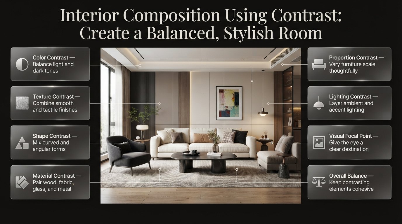
Interior Composition Using Contrast | A room can have expensive furniture, attractive colors, and carefully selected decorations yet still feel incomplete. Sometimes, the problem is that everything looks too similar. The sofa blends into the walls, the furniture has similar shapes, and the accessories fail to create a clear focal point. Instead of feeling inviting, the space looks flat and lacks personality.
This is where interior composition using contrast becomes essential. It involves combining different colors, textures, shapes, materials, proportions, and lighting conditions to create visual interest while maintaining balance throughout a room. When these differences are planned carefully, even a simple interior can feel sophisticated, comfortable, and professionally designed.
At DesignMode24 Interior Design, the focus is on practical design principles that help homeowners make better decisions about their spaces. Understanding contrast can help you choose furniture more confidently, coordinate finishes, improve lighting, and create a room that feels cohesive rather than overcrowded.
In this guide, you’ll learn how contrast works, which combinations are most effective, how to apply it in different rooms, and how to avoid the mistakes that make interiors feel chaotic. You’ll also discover practical examples, professional planning techniques, and straightforward ways to improve your existing home without starting an expensive renovation.
What Is Interior Composition Using Contrast?
Interior composition using contrast is the process of arranging different visual elements so their differences create interest, emphasis, and balance. These differences can appear in color, texture, shape, size, brightness, or material. The objective is to help individual elements stand out while making the entire room feel connected.
For example, a dark brown sofa against warm white walls creates color contrast. Pairing it with a rounded wooden coffee table introduces a difference in shape, while a woven rug adds texture. Each element contributes something different, but the materials and colors can still work together.
Contrast is not simply about placing opposite colors next to each other. It is about understanding how each element influences the appearance of everything around it.
Why Is Contrast Important in Interior Design?
Contrast gives a room visual structure. Without noticeable differences, furniture, walls, and accessories may merge into one another. The result can feel monotonous, even when every individual item is attractive.
When contrast is used effectively, it helps the eye identify important features and understand the relationship between different parts of the space.
Its main benefits include:
- Creating focal points: Contrasting colors or sizes draw attention to a fireplace, artwork, headboard, or statement piece of furniture.
- Adding depth: Differences in lightness, texture, and material make a room feel more layered.
- Improving balance: Lighter elements can offset visually heavy furniture and dark finishes.
- Defining separate areas: Contrast can distinguish a dining space from a living area without requiring a physical partition.
- Expressing personality: Carefully selected differences make a home feel individual rather than copied from a showroom.
- Supporting functionality: Changes in lighting and material can help distinguish working areas, circulation routes, and relaxation zones.
The most important principle is that contrast should have a purpose. If every object competes for attention, the room loses the visual order that contrast is supposed to create.
What Are the Main Types of Contrast in Interior Composition?
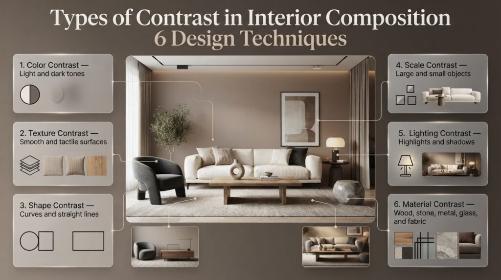
Contrast can be introduced through several design elements. Understanding their individual effects makes it easier to decide which changes will improve your room and which might create unnecessary visual noise.
1. Color Contrast: How Do Different Colors Work Together?
Color contrast occurs when colors differ in hue, lightness, saturation, or temperature. A navy sofa against a cream wall creates a noticeable light-dark relationship, while terracotta accessories beside muted green furniture introduce a contrast between different hues.
Color contrast can be dramatic or subtle. You do not need pure black and white to achieve a strong result.
Consider a living room with warm beige walls, a medium-brown sofa, and dark bronze lighting. Although the palette remains neutral, the differences in brightness and undertones help each element remain visually distinct.
To use color contrast effectively:
- Choose one dominant color family for the largest surfaces.
- Introduce a supporting color through furniture or textiles.
- Use a stronger accent color in selected accessories.
- Repeat important colors in different parts of the room.
- Test paint samples under both natural and artificial lighting.
The final point matters because colors can change noticeably throughout the day. A gray paint that appears neutral in daylight may look blue or violet under certain artificial lighting.
Expert tip: Before purchasing a large piece of furniture, place fabric and paint samples together in the actual room. Evaluate them in the morning, afternoon, and evening rather than relying on showroom lighting.
For additional guidance on choosing and coordinating shades, explore the Paint & Color category.
2. Texture Contrast: How Can Surfaces Add Depth?
Texture contrast combines surfaces that look or feel different. Examples include smooth stone beside natural wood, soft velvet against woven linen, or a polished ceramic vase on a rough timber shelf.
This technique is particularly effective in neutral interiors because it adds complexity without requiring additional colors.
Imagine a bedroom decorated almost entirely in beige. If the walls, bedding, curtains, and furniture all have smooth, similar finishes, the room may feel lifeless. Adding a chunky knitted throw, linen curtains, a timber bedside table, and a textured rug creates depth while preserving the calm palette.
Useful texture combinations include:
- Smooth plaster walls with woven textiles.
- Leather seating with soft wool cushions.
- Polished stone with brushed metal.
- Natural timber with matte ceramic accessories.
- Fine cotton bedding with a textured blanket.
Texture should also reflect the room’s practical requirements. A delicate fabric may work well for decorative cushions but may be unsuitable for heavily used seating in a busy household.
Quick tip: Start with two or three noticeably different textures. Add more only when they improve the composition rather than making the room feel busy.
3. Shape Contrast: Why Should Furniture Forms Differ?
Shape contrast comes from combining different silhouettes, such as circles and rectangles, curves and straight lines, or organic forms and geometric patterns.
A rectangular dining table surrounded by chairs with rounded backs creates a gentle contrast. Similarly, a curved armchair can soften a living room dominated by square cabinetry and straight-lined furniture.
Different shapes influence the atmosphere of a room. Straight lines often communicate order and structure, while curved forms can feel softer and more relaxed. Their effects depend on proportion, material, and placement.
Try these combinations:
- A round coffee table with a rectangular sofa.
- A circular mirror above a straight console.
- Curved dining chairs beside an angular table.
- Organic ceramic accessories on geometric shelves.
- A sculptural pendant above a simple dining arrangement.
Avoid introducing too many unrelated shapes. If every item has an unusual silhouette, the composition may lose its direction.
A practical approach is to establish one dominant shape and introduce a contrasting form in one or two supporting pieces. This creates visual variety without compromising the overall design.
4. Scale Contrast: How Do Different Sizes Affect a Room?
Scale contrast involves combining objects of different sizes. A large painting above a narrow console, an oversized pendant over a dining table, or a substantial sofa beside a small side table can all create contrast in scale.
The difference becomes successful when the dimensions relate appropriately to the room and surrounding objects.
For example, a large artwork can give a plain wall a clear focal point. However, if the artwork is too small for the furniture below it, it may appear disconnected. If it is excessively large, it may overwhelm the arrangement.
Before selecting furniture or accessories, consider:
- The height and width of the available wall.
- The dimensions of nearby furniture.
- Ceiling height and natural light.
- The viewing distance from the entrance.
- The amount of space required for movement.
Scale contrast also applies to decorative accessories. A single substantial vase can often create a stronger composition than several tiny objects scattered across a table.
For more practical guidance, see Choosing Furniture Delivery Dimensions. Measuring furniture and checking access dimensions before delivery can help prevent expensive mistakes.
5. Light and Shadow: How Does Lighting Create Contrast?
Lighting contrast develops when some areas receive more illumination than others. It can also result from differences between direct and indirect lighting, illuminated surfaces and shadows, or warm and cool light sources.
A room with one central ceiling light may feel flat because the lighting does little to distinguish individual areas. Adding a floor lamp beside the sofa, task lighting over a desk, and a carefully positioned light near artwork introduces layers.
Lighting can also reveal texture. A wall with a rough finish may appear relatively smooth under uniform illumination but show much more depth when light falls across it from the side.
An effective lighting plan usually includes:
- Ambient lighting for general visibility.
- Task lighting for reading, cooking, and working.
- Accent lighting for artwork and architectural details.
- Adjustable lighting where different activities require different brightness levels.
Avoid using brightness alone to create contrast. Glare, harsh shadows, and poorly positioned fixtures can make a room uncomfortable even when the visual effect seems dramatic.
For more ideas about combining lighting with interior planning, explore Modern Bedroom Design.
6. Material Contrast: How Can Different Finishes Work Together?
Material contrast combines elements with different physical qualities, such as timber, glass, metal, stone, ceramic, and fabric.
A wooden dining table with black metal legs creates a different visual effect from an entirely timber table. Glass can make a furniture arrangement feel lighter, while stone introduces solidity and texture.
The key is to select materials that differ in a meaningful way but still share a visual connection.
| Material combination | Design effect | Suitable application |
|---|---|---|
| Natural oak and black metal | Warmth with definition | Dining rooms and offices |
| Marble and timber | Refined and organic | Kitchens and bathrooms |
| Glass and upholstered fabric | Lightness against softness | Living rooms |
| Matte and polished finishes | Subtle surface variation | Kitchens and bathrooms |
| Linen and leather | Relaxed texture with smooth definition | Bedrooms and living rooms |
| Stone and natural woven materials | Solid structure with tactile softness | Entryways and living spaces |
Material selection should account for cleaning, durability, moisture, heat, and daily use. A beautiful finish is only a good choice when it suits its environment.
How Do You Create Contrast Without Losing Balance?
A successful composition needs both difference and connection. Contrast makes individual elements noticeable, while balance prevents one element from dominating the entire room.
The following process provides a practical starting point for designing a new space or improving an existing one.
Step 1: Identify the Main Focal Point
Decide which element should attract the most attention when someone enters the room.
It could be a fireplace, sofa, headboard, artwork, dining table, or architectural feature. Once you identify it, arrange the surrounding elements to support rather than compete with it.
For example, a dark green sofa can become the focal point of a living room with warm white walls, a light rug, natural timber, and restrained green accessories.
The sofa stands out because its surroundings give it enough visual separation.
Step 2: Establish a Dominant Color Palette
Choose the main colors before purchasing additional accessories.
A familiar starting point is the 60-30-10 guideline:
- Approximately 60% dominant color.
- Approximately 30% supporting color.
- Approximately 10% accent color.
These proportions are a flexible planning tool rather than a strict formula. Natural wood, flooring, artwork, and architectural features may change the final distribution.
For example, a room might use cream for the walls and curtains, brown for the furniture, and dark green for selected cushions and artwork.
The result has visible contrast without introducing too many competing colors.
Step 3: Introduce Different Textures
Once the main palette is established, consider how the surfaces interact.
A room with pale walls and neutral upholstery could benefit from a textured wool rug, a timber coffee table, and linen curtains. Each surface introduces variety while supporting the same overall palette.
Work from large surfaces toward smaller details. This makes it easier to identify whether the room needs more texture or already has sufficient variation.
Step 4: Balance Visual Weight
Visual weight refers to how strongly an element attracts attention. Dark colors, large dimensions, dense shapes, and solid materials often make objects appear heavier.
A substantial dark sofa may therefore benefit from a pale rug, a glass side table, or a chair with open legs.
The goal is not to make every object equally noticeable. Instead, distribute visual weight so that one corner does not overwhelm the rest of the room.
Read Visual Weight in Interior Spaces for a deeper explanation of this principle.
Step 5: Repeat Selected Details
Repetition connects contrasting elements.
If a room contains black metal furniture, repeat the finish in a lamp base or picture frame. If natural oak appears in the dining table, consider using a related wood tone in shelving or decorative accessories.
The materials do not have to match perfectly. They simply need enough similarity to create a relationship.
Two or three deliberate repetitions are often sufficient.
Step 6: Review the Room Before Adding More
Stand at the entrance and observe where your eyes go first. Then look at the room from the main seating position and other important viewpoints.
If several elements compete for attention, simplify one area. If everything blends together, introduce a more noticeable difference in tone, texture, shape, or scale.
This final editing stage often improves a room more than purchasing additional accessories.
How Does Contrast Work in Different Interior Design Styles?
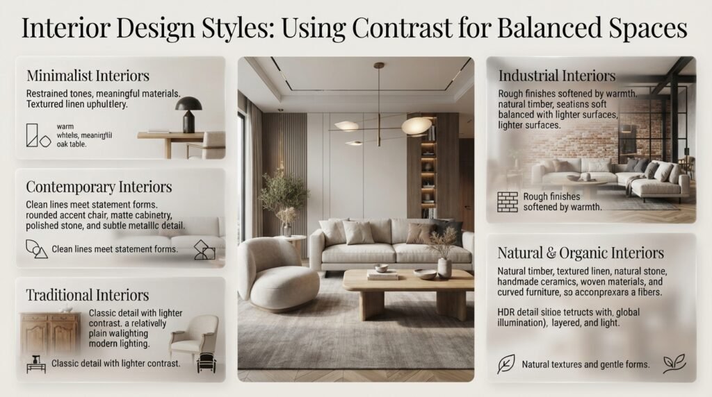
Contrast is not restricted to one decorating style. Its expression changes depending on whether the room is minimalist, traditional, contemporary, industrial, or inspired by natural materials.
Minimalist Interiors
Minimalist spaces benefit from restrained contrast because every material and object receives greater attention.
A simple combination might include warm white walls, a natural oak table, a dark sculptural lamp, and textured linen upholstery.
The contrast comes from material quality, proportion, and subtle tonal differences rather than numerous decorative objects.
Keep surfaces relatively uncluttered and give important pieces enough surrounding space to remain visually distinct.
Contemporary Interiors
Contemporary interiors often combine clean lines with contrasting materials and carefully selected statement pieces.
A streamlined sofa can sit beside a rounded accent chair, while matte cabinetry is balanced by a polished stone surface or a reflective metal detail.
The aim is to create visual interest without making the space feel overly formal.
Traditional Interiors
Traditional rooms can combine detailed furniture with simpler fabrics, contrasting wall colors, and contemporary lighting.
For example, an ornate wooden cabinet may look more distinctive against a relatively plain wall. A traditional dining table can also work with upholstered chairs in a lighter fabric.
The contrast should respect the character of the original furniture rather than disguising it.
Industrial Interiors
Industrial-inspired spaces often use contrasts between rough and refined materials.
Exposed brick, dark metal, natural timber, and soft upholstery can create a layered environment. The warmth of wood and fabric helps balance harder architectural finishes.
However, too much dark metal and exposed texture may make a compact room feel visually heavy. Introduce lighter surfaces and appropriate lighting where needed.
Natural and Organic Interiors
Interiors inspired by nature often combine warm wood, stone, linen, ceramics, and muted colors.
Contrast appears through differences in texture and form rather than extreme color combinations. A smooth ceramic vase against a woven surface or a curved chair beside a straight timber table can provide enough variation.
This approach works particularly well when the objective is a calm, comfortable atmosphere.
How Can You Apply Contrast in Each Room of Your Home?
The right type of contrast depends on what happens in the room. A living area needs comfortable seating and clear focal points, while a kitchen requires practical surfaces and good visibility.
Living Room: Create a Clear Visual Hierarchy
Living rooms often contain several major elements, including seating, a rug, artwork, shelving, lighting, and entertainment equipment.
Contrast helps organize these components.
Imagine a charcoal sofa against warm white walls, a light oak coffee table, and a textured beige rug. A large artwork with dark framing can connect the sofa with the rest of the room.
The arrangement works because the darker elements are repeated rather than scattered randomly.
Keep circulation routes clear and avoid grouping every dark object in the same corner. The composition should remain balanced from the entrance and the main seating position.
Bedroom: Combine Definition With Comfort
A bedroom should feel restful while still having enough visual depth to avoid appearing plain.
One effective arrangement includes a dark timber headboard, light bedding, linen curtains, and warm bedside lighting. The headboard establishes a focal point, while the lighter fabrics create a softer surrounding composition.
Useful combinations include:
- Pale bedding with a darker headboard.
- Smooth cotton with a textured throw.
- Curved bedside lamps with a rectangular bed frame.
- Natural wood with muted wall colors.
Avoid using too many competing patterns around the bed. A strong headboard and a few complementary textures may be sufficient.
Kitchen: Balance Visual Interest With Practicality
Kitchens contain strong lines, reflective surfaces, cabinets, appliances, and worktops. Contrast can distinguish these elements and give the room more character.
Dark lower cabinets with lighter upper cabinets can create depth. A timber island may soften a kitchen dominated by stone and metal.
Material choices must also account for maintenance. Glossy surfaces can reveal fingerprints, while deeply textured finishes may require more cleaning.
When planning a kitchen, consider the relationship between cabinet colors, worktop materials, flooring, and lighting before selecting decorative accents.
For additional inspiration, explore Celebrity Kitchen Layout Features. The useful principle is to examine how layout, focal points, storage, and materials work together rather than copying an expensive appearance without considering your own space.
Bathroom: Use Contrast to Define Features
Bathrooms can benefit from clear visual separation between fixtures, cabinetry, and wall finishes.
White sanitaryware against darker tiles creates a noticeable difference, while wood-look cabinetry can soften a composition dominated by ceramic and glass.
In a compact bathroom, limit the strongest contrast to one main feature, such as the vanity, mirror frame, or shower wall.
Choose materials suitable for moisture exposure and ensure the floor finish provides appropriate slip resistance. Visual impact should never come at the expense of safety or maintenance.
Entryway: Make a Strong First Impression
An entryway introduces the home’s overall design language. Contrast can make this area feel welcoming while helping essential features remain visible.
A light wall behind a dark console, a round mirror above a rectangular bench, or a textured runner beneath a simple storage unit can create a clear composition.
However, entryways are also functional spaces. Bags, shoes, coats, and everyday objects need practical storage.
Before adding decorations, decide where people will place their belongings and how they will move through the area.
Use Entryway Storage Capacity Planning to help coordinate storage requirements with the visual arrangement.
Home Office: Separate Work From Relaxation
A home office should support concentration and make important equipment easy to access.
A dark desk against a lighter wall can establish the working zone. A textured desk mat, warm task lighting, and a limited number of accessories provide additional contrast without creating unnecessary distractions.
If the office shares a room with a bedroom or living area, contrast can help distinguish the workspace without installing a permanent partition.
Use a consistent accent color, different lighting, or a distinct furniture arrangement to establish the boundary.
What Is the Difference Between Contrast, Balance, Harmony, and Rhythm?
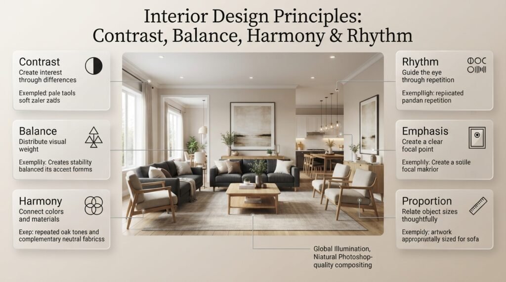
These design principles work together, but each serves a different purpose.
| Principle | What it does | Example |
|---|---|---|
| Contrast | Creates noticeable differences | Dark sofa against pale walls |
| Balance | Distributes visual weight | Heavy furniture balanced with lighter elements |
| Harmony | Connects different elements | Repeated wood tones and complementary colors |
| Rhythm | Guides the eye through repetition | Repeated pendant lights over a kitchen island |
| Emphasis | Establishes a focal point | Large artwork above a console |
| Proportion | Relates dimensions to one another | Artwork sized appropriately for a sofa |
A room can have strong contrast and still feel poorly designed if the visual weight is concentrated in one place.
Similarly, a room can have harmony without much contrast. If all the furniture, walls, and accessories share similar tones and textures, the space may feel coordinated but flat.
The strongest compositions combine these principles. Contrast provides interest, balance creates stability, harmony establishes connection, and rhythm helps the eye move through the space.
How Can You Use Contrast in a Small Room?
Small rooms require careful planning because every major piece of furniture influences the overall composition.
A common misconception is that all surfaces must be light. Light colors can help a room feel open, but darker accents can also add depth and establish a focal point.
Try these techniques:
- Keep the main color palette relatively restrained.
- Use one strong focal point instead of several competing features.
- Choose furniture with open legs where appropriate.
- Combine smooth finishes with a few tactile materials.
- Use mirrors strategically to reflect available light.
- Avoid excessive patterns and unrelated accent colors.
- Preserve clear walking routes between furniture.
For example, a compact living room could include warm white walls, a medium-toned sofa, a round oak coffee table, and a dark-framed mirror.
The contrast gives the space definition without requiring numerous decorative accessories.
Furniture scale is especially important. A dark, oversized sofa may visually dominate a small room even when its color works well with the walls. Measure the available floor space and check the furniture’s dimensions before buying.
For practical projects that improve small spaces, explore DIY Home Projects.
How Can You Use Contrast Without Spending Too Much?
You don’t need a complete renovation to improve the visual composition of a room. Small, deliberate changes can often produce a noticeable difference.
Start by evaluating the furniture, finishes, and accessories you already own. Identify what looks repetitive, what feels visually heavy, and which areas lack definition.
Then consider the following low-cost adjustments.
Rearrange Existing Furniture
Sometimes, the room needs a different arrangement rather than additional furniture.
Move a chair away from a heavy sofa, reposition artwork to establish a clearer focal point, or separate similar objects so they don’t appear as one continuous visual block.
Check that the revised arrangement still allows comfortable movement.
Change Soft Furnishings
Cushions, throws, curtains, and rugs can introduce contrast without requiring structural changes.
For example, adding a textured cushion to a smooth sofa or replacing a low-contrast throw with a deeper shade may create the variation the room needs.
Choose colors that relate to existing furniture rather than introducing unrelated accents.
Update Small Finishes
Changing a lamp base, picture frame, cabinet handle, or decorative tray can introduce a contrasting material or finish.
These updates are especially effective when the new detail repeats a color or material already present elsewhere.
Improve the Lighting Arrangement
Adding a suitable table lamp or repositioning an existing floor lamp can reveal textures and establish a more comfortable atmosphere.
Before purchasing a fixture, consider whether the room needs general illumination, task lighting, or a focused accent.
Create a Simple Feature
A carefully arranged shelf or a small collection of artwork can create a focal point.
For ideas that combine storage and decoration, explore Wall Shelves Ideas.
The goal is to make each addition serve a purpose. Buying more objects without improving their arrangement rarely solves a problem with contrast.
What Are the Most Common Mistakes When Using Contrast?
Even attractive design elements can create a disappointing result when they are combined without considering their relationships.
Mistake 1: Using Too Many Accent Colors
This often happens when homeowners choose accessories individually rather than considering the room as a whole.
The result is a collection of colors competing for attention, with no clear focal point.
How to avoid it: Establish a dominant palette and introduce accents selectively. Repeat important colors so they feel connected rather than scattered.
Mistake 2: Making Everything a Statement Piece
A bold sofa, dramatic wallpaper, oversized pendant, patterned rug, and colorful artwork can compete with one another.
How to avoid it: Choose one primary focal point and allow the remaining elements to support it. Secondary pieces can have personality without demanding equal attention.
Mistake 3: Ignoring Visual Weight
A large, dark cabinet may dominate a small room, even if its dimensions technically fit.
How to avoid it: Consider the object’s color, shape, size, and position. Balance visually heavy elements with lighter materials, open forms, and thoughtful spacing.
Mistake 4: Combining Materials Without a Connection
Different materials can look disconnected when they have unrelated colors, finishes, or design styles.
How to avoid it: Establish a relationship through a repeated wood tone, similar undertones, complementary shapes, or a consistent metal finish.
Mistake 5: Relying Only on Black and White
High-contrast monochromatic schemes can be effective, but they are not the only way to create visual interest.
How to avoid it: Experiment with warm and cool neutrals, rough and smooth surfaces, or curved and angular forms. These combinations can provide depth without extreme color differences.
Mistake 6: Forgetting About Lighting
A paint color that looks balanced in a showroom may appear different in a north-facing room or under warm artificial lighting.
How to avoid it: Test samples in the actual space and examine them under different lighting conditions before making a large purchase.
Mistake 7: Prioritizing Appearance Over Everyday Use
A delicate textile or difficult-to-clean finish may look attractive but become frustrating in a busy household.
How to avoid it: Consider cleaning requirements, durability, moisture exposure, sunlight, and how frequently the surface will be used.
Mistake 8: Copying a Photograph Without Considering the Room
An arrangement that looks beautiful in a spacious photograph may not work in a smaller home with different ceiling heights, windows, and circulation requirements.
How to avoid it: Use photographs for inspiration, but adapt the proportions, materials, and furniture arrangement to your actual space.
What Do Professional Designers Consider Before Finalizing Contrast?
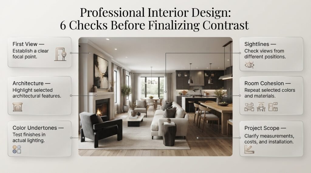
Professional composition involves more than choosing items that look different. It requires evaluating the room as a complete environment.
Study the First View
Identify the first important feature visible from the entrance. Arrange the strongest contrast around that focal point without obstructing windows, doors, or circulation.
A room should feel intentional before someone examines its smaller decorative details.
Work With Existing Architecture
A contrasting finish can highlight a fireplace, niche, staircase, or built-in cabinet. However, not every architectural feature needs to become a focal point.
Highlighting too many features can weaken the visual hierarchy. Choose the details that contribute most to the room’s character.
Evaluate Undertones
Two colors may look similar individually but clash when placed together.
A warm beige wall, for example, may appear yellow beside a cool gray sofa. The combination might still work, but it should be evaluated under the room’s actual lighting.
Use physical samples when possible, especially for large surfaces and expensive materials.
Consider the View From Different Positions
People experience rooms while walking, sitting, working, and moving between spaces.
Check whether dark furniture blocks an important sightline, whether artwork is visible from the entrance, and whether lighting creates uncomfortable glare.
Contrast should improve the whole room rather than one carefully staged viewpoint.
Coordinate Adjacent Rooms
Open-plan homes need continuity between living, dining, and kitchen areas.
You can give each zone a different focal point while repeating selected materials or colors. For example, oak in the living room might relate to the dining table, while black metal details connect both spaces with kitchen hardware.
For more guidance, explore Creating Cohesion Between Different Rooms.
Clarify the Scope of Major Changes
If your project involves moving walls, installing new lighting, changing electrical systems, or commissioning custom furniture, establish the practical requirements before making design decisions.
Clarify responsibilities, materials, measurements, costs, and installation arrangements with the relevant professionals.
When hiring an interior designer, Interior Designer Contract Essentials can help you understand why a clear written agreement matters.
You can also review Questions to Ask an Interior Design Consultant before discussing your project. Clear communication helps ensure that the proposed composition reflects your needs, budget, and lifestyle.
A Practical Checklist for Planning Interior Contrast
Before finalizing your room, use this checklist to evaluate the composition.
- Is there a clear primary focal point?
- Do the main colors have enough difference to define important elements?
- Are at least two complementary textures present?
- Do the furniture shapes relate to one another?
- Is visual weight distributed across the room?
- Are accent colors repeated rather than scattered randomly?
- Does the lighting reveal the intended textures and finishes?
- Are furniture dimensions appropriate for the available space?
- Can people move comfortably through the room?
- Are the materials practical to clean and maintain?
- Do adjacent rooms share enough visual continuity?
- Does every major decorative element have a clear purpose?
If most answers are yes, the composition probably has a strong foundation. You don’t need to add more contrast simply to make the design look sophisticated.
How Do You Use Contrast in Interior Design Without Making a Room Look Too Busy?
The best way to use contrast without making a room feel busy is to establish a clear focal point and limit the number of competing elements. Contrast should help the eye move naturally around the space rather than force it to focus on several things at once. Start with the room’s largest features, such as walls, flooring, and furniture, before introducing smaller decorative details.
For example, a living room with cream walls, a dark brown sofa, and a natural wood coffee table already has contrast in color and material. Adding a textured rug and a few complementary cushions can create depth without introducing unnecessary visual complexity. The key is to make each contrasting element serve a specific purpose.
Practical tips:
Choose one primary focal point, such as a sofa, fireplace, or statement artwork.
Limit the main color palette to two or three coordinated color families.
Combine a few contrasting textures instead of mixing too many patterns.
Repeat selected materials or accent colors to create visual continuity.
Remove decorative objects that compete with the room’s main feature.
What Types of Contrast Make an Interior Look More Expensive and Professionally Designed?
Interiors often look more refined when contrast comes from carefully selected materials, balanced proportions, and subtle differences in texture rather than an excessive number of decorative accessories. Combining natural wood with stone, matte finishes with selected polished surfaces, or soft upholstery with slim metal details can create a layered appearance without making the room feel overdesigned.
For instance, a neutral living room can feel sophisticated when a textured wool rug sits beneath a smooth coffee table, while a dark metal lamp adds definition beside a light-colored sofa. These elements create different visual experiences while maintaining a consistent palette. Good proportions, thoughtful lighting, and quality finishes appropriate to the budget are just as important as the contrast itself.
Professional recommendations:
Combine two or three complementary materials rather than using too many competing finishes.
Use matte and reflective surfaces strategically to create depth.
Choose furniture with proportions suited to the room’s dimensions.
Repeat selected metal finishes or wood tones across the space.
Use layered lighting to reveal textures and highlight important features.
How Can You Create Contrast in a Small Living Room Without Making It Feel Smaller?
Contrast can improve a small living room when it defines important features without visually fragmenting the space. Instead of introducing several strong colors, begin with a light or neutral background and add a few darker or more textured elements. This approach creates depth while keeping the overall composition relatively calm.
For example, warm white walls, a medium-toned sofa, a round wooden coffee table, and one dark-framed mirror can create an attractive balance. Furniture with open legs may also help preserve visible floor space, while carefully positioned lighting can prevent darker areas from feeling heavy. However, the room’s actual dimensions, daylight, and circulation should guide every decision.
Space-saving design tips:
Use one dominant focal point rather than several competing features.
Introduce darker colors through selected furniture or accessories.
Choose appropriately sized furniture and measure before purchasing.
Combine smooth finishes with a small number of tactile materials.
Keep walking routes and sightlines clear.
Use mirrors to reflect available light where their placement is useful.
How Do You Combine Contrasting Colors, Textures, and Materials in One Room?
The most effective way to combine different colors, textures, and materials is to give each element a clear role and connect the overall composition through repetition. Color can establish the main visual relationship, texture can add depth, and material contrast can introduce character. When these elements share compatible undertones, finishes, or shapes, they can look coordinated without matching exactly.
Consider a bedroom with warm beige walls, a dark timber headboard, white bedding, linen curtains, and a ceramic bedside lamp. The headboard provides a darker visual anchor, the linen introduces softness, and the ceramic surface adds another material quality. Because the elements belong to a restrained palette, the differences feel intentional rather than random.
A practical method:
Select the dominant wall or flooring color first.
Choose furniture that creates a useful difference in tone or material.
Add contrasting textures through rugs, curtains, cushions, or bedding.
Repeat one or two finishes to connect separate areas.
Test physical samples together under the room’s natural and artificial lighting.
Review the composition before adding more accessories.
What Are the Biggest Mistakes to Avoid When Using Contrast in Interior Composition?
The most common mistake is treating contrast as a way to make every item stand out. When bold colors, oversized furniture, multiple patterns, and unrelated materials compete for attention, the room can feel disorganized. Another frequent problem is choosing finishes separately without considering how they look beside the existing walls, flooring, lighting, and furniture.
A successful composition balances noticeable differences with visual continuity. For example, a dark sofa can work beautifully against pale walls, but adding several unrelated accent colors and competing statement pieces may weaken the arrangement. Rather than purchasing more decorations, it is often better to simplify the palette, improve the furniture layout, or repeat a finish that already exists in the room.
Mistakes to avoid:
Using too many accent colors without a consistent palette.
Making every furniture piece or accessory a focal point.
Ignoring visual weight and room proportions.
Mixing materials that have no connecting design element.
Selecting paint or upholstery without testing it in the actual lighting.
Prioritizing appearance over durability and maintenance.
Copying a room photograph without adapting it to your own space.
Professional advice: Before adding another contrasting element, ask yourself whether it improves the room’s balance, functionality, or visual hierarchy. If it does none of these things, it may not be necessary.
Conclusion
Interior composition using contrast is one of the most effective ways to create rooms that feel balanced, visually interesting, and professionally designed. By combining light and dark colors, smooth and textured surfaces, different furniture shapes, and varied materials, you can give each element a clear purpose while making the entire space feel connected. The key is not to introduce as many differences as possible, but to use contrast thoughtfully so that every feature contributes to the room’s overall design.
Before making changes, consider the room’s size, natural lighting, existing furniture, and the atmosphere you want to create. A small living room may benefit from subtle differences in texture and carefully placed dark accents, while a larger space can often accommodate stronger color combinations or more dramatic material contrasts. Repeating selected colors, finishes, and shapes throughout the room also helps maintain visual harmony.
For a successful result, start with one main contrast, build around it gradually, and pay attention to visual weight, proportion, and functionality. Whether you are refreshing a bedroom, updating a living room, or planning a complete home makeover, a thoughtful approach to contrast can make ordinary interiors feel more intentional and distinctive. With the right balance of difference and harmony, you can create a home that reflects your personal style without sacrificing comfort or practicality.
Explore more inspiration and practical decorating guidance at DesignMode24 Interior Design to develop interior spaces that combine creativity, comfort, and timeless appeal.