
Introduction
Creating Cohesion Between Different Rooms | Have you ever walked from one room into another and felt like you had suddenly entered a completely different house? The living room may have warm beige tones and natural wood, while the kitchen has cool gray finishes, the bedroom follows a completely different color palette, and the hallway seems to belong to neither space.
This is one of the most common challenges in residential interior design. Individual rooms can look beautiful on their own, yet the entire home can still feel disconnected.
That is why creating cohesion between different rooms matters.
Cohesion doesn’t mean painting every room the same color, buying matching furniture, or following one strict decorating style throughout the house. Instead, it means creating subtle visual relationships between spaces so that the home feels intentional, comfortable, and connected.
A cohesive home can still be colorful, eclectic, modern, traditional, minimalist, or highly personal. The trick is knowing which elements should repeat and which ones should change.
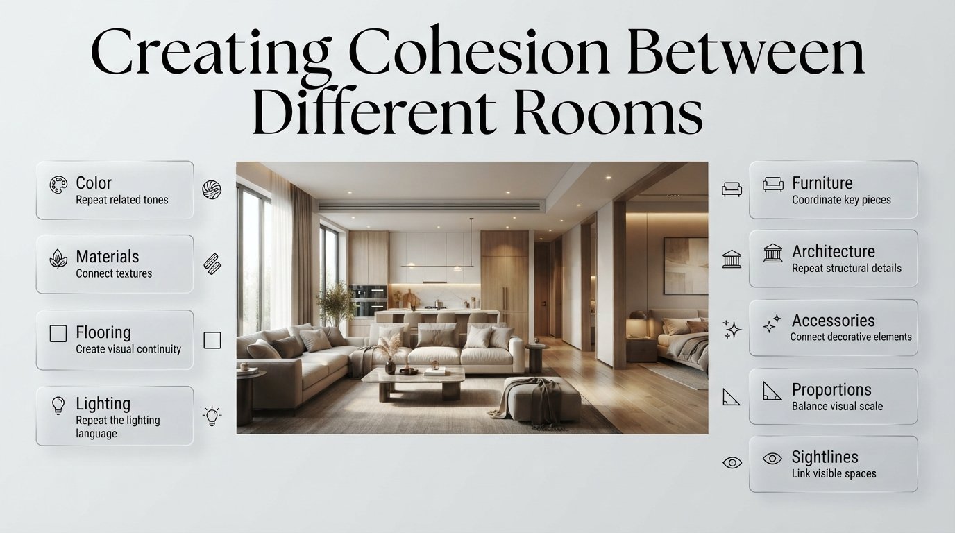
In this guide, you’ll learn how to connect different rooms through color, materials, flooring, lighting, furniture, architectural details, accessories, proportions, and sightlines. You’ll also learn how to combine different styles without making the home feel random, how to fix disconnected rooms without renovating everything, and which common mistakes can quietly destroy visual flow.
For readers interested in developing a broader understanding of residential interiors, the DesignMode24 Interior Design website also provides additional room and home design inspiration.
What Does Creating Cohesion Between Different Rooms Actually Mean?
Creating cohesion between different rooms means establishing visual connections between separate spaces so they feel like parts of one home rather than unrelated environments. These connections can come from repeated colors, materials, flooring, lighting finishes, furniture shapes, textures, architectural details, or decorative accents.
The important distinction is between cohesion and uniformity.
Uniformity means making everything look the same.
Cohesion means making different things work together.
For example, a home might have a soft neutral living room, a darker dining room, and a slightly more colorful bedroom. Those rooms don’t need identical walls or furniture. If they share compatible wood tones, similar metal finishes, related accent colors, and a consistent design character, they can still feel connected.
Think of the home as a story.
Each room is a different chapter, but the same themes appear throughout the book.
Why Is Cohesion Important in Interior Design?
Cohesion makes a home easier for the eye to understand.
When one space transitions into another, repeated visual elements give the eye something familiar to recognize. This creates a smoother sense of movement and makes the entire interior feel more considered.
Good cohesion can help:
- Create a stronger sense of flow
- Make small homes feel less visually crowded
- Make open-plan spaces feel organized
- Prevent individual rooms from looking randomly decorated
- Help different furniture styles work together
- Make gradual decorating more successful
- Create a stronger relationship between public and private areas
- Make renovations feel intentional rather than piecemeal
It is especially useful when several rooms are visible from one another.
A hallway looking directly into a living room, for example, creates a visual relationship even though those spaces serve completely different purposes.
How Do You Make Different Rooms Feel Like They Belong Together?
The most reliable approach is to choose a few design elements that will repeat throughout the home while allowing each room to develop its own identity.
A practical formula is:
Shared elements + room-specific details = visual cohesion
Shared elements might include:
- A consistent neutral foundation
- One dominant wood tone
- A repeated metal finish
- Similar lighting temperature
- One or two recurring accent colors
- Related furniture shapes
- Similar levels of visual simplicity
Room-specific details might include:
- Artwork
- Accent walls
- Pattern
- Decorative objects
- Unique furniture
- Different textile combinations
- Different levels of color
This balance prevents two opposite problems.
If there is too little repetition, rooms feel disconnected.
If there is too much repetition, the home can feel like a showroom where every room was purchased as part of the same package.
The goal is to create recognition without repetition becoming predictable.
Start With a Whole-Home Design Direction
Before choosing paint, furniture, rugs, or accessories, decide what you want the home to feel like.
This doesn’t require choosing a single design style from a textbook.
Instead, describe your preferred atmosphere using three to five words.
For example:
Warm – natural – relaxed – contemporary
Or:
Elegant – calm – refined – timeless
Or:
Colorful – artistic – collected – comfortable
These words become a decision-making filter.
If an item doesn’t support the overall atmosphere, you can question whether you really need it.
Why Does a Design Direction Matter?
Without an overall direction, decorating often happens one purchase at a time.
Someone buys a sofa because it looks comfortable.
Then a rug because it looks attractive.
Then a dining table because it is on sale.
Then artwork because the wall feels empty.
Each purchase might be good individually, but the combination may not work.
This is one reason professional interiors often feel more cohesive. Major decisions are usually made within a larger visual framework.
The Interior Design section can provide broader inspiration when you’re establishing the overall character of your home.
A Simple Design Direction Exercise
Write down:
- Three words describing the atmosphere you want.
- Three materials you like.
- Three colors you would happily live with.
- Two finishes you want to repeat.
- One design element you definitely don’t want.
This small exercise can prevent many expensive mistakes later.
Build a Whole-Home Color Strategy
Color is one of the strongest tools for connecting different rooms.
But cohesion doesn’t require using exactly the same paint color everywhere.
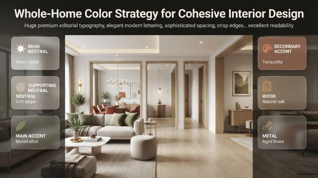
Instead, create a color family.
A practical whole-home palette might contain:
| Element | Example |
|---|---|
| Main neutral | Warm white |
| Supporting neutral | Soft taupe |
| Main accent | Muted olive |
| Secondary accent | Terracotta |
| Wood | Natural oak |
| Metal | Aged brass |
The living room might use olive in cushions.
The bedroom might use it in artwork.
The hallway might have a small decorative object in the same family.
The dining area might introduce terracotta through textiles.
The colors don’t need to be equally distributed.
They simply need to have a relationship.
Should Every Room Have the Same Wall Color?
No.
Using the same wall color throughout a home can create continuity, but it isn’t the only way to achieve it.
Different colors can work when their undertones and intensity levels are compatible.
For example, you could have:
- Warm white in the hallway
- Soft beige in the living room
- Muted green in the dining room
- Warm gray-beige in the bedroom
If these colors belong to a compatible palette, the transition can feel natural.
The problem usually occurs when every room is selected independently.
Pay Attention to Undertones
Undertones are one of the biggest reasons supposedly coordinated colors clash.
Two beige paints may look completely different because one has yellow undertones while another has pink or gray undertones.
The same issue applies to:
- White
- Gray
- Taupe
- Green
- Blue
- Brown
Always test important colors in the actual room.
Look at them:
- During daylight
- During evening hours
- Under artificial lighting
- Next to flooring
- Beside furniture
- Against adjacent walls
⚠ Common Mistake: Choosing a paint color from a small online image and assuming it will look identical in your home. Lighting and surrounding materials can dramatically change how a color appears.
For more color-related inspiration and ideas, explore Paint Color.
Use Flooring as a Visual Bridge
Flooring is one of the most effective ways to create continuity because it covers a large visual area.
When the same flooring extends through several rooms, the spaces immediately feel more connected.
This works particularly well across:
- Living rooms
- Dining rooms
- Hallways
- Open-plan kitchens
- Entry areas
The same flooring isn’t always practical.
Bathrooms, laundry areas, and other high-moisture spaces may require different materials.
In those situations, the goal isn’t to hide the transition.
The goal is to make the transition look intentional.
For example, warm oak flooring can transition into a warm stone tile with related undertones.
The materials are different, but the visual temperature remains compatible.
What If You Already Have Different Floors?
Don’t automatically replace everything.
Look at the existing materials first.
Ask:
- Do they share a similar undertone?
- Are they similar in visual weight?
- Do the transitions occur in sensible locations?
- Can furniture or rugs soften the change?
- Is one floor visually dominating the others?
Sometimes the solution is not replacement but coordination.
Repeat Wood Tones Carefully
Wood introduces warmth, texture, and natural variation.
It can also become one of the strongest connecting elements in a home.
Imagine natural oak appearing in:
- Living room shelving
- Dining chairs
- Bedroom furniture
- Hallway console
- Decorative frames
The furniture doesn’t need to come from the same collection.
The repeated material creates a relationship.
Can Different Wood Tones Work Together?
Yes.
A home doesn’t have to use only one wood finish.
However, too many unrelated wood tones can make the interior feel fragmented.
A practical strategy is to establish:
One dominant wood tone + one supporting wood tone
For example:
- Natural oak as the main tone
- Dark walnut as a contrast
Use the dominant tone more frequently and allow the darker wood to appear selectively.
⭐ Expert Tip: Compare wood samples next to each other rather than judging them separately. Two finishes that look attractive individually may have very different undertones when placed together.
Coordinate Metal Finishes Throughout the Home
Metal finishes are smaller than flooring or furniture, but they appear in many places.
They can show up on:
- Door handles
- Cabinet hardware
- Faucets
- Light fixtures
- Mirror frames
- Furniture legs
- Decorative accessories
This makes them useful for creating subtle cohesion.
You don’t have to use one metal everywhere.
Instead, select a primary finish and possibly one supporting finish.
For example:
Primary: Brushed brass
Secondary: Matte black
The brass can appear more frequently while black provides contrast.
Avoid the “One Metal Everywhere” Trap
Repeating a finish is useful, but overusing it can become predictable.
A brass faucet, brass handles, brass light fixtures, brass furniture, brass mirrors, and brass accessories in every room may feel excessive.
Cohesion works best when repetition is noticeable but not forced.
Connect Rooms Through Lighting
Lighting is often treated as a room-by-room decision.
That can create problems.
A warm, softly illuminated living room may feel disconnected if the hallway beside it uses extremely cool, bright lighting.
You don’t need identical fixtures.
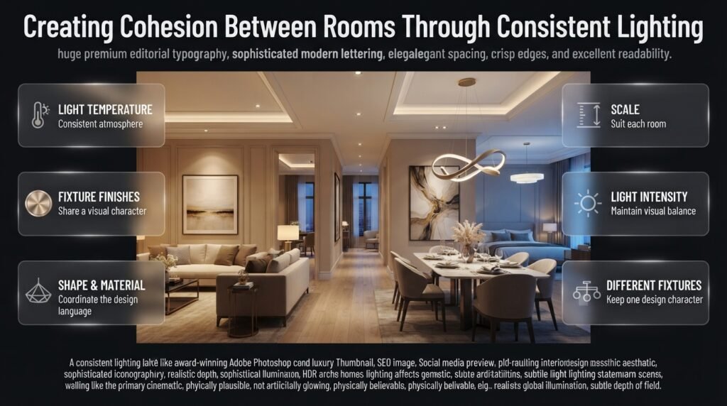
Instead, create consistency through:
- Light temperature
- Fixture finishes
- Shape
- Material
- Scale
- Light intensity
A large sculptural pendant can work in the dining room while a simpler ceiling fixture works in the bedroom.
The fixtures can still share a finish or design character.
Why Does Lighting Temperature Matter?
Light changes how everything else looks.
A wall color, wood finish, fabric, and artwork can all appear different under different light sources.
Keeping the general lighting atmosphere consistent makes room transitions smoother.
For homeowners exploring more advanced lighting systems, Modern Bedroom Design provides a useful related direction for thinking about lighting as part of the interior rather than simply a functional necessity.
Repeat Shapes to Create Visual Rhythm
Color isn’t the only thing the eye recognizes.
Shapes can create cohesion too.
Suppose your living room has:
- A rounded sofa
- Circular coffee table
- Arched floor lamp
You don’t need to repeat all three elsewhere.
A curved mirror in the hallway or rounded bedside tables in the bedroom may be enough to continue the visual language.
The same principle works with straight lines.
A home with strong rectangular architecture might use:
- Linear shelving
- Rectangular artwork
- Straight-edged furniture
- Long horizontal lighting
Why Does Shape Repetition Work?
Repeated forms create rhythm.
The eye notices a shape in one room and unconsciously recognizes similar forms elsewhere.
This is particularly effective when the color palette changes from room to room.
Use Textiles to Connect Separate Spaces
Textiles are one of the easiest ways to carry visual elements throughout a home.
They include:
- Curtains
- Rugs
- Cushions
- Throws
- Upholstery
- Bedding
- Fabric wall art
You don’t need matching fabrics.
Instead, repeat:
- A color
- A texture
- A pattern family
- A material
- A visual weight
For example, natural linen can appear in living-room curtains while a similar texture appears in bedroom bedding.
A muted green might appear in the living-room cushions and again in bedroom artwork.
The repetition creates familiarity without looking copied.
📌 Quick Tip: Coordinate textiles by relationship rather than by exact matching. Similar tones and textures usually look more sophisticated than identical fabric sets.
Create Cohesion Through Accessories
Accessories can carry a color or material from one room to another without requiring major renovation.
Useful connecting accessories include:
- Artwork
- Vases
- Books
- Plants
- Decorative bowls
- Sculptural objects
- Mirrors
- Frames
Suppose your home uses muted terracotta as an accent.
You might use it:
- In one living-room cushion
- In a dining-room artwork
- In a bedroom throw
- In a ceramic vase near the entry
This creates a visual thread.
The accent doesn’t have to dominate any room.
In fact, subtle repetition usually works better.
Don’t Forget Sightlines Between Rooms
One of the most useful professional techniques is to stop judging rooms individually.
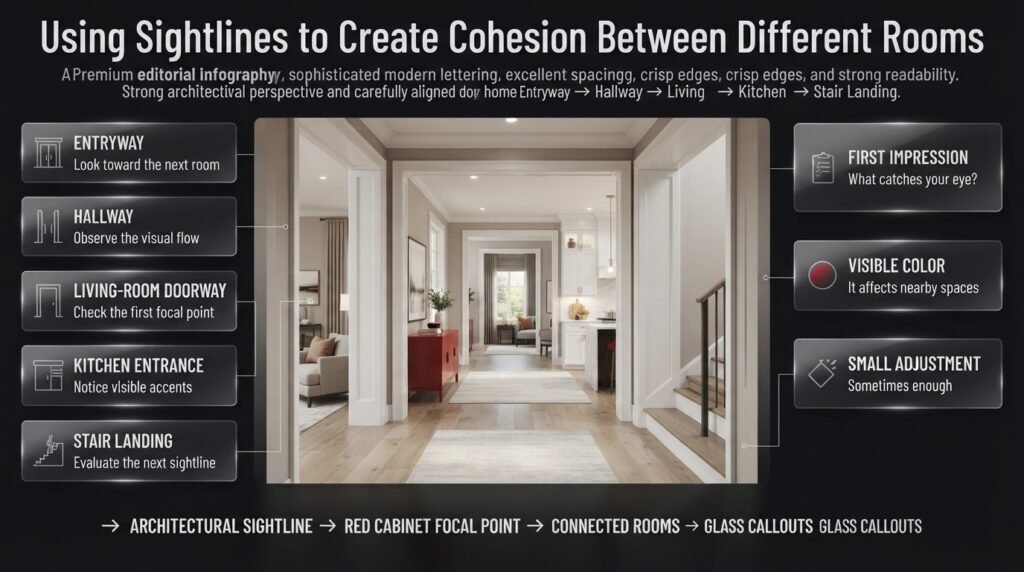
Instead, judge them from the places where you actually experience them.
Stand in the:
- Entryway
- Hallway
- Living-room doorway
- Kitchen entrance
- Stair landing
Then look into the next room.
Ask:
What catches my eye first?
If a strong red cabinet is immediately visible from a neutral hallway, that color becomes part of the hallway’s visual experience.
If the bedroom door opens directly toward a completely different color palette, the transition matters.
You don’t necessarily need to redesign the second room.
Sometimes one small adjustment is enough.
How Do You Connect an Open-Plan Living Space?
Open-plan homes require particularly careful coordination because several functional areas are visible simultaneously.
A kitchen, dining area, and living room should feel related while still having distinct purposes.
A useful approach is:
Kitchen = structured
Dining = transitional
Living = softer
You can connect these zones using:
- Similar wood tones
- Shared colors
- Related hardware
- Coordinated lighting
- Compatible textiles
- Consistent flooring
Then use rugs, furniture placement, lighting, and accessories to establish boundaries.
Should Everything Match in an Open-Plan Room?
No.
If every surface and furniture piece has the same color and finish, the room can become visually flat.
You need both:
Connection + contrast
For example:
- Warm wood kitchen
- Neutral dining furniture
- Soft upholstered living furniture
The three areas feel different but belong to the same palette.
How Can Different Interior Styles Work Together?
You don’t have to choose one design style for the entire home.
A person may prefer contemporary furniture in the living room, traditional details in the dining area, and a calmer minimalist bedroom.
These can coexist.
The trick is to identify the elements that can bridge them.
Traditional + Contemporary
Try connecting them through:
- Similar neutral colors
- Related wood tones
- Repeated metal finishes
- Similar artwork colors
- Consistent flooring
Minimalist + Warm Natural Style
Use:
- Simple silhouettes
- Natural materials
- Soft neutrals
- Limited accessories
- Warm textures
Eclectic + Contemporary
Use:
- A controlled color palette
- Repeated materials
- Consistent lighting temperature
- Similar visual scale
- Intentional negative space
The furniture can differ.
The supporting design language creates the connection.
Use Architecture as Part of the Design Language
Architecture should not be treated as an obstacle that decoration has to hide.
Existing features can become the foundation for cohesion.
These may include:
- Arched openings
- Wood beams
- Wall paneling
- Built-in shelving
- Large windows
- Sloped ceilings
- Angled walls
The important thing is to respond to the architecture consistently.
For example, if a home contains several curved openings, subtle curved mirrors, furniture, or lighting can echo those shapes.
You don’t need to turn every object into an arch.
For homeowners dealing with unusual room geometry, Furniture for Rooms With Angled Walls is particularly relevant when furniture placement needs to respond to irregular architecture.
Similarly, if a home’s upper rooms have unusual ceiling angles, Wardrobe Design for Sloped Ceilings can be useful when storage needs to work with the architecture rather than against it.
These are specialized design decisions, so they should support the overall visual language rather than becoming the main theme of every room.
Use Smart Features Without Breaking the Design
Modern homes increasingly include automated blinds, smart lighting, sensors, integrated controls, and other technology.
Technology should ideally disappear into the design rather than becoming a visual interruption.
For example, window treatments should work with the room’s color palette, furniture arrangement, and natural light.
If you’re planning technology around window treatments, Designing Interiors Around Automated Blinds provides a related resource.
The broader principle is simple:
Technology should support the design language rather than compete with it.
This is particularly important when the same smart-home features appear across several rooms.
Consider Materials Beyond Appearance
A cohesive home isn’t only about what looks good.
Materials also affect comfort, maintenance, durability, and indoor atmosphere.
If you’re selecting finishes for several rooms, think about:
- Durability
- Cleaning requirements
- Moisture exposure
- Texture
- Longevity
- Maintenance
- Indoor air quality
For homeowners researching healthier finishing choices, Low VOC Finishes for Healthier Interiors is a useful related resource.
The key point is that cohesion shouldn’t force you to use the same material everywhere.
A bathroom has different practical requirements from a bedroom.
A kitchen needs different durability from a decorative hallway.
Good design connects spaces while respecting how each room is actually used.
Make the Entryway Part of the Whole Home
The entryway creates the first transition into the interior.
It should introduce the home’s design language without trying to display every design idea at once.
Consider repeating:
- Main wall color
- Wood tone
- Metal finish
- Flooring
- Lighting character
- Accent color
Storage is also important because clutter can immediately disrupt visual cohesion.
Shoes, bags, keys, coats, and daily-use items can overwhelm a small entry.
If you’re planning storage around an entry space, Entryway Storage Capacity Planning can help with the functional side of that design problem.
The broader principle is worth remembering:
A visually cohesive home can still feel chaotic if everyday clutter has nowhere to go.
Don’t Ignore Repair and Existing Conditions
Not every home needs a complete redesign.
Sometimes cohesion can be improved by repairing, refreshing, or adapting what already exists.
Before replacing furniture or finishes, inspect:
- Damaged surfaces
- Worn hardware
- Old lighting
- Loose fixtures
- Scratched furniture
- Faded textiles
- Unnecessary decorative objects
A repaired and coordinated existing piece can often contribute more character than a completely new replacement.
For additional ideas around practical home repairs and improvements, see Mintpaldecor Home Repair Inspiration.
How Can You Create Cohesion on a Budget?
You don’t need to renovate the entire house.
Start with elements that have a large visual effect relative to their cost.
Budget-Friendly Changes
- Repaint a disconnected wall.
- Replace mismatched cabinet hardware.
- Introduce a recurring accent color.
- Coordinate curtains.
- Replace visually conflicting cushions.
- Rearrange furniture.
- Add artwork using colors from nearby rooms.
- Change inconsistent light bulbs.
- Remove unnecessary accessories.
- Repeat an existing wood tone through smaller objects.
The DIY Home Projects section can also be useful when you want to improve visual continuity through manageable projects rather than a full professional renovation.
💡 Pro Tip: Before buying anything, remove three items from each room that don’t contribute to the design direction. You may discover that the home already has more cohesion than you thought—the problem was visual clutter.
What Are the Biggest Mistakes When Creating Cohesion?
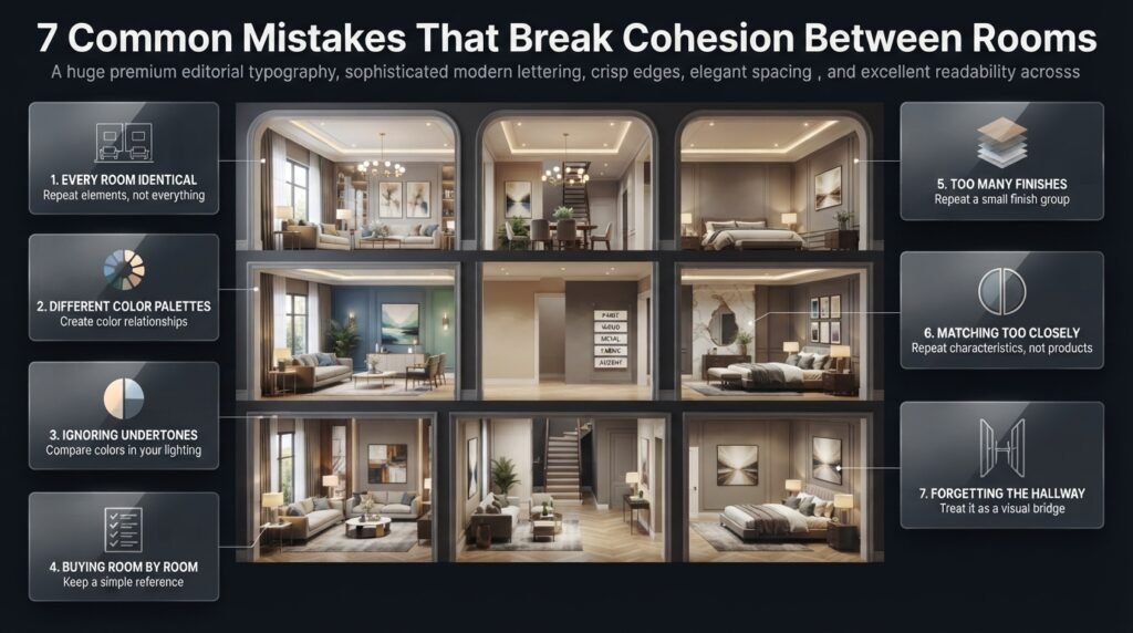
Mistake 1: Making Every Room Identical
This happens when homeowners confuse cohesion with matching.
The result can feel repetitive.
Better approach:
Repeat selected elements while allowing each room to have its own character.
Mistake 2: Giving Every Room a Completely Different Color Palette
One room becomes blue.
Another becomes green.
Another becomes beige.
Another becomes purple.
The problem isn’t color itself.
The problem is the absence of relationships.
Better approach:
Use colors that share undertones or repeat selected accent colors across multiple spaces.
Mistake 3: Ignoring Undertones
A warm beige next to a cool gray can create an uncomfortable transition.
Better approach:
Compare colors physically and under the lighting conditions in your home.
Mistake 4: Buying Furniture One Room at a Time
This is especially common when decorating gradually.
Each item may be attractive, but the overall home becomes inconsistent.
Better approach:
Keep a simple reference containing:
- Paint colors
- Wood tones
- Metal finishes
- Main fabrics
- Accent colors
Review it before buying major pieces.
Mistake 5: Using Too Many Finishes
Too many woods, metals, patterns, stone types, and colors can overwhelm the eye.
Better approach:
Choose a small group of dominant finishes and repeat them.
Mistake 6: Matching Everything Too Closely
The opposite problem is also real.
Identical furniture, identical artwork, identical colors, and identical accessories can make the home feel staged.
Better approach:
Repeat characteristics rather than exact products.
Mistake 7: Forgetting the Hallway
People often decorate bedrooms and living rooms but ignore connecting spaces.
That creates abrupt transitions.
Better approach:
Treat hallways, stairs, and entry areas as visual bridges.
A Professional Step-by-Step Method for Creating Cohesion
If you’re starting with a home that currently feels disconnected, don’t change everything at once.
Follow this sequence.
Step 1: Map Your Sightlines
Stand in major circulation points and identify which rooms can be seen together.
Why it matters:
These areas require the strongest visual coordination.
Professional advice:
Prioritize rooms that are visually connected before rooms that are completely hidden from one another.
Common mistake:
Trying to coordinate every room equally.
Step 2: Identify Existing Elements Worth Keeping
Make a list of:
- Flooring
- Doors
- Cabinets
- Furniture
- Architectural details
- Lighting
- Wood finishes
Why it matters:
Replacing everything isn’t always necessary.
Quick example:
If your existing oak flooring is attractive, use it as a foundation for your furniture and color choices instead of designing around it as if it were a problem.
Step 3: Choose Three Connecting Elements
Pick three elements to repeat.
For example:
Natural oak + warm neutrals + aged brass
These become your visual anchors.
Professional advice:
Three strong connections are usually more useful than ten weak ones.
Step 4: Build Your Color Palette
Choose:
- One dominant neutral
- One secondary neutral
- One or two accents
Then distribute them naturally.
Step 5: Establish Material Relationships
Decide which materials will appear throughout the home.
For example:
- Natural wood
- Linen
- Stone
- Aged metal
The exact combination depends on your home’s architecture and lifestyle.
Step 6: Coordinate Lighting
Check whether the rooms have compatible light temperatures and visual fixture styles.
Step 7: Give Each Room Its Own Identity
Now introduce room-specific details.
The bedroom can be softer.
The living room can be more social.
The kitchen can be more functional.
The dining area can be more formal.
The shared elements keep them connected.
Step 8: Review the Home as One Composition
Walk through the entire home.
Don’t stop at individual rooms.
Look at:
- Doorways
- Corners
- Hallways
- Open-plan transitions
- Visible furniture
- Color changes
This final review often reveals the biggest inconsistencies.
How Much Should Different Rooms Match?
There isn’t a universal percentage that every home should follow.
A better framework is to divide design decisions into three groups.
| Type | Purpose | Example |
|---|---|---|
| Shared | Creates continuity | Main wood tone |
| Related | Adds variation | Warm neutral colors |
| Unique | Gives personality | Bedroom artwork |
If almost everything is shared, the home can become monotonous.
If almost nothing is shared, the rooms can feel unrelated.
The strongest result usually comes from balancing all three.
How Can an Eclectic Home Still Feel Cohesive?
An eclectic home can be highly cohesive when there is an underlying structure.
You can combine:
- Vintage furniture
- Contemporary lighting
- Traditional artwork
- Modern cabinetry
- Handmade accessories
The key is to control the elements around them.
For example:
Different furniture styles + shared color palette + repeated material + consistent scale
This creates an intentional collected appearance.
Don’t Confuse Eclectic With Random
Eclectic design still requires editing.
If every item has a different color, style, material, and scale, the result becomes visual noise.
Choose which objects deserve attention.
Let the remaining elements support them.
How Can You Create Cohesion Between Rooms With Different Purposes?
A bedroom and kitchen don’t need the same atmosphere.
Their functions are completely different.
Instead, connect them through background elements.
For example:
Kitchen
- Natural oak
- Warm white
- Brass hardware
Bedroom
- Natural oak
- Warm white
- Brass lighting detail
The mood changes.
The visual language remains recognizable.
This is one of the most useful principles in whole-home design:
Repeat the foundation, change the expression.
What Role Does Scale Play?
Scale is often overlooked when homeowners think about cohesion.
Two rooms can have matching colors but still feel disconnected because their furniture proportions are dramatically different.
Consider:
- Sofa height
- Coffee-table size
- Artwork dimensions
- Pendant scale
- Rug proportions
- Cabinet height
A large room can support larger visual elements.
A compact room may need lighter pieces.
The goal isn’t identical scale.
The goal is avoiding dramatic proportional jumps without a reason.
How Do You Know When a Home Has Too Much Visual Noise?
Stand in one room and count how many things compete for attention.
You may notice:
- Multiple strong patterns
- Too many accent colors
- Several metal finishes
- Many different wood tones
- Oversized artwork
- Numerous decorative objects
- Competing furniture styles
If everything is trying to become the focal point, nothing feels intentional.
The Solution
Choose a hierarchy.
Every room should have:
One main focal point
Then supporting elements.
This also helps the room connect with neighboring spaces because the eye has a clear visual path.
How Do You Make Different Rooms Feel Cohesive Without Making Them Look the Same?
Different rooms feel cohesive when they share a few visual elements while still maintaining their own personality. Instead of using identical furniture or the same wall color everywhere, repeat selected colors, materials, wood tones, metal finishes, lighting characteristics, or shapes throughout the home. This creates continuity without making every room look like part of a matching furniture set.
A practical approach is to choose three connecting elements for the whole home. For example, you might use warm neutral colors, natural wood, and brushed brass as your recurring foundation. The living room could use these elements through furniture and lighting, while the bedroom might introduce them through a wood bed frame, warm bedding, and brass lamps.
The important part is variation in how the elements appear. A muted green could be a cushion in the living room, artwork in the dining room, and a throw in the bedroom. This creates a visual thread rather than obvious repetition. Current design guidance increasingly emphasizes personalized spaces rather than perfectly matched interiors, making this approach particularly useful for contemporary homes.
Professional points to remember:
Choose 2–4 recurring design characteristics rather than trying to coordinate everything.
Repeat colors in different ways instead of copying the same accessory.
Keep the main material palette controlled.
Allow each room to have its own focal point.
Think of the home as one design story with different chapters.
Should Every Room in a House Have the Same Color Scheme?
Every room doesn’t need to use exactly the same colors, but the colors should have some relationship if you want the home to feel connected. A whole-home color scheme works best when rooms share compatible undertones, repeat selected accent colors, or use different shades from the same broader color family.
For example, your living room could use warm beige as the dominant color, the dining room could introduce muted olive, and the bedroom could use soft taupe. These rooms don’t match, but they can still work together because the colors have a warm, natural character.
This approach is becoming particularly useful as interiors move away from completely neutral, beige-only schemes toward warmer and more personalized palettes. Current 2026 design coverage points toward earthy colors, warmer woods, muted tones, and more individual expression rather than sterile uniformity.
The biggest thing to watch is undertone. A warm beige next to a blue-based gray can create a much sharper transition than expected. Always test paint colors in your actual lighting and view them from adjoining rooms.
Professional points to remember:
Choose one dominant neutral for the home’s foundation.
Add 1–3 supporting colors depending on the size and complexity of the home.
Repeat accent colors instead of assigning a completely new palette to every room.
Check warm and cool undertones before committing to paint.
Look at colors from doorways and hallways, not only from the center of each room.
How Do You Connect Rooms With Completely Different Interior Design Styles?
You can connect completely different interior styles by finding common elements underneath those styles. The furniture doesn’t have to match. Instead, use color, flooring, materials, proportions, lighting, artwork, or metal finishes to create a bridge between the rooms.
For example, imagine a contemporary living room next to a more traditional dining room. Trying to make both rooms use identical furniture would remove their individual character. A better solution might be to use the same warm wood tone in both spaces, repeat a brass finish, and carry one accent color from the living-room artwork into the dining-room textiles.
This is particularly relevant to the current movement toward more collected, personal interiors. Designers are increasingly combining different periods, materials, and styles rather than creating rooms that look as though everything was purchased from one showroom.
The key is to create a bridge, not force a merger.
If one room is minimalist and another is traditional, the bridge could be a shared neutral palette. If one is contemporary and another is rustic, natural wood and warm textiles may provide the connection.
Professional points to remember:
Identify what the two styles already have in common.
Use flooring as a strong transition element where possible.
Repeat one or two materials.
Coordinate the visual weight of major furniture.
Use artwork and textiles to soften style changes.
Don’t introduce another completely different style just to connect the first two.
What Colors and Materials Are Best for Creating Flow Between Rooms?
The most useful colors and materials are not necessarily the trendiest ones; they are the ones that can adapt across different rooms. Warm neutrals, earthy colors, natural wood, stone, linen, textured fabrics, and restrained metal finishes are particularly flexible because they can move between living areas, bedrooms, dining spaces, and transitional zones without feeling forced.
In 2026, warm earthy palettes, natural materials, tactile textures, and more personalized color are prominent directions in residential interiors. At the same time, designers are using color more confidently rather than treating neutrals as the only route to cohesion.
A good example would be:
Warm ivory → natural oak → muted olive → aged brass
The ivory can appear on walls, oak in furniture, olive through textiles or artwork, and brass through lighting or hardware.
You don’t need all four elements in every room. Their occasional repetition is enough to establish a relationship.
Materials should also be considered together rather than separately. A paint color may look perfect on a sample, but if it clashes with your flooring or countertop undertone, the finished room can feel disconnected. Coordinating color and materials as one system is therefore more reliable than selecting them independently.
Professional points to remember:
Start with permanent materials such as flooring and countertops.
Build your paint palette around those fixed elements.
Repeat natural materials selectively.
Use textured materials to prevent neutral rooms from looking flat.
Don’t introduce too many wood tones.
Keep metal finishes intentional rather than automatically matching every fixture.
How Can You Make an Open-Plan Home Feel Cohesive Without Making Every Area Look Identical?
An open-plan home feels cohesive when its kitchen, dining, and living areas share a visual foundation but have clear functional identities. Use common flooring, related colors, compatible furniture finishes, and repeated materials to connect the zones, then use rugs, lighting, furniture placement, and subtle color changes to distinguish them.
For example, an open-plan space might use natural oak throughout the kitchen and living area. The kitchen could have warm white cabinets, the dining area could introduce darker wood chairs, and the living area could use soft upholstery and an olive accent. The zones look different, but the shared wood and color relationships keep the entire space connected.
Color can be particularly effective in open-plan spaces. Current guidance from paint specialists specifically highlights repeating an accent color and extending color between connected areas as a way of creating visual continuity.
Lighting is equally important. Instead of relying on one bright ceiling fixture, layered lighting can define different functions while maintaining a consistent atmosphere. This fits the broader 2026 movement toward warmer, more layered and sensory residential lighting.
Professional points to remember:
Keep the main flooring consistent when practical.
Choose a common base color for the entire open area.
Repeat one or two materials across zones.
Use rugs to visually define seating and dining areas.
Use pendant lighting to identify functional zones.
Keep the lighting temperature reasonably consistent.
Don’t make every zone identical—the purpose of zoning is to create distinction within unity.
Conclusion
Creating cohesion between different rooms is not about making every space look identical. The most successful homes usually have a visual relationship between rooms while still allowing each area to have its own personality. A shared color family, repeated materials, similar wood tones, consistent lighting language, related hardware, or carefully repeated decorative accents can quietly connect spaces without making the design feel predictable. Current interior design also continues to favor warmer palettes, natural materials, layered textures, and more personal interiors rather than perfectly matched rooms.
The key is to think about the home as one complete design story made up of different chapters. Your living room can be relaxed, your bedroom can be softer, your kitchen can be practical, and your bathroom can be more dramatic—yet they can still feel as though they belong to the same home. Even a small repeated detail, such as a wood tone, accent color, metal finish, or textile texture, can create that connection.
Before choosing individual furniture, paint colors, flooring, lighting, or accessories, establish a simple whole-home design direction. Decide which elements will remain consistent and where you want variation. This approach gives you enough structure to create flow while leaving room for creativity. Designers have long used this balance—keeping a consistent palette while changing proportions and applications from room to room—to create visual continuity without repetition.
Ultimately, cohesion should make your home feel intentional, comfortable, and naturally connected—not perfectly matched. When colors, materials, textures, proportions, and transitions are considered together, different rooms can have their own identity while still contributing to one beautiful overall experience.