
Introduction
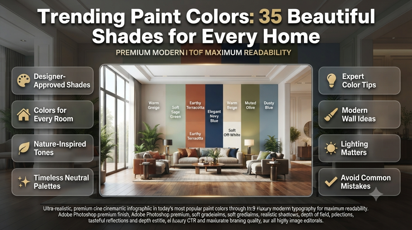
Trending Paint Colors: 35 Beautiful Shades for Every Home | Choosing a paint colour sounds simple until you’re standing in front of hundreds of swatches wondering which one will still look beautiful a year from now. A colour that appears perfect under showroom lighting can feel completely different once it’s on your walls. That’s why understanding Trending Paint Colors is about more than following fashion—it’s about selecting shades that complement your home’s style, lighting, and personality.
Whether you’re planning a full home makeover, refreshing a single room, or preparing your property for sale, the right paint colour can dramatically transform the atmosphere. Modern paint trends combine timeless neutrals with nature-inspired greens, warm earth tones, sophisticated blues, and bold statement colours that create character without overwhelming a space.
In this comprehensive guide, you’ll discover the latest trending paint colours, why they’re becoming popular, how to choose the perfect shade for every room, common mistakes to avoid, and expert decorating tips that professionals use to achieve beautiful, long-lasting results.
Why Are Trending Paint Colors So Important?
Trending paint colours reflect current interior design preferences, lifestyle changes, and evolving colour psychology. They help homeowners create spaces that feel modern, welcoming, and timeless while increasing visual appeal and potentially improving property value when chosen thoughtfully.
Paint colour influences much more than appearance. It affects how large a room feels, how natural light is reflected, and even how comfortable people feel inside the space.
Today’s paint trends are moving away from extremely cold whites and overly dark interiors. Instead, designers are embracing warmth, natural inspiration, and colours that create calm, comfortable living environments.
Some of the biggest reasons homeowners follow paint colour trends include:
- Refreshing outdated interiors
- Increasing resale appeal
- Creating relaxing living spaces
- Matching modern furniture styles
- Improving natural light reflection
- Giving older homes a contemporary look
- Expressing personal style without major renovations
If you’re also planning a complete renovation, exploring Interior Design ideas alongside paint colours can help create a more cohesive look throughout your home.
What Makes a Paint Colour Trend?
Paint colour trends are influenced by interior designers, architecture, fashion, lifestyle changes, colour psychology, global design movements, and consumer preferences. The most successful colours combine timeless appeal with modern aesthetics.
Unlike fashion trends that change every season, paint colour trends usually evolve gradually.
Several factors shape the colours that become popular.
Lifestyle Changes
People now spend more time at home than ever before. As a result, homeowners prefer colours that create peaceful, relaxing environments instead of overly bold or stimulating spaces.
Nature-inspired colours have become increasingly popular because they help bring a sense of calm indoors.
Interior Design Styles
Modern homes often combine several design styles, including:
- Scandinavian
- Japandi
- Modern Farmhouse
- Contemporary
- Minimalist
- Organic Modern
- Coastal
- Transitional
These styles naturally favour warm neutrals, muted greens, soft blues, earthy browns, and creamy whites.
Colour Psychology
Every paint colour creates a different emotional response.
| Colour Family | Feeling It Creates | Best Used In |
|---|---|---|
| Soft White | Clean and open | Entire home |
| Beige | Warm and comfortable | Living rooms |
| Greige | Modern and balanced | Hallways |
| Sage Green | Calm and natural | Bedrooms |
| Olive Green | Rich and elegant | Dining rooms |
| Dusty Blue | Peaceful | Bedrooms |
| Terracotta | Warm and welcoming | Feature walls |
| Charcoal | Sophisticated | Offices |
| Deep Navy | Luxurious | Accent walls |
💡 Pro Tip: Instead of choosing colours based only on current trends, think about how you want each room to feel. A relaxing bedroom and an energetic kitchen often benefit from very different colour palettes.
Top Trending Paint Colors for 2026
Interior designers are moving towards colours inspired by nature, comfort, and timeless elegance rather than short-lived design fads.
Let’s explore the shades dominating homes this year.
1. Warm White
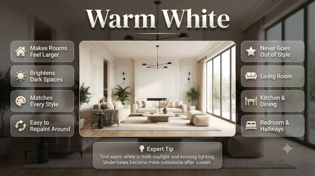
Warm white is one of the most popular trending paint colours because it creates bright, welcoming spaces without feeling cold or clinical. It pairs beautifully with natural wood, stone, and modern furnishings.
Unlike pure white, warm white contains soft cream or beige undertones.
This subtle warmth makes rooms feel inviting while still reflecting plenty of natural light.
Why Homeowners Love Warm White
- Makes rooms feel larger
- Brightens darker spaces
- Matches every decorating style
- Easy to repaint around later
- Never goes out of style
Best Rooms
- Living room
- Hallways
- Kitchens
- Bedrooms
- Dining rooms
Warm white also works exceptionally well with wooden flooring, linen fabrics, and black metal fixtures.
⭐ Expert Tip: Always test warm white in both daylight and evening lighting. Undertones become much more noticeable after sunset.
2. Greige
Greige combines grey and beige into one versatile neutral that feels modern while maintaining warmth. It works with nearly every decorating style and remains one of the safest long-term paint colour choices.
Greige solves a common problem.
Many homeowners find grey too cold while beige feels outdated.
Greige offers the perfect balance.
Why Greige Continues to Trend
- Extremely versatile
- Suitable for open-plan homes
- Complements warm and cool décor
- Looks expensive without being overpowering
- Creates smooth transitions between rooms
Ideal Pairings
Greige works beautifully alongside:
- White trim
- Black fixtures
- Oak flooring
- Marble countertops
- Brass hardware
- Natural fabrics
If you’re considering complementary palettes, the Neutral Color Schemes guide offers additional inspiration for creating harmonious interiors.
3. Sage Green
Sage green is among the most searched trending paint colours because it brings the calming influence of nature indoors. It creates relaxing spaces while remaining sophisticated and easy to coordinate with neutral décor.
Green has become one of the strongest colour trends because it reflects wellness, sustainability, and outdoor living.
Sage is subtle enough for entire rooms while adding far more personality than standard neutrals.
Benefits of Sage Green
- Creates a peaceful atmosphere
- Works in both traditional and modern homes
- Pairs beautifully with wood finishes
- Looks elegant year-round
- Adds gentle colour without overwhelming the room
Best Rooms
- Bedrooms
- Bathrooms
- Home offices
- Reading rooms
- Living rooms
Colour Pairings
Sage green pairs especially well with:
- Cream
- Warm white
- Oak
- Walnut
- Brass
- Soft terracotta
- Light stone
📌 Quick Tip: If painting an entire room feels like too much, consider using sage green on a single feature wall while keeping the remaining walls warm white.
4. Soft Beige
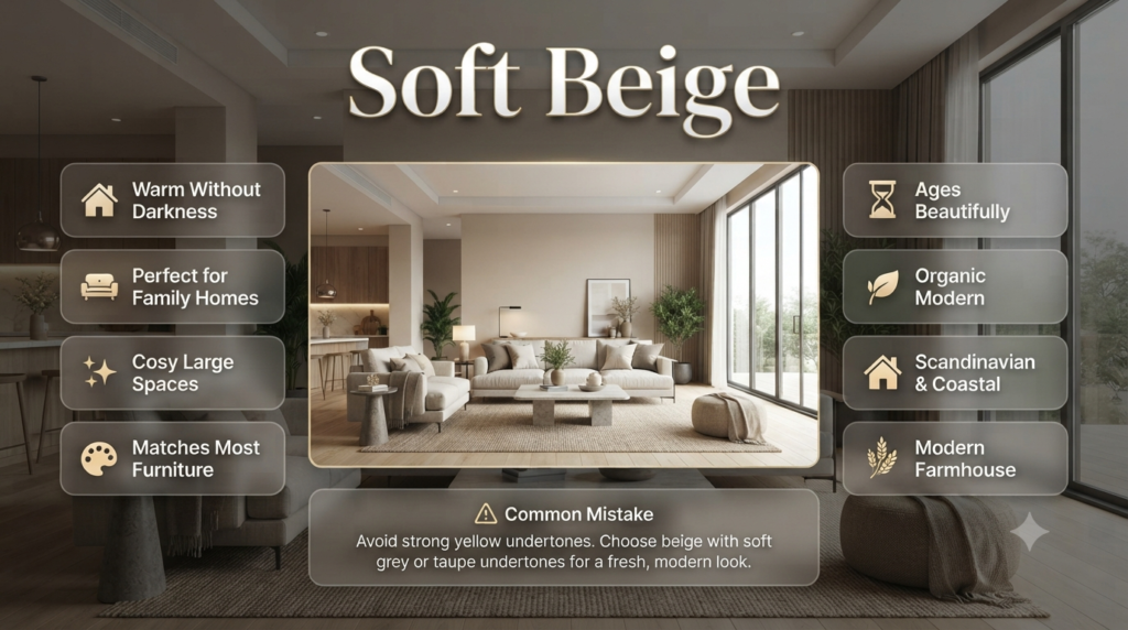
Soft beige has made a major comeback thanks to the popularity of warm, comfortable interiors. Modern beige feels fresh, elegant, and significantly more sophisticated than older yellow-toned beiges.
Today’s beige isn’t the same colour many people remember from years ago.
Modern beige contains subtle grey or taupe undertones that prevent it from looking dated.
Why Soft Beige Is Returning
- Creates warmth without darkness
- Perfect for family homes
- Makes large spaces feel cosy
- Works with almost every furniture colour
- Ages beautifully over time
Ideal Design Styles
Soft beige suits:
- Modern Farmhouse
- Coastal
- Transitional
- Traditional
- Scandinavian
- Organic Modern
⚠ Common Mistake: Choosing a beige with strong yellow undertones can make rooms feel dated. Instead, look for balanced beige shades with soft grey or taupe undertones for a more contemporary appearance.
5. Dusty Blue
Dusty blue offers a calming alternative to brighter blues. It creates elegant, relaxing interiors and complements both modern and classic homes without overpowering the space.
Unlike vibrant navy or royal blue, dusty blue has muted grey undertones that make it easier to decorate around.
It’s especially effective in rooms where you want a peaceful atmosphere.
Why Designers Recommend Dusty Blue
- Reduces visual stress
- Adds subtle colour
- Works well with natural light
- Pairs beautifully with white trim
- Creates timeless elegance
Best Places to Use It
- Bedrooms
- Guest rooms
- Bathrooms
- Home offices
- Reading nooks
Dusty blue also pairs wonderfully with natural linen, woven textures, light oak furniture, and brushed nickel finishes, making it a favourite for both contemporary and classic interiors.
Paint Finish Matters Just As Much as Colour
Even the most beautiful trending paint colour can look completely different depending on the finish you choose. Matte finishes soften colours and hide wall imperfections, while satin and semi-gloss finishes reflect more light and make colours appear brighter.
For a detailed comparison of finishes and where to use each one, visit Paint Finishes before making your final decision.
6. Earthy Terracotta
Earthy terracotta is one of the fastest-growing trending paint colours because it brings warmth, character, and a natural feel into modern homes. Inspired by clay and sun-baked landscapes, it creates inviting interiors that feel timeless rather than trendy.
Terracotta has moved beyond Mediterranean-style homes. Designers now use softer, muted versions that blend beautifully with modern furniture, natural wood, stone, and textured fabrics.
Instead of overwhelming a room, today’s terracotta shades create warmth and depth.
Why Terracotta Is Trending
- Adds warmth to neutral interiors
- Creates a cosy atmosphere
- Complements organic materials
- Works in both traditional and contemporary homes
- Looks stunning in natural daylight
Best Rooms
- Dining rooms
- Living rooms
- Entryways
- Feature walls
- Home libraries
Perfect Colour Pairings
Terracotta looks beautiful alongside:
- Warm white
- Cream
- Sage green
- Olive green
- Natural oak
- Walnut
- Matte black accents
💡 Pro Tip: If you’re hesitant about bold colours, use terracotta as an accent wall instead of painting the entire room.
7. Olive Green
Olive green combines elegance with nature-inspired warmth. It creates rich, sophisticated interiors while remaining surprisingly versatile for both classic and modern homes.
Olive green is deeper than sage but softer than forest green.
It works particularly well in homes with natural materials, exposed wood beams, stone fireplaces, or black-framed windows.
Benefits of Olive Green
- Creates luxurious interiors
- Adds depth without feeling too dark
- Works beautifully with brass hardware
- Complements wooden furniture
- Suitable for every season
Ideal Rooms
- Dining rooms
- Home offices
- Bedrooms
- Living rooms
Olive green also pairs exceptionally well with leather furniture, linen curtains, and textured rugs for a layered, designer-inspired look.
8. Deep Navy Blue
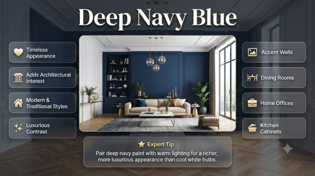
Deep navy remains one of the most timeless trending paint colours. It adds drama, sophistication, and elegance without going out of style, making it perfect for statement spaces.
While lighter blues create calmness, navy introduces contrast and visual interest.
It’s often used to create focal points rather than covering every wall.
Why Designers Love Navy
- Timeless appearance
- Adds architectural interest
- Works with modern and traditional interiors
- Enhances white trim
- Creates luxurious contrast
Best Uses
- Accent walls
- Dining rooms
- Home offices
- Built-in shelving
- Kitchen cabinets
⭐ Expert Tip: Navy paint looks richer when paired with warm lighting rather than cool white bulbs.
9. Charcoal Grey
Charcoal grey provides bold sophistication without the harshness of black. It creates depth, highlights architectural details, and works exceptionally well in contemporary interiors.
Modern charcoal paints often include warm undertones that prevent spaces from feeling cold.
When balanced with lighter colours, charcoal adds elegance rather than heaviness.
Ideal Applications
- Fireplace surrounds
- Media walls
- Home offices
- Exterior feature walls
- Built-in cabinets
Pair It With
- Crisp white
- Warm beige
- Oak wood
- Brass finishes
- Soft grey fabrics
⚠ Common Mistake: Using charcoal in a room with very little natural light can make the space feel smaller. Balance it with lighter walls, mirrors, and layered lighting.
10. Soft Taupe
Soft taupe blends brown, beige, and grey into one versatile neutral. It creates warm, elegant interiors while remaining easy to coordinate with changing décor.
Taupe has become increasingly popular because it offers more character than white while remaining highly flexible.
It works especially well in open-plan homes where continuity is important.
Why Homeowners Choose Taupe
- Warm yet modern
- Suitable for every room
- Doesn’t date quickly
- Complements both warm and cool colours
- Easy to decorate around
How to Choose the Right Trending Paint Colour
The best trending paint colour isn’t necessarily the most popular one—it’s the colour that suits your lighting, room size, furniture, lifestyle, and personal taste. Testing samples before committing helps avoid expensive mistakes.
Choosing paint becomes much easier when you follow a structured approach.
Step 1: Understand Your Room’s Natural Light
Natural light changes paint colour dramatically.
| Room Direction | Light Quality | Recommended Colours |
|---|---|---|
| North-facing | Cooler light | Warm white, beige, terracotta |
| South-facing | Bright warm light | Sage, greige, dusty blue |
| East-facing | Bright mornings | Soft neutrals, taupe |
| West-facing | Warm evenings | Olive green, navy, greige |
Step 2: Consider Room Size
Smaller rooms usually benefit from lighter colours because they reflect more light.
Large rooms can comfortably handle richer shades like:
- Olive green
- Navy blue
- Charcoal
- Deep taupe
However, don’t assume dark colours always make rooms feel smaller. In well-lit spaces, they can actually create a cosy and luxurious atmosphere.
Step 3: Match Existing Furniture
Your walls should complement—not compete with—your furniture.
Think about:
- Flooring
- Curtains
- Sofas
- Cabinets
- Countertops
- Artwork
- Rugs
Neutral paint colours provide greater flexibility if you plan to update furniture over time.
Step 4: Test Before You Paint
Never choose a paint colour based only on a tiny sample card.
Instead:
- Buy sample pots.
- Paint large test patches.
- Observe them throughout the day.
- Check under artificial lighting.
- Compare them with flooring and furniture.
This simple step can save both money and frustration.
Trending Paint Colours by Room
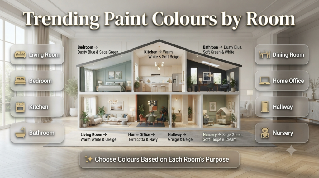
Different rooms have different purposes, so choosing colours based on function often leads to better results than simply following trends.
| Room | Recommended Trending Colours |
|---|---|
| Living Room | Warm White, Greige, Sage Green |
| Bedroom | Dusty Blue, Sage Green, Taupe |
| Kitchen | Warm White, Greige, Soft Beige |
| Bathroom | Dusty Blue, Soft Green, White |
| Dining Room | Olive Green, Terracotta, Navy |
| Home Office | Charcoal, Navy, Olive Green |
| Hallway | Warm White, Greige, Beige |
| Nursery | Sage Green, Soft Taupe, Cream |
If you’re refreshing outdoor spaces as well, explore [Exterior Paint Colors: 25 Best Ideas for Every Home – Exterior Paint] to create a coordinated look between your home’s interior and exterior.
Should You Follow Paint Trends?
Featured Snippet Answer
Paint trends are excellent sources of inspiration, but your home’s architecture, lighting, and personal preferences should always guide the final decision. Timeless colours often deliver better long-term satisfaction than short-lived trends.
Ask yourself:
- Will I still enjoy this colour in five years?
- Does it suit my furniture?
- Does it fit my home’s style?
- Does it work in different lighting conditions?
The goal is to create a home that feels comfortable—not simply fashionable.
Common Paint Colour Mistakes to Avoid
Many disappointing paint projects happen because homeowners rush the decision-making process.
1. Choosing Paint Under Store Lighting
Paint often looks completely different once it’s in your home.
How to avoid it:
- Test samples on multiple walls.
- View them during morning, afternoon, and evening.
2. Ignoring Undertones
Two whites may look similar until they’re placed side by side.
Always identify whether a colour has:
- Yellow undertones
- Pink undertones
- Blue undertones
- Green undertones
- Grey undertones
Undertones determine whether colours work together.
3. Using One Colour Everywhere
A whole house painted in a single shade can sometimes feel flat.
Instead, use complementary colours that create subtle contrast while maintaining flow.
For inspiration, explore Neutral Color Schemes and Warm Color Palettes to build a balanced colour story throughout your home.
4. Forgetting the Ceiling
The ceiling is often called the “fifth wall.”
Choosing the right ceiling colour can:
- Make ceilings appear higher
- Brighten darker rooms
- Add architectural interest
Learn more in Ceiling Colors before finalising your paint plan.
5. Choosing Trends Over Lifestyle
A beautiful dark colour may look incredible in a magazine but could show fingerprints, dust, or scuff marks more easily in a busy family home.
Always balance style with practicality.
⚠ Common Mistake: Copying a paint colour from social media without considering your room’s lighting, ceiling height, and furnishings often leads to disappointing results.
Expert Recommendations for a Designer-Looking Home
Professional interior designers rarely rely on colour alone. They create balanced spaces by considering texture, lighting, finish, and proportion together.
Here are some proven strategies professionals use:
- Stick to a cohesive colour palette throughout the home.
- Mix warm and cool tones for balance.
- Layer different textures such as wood, linen, stone, and metal.
- Use accent colours sparingly for greater impact.
- Repeat one or two colours across different rooms to create flow.
- Select the right paint finish for each surface and room.
⭐ Expert Tip: Before buying several tins of paint, create a mood board using your chosen colours, flooring, fabrics, and furniture samples. Seeing everything together helps you identify clashes before you start painting.
Best Trending Paint Color Combinations for Every Home
Featured Snippet Answer
The best trending paint colour combinations balance warm and cool tones while creating visual harmony. Pairing complementary shades adds depth, improves flow between rooms, and gives your home a professionally designed appearance.
Instead of choosing colours one by one, think about how they work together throughout your home.
| Main Colour | Complementary Colour | Best For |
|---|---|---|
| Warm White | Sage Green | Living Room |
| Greige | Charcoal Grey | Modern Interiors |
| Soft Beige | Olive Green | Dining Room |
| Dusty Blue | Warm White | Bedrooms |
| Navy Blue | Brass & White | Home Office |
| Terracotta | Cream | Accent Walls |
| Taupe | Natural Oak | Open-Plan Homes |
If you’re planning a complete home makeover, you’ll find more decorating inspiration, room styling ideas, and renovation guides on Design Mode 24 – Home Page.
You can also explore these related guides:
What Paint Colors Are Trending to Replace Cool Grays and Stark Whites?
The biggest shift in interior design is moving away from cool grays and stark whites toward warmer, nature-inspired colours. Homeowners now prefer shades that make a space feel comfortable, inviting, and timeless rather than cold or overly minimal.
The most popular replacements include warm white, greige, soft beige, sage green, taupe, olive green, and earthy terracotta. These colours work beautifully with natural wood, stone, textured fabrics, and modern furnishings while creating a softer, more welcoming atmosphere. Unlike cool gray, which can sometimes feel sterile, these newer colours add depth and warmth without overwhelming the room.
Popular replacements include:
Warm White
Greige
Soft Beige
Sage Green
Taupe
Olive Green
Earthy Terracotta
What are the top 5 trending paint colors of the year?
The top trending paint colours this year focus on warmth, versatility, and a connection to nature. These shades suit a wide variety of home styles and remain fashionable beyond short-term design trends.
Warm White – Bright, clean, and welcoming without feeling harsh.
Greige – A balanced mix of grey and beige that complements almost any décor.
Sage Green – A calming, nature-inspired colour that’s ideal for bedrooms, living rooms, and home offices.
Soft Beige – A modern neutral with subtle undertones that creates warmth and elegance.
Earthy Terracotta – A rich, organic tone that adds character and warmth, especially on feature walls and in dining areas.
These colours offer flexibility, timeless appeal, and excellent compatibility with natural materials such as wood, stone, linen, and brass finishes.
How does natural and artificial lighting affect these new paint colors?
Lighting has a major impact on how paint colours appear. The same colour can look completely different depending on the room’s orientation, the amount of daylight it receives, and the type of artificial lighting used in the evening.
North-facing rooms usually receive cooler light, making colours appear darker or slightly bluer. South-facing rooms receive warmer sunlight, which enhances warm tones and softens cooler shades. East-facing rooms look brighter in the morning, while west-facing rooms become noticeably warmer later in the day.
Artificial lighting also changes colour perception. Warm white bulbs enhance beige, cream, and terracotta tones, while cool white lighting can make colours appear flatter or cooler than expected. For the most accurate results, always test paint samples in your home under both daylight and evening lighting before making a final decision.
Best practice:
Test paint in morning, afternoon, and evening.
View samples under both natural and artificial light.
Paint large sample sections instead of relying on small swatches.
Compare colours next to flooring, furniture, and curtains.
What is “Color Drenching” and why is it highly demanded right now?
Color Drenching is an interior design technique where the same paint colour is used on multiple surfaces, including walls, ceilings, trim, doors, and sometimes built-in furniture. Rather than creating contrast between different elements, this approach produces a seamless, immersive look that feels sophisticated and professionally designed.
The trend has become highly popular because it creates calm, cohesive spaces with a luxurious finish. It can also make architectural details feel more intentional and reduce visual clutter, especially in modern homes. Colour drenching works particularly well with warm neutrals, sage green, olive green, dusty blue, and deep navy.
Why homeowners love Color Drenching:
Creates a cohesive designer look.
Makes rooms feel calm and elegant.
Enhances architectural details.
Works well in both small and large spaces.
Gives interiors a modern, high-end appearance.
What are the best practices for sampling paint to avoid making a costly mistake?
Choosing paint from a small colour card is one of the most common reasons homeowners end up repainting a room. The best way to avoid costly mistakes is to test paint samples in the actual space where they will be used.
Purchase sample pots and apply the paint to large sections of several walls rather than tiny patches. Observe the colour at different times of the day, paying attention to how it changes in natural sunlight and under artificial lighting. It’s also important to compare the sample with existing flooring, cabinets, furniture, fabrics, and décor to ensure everything works together.
Before buying multiple tins of paint, live with the samples for a few days. This extra time helps you notice subtle undertones and prevents expensive repainting later.
Professional sampling tips:
Buy tester pots before committing.
Paint large sample areas (not small squares).
Test on more than one wall.
Check colours throughout the day.
Compare with furniture and flooring.
Wait at least 24–48 hours before making a final decision.
Choose the paint finish (matte, eggshell, satin, etc.) before approving the final colour, as the finish can slightly affect how the colour appears.
Conclusion
Choosing the right Trending Paint Colors is about more than following the latest design trend—it’s about creating a home that feels comfortable, reflects your personality, and stands the test of time. While cool grays and stark whites are giving way to warmer, nature-inspired shades, the best colour is always one that complements your home’s lighting, architecture, and existing décor.
Whether you prefer the timeless appeal of warm white, the versatility of greige, the calming beauty of sage green, or the richness of earthy terracotta, taking the time to test colours properly and understand how they interact with light will help you achieve professional-looking results. Trends can provide inspiration, but thoughtful colour selection ensures your home remains stylish and inviting for years to come.
Before starting your next painting project, explore more expert advice, colour inspiration, and practical decorating ideas on Design Mode 24, including guides on Paint Colors, Interior Design, Paint Finishes, Accent Walls, and Home Improvement. With the right planning and colour choices, you can confidently transform any room into a space that feels modern, welcoming, and uniquely yours.

Leave a Reply