
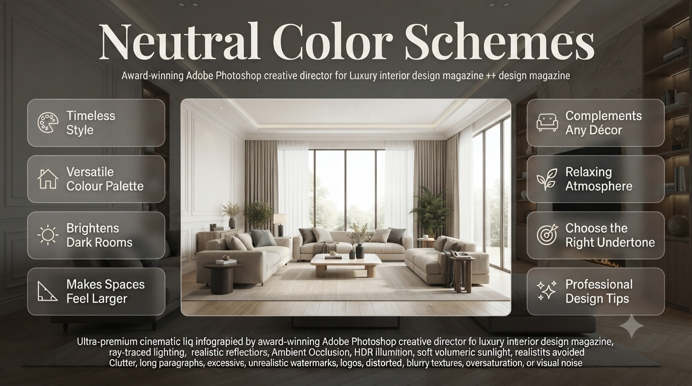
Neutral Color Schemes Interior Designers Swear By | Creating a beautiful home isn’t just about choosing stylish furniture or expensive décor. One of the biggest decisions you’ll make is selecting the right colour palette. While bold colours come and go with changing trends, neutral color schemes have remained a favourite among homeowners, interior designers, and property developers for decades.
The appeal of neutral colours lies in their versatility. They can make a small room feel larger, brighten darker spaces, create a relaxing atmosphere, and provide the perfect backdrop for furniture, artwork, and decorative accessories. Whether you’re renovating an entire house or simply repainting one room, choosing the right neutral palette can completely transform how your home looks and feels.
If you’ve ever stood in front of hundreds of paint samples wondering whether to choose warm white, greige, beige, taupe, or soft grey, you’re not alone. Many people assume neutral colours are easy because they’re “safe,” but selecting the wrong undertone can make a room feel cold, dull, or even dated.
In this guide, you’ll learn what neutral colour schemes are, why they’re so popular, how to choose the right shades, and which combinations work best in different spaces. You’ll also discover practical design advice used by professionals, common mistakes to avoid, and simple ways to create a home that feels elegant, welcoming, and timeless.
What Are Neutral Color Schemes?
Neutral color schemes use colours with subtle tones rather than bold or vibrant hues. These include whites, creams, beiges, greys, taupes, greiges, and soft earthy shades that create a balanced, timeless, and versatile interior suitable for almost every room and decorating style.
Neutral colours are often misunderstood as plain or boring. In reality, they offer incredible flexibility and depth. Instead of dominating a room, neutral shades allow architectural details, furniture, textures, and natural light to become the main focus.
A well-designed neutral room feels calm without appearing empty. Layers of different shades and materials create visual interest while maintaining a clean and sophisticated appearance.
Professional designers frequently use neutral palettes because they:
- Stay fashionable for many years
- Suit both traditional and contemporary interiors
- Pair effortlessly with natural materials
- Make decorating easier
- Appeal to a wide range of personal styles
Whether you prefer Scandinavian minimalism, modern luxury, rustic farmhouse, coastal living, or classic interiors, neutral colour schemes provide a solid foundation.
💡 Pro Tip: Think of neutral colours as the “canvas” of your home. Once the walls create a balanced backdrop, it’s much easier to update furniture, artwork, rugs, and accessories without repainting.
Why Neutral Color Schemes Never Go Out of Style
Neutral colour schemes remain popular because they create timeless interiors, maximise natural light, complement nearly every design style, and adapt easily as furniture, décor, and trends change over time.
Unlike fashionable colours that may look dated after only a few years, neutrals have lasting appeal. They don’t compete for attention. Instead, they create harmony throughout a home.
Interior designers often recommend neutral palettes because they reduce visual clutter while allowing each room to feel connected. Moving from one room to another feels smooth and intentional rather than disjointed.
Some of the biggest reasons homeowners continue choosing neutral colours include:
They Make Rooms Feel Larger
Lighter neutral shades reflect more natural light than darker colours.
This reflection creates the illusion of:
- Higher ceilings
- Wider walls
- Larger floor space
- More open layouts
That’s why apartments, smaller bedrooms, hallways, and compact living spaces often benefit from neutral paint colours.
They Complement Every Design Style
One of the greatest strengths of neutral colours is their adaptability.
They work beautifully with:
- Modern interiors
- Contemporary homes
- Traditional houses
- Farmhouse décor
- Coastal themes
- Industrial spaces
- Scandinavian design
- Japandi interiors
- Luxury homes
Instead of changing the wall colour every few years, homeowners can simply replace furniture or decorative accessories to achieve a fresh look.
They Increase Decorating Flexibility
A colourful sofa may only match certain wall colours.
A neutral room, however, allows you to introduce almost any accent colour without creating visual conflict.
Popular accent colours include:
- Navy blue
- Forest green
- Terracotta
- Mustard yellow
- Black
- Olive
- Burnt orange
- Deep charcoal
- Dusty rose
This flexibility saves money because redecorating becomes much easier.
They Appeal to Future Buyers
Neutral interiors have broad appeal in the property market.
Potential buyers can imagine adding their own furniture and personal style without immediately planning expensive repainting work.
This is one reason estate agents and interior staging professionals often recommend neutral paint colours before listing a property for sale.
⭐ Expert Tip: If you’re renovating with long-term value in mind, neutral colour schemes are one of the safest investments because they rarely go out of style and suit a wide range of tastes.
Understanding the Different Types of Neutral Colours
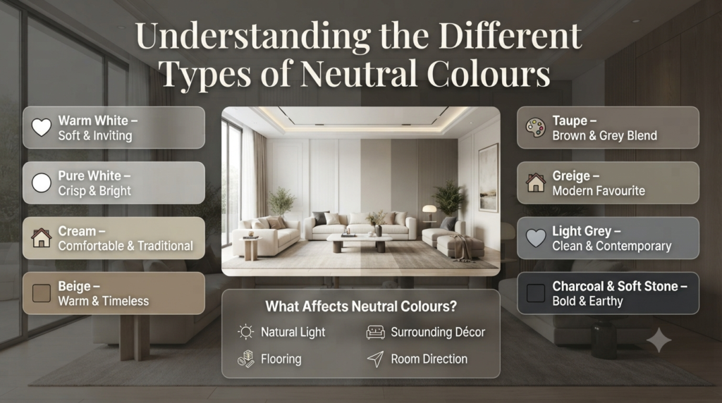
Neutral colours include white, off-white, cream, beige, taupe, greige, grey, charcoal, and soft earthy tones. Each has unique undertones that influence how warm, cool, bright, or cosy a room feels.
Not all neutral colours are the same. Understanding their characteristics makes choosing paint much easier.
| Neutral Colour | Appearance | Best For |
|---|---|---|
| Warm White | Soft and inviting | Living rooms, bedrooms |
| Pure White | Crisp and bright | Modern interiors |
| Cream | Comfortable and traditional | Family homes |
| Beige | Warm and timeless | Open-plan spaces |
| Taupe | Rich blend of brown and grey | Luxury interiors |
| Greige | Mix of grey and beige | Modern homes |
| Light Grey | Clean and contemporary | Offices and kitchens |
| Charcoal | Bold neutral | Feature walls |
| Soft Stone | Natural earthy tone | Rustic and organic interiors |
Each colour reacts differently depending on lighting, flooring, surrounding décor, and the direction a room faces.
Warm Neutrals
Warm neutral colours contain hints of:
- Yellow
- Red
- Brown
- Gold
Examples include:
- Cream
- Ivory
- Warm beige
- Sand
- Camel
- Honey
- Mushroom
Warm neutrals create comfortable, welcoming interiors that feel cosy throughout the year.
They are particularly effective in:
- Living rooms
- Dining rooms
- Bedrooms
- North-facing rooms with limited sunlight
Cool Neutrals
Cool neutrals contain subtle undertones of:
- Blue
- Green
- Violet
Examples include:
- Cool white
- Ash grey
- Dove grey
- Soft stone
- Silver grey
These colours create a fresh, modern appearance and work especially well in bright rooms with plenty of natural sunlight.
They’re often chosen for:
- Kitchens
- Bathrooms
- Home offices
- Contemporary apartments
Greige: The Best of Both Worlds
Greige has become one of the most popular interior paint colours in recent years.
By blending beige with grey, greige provides warmth without appearing yellow and modernity without feeling cold.
This balanced colour suits almost every decorating style and pairs beautifully with:
- Natural wood
- Marble
- Black metal
- Brass
- Linen
- White trim
Its versatility makes it a favourite among interior designers working on modern family homes.
The Biggest Benefits of Neutral Color Schemes
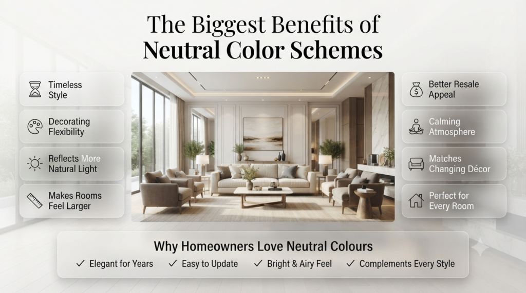
Neutral colour schemes offer timeless style, greater decorating flexibility, improved light reflection, better resale appeal, and a calming atmosphere while providing an adaptable foundation for changing furniture and décor over time.
Choosing neutral colours offers practical advantages beyond aesthetics.
They Create a Calm Environment
Busy colours can become visually overwhelming.
Neutral tones encourage relaxation and reduce visual distractions, making them ideal for spaces where comfort is the priority.
They’re especially popular in:
- Bedrooms
- Reading corners
- Home offices
- Meditation spaces
- Family living rooms
They Maximise Natural Light
Light neutrals reflect sunlight around a room.
This reduces dark corners and creates a brighter atmosphere without additional lighting.
Rooms with limited windows often benefit significantly from warm whites, soft creams, or pale greige walls.
📌 Quick Tip: Always test paint samples at different times of the day. Morning, afternoon, and evening light can dramatically change how a neutral colour appears.
They Make Decorating Easier
Neutral walls allow almost any decorating style to work successfully.
You can easily refresh your home by changing:
- Cushions
- Curtains
- Rugs
- Lamps
- Artwork
- Plants
- Decorative accessories
Instead of repainting every few years, small decorative updates often achieve the desired transformation.
They Reduce Visual Clutter
Neutral backgrounds help organise visual space.
Rather than competing with furniture and accessories, they create balance throughout the room.
This is one reason luxury hotels, premium apartments, and designer show homes frequently rely on carefully selected neutral palettes.
They Age Gracefully
Unlike trend-driven colours that can quickly lose popularity, neutral colour schemes maintain their elegance for many years.
A timeless palette means fewer costly updates and a home that continues to feel fresh and sophisticated regardless of changing design trends.
⚠ Common Mistake: Choosing a neutral paint colour directly from a small swatch without testing it on your walls. Lighting, flooring, and surrounding furnishings can dramatically alter how a colour appears once applied.
Neutral Colour Comparison at a Glance
| Feature | Neutral Colour Schemes | Bold Colour Schemes |
|---|---|---|
| Timeless Appeal | Excellent | Often trend-driven |
| Decorating Flexibility | Very High | Limited |
| Reflects Natural Light | Excellent | Depends on shade |
| Works with Different Styles | Excellent | Moderate |
| Property Resale Appeal | High | Varies |
| Easy to Update | Very Easy | Often requires repainting |
| Suitable for Small Rooms | Excellent | Depends on colour |
Where Neutral Color Schemes Work Best
Neutral palettes are suitable for nearly every area of the home, including:
- Living rooms
- Bedrooms
- Kitchens
- Dining rooms
- Bathrooms
- Hallways
- Home offices
- Entryways
- Open-plan living areas
- Apartments
- New-build homes
- Period properties
Because they create continuity between spaces, neutral colour schemes are especially effective in homes with open layouts, where maintaining a cohesive flow is important.
For more ideas on creating harmonious interiors, explore Interior Design and discover practical renovation inspiration in Home Improvement.
How to Choose the Perfect Neutral Color Scheme for Your Home
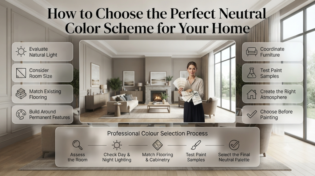
The best neutral color scheme depends on your room’s natural light, size, existing flooring, furniture, and the atmosphere you want to create. Always test paint samples in different lighting conditions before making a final decision.
Choosing a neutral paint colour may seem simple, but the subtle differences between shades can dramatically affect how a room looks and feels. A beige that appears warm in a showroom might look yellow in your living room, while a soft grey could appear blue in north-facing light.
Professional interior designers rarely choose paint first. Instead, they evaluate the room as a whole and build a cohesive palette around permanent features such as flooring, cabinetry, and worktops.
If you’re planning a full home makeover, browse the latest inspiration on the Interior Design Mode 24 Home Page before selecting colours. You’ll also find practical ideas in the Paint Color and Interior Design sections.
Factors to Consider Before Choosing Neutral Colours
Every room has unique characteristics. Understanding these factors helps you select a neutral palette that enhances the space rather than working against it.
1. Evaluate Natural Light
Natural light has the greatest impact on how neutral paint colours appear. A colour that looks perfect in one room may appear completely different in another because of sunlight direction and intensity.
Room orientation matters more than many homeowners realise.
North-Facing Rooms
These rooms receive cooler, softer daylight.
The best choices include:
- Warm White
- Cream
- Soft Beige
- Light Taupe
- Warm Greige
These shades add warmth and prevent the room from feeling cold.
South-Facing Rooms
South-facing rooms receive abundant sunlight throughout the day.
Most neutral colours perform well here, including:
- Pure White
- Soft Grey
- Greige
- Stone
- Ivory
Natural sunlight enhances depth without making the room feel dull.
East-Facing Rooms
Morning sunlight is bright and warm before becoming cooler later in the day.
Balanced neutrals work best because they adapt throughout changing daylight.
West-Facing Rooms
Afternoon sunlight is warmer and often richer.
Cooler neutral shades can help balance the golden evening light.
💡 Pro Tip: Paint large sample boards instead of testing tiny patches directly on the wall. Move them around the room and observe them throughout the day.
Consider Your Existing Flooring
Many homeowners choose wall paint without considering the floor beneath it.
Since flooring is expensive to replace, your paint should complement it.
| Flooring Type | Recommended Neutral Colours |
|---|---|
| Light Oak | Warm White, Greige, Cream |
| Dark Walnut | Taupe, Beige, Soft White |
| Marble | Cool Grey, White, Greige |
| Concrete | Ash Grey, Stone, Warm White |
| Natural Stone | Sand, Taupe, Mushroom |
Matching undertones creates a balanced and cohesive interior.
Match Neutral Colours with Furniture
Furniture occupies a significant amount of visual space, so wall colours should work alongside it rather than compete.
Wooden Furniture
Pairs beautifully with:
- Cream
- Beige
- Mushroom
- Warm White
- Taupe
Modern White Furniture
Looks elegant with:
- Greige
- Dove Grey
- Soft Stone
- Light Taupe
Black Furniture
Creates striking contrast with:
- Warm White
- Ivory
- Soft Beige
- Pale Grey
Colourful Furniture
Neutral walls allow vibrant furniture to become the focal point without overwhelming the room.
Warm vs Cool Neutral Colours
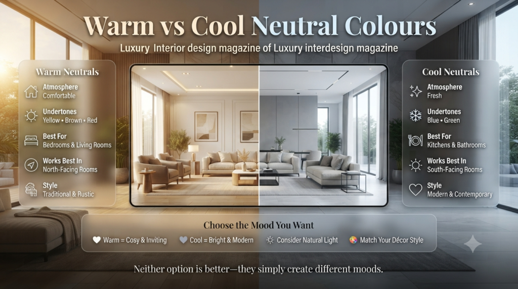
Warm neutrals create cosy, welcoming interiors, while cool neutrals produce a fresh, clean, contemporary appearance. The right choice depends on lighting, décor style, and the mood you want to achieve.
| Feature | Warm Neutrals | Cool Neutrals |
|---|---|---|
| Atmosphere | Comfortable | Fresh |
| Undertones | Yellow, Brown, Red | Blue, Green |
| Best For | Bedrooms, Living Rooms | Kitchens, Bathrooms |
| Works Best In | North-facing rooms | South-facing rooms |
| Style | Traditional & Rustic | Modern & Contemporary |
Neither option is better—they simply create different moods.
Best Neutral Color Schemes for Every Room
Living Room
Living rooms benefit from warm neutral colours that encourage relaxation while providing flexibility for furniture and décor.
Excellent choices include:
- Warm White
- Soft Beige
- Greige
- Taupe
- Mushroom
- Stone
Layer these colours with natural textures like linen, wool, wood, and woven baskets to create depth.
⭐ Expert Tip: Use three or four shades of the same neutral colour throughout the room rather than relying on one flat tone. Layering creates a luxurious designer look.
Bedroom
Bedrooms should feel peaceful and restful.
Popular neutral bedroom colours include:
- Soft Ivory
- Warm White
- Pale Taupe
- Light Greige
- Cream
- Soft Stone
Combine them with soft bedding, textured cushions, and natural timber furniture for a relaxing retreat.
Kitchen
Neutral kitchens continue to dominate modern interior design because they feel bright, clean, and timeless.
Recommended colours include:
- Warm White
- Greige
- Light Grey
- Soft Beige
- Cream
These shades complement:
- White cabinets
- Timber cabinetry
- Quartz worktops
- Marble splashbacks
- Stainless steel appliances
For more renovation inspiration, visit the Home Improvement section.
Bathroom
Bathrooms benefit from fresh, light-reflecting colours.
Professional designers often recommend:
- Crisp White
- Dove Grey
- Stone
- Pale Greige
- Soft Taupe
These colours create a spa-like atmosphere while making smaller bathrooms feel larger.
Dining Room
Dining spaces work beautifully with warmer neutral tones because they encourage comfort and conversation.
Popular choices include:
- Sand
- Mushroom
- Warm Beige
- Cream
- Soft Taupe
Adding warm lighting enhances the inviting atmosphere.
Hallway
Hallways connect every room, making them an ideal place for a consistent neutral palette.
Recommended colours include:
- Warm White
- Soft Grey
- Greige
- Ivory
- Pale Stone
These shades reflect light and help narrow corridors feel wider.
Home Office
A productive workspace should feel calm without becoming dull.
Great neutral colours include:
- Light Grey
- Greige
- Soft White
- Stone
- Mushroom
These shades minimise distractions while maintaining a professional appearance.
Layering Neutral Colours Like Interior Designers
One reason professionally designed homes look so sophisticated is that they rarely rely on a single neutral colour.
Instead, designers layer complementary shades through different materials and finishes.
A balanced neutral room might include:
- Warm white walls
- Taupe curtains
- Beige sofa
- Oak coffee table
- Cream rug
- Linen cushions
- Stone accessories
- Black metal accents
Although each item is neutral, the variety of textures creates richness and visual interest.
📌 Quick Tip: Texture is just as important as colour. Mix wood, linen, cotton, wool, glass, marble, and metal to prevent neutral rooms from feeling flat.
Common Mistakes When Choosing Neutral Color Schemes
Even experienced homeowners occasionally make these mistakes.
Choosing Paint Before Furniture
Large furniture pieces are more expensive to replace than paint.
Select furniture first whenever possible.
Ignoring Undertones
A beige with yellow undertones may clash with grey flooring.
Always compare undertones before making your final decision.
Using Only One Shade
Rooms painted entirely in one colour often appear flat.
Instead, layer multiple complementary neutral shades.
Forgetting About Lighting
Paint changes significantly throughout the day.
Always view samples in:
- Morning light
- Midday sunlight
- Evening light
- Artificial lighting
⚠ Common Mistake: Buying paint immediately after seeing a small sample card in the shop. The same colour can look completely different once applied to full-sized walls.
Expert Designer Recommendations
Professional interior designers consistently follow a few proven principles when creating timeless neutral interiors.
- Choose undertones before selecting colours.
- Test multiple paint samples side by side.
- Repeat neutral shades throughout the home for visual flow.
- Add texture instead of excessive colour.
- Balance warm and cool elements.
- Introduce contrast with natural materials.
- Keep ceilings lighter than walls in most rooms.
- Use darker neutral accents to create depth and definition.
These simple techniques help create interiors that remain stylish for years rather than following short-lived trends.
Decorating with Neutral Color Schemes Without Looking Boring
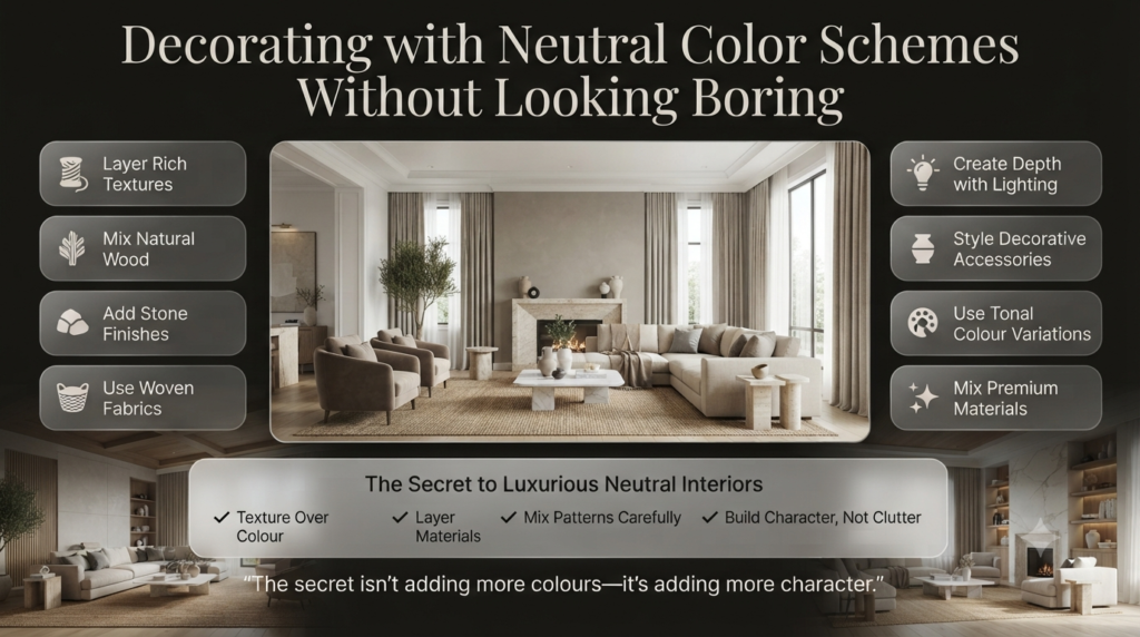
A neutral colour scheme stays interesting by layering different textures, materials, patterns, and subtle colour variations. Instead of relying on bold paint colours, designers create depth using fabrics, wood, stone, metals, lighting, and decorative accessories.
One of the biggest misconceptions about neutral interiors is that they’re dull. In reality, some of the world’s most luxurious homes, boutique hotels, and designer showrooms rely almost entirely on neutral palettes.
The secret isn’t adding more colours—it’s adding more character.
Layer Different Textures
Texture is what transforms a simple neutral room into a sophisticated living space.
Mix a variety of natural materials such as:
- Linen curtains
- Wool rugs
- Cotton cushions
- Leather chairs
- Timber furniture
- Marble tables
- Stone accessories
- Woven baskets
- Ceramic vases
Each material reflects light differently, giving the room richness without overwhelming the eye.
💡 Pro Tip: Aim for at least five different textures in every room. Even if the colours are similar, varied textures create depth and visual interest.
Introduce Contrast
Contrast prevents a neutral room from feeling flat.
Some timeless combinations include:
| Light Base | Dark Accent |
|---|---|
| Warm White | Matte Black |
| Cream | Walnut Wood |
| Greige | Charcoal |
| Beige | Dark Bronze |
| Ivory | Black Metal |
Dark accents help define architectural features and make lighter colours stand out.
Use Natural Materials
Nature-inspired materials complement neutral colour palettes beautifully.
Consider incorporating:
- Oak
- Walnut
- Marble
- Travertine
- Limestone
- Bamboo
- Rattan
- Jute
- Clay
- Concrete
These materials add warmth, texture, and authenticity to the space.
Add Greenery
Indoor plants introduce life into neutral interiors.
Popular choices include:
- Olive trees
- Snake plants
- Fiddle Leaf Fig
- Monstera
- Peace Lily
- ZZ Plant
- Rubber Plant
Green foliage naturally complements almost every neutral palette.
The Best Accent Colours for Neutral Color Schemes
Neutral colour schemes pair beautifully with accent colours such as navy blue, forest green, terracotta, mustard yellow, dusty rose, olive green, and black. These colours add personality without overpowering the calm foundation of neutral interiors.
Accent colours don’t need to dominate a room. Even small touches can create a striking effect.
Navy Blue
Adds elegance and sophistication.
Works beautifully with:
- White
- Greige
- Beige
- Light Grey
Forest Green
Creates a calming, nature-inspired atmosphere.
Perfect alongside:
- Cream
- Taupe
- Mushroom
- Stone
Terracotta
Introduces warmth and Mediterranean character.
Looks stunning with:
- Sand
- Ivory
- Warm White
- Beige
Mustard Yellow
Adds cheerful energy without overwhelming neutral spaces.
Best paired with:
- Soft Grey
- White
- Greige
Dusty Rose
Creates softness and warmth.
Ideal for bedrooms and living rooms.
Black
Black is technically a neutral and works exceptionally well for:
- Window frames
- Lighting fixtures
- Cabinet handles
- Picture frames
- Furniture legs
⭐ Expert Tip: Limit accent colours to one or two shades throughout a room. Too many contrasting colours can reduce the calming effect that makes neutral schemes so appealing.
Neutral Colour Scheme Checklist
Before painting, run through this quick checklist:
✔ Consider the room’s purpose.
✔ Assess natural and artificial lighting.
✔ Identify the undertones in your flooring.
✔ Match colours with existing furniture.
✔ Test large paint samples.
✔ Observe colours throughout the day.
✔ Layer different textures.
✔ Add subtle contrast.
✔ Keep the overall palette consistent throughout the home.
Following these simple steps helps you avoid costly mistakes and creates a home with lasting appeal.
Key Takeaways
- Neutral colour schemes never go out of style because they’re versatile, timeless, and adaptable.
- Warm neutrals create cosy interiors, while cool neutrals suit modern spaces.
- Natural light significantly affects how paint colours appear.
- Layering textures is essential for preventing neutral rooms from looking flat.
- Flooring, furniture, and lighting should always influence your paint choice.
- Testing paint samples in different lighting conditions is one of the most important steps.
- Neutral colours make future decorating and home updates much easier.
- A consistent palette creates better flow between rooms.
- Accent colours should enhance, not dominate, a neutral design.
For more decorating inspiration, explore the Interior Design Mode 24 Home Page, browse the Interior Design category, discover practical renovation ideas in Home Improvement, and find more expert guides in the Paint Color section.
What are the best neutral paint colors that don’t turn yellow or blue?
The best neutral paint colours that stay balanced without appearing overly yellow or blue are those with subtle, well-balanced undertones. Popular choices include greige, soft taupe, warm white, off-white, mushroom, and stone shades. These colours adapt well to different lighting conditions and create a timeless look.
Before committing to a paint colour, always test large sample swatches on multiple walls and observe them in natural morning light, afternoon sunlight, and evening artificial lighting. A paint that looks perfect in the shop can appear completely different once it’s on your walls.
If you’re looking for a versatile option, greige is often considered one of the safest neutral colours because it combines the warmth of beige with the sophistication of grey, making it less likely to shift dramatically towards yellow or blue.
💡 Pro Tip: Avoid selecting paint from tiny colour cards. Large sample boards provide a much more accurate representation of how a colour will look in your home.
How do you design a neutral room without making it look boring or flat?
A neutral room feels inviting when you focus on texture, contrast, and layering rather than relying solely on colour. Professional interior designers often combine multiple neutral shades with natural materials to create depth and visual interest.
To achieve a designer-inspired neutral interior:
Layer different shades of white, beige, taupe, or greige.
Mix natural textures like linen, wool, cotton, leather, timber, marble, and woven materials.
Add black or dark bronze accents for contrast.
Introduce greenery through indoor plants.
Include patterned rugs, cushions, or artwork in subtle tones.
Use a variety of lighting sources, including table lamps, wall lights, and pendant fixtures.
Rather than filling a room with bold colours, let materials and textures become the focal point. This creates a calm, sophisticated space that never feels plain.
⭐ Expert Tip: A well-designed neutral room usually contains at least four or five different textures. Even when the colours are similar, varied finishes make the space feel rich and dynamic.
Warm neutral vs. cool neutral: How do I choose the right one for my home?
The right choice depends on your home’s natural light, existing finishes, and the atmosphere you want to create.
Choose Warm Neutrals If You Want:
A cosy, welcoming atmosphere.
A room that feels comfortable year-round.
Colours that complement wooden furniture and traditional décor.
To brighten north-facing rooms with cooler natural light.
Common warm neutrals include:
Cream
Warm White
Beige
Taupe
Sand
Mushroom
Choose Cool Neutrals If You Want:
A clean, modern appearance.
A fresh and airy feel.
Colours that pair well with marble, stainless steel, and black accents.
To balance bright south-facing rooms with abundant sunlight.
Popular cool neutrals include:
Light Grey
Dove Grey
Cool White
Soft Stone
Ash Grey
Warm Neutrals
Cool Neutrals
Cosy and inviting
Fresh and contemporary
Yellow or brown undertones
Blue or green undertones
Best for living rooms and bedrooms
Ideal for kitchens and bathrooms
Complement traditional interiors
Suit modern and minimalist designs
📌 Quick Tip: If you’re unsure which direction to take, greige offers a balanced middle ground by combining warm and cool characteristics.
What is the modern replacement for the outdated 2010s grey trend?
While cool grey dominated interior design throughout the 2010s, today’s trends favour warmer, more natural neutral tones that create inviting and timeless interiors.
Modern alternatives include:
Greige
Mushroom
Soft Taupe
Warm White
Stone
Sand
Clay
Oatmeal
Putty
Soft Beige
These colours provide the same versatility as grey while adding warmth and character. They also pair beautifully with natural wood, textured fabrics, and organic materials, which are key features of contemporary interior design.
Many designers now prefer layered warm neutrals over monochromatic grey because they create spaces that feel brighter, softer, and more comfortable without sacrificing a clean, modern aesthetic.
⚠ Common Mistake: Replacing grey with overly yellow beige can make a room feel dated. Look for balanced neutrals with subtle undertones for a more refined result.
Can you use black as a neutral in a minimalist interior?
Yes. Black is widely regarded as a neutral and is an excellent choice for minimalist interiors when used thoughtfully. Rather than dominating the space, black provides contrast, structure, and visual definition against lighter neutral backgrounds.
Common ways to introduce black include:
Window frames
Door hardware
Kitchen cabinet handles
Light fixtures
Picture frames
Dining chairs
Coffee tables
Shelving
Decorative accessories
The key is balance. In a minimalist design, black should act as an accent rather than the primary colour. Pairing black with warm whites, greige, soft taupe, or natural timber creates a timeless, high-end aesthetic without making the room feel dark or overwhelming.
⭐ Expert Tip: Follow the “less is more” principle. A few carefully placed black elements can make a neutral room feel sophisticated and intentional while maintaining the calm simplicity that defines minimalist design.
Conclusion
Neutral color schemes remain one of the most reliable and timeless choices in interior design because they combine elegance, versatility, and practicality. Whether you prefer warm beiges, sophisticated greiges, soft whites, or earthy taupes, a carefully planned neutral palette creates a home that feels bright, balanced, and welcoming for years to come.
The key to success isn’t choosing the trendiest paint colour—it’s understanding undertones, evaluating natural light, coordinating with your flooring and furnishings, and layering textures to add depth and personality. Small details such as wood finishes, fabrics, lighting, greenery, and contrasting accents can transform a simple neutral room into a space that feels luxurious rather than plain.
As design trends continue to evolve, today’s interiors are moving away from cold, one-dimensional greys toward warmer, nature-inspired neutrals that offer comfort without sacrificing style. By selecting timeless shades and decorating thoughtfully, you’ll create rooms that are easy to update, appealing to future buyers, and enjoyable to live in every day.
If you’re planning your next decorating project, start by exploring more expert inspiration on the Interior Design Mode 24 Home Page. You can also discover practical ideas in the Paint Color, Interior Design, and Home Improvement sections to help you choose colours with confidence and create a home that stands the test of time.

Leave a Reply