
Introduction
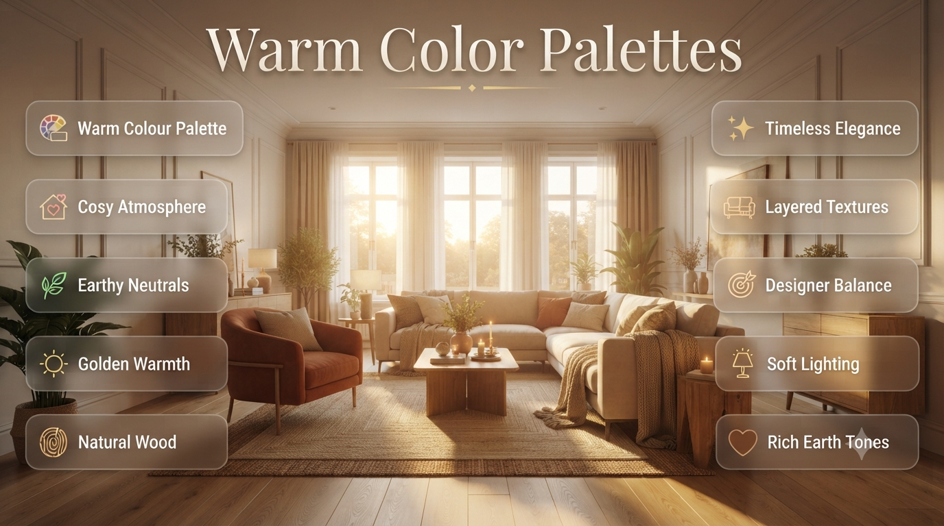
Have you ever walked into a room that instantly felt welcoming, cosy, and relaxing? Chances are, its design relied on a carefully chosen warm color palette rather than bright or overly cool shades. Warm colours have the unique ability to make spaces feel inviting, comfortable, and full of personality without overwhelming the senses.
Whether you’re redecorating your living room, choosing paint colours for a new home, or simply looking for inspiration, understanding how warm colour palettes work can completely transform your interior. The right combination of earthy neutrals, rich terracottas, creamy beiges, golden yellows, and soft browns can create spaces that feel luxurious while remaining timeless.
In this guide, you’ll learn what warm colour palettes are, why interior designers use them, how to choose the right shades for different rooms, and the professional techniques that make warm interiors feel elegant instead of outdated.
What Are Warm Color Palettes?
A warm color palette is a collection of colours that contain yellow, orange, red, or warm brown undertones. These colours create comfortable, inviting, and visually cosy interiors. Warm palettes are commonly used in homes because they add depth, improve atmosphere, and make spaces feel more welcoming throughout every season.
Warm colours are inspired by nature.
Think about:
- Golden sunsets
- Autumn leaves
- Desert landscapes
- Natural timber
- Clay pottery
- Soft candlelight
- Sandy beaches
These colours naturally create emotional comfort because people associate them with warmth, sunlight, and relaxation.
Unlike cool palettes that can feel crisp and modern, warm palettes tend to make rooms feel lived-in, comfortable, and welcoming.
Why Are Warm Color Palettes So Popular?
Interior designers continue to recommend warm palettes because they create homes people actually enjoy living in—not just looking at.
Several modern design trends have moved away from the cool grey interiors that dominated the 2010s. Today’s homeowners prefer spaces that feel softer, calmer, and more personal.
Warm colours help achieve exactly that.
Some of the biggest reasons include:
- They make large rooms feel more comfortable.
- They create a welcoming atmosphere for guests.
- They work beautifully with natural materials.
- They complement wood flooring and furniture.
- They photograph well in both daylight and evening lighting.
- They remain stylish despite changing design trends.
💡 Pro Tip: Warm interiors don’t have to be dark. Soft creams, warm whites, light taupes, and sandy beiges can make a room feel bright while still adding warmth.
Understanding Warm Colours
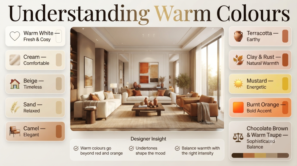
People often assume warm colours only mean red or orange.
In reality, professional designers work with a much wider range.
Primary Warm Colours
| Colour | Mood | Best Uses |
|---|---|---|
| Warm White | Fresh and cosy | Whole-house walls |
| Cream | Comfortable | Living rooms |
| Beige | Timeless | Any room |
| Sand | Relaxed | Bedrooms |
| Camel | Elegant | Furniture |
| Terracotta | Earthy | Accent walls |
| Clay | Natural | Dining rooms |
| Rust | Rich | Accessories |
| Mustard | Energetic | Feature décor |
| Burnt Orange | Bold | Statement pieces |
| Chocolate Brown | Sophisticated | Furniture |
| Warm Taupe | Balanced | Entire interiors |
Each colour offers warmth without necessarily making a room feel smaller.
The secret lies in choosing the right intensity and undertone.
What Makes a Colour Feel Warm?
Colours feel warm because they contain yellow, orange, or red undertones. Even neutral shades such as beige, greige, taupe, and white can appear warm if their underlying pigments lean towards cream, gold, or soft brown rather than blue or grey.
Many people focus only on the visible colour.
Professional designers focus on the undertone.
For example:
| Paint Colour | Undertone | Feels |
|---|---|---|
| White + Blue | Cool | Crisp |
| White + Yellow | Warm | Soft |
| Grey + Blue | Cool | Modern |
| Grey + Brown | Warm | Comfortable |
| Beige + Gold | Warm | Elegant |
| Cream + Yellow | Warm | Inviting |
Understanding undertones helps prevent costly decorating mistakes.
⚠ Common Mistake: Choosing paint under showroom lighting without checking how it looks in your own home. Natural light can dramatically change the appearance of warm colours.
The Psychology Behind Warm Color Palettes
Colour influences how we experience a room long before we notice the furniture or décor.
Warm colours create emotional responses because they’re linked to natural elements like sunlight, fire, earth, and wood.
Here’s how different warm shades affect mood:
Warm White
Creates a sense of cleanliness without feeling cold.
Ideal for:
- Family homes
- Open-plan living
- Hallways
- Kitchens
Beige
One of the most versatile interior colours.
It feels:
- Calm
- Stable
- Relaxing
- Timeless
Perfect for homeowners who want flexibility when changing furniture or accessories.
Terracotta
Terracotta introduces earthy richness without becoming overwhelming.
It works especially well in:
- Mediterranean homes
- Rustic interiors
- Modern organic designs
- Bohemian spaces
Soft Brown
Brown represents stability and comfort.
Natural wood finishes instantly make interiors feel warmer and more luxurious.
Mustard Yellow
Adds optimism and energy.
Best used in moderation through:
- Cushions
- Artwork
- Chairs
- Decorative accessories
Too much mustard can dominate a room, so balance it with softer neutrals.
⭐ Expert Tip: Designers often limit bold warm colours to around 10% of a room’s palette, allowing neutral tones to create balance while colourful accents provide personality.
Benefits of Using Warm Color Palettes
Choosing warm colours isn’t just about appearance.
They also improve how a room feels and functions.
1. Creates a Welcoming Atmosphere
Warm colours encourage relaxation.
That’s why hotels, cafés, and luxury homes frequently rely on warm palettes instead of stark white interiors.
2. Makes Large Rooms Feel Cosier
Large open spaces can sometimes feel empty.
Warm colours visually bring walls closer, making oversized rooms feel more intimate.
3. Pairs Beautifully with Natural Materials
Warm palettes complement:
- Oak flooring
- Walnut furniture
- Stone worktops
- Linen fabrics
- Leather sofas
- Woven baskets
- Rattan furniture
This combination creates depth without relying on bold colours.
4. Ages Gracefully
Unlike short-lived colour trends, warm neutrals remain fashionable for years.
This makes them an excellent investment for homeowners who don’t want to repaint frequently.
5. Works in Every Season
Many colour schemes only suit certain times of the year.
Warm palettes adapt beautifully.
During summer, they feel airy when paired with natural light.
During winter, they create comfort with layered textiles and warm lighting.
📌 Quick Tip: If you’re unsure where to begin, start with warm white walls and gradually introduce deeper warm tones through furniture, textiles, and accessories.
Warm Color Palettes vs Cool Color Palettes
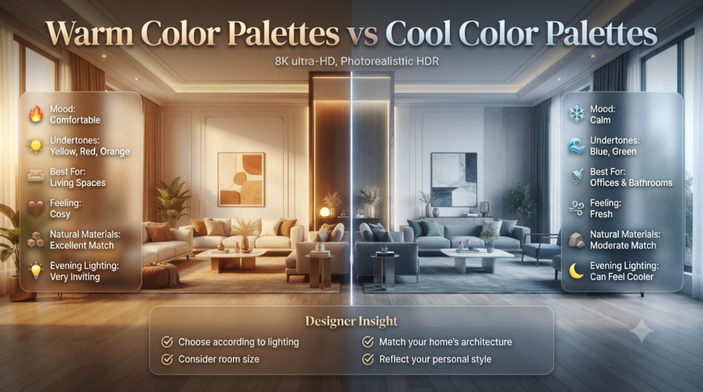
Warm colour palettes create cosy, welcoming interiors using shades with yellow, red, and orange undertones. Cool palettes rely on blue, green, and grey undertones to create fresh, calming spaces. The right choice depends on your home’s lighting, room size, and the atmosphere you want to achieve.
| Feature | Warm Palette | Cool Palette |
|---|---|---|
| Mood | Comfortable | Calm |
| Undertones | Yellow, Red, Orange | Blue, Green |
| Best For | Living spaces | Offices, bathrooms |
| Feeling | Cosy | Fresh |
| Natural Materials | Excellent match | Moderate match |
| Evening Lighting | Very inviting | Can feel cooler |
Neither palette is objectively better.
The best choice depends on your home’s architecture, lighting, and personal style.
How to Choose the Right Warm Color Palette
Selecting a warm palette involves more than picking a colour you like. The most successful interiors balance the room’s purpose, natural light, and existing finishes.
Step 1: Assess Natural Light
Notice how sunlight enters the room throughout the day.
- North-facing rooms often benefit from warmer creams, soft beiges, or light taupes to counter cooler daylight.
- South-facing rooms receive abundant sunlight and can handle richer warm shades like terracotta or clay.
- East-facing rooms feel bright in the morning and softer later, making sandy neutrals a versatile option.
- West-facing rooms gain warm afternoon light, which enhances earthy colours beautifully.
Step 2: Consider Existing Features
Before choosing paint, look at elements you won’t easily replace, such as:
- Flooring
- Kitchen cabinets
- Stone countertops
- Brick fireplaces
- Timber beams
- Large furniture pieces
Your wall colour should complement these features rather than compete with them.
Step 3: Build a Balanced Palette
A simple designer-approved formula is:
- 60% main wall colour
- 30% secondary colour (furniture, rugs, curtains)
- 10% accent colour (artwork, cushions, décor)
This creates harmony without making the room feel monotonous.
Warm Colour Palette Inspiration
Here are a few timeless combinations that work in a variety of homes:
| Style | Main Colour | Supporting Colours | Accent |
|---|---|---|---|
| Modern Organic | Warm White | Oak, Taupe | Olive Green |
| Rustic Retreat | Cream | Terracotta, Brown | Burnt Orange |
| Scandinavian Warm | Soft Beige | Light Wood | Black |
| Mediterranean | Sand | Clay, Stone | Deep Blue |
| Contemporary Classic | Greige | Walnut | Brass |
These palettes show that warm interiors don’t rely on one colour—they succeed through thoughtful layering.
Naturally Related Resources
As you plan your home makeover, these guides may also help:
These resources can provide additional ideas for coordinating colours, finishes, and overall home design.
Best Warm Color Palettes for Every Room in Your Home
Choosing the right warm colour palette isn’t just about selecting attractive paint. Every room has a different purpose, receives different natural light, and creates a different emotional experience. Professional designers adjust the warmth, depth, and balance of colours based on how the space is used.
Below are some of the most effective warm colour combinations for each area of the home.
Warm Color Palettes for Living Rooms
The best warm colour palettes for living rooms combine soft neutrals with earthy accent colours such as warm white, beige, taupe, terracotta, camel, and walnut. These combinations create comfortable, welcoming spaces that work well in both natural daylight and evening lighting.
The living room is usually the heart of the home, where family members relax and guests gather. Warm colours help create a comfortable atmosphere without making the room feel heavy.
Recommended Colour Palette
| Element | Colour |
|---|---|
| Walls | Warm White |
| Sofa | Beige |
| Rug | Cream |
| Wood | Natural Oak |
| Accent Chairs | Camel |
| Accessories | Terracotta |
This palette suits both modern and traditional interiors.
Works especially well with:
- Oak flooring
- Linen curtains
- Brass lighting
- Stone fireplaces
- Indoor plants
💡 Pro Tip: Layer different shades of beige instead of using a single colour throughout the room. This creates depth without adding visual clutter.
Warm Color Palettes for Bedrooms
Bedrooms should encourage rest while still feeling inviting.
Soft warm colours create a calming environment that promotes relaxation better than bright or highly saturated colours.
Recommended Bedroom Colours
- Soft Cream
- Warm White
- Light Taupe
- Sand Beige
- Dusty Clay
- Muted Terracotta
Avoid overly bright reds or oranges on large walls, as they may feel too stimulating.
Designer Colour Combination
| Walls | Bedding | Furniture | Accent |
|---|---|---|---|
| Cream | White Linen | Oak | Rust Cushions |
This palette creates a boutique hotel feel that’s timeless and easy to update.
⭐ Expert Tip: Bedrooms feel more luxurious when the colour palette extends beyond the walls. Match bedding, curtains, and cushions to create a cohesive look.
Warm Color Palettes for Kitchens
Modern kitchens have moved beyond all-white designs.
Warm neutrals help kitchens feel cleaner, brighter, and more welcoming without sacrificing a contemporary appearance.
Popular Kitchen Colours
- Warm White
- Mushroom Beige
- Soft Greige
- Cream
- Clay
- Sage Green paired with warm wood
These colours work particularly well with:
- Timber cabinets
- Quartz worktops
- Brass hardware
- Open shelving
- Natural stone splashbacks
Kitchen Palette Example
| Surface | Colour |
|---|---|
| Cabinets | Warm White |
| Island | Walnut |
| Walls | Soft Beige |
| Splashback | Travertine |
| Hardware | Brushed Brass |
The result is elegant without feeling cold.
Warm Color Palettes for Dining Rooms
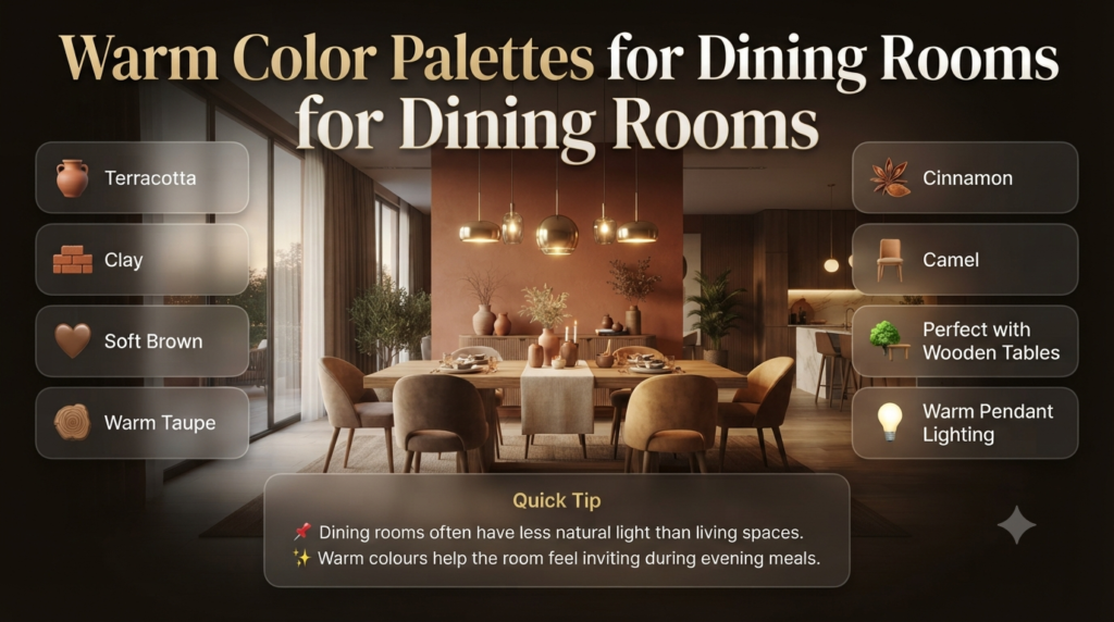
Dining rooms benefit from colours that encourage conversation and comfort.
Earthy shades help create an intimate atmosphere.
Popular choices include:
- Terracotta
- Clay
- Soft Brown
- Warm Taupe
- Cinnamon
- Camel
These colours pair beautifully with wooden dining tables and warm pendant lighting.
📌 Quick Tip: Dining rooms often have less natural light than living spaces. Warm colours prevent them from feeling dull during evening meals.
Warm Color Palettes for Bathrooms
Many homeowners assume bathrooms should only be white.
However, warm neutrals often create a spa-like atmosphere.
Excellent choices include:
- Cream
- Sand
- Light Beige
- Warm Grey
- Travertine
- Natural Stone
Pair these colours with:
- Timber vanities
- Brushed brass taps
- Soft white towels
- Warm LED lighting
The result feels luxurious while remaining practical.
Warm Color Palettes for Home Offices
A productive workspace doesn’t need to feel sterile.
Warm neutral backgrounds improve comfort during long working hours.
Recommended colours include:
- Mushroom
- Light Taupe
- Warm White
- Camel
- Soft Brown
Avoid using too many bold warm colours in offices, as they can become visually distracting.
The Most Popular Warm Colour Combinations
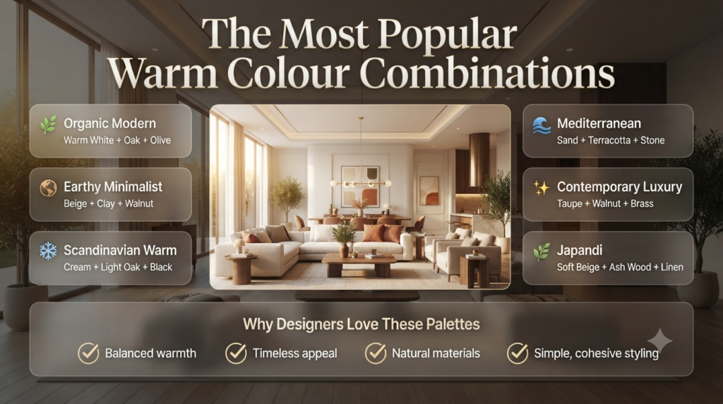
Instead of choosing colours individually, designers build palettes.
Here are combinations that consistently work well.
| Palette | Colours |
|---|---|
| Organic Modern | Warm White + Oak + Olive |
| Earthy Minimalist | Beige + Clay + Walnut |
| Scandinavian Warm | Cream + Light Oak + Black |
| Mediterranean | Sand + Terracotta + Stone |
| Contemporary Luxury | Taupe + Walnut + Brass |
| Japandi | Soft Beige + Ash Wood + Linen |
These combinations have remained popular because they balance warmth with simplicity.
How Professionals Layer Warm Colours
Professional designers create warm interiors by layering multiple shades, textures, and natural materials rather than relying on one dominant colour. Combining warm paint, wood, fabrics, stone, metals, and lighting creates depth, making rooms feel sophisticated instead of flat.
Many people mistakenly paint every wall beige and assume the room will automatically feel warm.
Professionals know that warmth comes from layering.
Think about combining:
Paint
Warm white walls
↓
Flooring
Natural oak
↓
Furniture
Camel leather
↓
Textiles
Cream linen
↓
Accessories
Terracotta ceramics
↓
Lighting
Warm white LED bulbs
Walls
   ↓
Flooring
   ↓
Furniture
   ↓
Textiles
   ↓
Accessories
   ↓
Lighting
Every layer contributes to the overall atmosphere.
Choosing Furniture That Complements Warm Colours
Furniture should reinforce your chosen palette rather than compete with it.
Excellent Matches
| Furniture Finish | Works With |
|---|---|
| Oak | Cream walls |
| Walnut | Beige |
| Teak | Terracotta |
| Rattan | Sand |
| Leather | Camel |
| Linen | Warm White |
Natural materials make warm palettes feel authentic.
Highly glossy synthetic finishes can sometimes reduce that cosy effect.
Flooring Choices That Enhance Warm Interiors
Flooring has a significant impact on how colours appear.
Best Flooring Options
- Oak hardwood
- Walnut timber
- Natural stone
- Travertine
- Limestone
- Warm-toned engineered wood
- Textured neutral carpets
If replacing flooring isn’t practical, choose rugs with warm undertones to soften cooler surfaces.
Lighting Makes Warm Colours Look Better
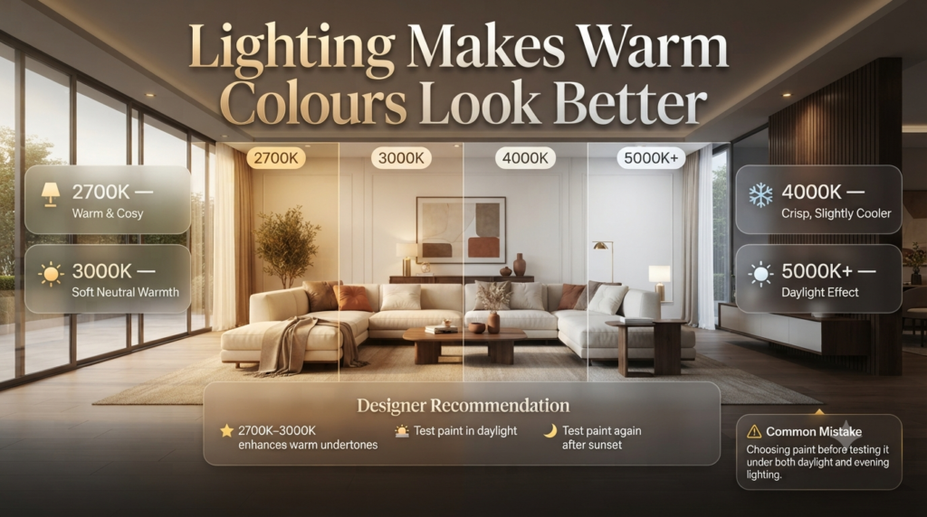
Lighting is often overlooked, yet it dramatically affects paint colour.
Warm colours appear richer under the right lighting.
Best Lighting Temperature
| Lighting | Result |
|---|---|
| 2700K | Warm and cosy |
| 3000K | Soft neutral warmth |
| 4000K | Crisp, slightly cooler |
| 5000K+ | Daylight effect |
For living spaces, many designers favour lighting in the 2700K–3000K range because it enhances warm undertones without making colours appear overly yellow.
⚠ Common Mistake: Choosing paint before testing it under both daylight and evening lighting. A colour that looks perfect in the afternoon can appear completely different after sunset.
Step-by-Step: Create Your Own Warm Color Palette
Step 1 – Identify the Mood
Ask yourself:
- Cosy?
- Luxurious?
- Rustic?
- Modern?
- Minimalist?
Your desired mood should guide every colour choice.
Step 2 – Choose a Main Neutral
Examples include:
- Warm White
- Cream
- Beige
- Taupe
- Greige
This becomes the foundation of your palette.
Step 3 – Add Natural Materials
Introduce warmth through:
- Timber
- Stone
- Linen
- Wool
- Leather
- Woven baskets
These materials add texture and prevent the space from feeling flat.
Step 4 – Select Accent Colours
Good options include:
- Terracotta
- Rust
- Olive Green
- Burnt Orange
- Mustard
- Chocolate Brown
Keep accent colours limited so they enhance rather than dominate the room.
Step 5 – Balance the Palette
Aim for a balanced distribution:
- 60% Main neutral
- 30% Secondary colour
- 10% Accent colour
This classic design principle helps create a harmonious interior.
Common Mistakes When Decorating with Warm Color Palettes
Even well-chosen colours can disappoint if they’re used incorrectly.
Mistake 1: Everything Matches Exactly
Using identical shades everywhere creates a flat, uninspiring room.
Better approach: Mix lighter and darker variations within the same colour family.
Mistake 2: Ignoring Undertones
Warm beige paired with cool grey often clashes.
Always compare paint samples with your flooring, furniture, and fabrics before making a final decision.
Mistake 3: Too Much Orange
Orange can add energy, but overusing it may overwhelm a room.
Instead, introduce it through smaller accents such as cushions, artwork, or ceramics.
Mistake 4: Forgetting Texture
Warm interiors rely on more than colour.
Without texture, even beautiful paint colours can feel one-dimensional.
Include:
- Woven fabrics
- Timber grain
- Stone
- Linen
- Wool
- Ceramic accessories
Mistake 5: Choosing Paint Before Furniture
Professional designers usually work in the opposite order.
Furniture, flooring, and permanent finishes often dictate the most suitable wall colours.
Expert Advice for Creating Timeless Warm Interiors
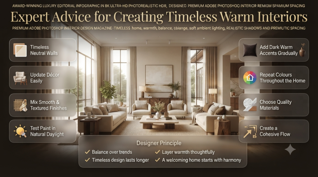
Design trends come and go, but warm interiors remain successful when they’re built around balance rather than fashion.
Professionals often recommend:
- Invest in timeless neutral wall colours.
- Add personality through décor that can be updated easily.
- Mix smooth and textured finishes for visual interest.
- Use natural daylight as your guide when testing paint.
- Introduce darker warm tones gradually through accessories.
- Repeat key colours throughout the home to create a cohesive flow.
- Choose quality materials over excessive decoration.
A thoughtfully layered warm palette doesn’t just look beautiful—it creates a home that feels welcoming every day.
Warm Color Palettes for Different Interior Design Styles
Warm colours are incredibly versatile. By adjusting the balance of tones, textures, and materials, you can create everything from a rustic farmhouse to a sleek contemporary home.
Modern Minimalist
A minimalist home doesn’t have to feel cold. Warm neutrals soften clean lines while maintaining a clutter-free look.
Recommended palette:
- Warm White
- Soft Beige
- Greige
- Natural Oak
- Light Taupe
Pair these colours with simple furniture, hidden storage, and textured fabrics for a calm, sophisticated interior.
Scandinavian Style
Modern Scandinavian interiors have evolved from cool grey spaces to warmer, more inviting environments.
Best colours include:
- Cream
- Sand
- Warm White
- Pale Oak
- Soft Brown
Layer knitted throws, linen curtains, and natural wood furniture to add depth.
Mediterranean Style
Mediterranean homes celebrate earthy, sun-inspired colours.
Ideal palette:
- Terracotta
- Clay
- Warm White
- Travertine
- Olive Green
- Deep Blue accents
Natural stone, exposed timber, and handcrafted ceramics complete the look.
Rustic Farmhouse
Rustic interiors rely heavily on warm, earthy colours.
Common choices include:
- Camel
- Walnut
- Chocolate Brown
- Cream
- Burnt Orange
- Natural Stone
This style embraces imperfections, making reclaimed wood and vintage furniture perfect companions.
Japandi Style
Japandi blends Japanese simplicity with Scandinavian comfort.
Popular colours include:
- Soft Beige
- Mushroom
- Warm White
- Light Oak
- Linen
The result is peaceful, uncluttered, and timeless.
Contemporary Luxury
Luxury interiors often avoid bright colours in favour of sophisticated warm neutrals.
Recommended palette:
| Walls | Furniture | Metal | Accent |
|---|---|---|---|
| Warm Taupe | Walnut | Brass | Black |
This combination creates elegance without feeling overly formal.
⭐ Expert Tip: The most luxurious interiors rarely rely on expensive colours—they rely on balanced proportions, premium materials, and thoughtful lighting.
Warm Colour Trends That Are Replacing Cool Grey Interiors
Over the past few years, homeowners have increasingly moved away from the all-grey interiors that once dominated magazines and social media.
Today’s trends focus on creating homes that feel comfortable, natural, and lived in.
Some of the most popular warm colour trends include:
- Warm whites replacing stark white walls
- Greige with brown undertones instead of blue-grey
- Earthy terracotta accents
- Mushroom and taupe neutrals
- Limewash-inspired finishes
- Natural oak and walnut furniture
- Textured plaster walls
- Linen and boucle fabrics
- Brass and bronze hardware
- Handmade ceramic décor
These trends emphasise longevity rather than short-lived fashion, making them excellent choices for homeowners who want timeless interiors.
What warm colors actually make a room look expensive instead of dated or cheap?
Warm colours look luxurious when they’re soft, muted, and inspired by natural materials rather than overly saturated or yellow. High-end interiors rarely rely on bright oranges or golden yellows. Instead, designers choose understated shades that create depth and elegance.
The warm colours that make a room look expensive include warm white, creamy ivory, greige, taupe, mushroom, camel, soft terracotta, clay, and rich walnut brown. These sophisticated shades pair beautifully with natural wood, stone, linen, and brushed brass, creating a timeless interior instead of one that feels outdated.
Luxury Warm Colours Designers Love
Colour
Why It Looks Expensive
Best Paired With
Warm White
Clean yet inviting
Oak, linen, black accents
Ivory
Soft and elegant
Marble, brass, walnut
Greige
Modern and timeless
Black fixtures, wood flooring
Taupe
Rich depth
Cream textiles, bronze
Mushroom
Contemporary neutral
Travertine, oak
Camel
Warm sophistication
Leather, walnut furniture
Soft Terracotta
Earthy luxury
Limestone, olive green
Clay
Natural warmth
Woven textures, timber
Chocolate Brown
Dramatic elegance
Cream upholstery, brass
What Makes Warm Colours Look Premium?
Luxury interiors focus on undertones, not brightness. Soft earthy colours create a refined atmosphere because they reflect natural materials found in high-end homes.
For example:
Warm white walls
Natural oak flooring
Linen curtains
Walnut furniture
Travertine stone
Brushed brass lighting
Together, these elements create warmth without appearing heavy.
⚠ Common Mistake: Choosing bright yellow walls or vivid orange accents can make a room feel dated. Instead, opt for muted earthy tones that age gracefully.
⭐ Expert Tip: If you’re unsure whether a warm colour feels luxurious, compare it to natural materials like stone, sand, or timber. The closer it resembles nature, the more timeless it tends to look.
How do you layer warm color palettes without making a small room feel cramped?
Layering warm colours successfully is about introducing variety through texture and tone rather than filling the room with dark colours. Light warm neutrals create depth while preserving an open, airy feel.
To layer warm colour palettes in a small room, use light warm neutrals as the foundation, add medium warm wood tones, incorporate textured fabrics, and limit darker accents to small decorative pieces. Keeping the walls light while introducing warmth through furniture and accessories prevents the space from feeling cramped.
A Simple Layering Formula
Instead of using one colour everywhere, build the room in layers:
Light Warm Walls ↓ Natural Wood Furniture ↓ Neutral Upholstery ↓ Textured Rugs & Curtains ↓ Warm Decorative Accents
Example for a Small Living Room
Element
Colour
Walls
Warm White
Sofa
Light Beige
Rug
Cream
Coffee Table
Oak
Cushions
Terracotta & Camel
Curtains
Natural Linen
This combination keeps the room bright while adding warmth and visual interest.
Tips to Make Small Rooms Feel Larger
Choose warm whites instead of stark white.
Stick to one main colour family.
Use mirrors to reflect natural light.
Introduce texture instead of extra colours.
Select furniture with visible legs to create a sense of openness.
Keep ceilings lighter than walls.
💡 Pro Tip: Limit dark warm colours such as chocolate brown or deep rust to around 10% of the room. This adds contrast without overwhelming the space.
What is the “Quiet Luxury” approach to warm tones, and how do I replicate it?
Quiet Luxury is a design philosophy that values timeless quality, subtle elegance, and premium materials over bold colours or trendy décor. Warm tones play a central role because they create calm, inviting spaces that never feel flashy.
The Quiet Luxury approach uses soft warm neutrals, natural materials, and understated finishes to create elegant interiors. Instead of bold colours or excessive decoration, it focuses on warm whites, taupes, oak, linen, stone, and carefully chosen textures that communicate sophistication through simplicity.
Key Characteristics of Quiet Luxury
Warm white walls
Cream and taupe textiles
Natural oak or walnut furniture
Travertine or limestone surfaces
Linen curtains
Wool rugs
Brushed brass or bronze details
Handmade ceramics
Soft ambient lighting
Quiet Luxury Colour Palette
Base
Secondary
Accent
Warm White
Taupe
Walnut
Cream
Mushroom
Olive Green
Soft Beige
Camel
Bronze
How to Achieve the Look
Start with a warm neutral wall colour.
Invest in quality materials rather than excessive décor.
Layer textures like linen, wool, timber, and stone.
Keep accessories simple and meaningful.
Use warm lighting (2700K–3000K) to enhance the palette.
⭐ Expert Tip: Quiet Luxury is less about buying expensive items and more about creating harmony. A few well-made pieces often have a greater impact than a room filled with trendy decorations.
How do I balance warm paint colors with existing cool elements like gray flooring or marble?
Many homes already include cool materials such as grey flooring, white marble, or stainless-steel appliances. Rather than replacing them, designers soften these features with warm colours and natural textures.
Balance warm paint colours with cool flooring or marble by choosing soft warm neutrals that bridge both tones. Add warmth through wood furniture, textiles, rugs, and lighting while allowing cool surfaces to provide contrast. This creates a balanced, cohesive interior rather than a colour clash.
Pairing Warm Paint with Cool Finishes
Existing Feature
Warm Colour Recommendation
Cool Grey Flooring
Warm Greige
White Marble
Cream
Grey Tiles
Soft Beige
Stainless Steel
Warm White
Black Fixtures
Camel & Oak
Practical Ways to Add Warmth
Place an oak coffee table on grey flooring.
Use a textured cream rug.
Add linen curtains.
Choose walnut furniture.
Introduce brass lighting fixtures.
Decorate with woven baskets and ceramic accessories.
These additions soften cool architectural elements without requiring major renovations.
⚠ Common Mistake: Painting walls bright yellow to “warm up” grey floors often creates an awkward contrast. Soft earthy neutrals achieve a much more refined result.
What accent colors should be paired with warm neutrals to elevate the space?
Accent colours add personality while allowing warm neutrals to remain the foundation of the design. The most successful combinations are inspired by nature and used in moderation.
The best accent colours for warm neutrals include olive green, sage green, deep navy, charcoal, terracotta, rust, chocolate brown, muted black, and brushed brass. These shades provide contrast and sophistication while maintaining the warmth and elegance of the overall palette.
Best Accent Colours
Accent Colour
Works Well With
Style
Olive Green
Cream & Taupe
Organic Modern
Sage Green
Warm White
Scandinavian
Deep Navy
Beige
Contemporary
Terracotta
Warm White
Mediterranean
Rust
Camel
Rustic
Chocolate Brown
Ivory
Classic
Charcoal
Greige
Modern
Matte Black
Cream
Minimalist
Brass
Any Warm Neutral
Luxury
The 60–30–10 Rule
To keep the room balanced:
60% – Main warm neutral (walls)
30% – Secondary colour (furniture and textiles)
10% – Accent colour (artwork, cushions, décor)
This approach ensures accent colours enhance the room without dominating it.
📌 Quick Tip: Repeat your chosen accent colour in at least three places—for example, a cushion, a vase, and artwork. This creates visual harmony and makes the design feel intentional rather than random.
Conclusion
A well-designed warm color palette has the power to transform any home into a space that feels comfortable, elegant, and timeless. Rather than relying on bold or trendy colours, the most successful interiors use warm neutrals, earthy tones, natural materials, and layered textures to create depth and character.
The secret is balance. Choose warm colours with subtle undertones, test them in your home’s natural and artificial lighting, and build your palette around existing features such as flooring, furniture, and architectural details. By incorporating quality materials, thoughtful lighting, and carefully selected accent colours, you can achieve a look that feels sophisticated rather than dated.
Whether you’re embracing the understated elegance of Quiet Luxury, refreshing a single room, or redesigning your entire home, warm colour palettes offer endless flexibility. From soft warm whites and creamy beiges to rich taupes, terracottas, and walnut browns, these colours create interiors that remain stylish through changing trends.
Remember that great interior design isn’t about filling a room with colour—it’s about creating harmony. Start with a timeless warm neutral foundation, layer textures and natural finishes, introduce accents with purpose, and let each element work together. The result is a home that not only looks beautiful but also feels welcoming, refined, and effortlessly luxurious for years to come.

Leave a Reply