
Interior paint colors have the power to completely transform a home. The right shade can make a small room feel larger, create a cosy atmosphere, improve natural light, and even influence your mood. Yet with thousands of paint colours available, choosing the perfect one often feels overwhelming.
Whether you’re decorating a new home, refreshing a single room, or planning a complete renovation, understanding how colours work together is the key to creating spaces you’ll enjoy for years. In this guide, you’ll learn how to choose interior paint colors with confidence, understand colour psychology, avoid common mistakes, and discover professional design tips that make every room look its best.
If you’re planning a full home makeover, exploring different Interior Design ideas before selecting paint colours can help create a more cohesive design throughout your home.
Why Interior Paint Colors Matter
Interior paint colors influence how a room looks, feels, and functions. The right colours affect brightness, mood, perceived space, and the overall style of your home. Choosing colours based on lighting, room purpose, and existing décor creates a balanced and inviting interior.
Many homeowners think paint is simply a decorative finish, but professional interior designers see it as one of the most important design decisions.
Paint colours affect:
- Mood
- Comfort
- Visual space
- Natural lighting
- Property appeal
- Furniture coordination
- Overall design harmony
A poorly chosen colour can make an expensive room feel uncomfortable, while the right colour can elevate even a modest space.
How Colours Influence Mood
Every colour creates a different emotional response.
Although personal preference always matters, colour psychology has been studied extensively in interior design.
| Colour | Creates This Feeling | Best Rooms |
|---|---|---|
| White | Clean, fresh, spacious | Any room |
| Beige | Warm, relaxing | Living rooms |
| Grey | Modern and sophisticated | Bedrooms, offices |
| Blue | Calm and peaceful | Bedrooms |
| Green | Balanced and refreshing | Living rooms, studies |
| Yellow | Cheerful and energetic | Kitchens |
| Navy | Elegant and luxurious | Dining rooms |
| Black | Dramatic and modern | Accent walls |
💡 Pro Tip: Instead of asking, “What colour do I like?”, ask, “How do I want this room to feel?” The answer often leads you to the right colour family.
Factors to Consider Before Choosing Interior Paint Colors
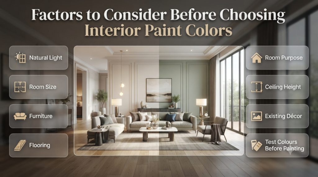
Before choosing interior paint colors, consider the room’s natural light, size, purpose, furniture, flooring, ceiling height, and existing décor. These factors influence how colours appear and whether they’ll create the atmosphere you want.
Many paint disappointments happen because homeowners fall in love with a colour online or in a showroom without considering how it will look in their own home.
Let’s look at the most important factors.
1. Natural Light Changes Everything
Natural light is one of the biggest influences on paint colour.
The exact same paint can appear completely different depending on:
- Window direction
- Time of day
- Season
- Cloud cover
- Room size
North-Facing Rooms
These rooms receive cooler light.
Colours often appear:
- Slightly darker
- More blue
- Less vibrant
Warm whites, greige, cream, soft beige, and warm taupe usually perform better.
South-Facing Rooms
South-facing spaces receive abundant warm sunlight.
Most colours appear:
- Brighter
- Warmer
- Richer
These rooms offer the greatest flexibility because both warm and cool colours work beautifully.
East-Facing Rooms
Morning sunlight is bright and warm.
Afternoons become cooler.
Soft greens, warm neutrals, pale blues, and muted earth tones often perform well throughout the day.
West-Facing Rooms
Morning light feels cooler.
Evening sunlight becomes warm and golden.
Many warm colours become especially rich during sunset hours.
📌 Quick Tip: Always test paint samples at different times of the day before making a final decision.
2. Room Size Matters
Colour affects how large or small a room feels.
Here’s a simple guide.
| Room Size | Recommended Colours |
|---|---|
| Small | White, cream, soft grey |
| Medium | Most neutral colours |
| Large | Dark colours, bold shades, feature colours |
Light colours reflect more light, making spaces feel larger.
Dark colours absorb light, making rooms feel more intimate and cosy.
Contrary to popular belief, dark colours don’t always make rooms feel smaller. In large rooms with plenty of natural light, they can create a luxurious, comfortable atmosphere.
3. Consider Ceiling Height
Ceiling colour often gets overlooked.
Yet it has a major impact on visual proportions.
Low Ceilings
Use:
- Bright white
- Soft off-white
- Very pale neutrals
These reflect light upward and create the illusion of height.
High Ceilings
You have more flexibility.
Slightly darker ceiling colours can make oversized rooms feel more balanced and welcoming.
4. Existing Furniture Should Guide Your Colour Choice
One of the most common decorating mistakes is choosing paint first and trying to match furniture later.
Professional designers often do the opposite.
Consider:
- Sofa colour
- Curtains
- Rugs
- Flooring
- Cabinets
- Artwork
- Wood finishes
- Decorative accessories
The goal isn’t to make everything match perfectly but to create harmony.
If your room already contains bold furniture, neutral wall colours often provide the ideal backdrop.
For more inspiration on creating a balanced home, browse the latest Home Improvement ideas alongside your paint planning.
Understanding Warm vs Cool Interior Paint Colors
Warm paint colours contain yellow, orange, or red undertones and create cosy, inviting interiors. Cool paint colours have blue, green, or purple undertones and produce calm, refreshing, and modern spaces. Choosing between them depends on lighting, room purpose, and personal style.
This is one of the most important concepts in interior design.
Warm Paint Colors
Warm colours include:
- Cream
- Beige
- Warm white
- Terracotta
- Sand
- Taupe
- Soft peach
- Warm greige
These colours make rooms feel:
- Comfortable
- Welcoming
- Cosy
- Relaxing
They’re particularly popular in:
- Living rooms
- Dining rooms
- Family rooms
Cool Paint Colors
Cool colours include:
- Blue-grey
- Sage green
- Dusty blue
- Charcoal
- Soft navy
- Mint
- Cool white
These create interiors that feel:
- Fresh
- Airy
- Peaceful
- Contemporary
Cool palettes work especially well in:
- Bedrooms
- Bathrooms
- Home offices
⭐ Expert Tip: Look beyond the main colour and pay attention to its undertone. Two paints labelled “white” can look completely different because one has warm yellow undertones while another has cool blue undertones.
Popular Interior Paint Color Families
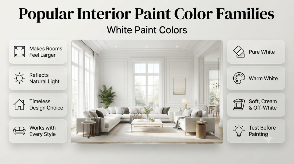
Instead of focusing on individual paint names, it helps to understand the main colour families. This makes it much easier to narrow down your choices.
White Paint Colors
White remains one of the most popular interior paint colours because it’s timeless and versatile.
Benefits include:
- Makes rooms appear larger
- Reflects natural light
- Works with every design style
- Easy to update with accessories
- Creates a clean, fresh appearance
However, not all whites are the same.
Popular categories include:
- Pure white
- Warm white
- Soft white
- Cream white
- Off-white
- Antique white
Choosing the right white depends on your home’s lighting and existing finishes.
⚠ Common Mistake: Selecting a bright white without testing it first. In some rooms, it can appear harsh or even slightly blue under certain lighting conditions.
Grey Paint Colors
Grey has become a favourite choice for modern interiors because it pairs well with wood, metal, stone, and almost any accent colour.
Depending on its undertones, grey can feel:
- Warm
- Cool
- Elegant
- Contemporary
- Minimalist
- Cosy
Warm greys often suit traditional homes, while cool greys complement modern and industrial interiors.
Beige and Greige Paint Colors
Beige has made a strong comeback, especially in homes that favour warmth over stark minimalism.
Greige—a blend of grey and beige—offers the best of both worlds.
Why homeowners love greige:
- Extremely versatile
- Easy to coordinate with furniture
- Suitable for open-plan layouts
- Works with both warm and cool décor
- Timeless rather than trendy
If you’re exploring more colour inspiration and room-by-room guidance, you’ll also find helpful resources in the Paint Color section.
Popular Interior Paint Color Families (Continued)
Blue Paint Colors
Blue is one of the most versatile interior paint colors because it suits almost every design style. It creates a peaceful environment and pairs beautifully with wood, white trim, natural stone, and metallic finishes.
Different shades of blue create different moods.
| Shade | Best For | Feeling Created |
|---|---|---|
| Sky Blue | Bedrooms | Calm and airy |
| Powder Blue | Nurseries | Soft and relaxing |
| Slate Blue | Living Rooms | Sophisticated |
| Navy Blue | Dining Rooms | Luxurious |
| Blue-Grey | Offices | Focused and modern |
Blue works especially well in rooms where relaxation is the priority.
Green Paint Colors
Green continues to grow in popularity because it brings a natural, organic feel indoors.
From soft sage to rich forest green, it complements many interior styles, including:
- Scandinavian
- Modern farmhouse
- Contemporary
- Traditional
- Rustic
- Minimalist
Popular green shades include:
- Sage Green
- Olive Green
- Moss Green
- Eucalyptus
- Forest Green
- Emerald
Green also pairs beautifully with natural wood furniture and indoor plants.
💡 Pro Tip: If you’re decorating with lots of natural materials like oak, walnut, linen, or stone, green walls often create a timeless look.
Earth Tone Paint Colors
Earth-inspired colours have become increasingly popular because they make homes feel warm and welcoming.
Examples include:
- Clay
- Sand
- Terracotta
- Camel
- Chocolate Brown
- Warm Taupe
- Rust
- Soft Caramel
These colours work particularly well in:
- Living rooms
- Dining areas
- Entryways
- Reading corners
Earth tones also blend beautifully with textured décor such as woven baskets, wooden furniture, and natural fabrics.
Best Interior Paint Colors for Every Room
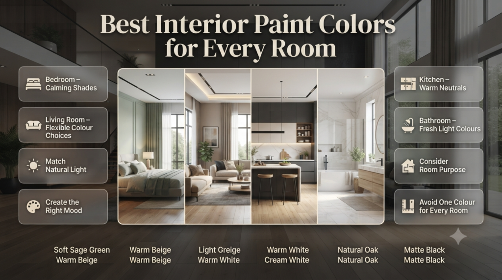
The best interior paint colors vary by room. Bedrooms benefit from calming shades, kitchens often suit warm neutrals, bathrooms look fresh with light colours, while living rooms offer flexibility depending on your home’s style and lighting.
Rather than choosing one colour for the whole house, think about how each room is used.
Living Room Paint Colors
The living room is often the heart of the home.
It should feel inviting while remaining practical for everyday living.
Popular choices include:
- Warm white
- Soft greige
- Sage green
- Light beige
- Dusty blue
- Warm grey
- Cream
If your living room receives plenty of sunlight, darker colours such as charcoal or navy can also work beautifully.
For additional inspiration, explore Interior Design ideas to see how furniture, lighting, and décor work together with wall colours.
Bedroom Paint Colors
Bedrooms should encourage relaxation.
Soft, muted colours usually perform best.
Recommended colours include:
- Pale blue
- Sage green
- Lavender grey
- Warm greige
- Soft cream
- Misty grey
Avoid extremely bright colours if your goal is restful sleep.
Kitchen Paint Colors
Modern kitchens often feature light, clean colours.
Popular options include:
- Warm white
- Light grey
- Soft green
- Cream
- Beige
- Pale blue
These shades help kitchens feel brighter while complementing cabinets and countertops.
Bathroom Paint Colors
Bathrooms benefit from colours that create a fresh, clean appearance.
Popular choices include:
- White
- Soft aqua
- Pale grey
- Light blue
- Soft green
- Cream
Smaller bathrooms often appear larger with lighter shades.
Dining Room Paint Colors
Dining rooms provide an opportunity to be more adventurous.
Many homeowners choose richer colours such as:
- Navy
- Olive Green
- Charcoal
- Deep Beige
- Warm Taupe
- Dark Greige
These colours create an intimate atmosphere perfect for entertaining.
Home Office Paint Colors
The right colour can improve focus and productivity.
Professional designers often recommend:
- Blue-grey
- Sage Green
- Warm White
- Light Taupe
- Muted Green
Avoid colours that feel overly stimulating, such as bright red or neon shades.
How to Choose Interior Paint Colors Step by Step
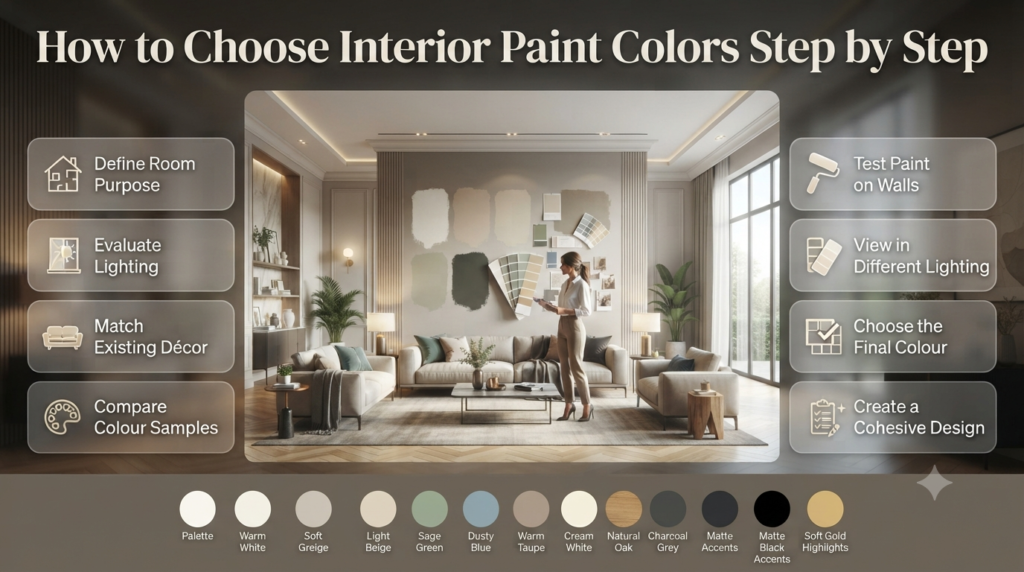
Choosing interior paint colors is easier when you follow a structured process. Start by understanding the room’s purpose, evaluate lighting, coordinate with existing décor, test samples, and only then commit to your final colour choice.
Step 1 – Define the Room’s Purpose
Ask yourself:
- Is this room for relaxing?
- Entertaining guests?
- Working?
- Sleeping?
- Family activities?
The purpose should influence the mood your colours create.
Step 2 – Study the Lighting
Observe your room:
Morning
Afternoon
Evening
Artificial lighting
Notice how shadows change throughout the day.
Why it matters:
Paint can look dramatically different depending on the lighting conditions.
Professional Advice:
View paint samples on multiple walls rather than relying on a single spot.
Common Mistake:
Choosing paint under showroom lighting without testing it at home.
Quick Example:
A cool grey selected in a brightly lit shop may appear dull in a north-facing bedroom.
Step 3 – Consider Existing Décor
Your walls should complement—not compete with—your furniture.
Look at:
- Flooring
- Rugs
- Curtains
- Artwork
- Cabinets
- Upholstery
- Decorative accessories
This creates a more cohesive design.
Step 4 – Test Large Paint Samples
Never rely on tiny colour swatches.
Instead:
- Paint sample boards.
- Test multiple walls.
- Observe them for several days.
- Compare during different lighting conditions.
⭐ Expert Tip: Many professionals paint removable poster boards instead of the wall. This allows you to move the sample around the room throughout the day.
Step 5 – Finalise the Entire Colour Palette
Think beyond wall colour.
Include:
- Trim colour
- Ceiling colour
- Door colour
- Cabinet colour
- Accent colours
A complete palette always feels more intentional.
Interior Paint Finishes Explained
Paint finish affects durability, appearance, and maintenance. Flat finishes hide imperfections, eggshell offers a soft sheen, satin is durable for busy spaces, while semi-gloss and gloss provide excellent moisture resistance and easy cleaning.
Choosing the right finish is almost as important as selecting the colour itself.
| Finish | Appearance | Best For |
|---|---|---|
| Flat | No shine | Ceilings, low-traffic rooms |
| Matte | Very low sheen | Bedrooms |
| Eggshell | Soft sheen | Living rooms |
| Satin | Smooth sheen | Hallways, kitchens |
| Semi-Gloss | Noticeable shine | Bathrooms, trim |
| High Gloss | Reflective | Doors, cabinets |
If you’re unsure which finish to choose, reading a dedicated guide on paint finishes can help you understand durability, maintenance, and where each finish performs best.
Should You Paint the Whole House One Colour?
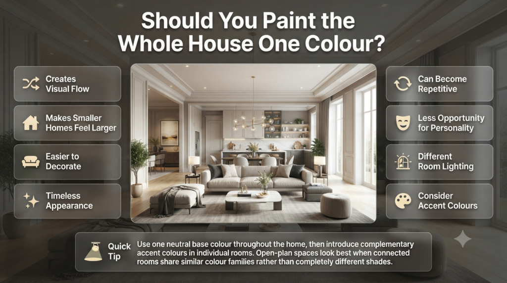
Many homeowners ask this question.
The answer depends on your home’s layout.
Advantages
- Creates visual flow
- Makes smaller homes feel larger
- Easier to decorate
- Timeless appearance
Disadvantages
- Can become repetitive
- Less opportunity for personality
- May not suit every room’s lighting
A popular compromise is to use one neutral base colour throughout the house while introducing different accent colours in individual rooms.
📌 Quick Tip: Open-plan homes often look best when connected spaces share similar colour families rather than completely different shades.
Trending Interior Paint Colors
Current trends continue to favour colours inspired by nature.
Popular choices include:
- Warm white
- Greige
- Mushroom
- Olive green
- Sage green
- Clay
- Dusty blue
- Soft terracotta
- Sand
- Muted charcoal
Unlike short-lived trends, these colours remain versatile and easier to update with changing décor.
Common Mistakes When Choosing Interior Paint Colors
The biggest paint colour mistakes include ignoring lighting, skipping sample tests, choosing colours that clash with furniture, following trends without considering your home, and selecting the wrong paint finish.
Avoid these common errors.
Buying Paint Without Testing
Paint almost never looks identical to the sample card.
Always test first.
Ignoring Undertones
Grey may contain:
- Blue
- Green
- Purple
- Brown
White may contain:
- Yellow
- Pink
- Blue
- Cream
Undertones become much more noticeable on large walls.
Choosing Colours Only Because They’re Trendy
Trends change.
Your home should reflect your lifestyle rather than social media fashions.
Forgetting Adjacent Rooms
Every room should transition naturally into the next.
Sudden colour changes can make a home feel disconnected.
Using Too Many Bold Colours
One or two feature colours usually create more impact than decorating every room differently.
⚠ Common Mistake: Buying several tins of paint before testing samples. Spending a little time on sampling can save significant money and frustration later.
Expert Advice from Interior Designers
Professional designers rarely choose wall colours first. Instead, they build a complete design plan and then select paint that complements the room.
Here are some of the techniques professionals use to achieve a polished look.
Start with the Largest Fixed Elements
Choose colours based on features that are difficult or expensive to change, such as:
- Flooring
- Kitchen cabinets
- Countertops
- Fireplaces
- Built-in wardrobes
- Large sofas
Paint is relatively easy to change later, but replacing flooring or cabinetry is much more costly.
Create a Whole-Home Colour Palette
Rather than selecting random colours for each room, develop a palette that flows naturally throughout the house.
A balanced palette usually includes:
- 1–2 primary neutral colours
- 2–3 complementary accent colours
- Natural wood tones
- Metallic finishes
- Textured materials
This approach creates continuity while allowing each room to have its own personality.
⭐ Expert Tip: Repeat one or two colours throughout the home in different ways. For example, a sage green used in the living room can reappear in artwork, cushions, or accessories in other rooms.
Use the 60-30-10 Colour Rule
One of the simplest design principles is the 60-30-10 rule.
| Percentage | Purpose | Example |
|---|---|---|
| 60% | Dominant colour | Wall paint |
| 30% | Secondary colour | Furniture and rugs |
| 10% | Accent colour | Cushions, artwork, décor |
This creates a balanced room without making it feel overwhelming.
Don’t Ignore Artificial Lighting
Many homeowners only test paint during the daytime.
However, you’ll likely spend most evenings indoors under artificial lighting.
Different bulbs change paint colours dramatically.
- Warm LED bulbs make colours appear softer.
- Cool white lighting enhances blue and grey tones.
- Daylight bulbs provide a more neutral appearance.
Always evaluate paint both day and night before making your final decision.
💡 Pro Tip: If you’re replacing lighting fixtures during a renovation, choose your light bulbs before selecting the final paint colour.
Interior Paint Color Combinations That Always Work
Some colour combinations remain popular because they’re versatile and timeless.
| Wall Colour | Trim | Furniture | Style |
|---|---|---|---|
| Warm White | Bright White | Natural Oak | Scandinavian |
| Sage Green | White | Walnut | Modern Farmhouse |
| Greige | Cream | Black Metal | Contemporary |
| Navy Blue | White | Light Wood | Coastal |
| Soft Beige | White | Linen | Classic |
| Charcoal | White | Oak | Modern |
| Dusty Blue | White | Light Grey | Transitional |
| Olive Green | Cream | Wood | Rustic |
These combinations work well because they balance contrast, warmth, and texture.
Quick Checklist Before Buying Paint
Use this checklist before making your purchase.
✔ Tested samples in your room
✔ Viewed colours during morning and evening
✔ Checked undertones
✔ Matched flooring
✔ Considered furniture
✔ Selected the correct finish
✔ Compared adjacent rooms
✔ Planned ceiling and trim colours
✔ Calculated enough paint for the project
✔ Purchased quality brushes and rollers
What are the top trending interior paint colors this year?
Warm Greiges and Muted Beiges: Shades like Alabaster, Accessible Beige, or Revere Pewter replace cool undertones. They create a cozy, inviting environment that still feels modern.
Sage Greens and Earthy Olives: These organic tones bring the outdoors inside, promoting calmness and mental well-being in living rooms and bedrooms.
Moody Terracottas and Deep Plums: Rich, saturated colors are highly requested for accent walls, powder rooms, and dedicated home offices to add instant drama and sophistication.
How do I choose the right paint finish (sheen) for each room?
Flat/Matte: Ideal for ceilings and adult bedrooms; hides surface imperfections perfectly but is difficult to clean.
Eggshell/Satin: The ultimate crowd-pleasers for living rooms, hallways, and family areas; offers a soft velvet look with decent scrubbability.
Semi-Gloss/Gloss: Mandatory for trim, baseboards, doors, kitchens, and bathrooms; provides maximum moisture resistance and wipes clean effortlessly.
Which paint colors make a small room look visually larger?
Soft Whites and Light Pastels: Utilizing crisp, light tones opens up tight spaces by maximizing natural light bounce.
Monochromatic Schemes: Painting the trim, baseboards, and walls the exact same color eliminates visual breaks, tricking the eye into seeing a taller room.
Cool Undertones: Light blues, soft greens, and cool greys naturally recede from the eye, creating an illusion of depth and distance.
How do lighting conditions affect interior paint colors?
North-Light Rooms: These spaces receive cool, bluish light all day, which makes colors look flatter. Counteract this by choosing warm-toned paints.
South-Light Rooms: These areas enjoy intense, warm sunlight. They handle almost any color well, but ultra-warm shades might look overly yellow or orange.
East/West-Light Rooms: East-facing rooms look warm in the morning and cool at night, while west-facing spaces experience the exact opposite.
What are the best interior paint colors for increasing home resale value?
Warm Neutrals: Stick to universally loved shades of off-white, cream, and soft beige to make the home feel clean, blank, and well-maintained.
Soft Blue Bathrooms: Real estate data consistently shows that homes with light blue or soft grey-blue bathrooms sell for a premium.
High-Contrast Trim: Using a clean, bright white on the trim against neutral walls makes the entire home look sharper, newer, and professionally staged.
Conclusion
Choosing the right Interior Paint Colors is about more than following trends—it’s about creating a home that feels comfortable, reflects your personality, and works with the way you live. From understanding how natural light changes colour to selecting the right finish and coordinating with your furniture, every decision contributes to the overall look and feel of your space.
Whether you prefer timeless neutrals, calming blues, nature-inspired greens, or bold statement shades, taking the time to test samples and plan a cohesive colour palette will help you achieve results you’ll love for years. Remember, the best interior paint color isn’t simply the most popular one—it’s the one that suits your home’s lighting, complements your décor, and creates the atmosphere you want in every room.
If you’re looking for more inspiration, expert decorating advice, and room-by-room colour guides, explore Interior Design Mode 24. You can also browse the latest ideas in Paint Color, Interior Design, and Home Improvement to help you confidently plan your next painting project and create a beautiful, well-balanced home.

Leave a Reply