
Introduction
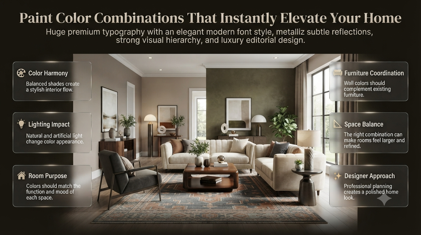
Paint Color Combinations That Instantly Elevate Your Home | Have you ever selected a paint color that looked beautiful on a small sample card but felt completely different after applying it to your walls? This is one of the most common problems homeowners face when decorating their homes.
The reason is simple: choosing paint color combinations is not only about picking colors you like. It is about understanding how different shades work together, how lighting changes colors, and how each room’s purpose affects the overall atmosphere.
A professional interior designer does not choose colors randomly. They consider wall size, furniture, flooring, natural light, room function, and the feeling they want to create.
Whether you are designing a modern apartment, refreshing a family home, or creating a luxurious interior, the right color combination can make your space feel bigger, warmer, calmer, and more stylish.
In this complete guide, you will learn how to choose the best paint combinations, understand professional color techniques, avoid common mistakes, and create a balanced interior that looks professionally designed.
For more interior inspiration and expert design ideas, explore Interior Design Mode 24.
What Are Paint Color Combinations?
Paint color combinations are carefully selected groups of colors used together in an interior or exterior space to create harmony, contrast, and a balanced visual appearance. The best combinations consider color relationships, lighting, furniture, and the purpose of the room.
A successful paint palette usually includes:
- Primary wall color – The dominant shade that defines the room.
- Secondary color – A supporting shade used on furniture, cabinets, or another wall.
- Accent color – A bold or contrasting color used for decoration and visual interest.
- Trim and ceiling color – Shades that complete the overall design.
For example:
Modern Luxury Combination:
- Warm white walls
- Soft beige furniture
- Matte black accents
- Natural wood textures
This combination works because every color has a specific role. The white keeps the room bright, beige adds warmth, black creates contrast, and wood introduces a natural element.
A professional-looking room usually does not depend on many colors. Instead, it uses a carefully controlled palette with different tones and textures.
Why Are Paint Color Combinations Important?
Many homeowners make the mistake of choosing a single favorite color and painting an entire room without considering how it interacts with other elements.
However, colors influence:
- Room size perception
- Mood and comfort
- Interior style
- Lighting appearance
- Furniture coordination
- Overall home flow
A well-planned color combination creates a space that feels intentional and professionally designed.
Make Small Rooms Feel Bigger
Light color combinations can visually expand smaller spaces by reflecting more natural and artificial light.
Example:
Small Bedroom Combination
- Soft white walls
- Light gray bedding
- Pale wood furniture
This creates an airy appearance and prevents the room from feeling crowded.
On the other hand, dark colors can make a room feel smaller if they are used incorrectly.
However, designers sometimes use dark shades strategically.
Example:
- Deep navy accent wall
- Light surrounding walls
- Bright lighting
This creates depth without making the entire room feel closed.
💡 Pro Tip: If your room receives limited sunlight, avoid using too many dark colors. Choose warmer light shades that reflect available light.
Create the Right Mood With Color
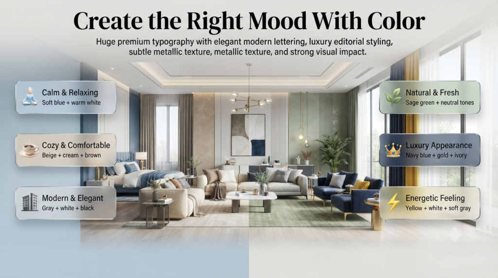
Every color creates a different emotional effect. Professional designers choose combinations based on the atmosphere they want to create.
| Desired Mood | Recommended Paint Color Combinations |
|---|---|
| Calm and relaxing | Soft blue + warm white |
| Cozy and comfortable | Beige + cream + brown |
| Modern and elegant | Gray + white + black |
| Natural and fresh | Sage green + neutral tones |
| Luxury appearance | Navy blue + gold + ivory |
| Energetic feeling | Yellow + white + soft gray |
For example, bedrooms usually benefit from relaxing colors because they should support rest and comfort.
A living room may use warmer combinations because it is a social and welcoming area.
Related inspiration:
Bedroom Color Inspiration
How Professional Designers Choose Paint Color Combinations
Choosing colors professionally requires more than following trends. Designers follow a structured process to create balanced results.
Step 1: Understand the Room’s Purpose
Before selecting any paint shade, identify what the room is used for.
Ask:
- Is this a relaxing space?
- Is this a social area?
- Should it feel energetic or peaceful?
- Do I want a modern or traditional style?
Different rooms require different approaches.
Bedroom
Best combinations:
- Soft blue + cream
- Sage green + beige
- Warm gray + white
Goal:
Create relaxation and comfort.
Living Room
Best combinations:
- Warm beige + white
- Gray + natural wood tones
- Green + neutral colors
Goal:
Create a welcoming environment.
Home Office
Best combinations:
- Soft gray + blue
- White + green accents
- Beige + charcoal details
Goal:
Improve focus while maintaining comfort.
⭐ Expert Tip: Always choose the emotional purpose of the room before selecting paint colors. A beautiful color that does not match the room’s function can feel uncomfortable over time.
Step 2: Consider Existing Furniture and Materials
One of the biggest professional secrets is matching paint colors with existing design elements.
Before painting, analyze:
- Flooring color
- Sofa fabric
- Curtains
- Kitchen cabinets
- Countertops
- Lighting fixtures
- Decorative items
A common mistake is selecting wall colors first and trying to match everything afterward.
For example:
Imagine a kitchen with:
- Dark wooden cabinets
- Beige stone countertops
- Brass handles
A cool blue wall may create a visual conflict.
A better choice:
- Warm white walls
- Soft beige tones
- Natural wood accents
This creates a connected and balanced look.
For kitchen-specific ideas, see:
Kitchen Paint Colors
Understanding Basic Color Theory for Better Combinations
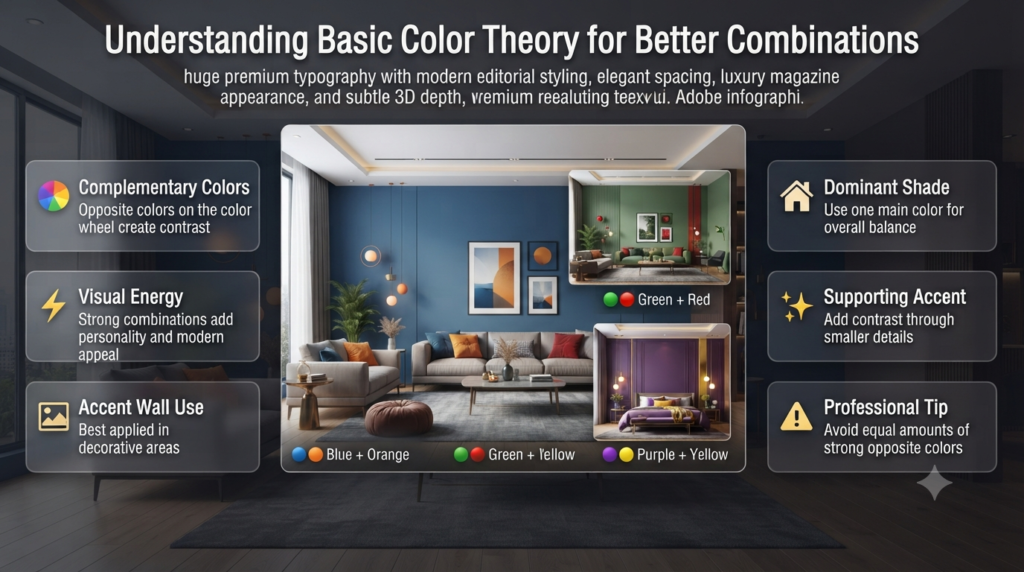
You do not need to become a professional color expert, but understanding basic color relationships helps you make smarter decisions.
Complementary Color Combinations
Complementary colors are opposite each other on the color wheel.
Examples:
- Blue + Orange
- Green + Red
- Purple + Yellow
These combinations create strong contrast and visual energy.
They work best for:
- Accent walls
- Decorative areas
- Modern interiors
However, using equal amounts of both colors can become overwhelming.
Professional approach:
Use one dominant shade and one supporting accent.
Example:
- 80% soft blue walls
- 20% warm orange accessories
⚠ Common Mistake: Painting two strong complementary colors on large walls can make the room feel visually stressful.
Analogous Color Combinations
Analogous colors sit next to each other on the color wheel.
Examples:
- Blue + Green
- Yellow + Orange
- Beige + Brown
These combinations feel natural because they share similar undertones.
Best for:
- Bedrooms
- Living rooms
- Relaxing spaces
Example:
A nature-inspired room:
- Sage green walls
- Olive accents
- Cream furniture
This creates a calm and organic atmosphere.
Monochromatic Color Combinations
A monochromatic palette uses different shades of the same color.
Example:
Blue theme:
- Light blue walls
- Medium blue furniture
- Navy accessories
Benefits:
✔ Elegant appearance
✔ Easy coordination
✔ Professional designer feel
However, using only one shade everywhere can make the room look flat.
Professionals add depth through:
- Different textures
- Fabrics
- Wood elements
- Lighting
The 60-30-10 Rule: A Professional Color Formula
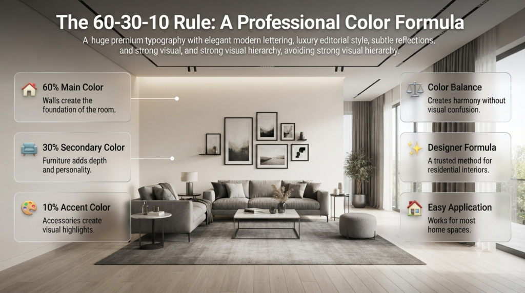
The 60-30-10 rule is one of the most useful techniques used by interior designers.
It creates balance by dividing colors into three percentages.
| Percentage | Color Role | Example |
|---|---|---|
| 60% | Main color | Walls |
| 30% | Secondary color | Furniture and curtains |
| 10% | Accent color | Artwork and accessories |
Example:
Modern living room:
60%
- Warm white walls
30%
- Gray sofa and rugs
10%
- Black frames and decorative items
This prevents the room from feeling random or overcrowded.
📌 Quick Tip: If you are unsure how many colors to use, start with this formula. It works for most residential interiors.
Popular Paint Color Combinations Designers Love
White + Beige: Timeless and Warm
White and beige remain popular because they create a clean yet comfortable atmosphere.
Best for:
- Living rooms
- Bedrooms
- Hallways
Benefits:
✔ Bright appearance
✔ Matches different furniture styles
✔ Creates a premium look
Possible problem:
Too much white can feel cold.
Solution:
Add:
- Wooden furniture
- Warm lighting
- Plants
- Textured fabrics
Learn more about balanced neutral palettes:
Neutral Color Schemes
Gray + White: Modern and Sophisticated
Gray and white create a contemporary appearance suitable for modern homes.
Works well with:
- Minimalist interiors
- Apartments
- Offices
Example:
- Light gray walls
- White ceiling
- Black metal accessories
The important factor is choosing the correct gray tone.
Warm gray creates a comfortable feeling, while cool gray creates a sharper modern look.
Best Paint Color Combinations for Every Room in Your Home
The best paint color combination depends on the purpose, size, lighting, and existing design elements of each room. Living rooms usually need welcoming colors, bedrooms benefit from calming shades, kitchens require fresh and practical palettes, and bathrooms work best with moisture-friendly light tones.
A color combination that looks perfect in one room may not work in another because every space has different lighting conditions and functions.
Professional designers always consider:
- Room size
- Natural sunlight
- Artificial lighting
- Furniture colors
- Flooring materials
- Desired atmosphere
Let’s explore the best combinations room by room.
Living Room Paint Color Combinations
The living room is usually the heart of a home. It is where families relax, guests gather, and everyday activities happen.
Because of this, living room colors should create a balance between comfort and style.
A good living room palette should feel:
- Welcoming
- Comfortable
- Elegant
- Long-lasting
For more ideas, explore:
Living Room Paint Ideas
1. Warm White + Beige + Natural Wood
This is one of the most timeless combinations for modern homes.
Color combination:
- Warm white walls
- Beige furniture
- Wooden flooring or furniture
Why it works:
Warm white keeps the room bright, while beige adds softness and natural wood introduces warmth.
Best for:
✔ Modern homes
✔ Minimal interiors
✔ Scandinavian-inspired designs
Professional advice:
Avoid using pure white everywhere because it can sometimes feel too cold. Warm whites with subtle beige undertones create a more comfortable appearance.
2. Gray + White + Black Accents
This combination creates a modern and sophisticated look.
Example:
- Light gray walls
- White ceiling
- Black lighting fixtures
- Dark furniture accents
Why designers like it:
- Creates visual contrast
- Works with modern furniture
- Looks luxurious without being overwhelming
⚠ Common Mistake: Choosing a very dark gray for all walls in a small living room can make the space feel smaller.
Better approach:
Use:
- Light gray as the main color
- Dark gray only for accents
3. Sage Green + Cream
Nature-inspired colors are becoming increasingly popular because they create a peaceful environment.
Combination:
- Sage green walls
- Cream furniture
- Natural wood elements
Perfect for:
- Relaxed living rooms
- Family spaces
- Homes with plants and natural textures
Related guide:
Warm Color Palettes
Bedroom Paint Color Combinations
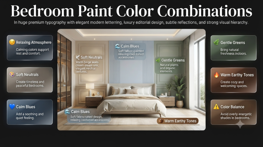
Bedrooms should support relaxation and comfort. The wrong color choice can make a bedroom feel too energetic or uncomfortable.
The best bedroom combinations usually include:
- Soft neutrals
- Calm blues
- Gentle greens
- Warm earthy tones
1. Soft Blue + White
A classic bedroom combination.
Why it works:
Blue is often associated with calmness and relaxation.
Ideal for:
- Master bedrooms
- Guest rooms
- Small bedrooms
Example:
- Soft blue feature wall
- White remaining walls
- Light-colored bedding
Professional tip:
Choose muted blue shades instead of extremely bright blues because they create a more relaxing atmosphere.
2. Beige + Chocolate Brown
This combination creates a warm and cozy bedroom.
Colors:
- Beige walls
- Brown furniture
- Cream fabrics
Best for:
- Traditional homes
- Luxury bedrooms
- Comfortable designs
Benefits:
✔ Warm appearance
✔ Easy furniture matching
✔ Timeless style
3. Olive Green + Cream
Olive green has become popular because it creates a natural and sophisticated feeling.
Works well with:
- Wooden furniture
- Linen fabrics
- Gold accessories
This combination creates a boutique hotel-style bedroom.
Kitchen Paint Color Combinations
Kitchens require colors that feel clean, bright, and welcoming.
Because kitchens already contain many design elements, wall colors should complement:
- Cabinets
- Countertops
- Backsplash
- Appliances
More kitchen inspiration:
Kitchen Paint Colors
1. White + Soft Gray
A popular modern kitchen combination.
Example:
- White cabinets
- Gray walls
- Stainless steel appliances
Advantages:
✔ Clean appearance
✔ Modern feel
✔ Makes kitchens look spacious
2. Navy Blue + White
This combination creates a luxury kitchen appearance.
Example:
- Navy lower cabinets
- White upper cabinets
- Brass handles
Why it works:
The contrast creates depth while maintaining elegance.
Best for:
- Modern kitchens
- Large kitchens
- Open-plan homes
3. Green + Natural Wood
A nature-inspired kitchen design.
Combination:
- Sage green cabinets
- Wooden shelves
- Cream walls
This creates a warm and organic atmosphere.
⭐ Expert Tip: Kitchens often look better with slightly warmer colors because cool shades can make food preparation areas feel less inviting.
Bathroom Paint Color Combinations
Bathrooms are smaller spaces, so color selection becomes extremely important.
The goal is usually to create:
- Clean appearance
- Spacious feeling
- Relaxing atmosphere
1. White + Light Blue
A fresh and spa-like combination.
Benefits:
- Makes small bathrooms feel larger
- Creates a clean appearance
- Works well with white fixtures
2. Gray + White Marble Tones
This creates a luxury bathroom style.
Example:
- Soft gray walls
- White tiles
- Marble surfaces
Perfect for:
- Modern bathrooms
- Minimal designs
3. Beige + Cream
A warmer alternative to traditional white bathrooms.
Works well with:
- Wooden cabinets
- Gold fixtures
- Natural textures
Exterior Paint Color Combinations for Homes
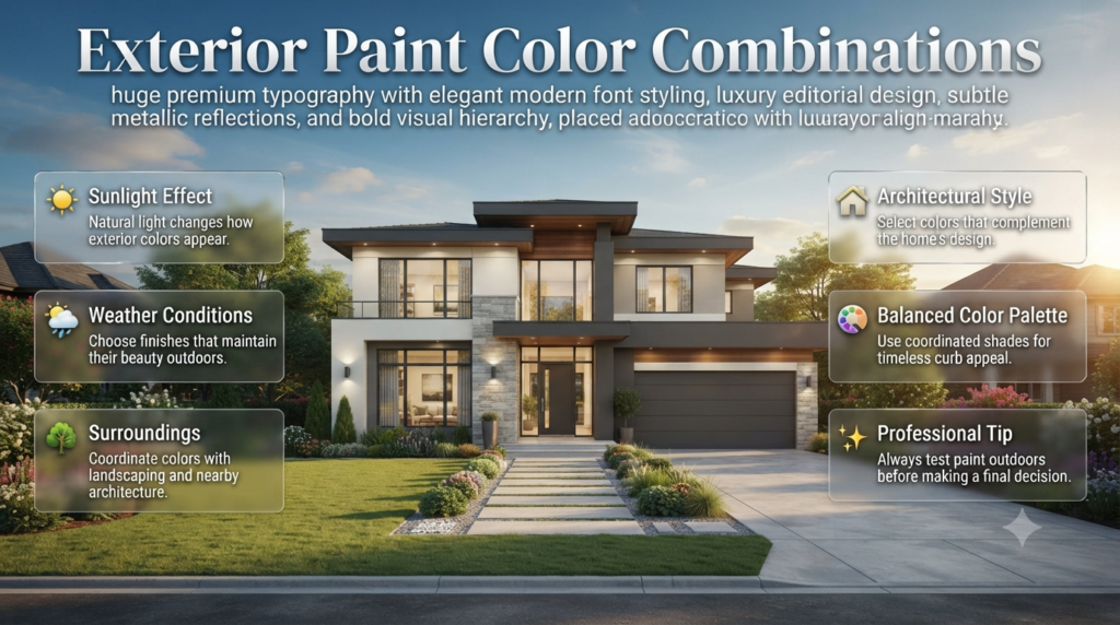
Exterior colors require careful planning because they are affected by:
- Sunlight
- Weather conditions
- Surrounding environment
A color that looks good indoors may appear completely different outside.
For complete exterior inspiration:
[Exterior Paint](Exterior Paint Colors: 25 Best Ideas for Every Home)
1. White + Gray Exterior
A modern and clean combination.
Example:
- White walls
- Gray roof
- Black windows
Style:
Modern
Minimal
Contemporary
2. Beige + Brown
A warm and traditional exterior palette.
Works well with:
- Brick details
- Wooden doors
- Natural landscaping
3. Charcoal + White
A bold modern exterior.
Combination:
- Charcoal walls
- White trim
- Wood accents
Best for:
- Contemporary homes
- Luxury properties
How Lighting Changes Paint Color Appearance
One of the biggest reasons homeowners dislike their final paint result is ignoring lighting.
The same paint can look different depending on:
- Morning sunlight
- Evening light
- LED bulbs
- Room direction
Example:
A gray paint may appear:
- Soft gray in natural light
- Blue-gray under cool LEDs
- Warm gray under yellow lighting
North-Facing Rooms
Usually receive cooler light.
Recommended colors:
- Warm beige
- Cream
- Soft yellow
- Warm white
Avoid:
- Very cool grays
- Icy blues
South-Facing Rooms
Receive warmer and brighter light.
Suitable colors:
- Cool gray
- Blue
- Green
- Neutral shades
Rooms With Limited Natural Light
Use:
- Light colors
- Reflective finishes
- Warm tones
Good combinations:
- White + beige
- Cream + soft gray
📌 Quick Tip: Always test paint samples on different walls before making a final decision. Observe them during morning, afternoon, and evening.
Trending Paint Color Combinations for Modern Homes
Interior color trends change every year, but some combinations remain popular because they are practical and timeless.
1. Earthy Green + Warm Neutrals
Popular because homeowners want more natural-looking interiors.
Combination:
- Sage green
- Beige
- Cream
Creates:
- Calm atmosphere
- Organic feeling
- Modern elegance
2. Warm White + Natural Wood
A favorite for minimalist homes.
Why it is trending:
- Simple
- Bright
- Comfortable
- Easy to decorate
3. Deep Blue + Soft Neutral Shades
Used for creating luxury spaces.
Example:
- Navy blue accent wall
- Ivory furniture
- Brass details
4. Terracotta + Cream
A warm Mediterranean-inspired combination.
Best for:
- Cozy homes
- Artistic interiors
- Relaxed spaces
Common Paint Color Combination Mistakes Homeowners Make
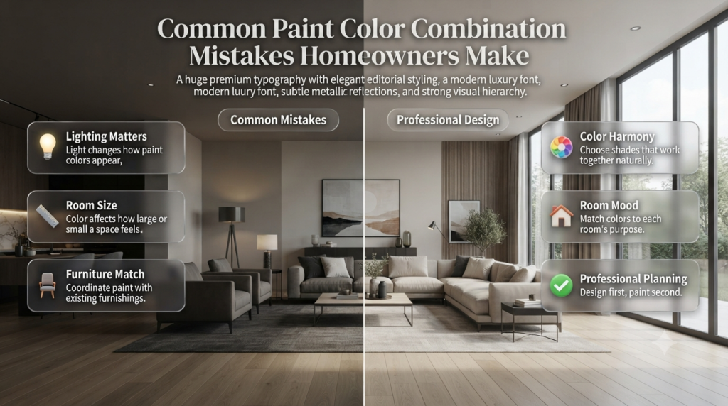
The biggest paint color mistakes happen when homeowners choose colors based only on personal preference without considering lighting, room size, existing materials, and color balance. A beautiful shade can look completely different when applied to a large wall or combined with unsuitable colors.
Choosing paint should be a planned design decision, not a last-minute purchase.
Professional designers spend time understanding:
- How colors interact
- How natural light affects shades
- How furniture changes the appearance
- How different rooms need different moods
Let’s look at the most common mistakes and how to avoid them.
Mistake 1: Choosing Colors Only From Small Paint Samples
Why It Happens:
Many homeowners select colors after looking at a tiny paint card in a store.
The problem is that a small sample does not show how the color will behave on an entire wall.
Why It Causes Problems:
Large surfaces reflect light differently.
A color may appear:
- Darker on a large wall
- Brighter in sunlight
- Cooler under LED lighting
- Warmer in evening light
Example:
A soft gray sample may look neutral in the store but appear blue once painted throughout a room.
Professional Solution:
Always test paint samples on your actual walls.
Check:
- Morning appearance
- Afternoon appearance
- Night lighting
💡 Pro Tip: Paint at least a 2-foot square area before making a final decision. This gives a more realistic idea of the final result.
Mistake 2: Ignoring Color Undertones
Why It Happens:
Many people choose colors based only on the main shade.
However, every paint color has hidden undertones.
Examples:
White may have:
- Blue undertones
- Yellow undertones
- Gray undertones
Gray may have:
- Warm beige undertones
- Cool blue undertones
Why It Matters:
Wrong undertones can create unwanted clashes.
Example:
A warm beige sofa may look uncomfortable with a cool blue-gray wall.
Better combination:
- Warm beige furniture
- Warm gray walls
- Cream accessories
⭐ Expert Tip: Before selecting a paint color, compare it with your flooring, furniture, and fabrics.
Mistake 3: Using Too Many Colors in One Room
Why It Happens:
Homeowners often try to add personality by including many different shades.
Why It Creates Problems:
Too many colors can make a room feel:
- Busy
- Unorganized
- Visually confusing
Professional designers usually follow a controlled palette.
A simple approach:
- 1 main color
- 1 supporting color
- 1 accent color
Example:
Modern bedroom:
- Beige walls
- Brown furniture
- Green plants
The result feels balanced and intentional.
Mistake 4: Choosing Trendy Colors Without Considering Long-Term Style
Why It Happens:
Popular colors on social media can influence homeowners.
Problem:
Trends change quickly.
A color that looks fashionable today may feel outdated after a few years.
Better Approach:
Use trends carefully.
Example:
Instead of painting every wall bright emerald green:
Use:
- Neutral walls
- Green accent wall
- Green furniture or accessories
This creates a stylish look without becoming difficult to update.
Mistake 5: Forgetting Ceiling and Trim Colors
Many homeowners focus only on walls and ignore other surfaces.
However, ceilings, doors, and trim influence the overall design.
Common professional combinations:
Classic Style:
- White ceiling
- White trim
- Colored walls
Modern Style:
- Same wall and ceiling color
- Contrasting black or dark trim
Related guide:
Ceiling Colors
Step-by-Step Guide: How to Create Your Own Paint Color Combination
Creating a professional-looking color palette becomes easier when you follow a structured process. Start by choosing your main color, then build supporting and accent shades around it while testing everything in your actual space.
Step 1: Decide the Mood You Want
Before selecting colors, decide how you want the room to feel.
Examples:
Relaxing:
- Blue
- Green
- Soft neutrals
Luxury:
- Navy
- Charcoal
- Gold accents
Warm and cozy:
- Beige
- Brown
- Cream
Step 2: Choose Your Main Color
The main color usually covers the largest surface area.
Examples:
Living room:
- Warm beige
Bedroom:
- Soft blue
Kitchen:
- White or light gray
Your main color should match:
- Room size
- Lighting
- Furniture style
Step 3: Select a Supporting Color
The supporting color adds depth.
Examples:
Main:
Warm white
Supporting:
Beige furniture
Main:
Soft gray
Supporting:
Natural wood
Step 4: Add an Accent Color
Accent colors create personality.
Use them on:
- Feature walls
- Pillows
- Artwork
- Curtains
- Decorative items
Examples:
Neutral room:
Accent:
- Deep green
- Navy blue
- Black
Step 5: Test Before Final Painting
Before completing the project:
✔ Apply samples
✔ Observe different lighting
✔ Compare with furniture
✔ Check at different times of day
This simple step prevents expensive mistakes.
Choosing the Right Paint Finish With Your Color Combination
Color is important, but finish also affects the final appearance.
Related guide:
Paint Finishes
| Paint Finish | Best For | Appearance |
|---|---|---|
| Matte | Bedrooms, ceilings | Soft and elegant |
| Eggshell | Living rooms | Slight shine, easy cleaning |
| Satin | Kitchens, bathrooms | Durable and washable |
| Semi-gloss | Doors, trim | Reflective and strong |
| Gloss | Decorative details | High shine |
Expert Recommendations for Better Paint Color Results
Professional designers follow several simple rules that improve results.
1. Always Consider the Whole Home
A single room should not feel disconnected.
Create flow by repeating:
- Similar tones
- Related shades
- Matching accent colors
Example:
Living room:
Warm beige
Hallway:
Soft cream
Bedroom:
Light brown tones
The home feels connected without looking identical.
2. Use Neutral Colors as a Foundation
Neutral colors create flexibility.
Popular neutrals:
- White
- Beige
- Gray
- Cream
- Taupe
They allow you to change:
- Furniture
- Artwork
- Curtains
without repainting frequently.
3. Use Dark Colors Strategically
Dark colors can look luxurious when used correctly.
Good applications:
- Accent walls
- Dining rooms
- Media rooms
Avoid using very dark shades everywhere unless the room has:
- Large windows
- Strong lighting
- Enough space
What are the best paint color combinations for a modern home?
Choosing the right paint color combination for a modern home is about creating balance between simplicity, elegance, and comfort. Modern interiors usually avoid too many competing colors and focus on carefully selected shades that create a clean and sophisticated appearance.
Some of the most popular modern combinations include warm white with natural wood tones, soft gray with white, sage green with beige, navy blue with cream, and charcoal with light neutrals. These combinations work well because they provide a timeless look while allowing flexibility with furniture, lighting, and décor changes.
For example, a living room with warm white walls, a beige sofa, wooden furniture, and black metal accents creates a modern luxury feel without looking too harsh. Similarly, sage green paired with cream creates a natural and relaxing atmosphere that works beautifully in bedrooms and family spaces.
Professional designers usually recommend selecting one dominant color, one supporting shade, and one accent color instead of using many different tones throughout the room.
Key points to remember:
Use neutral colors as a foundation for long-term style.
Add bold colors through accent walls or décor elements.
Consider natural lighting before finalizing colors.
Choose combinations that match your furniture and flooring.
Avoid copying trends without considering your home’s overall design.
How do I choose paint color combinations that make a small room look bigger?
Small rooms require careful color planning because the wrong combination can make the space feel crowded or darker. The best approach is to use colors that reflect light and create a feeling of openness.
Light and soft shades such as white, cream, light gray, pale blue, and soft beige are popular choices because they bounce natural light around the room and create a more spacious appearance.
However, making a small room look bigger does not mean using only plain white. Professional designers often combine light wall colors with subtle contrasts to add depth.
For example:
Soft beige walls
White ceiling
Light wood furniture
Minimal dark accents
This combination creates a bright but visually interesting room.
Another professional technique is using similar colors on walls and ceilings. When there is less visual interruption, the room appears taller and more open.
Helpful tips for small spaces:
Choose lighter shades with warm undertones.
Avoid too many dark colors on large walls.
Use mirrors and reflective surfaces with light paint colors.
Keep the color palette simple and coordinated.
Test paint samples because lighting can change how colors appear.
Should I match my wall paint color with furniture or create contrast?
The best interior designs usually do not match wall colors and furniture exactly. Instead, professionals create harmony through coordination and contrast.
Matching everything in the same color can make a room feel flat and outdated. On the other hand, using completely opposite colors without planning can create a disconnected appearance.
The ideal approach is to select colors that complement each other.
For example:
If you have a beige sofa, you can pair it with:
Warm white walls for a soft look
Sage green walls for a natural feel
Charcoal accents for modern contrast
If your furniture is dark, lighter wall colors can create balance and prevent the room from feeling heavy.
Interior designers often analyze the undertones of furniture before selecting paint. A warm wooden floor usually works better with warm paint colors, while cool gray furniture may pair better with cooler shades.
Professional recommendations:
Do not copy furniture colors exactly on walls.
Create contrast while maintaining harmony.
Consider fabric, wood, and metal finishes.
Use accessories to connect different colors.
Follow a balanced color ratio like the 60-30-10 rule.
What are the most popular paint color combinations trending this year?
Current interior design trends are moving toward colors that create comfort, connection with nature, and timeless elegance. Homeowners are choosing shades that feel relaxing rather than overly dramatic.
Some of the most trending paint combinations include:
Sage Green + Warm White
This combination brings a natural and peaceful feeling into the home. It works especially well in bedrooms, living rooms, and home offices.
Beige + Natural Wood
A favorite for modern minimalist interiors because it creates warmth while maintaining a clean appearance.
Navy Blue + Cream
This combination adds luxury and sophistication, especially when combined with gold or brass details.
Soft Gray + White
A modern choice for apartments and contemporary homes because it creates a balanced and professional appearance.
Terracotta + Neutral Shades
A warmer trend inspired by Mediterranean and earthy interior styles.
While trends are useful for inspiration, homeowners should choose colors based on their home’s architecture, lighting, and personal lifestyle.
Trending color selection tips:
Use trendy shades as accents if you want flexibility.
Choose timeless base colors for walls.
Consider how the color will look after several years.
Avoid selecting colors only because they are popular online.
Test samples in your actual room before painting.
How can I create a professional-looking paint color combination without hiring an interior designer?
Creating a designer-quality color palette is possible when you follow a structured approach. Professional results usually come from planning rather than using expensive materials.
Start by identifying the purpose and mood of the room. Decide whether you want the space to feel relaxing, luxurious, energetic, or natural.
Next, select:
A main wall color
A secondary supporting shade
An accent color
For example:
Modern Living Room Palette:
60% Warm white walls
30% Gray furniture and textiles
10% Black decorative accents
This creates balance and prevents the room from looking random.
Before committing, test your chosen colors under different lighting conditions. A shade that looks perfect during the day may appear completely different at night under artificial lights.
Professional steps for creating your own palette:
Study your existing furniture and flooring.
Select colors with matching undertones.
Use the 60-30-10 design rule.
Test paint samples on actual walls.
Choose the correct paint finish for each room.
Keep the overall home color flow connected.
A carefully planned paint combination can make your home look professionally designed while still reflecting your personal style.
Conclusion: Choose Paint Color Combinations That Make Your Home Feel Complete
Choosing the right paint color combinations is not just about following the latest trends or selecting your favorite shades. It is about creating a space where colors work together with your furniture, lighting, architecture, and lifestyle.
A successful color palette brings balance, improves the mood of your home, and helps every room feel more comfortable and visually appealing. Whether you prefer modern neutrals, natural earthy tones, bold contrasts, or timeless combinations, the key is selecting colors that support the purpose of each space.
Before making your final decision, always remember to:
- Test paint samples under different lighting conditions.
- Consider existing furniture, flooring, and décor.
- Use a balanced combination of main, supporting, and accent colors.
- Avoid choosing colors only because they are trending.
- Focus on creating a design that feels personal and long-lasting.
The perfect paint combination does not need to be complicated. With thoughtful planning and a clear understanding of color balance, you can transform ordinary rooms into beautiful, inviting spaces that feel professionally designed.
For more expert interior inspiration, color ideas, and home improvement guidance, explore Interior Design Mode 24 and discover creative ways to enhance your home.

Leave a Reply