
Introduction
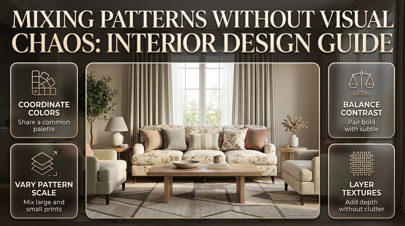
Mixing Patterns Without Visual Chaos | A room can have beautiful furniture, expensive fabrics, and carefully selected accessories yet still feel uncomfortable when too many patterns compete for attention. A floral sofa, striped curtains, geometric cushions, and a decorative rug might each look attractive individually, but bringing them together requires a little planning.
The secret to mixing patterns without visual chaos is understanding how colors, pattern scales, contrast, textures, and furniture proportions work together. You don’t need to make every print match, and you don’t have to avoid bold designs to create a sophisticated interior. Instead, you need to establish a visual hierarchy that allows each pattern to contribute something without overwhelming the room.
Whether you’re decorating a living room, refreshing a bedroom, choosing new curtains, or working with furniture you already own, the right approach can help you create a space that feels coordinated, comfortable, and personal.
At DesignMode24 Interior Design, thoughtful decorating begins with understanding how individual elements contribute to the atmosphere of an entire room. This guide explains how to choose compatible patterns, build a practical color palette, balance bold and subtle prints, and avoid common mistakes that make patterned interiors look cluttered.
What Does Mixing Patterns Without Visual Chaos Mean?
Mixing patterns without visual chaos means combining different decorative designs in a way that creates variety while maintaining visual balance. Stripes, florals, checks, geometrics, and abstract prints can coexist when their colors, scales, contrast levels, and placement establish a clear relationship.
The objective isn’t to make every element identical. It’s to help the eye understand how the different elements belong together.
For example, imagine a living room with a cream sofa, a botanical rug, navy striped cushions, and a small geometric accent pillow. The rug introduces the main decorative statement, the stripes create structure, and the geometric pattern adds detail. The plain sofa prevents the arrangement from becoming overwhelming.
Each element has a purpose.
Successful pattern mixing generally depends on four principles:
- Visual hierarchy: One pattern leads while the others support the composition.
- Color coordination: Selected shades connect different prints.
- Scale variation: Large, medium, and small motifs create visual rhythm.
- Visual breathing room: Plain surfaces and understated textures prevent overcrowding.
These principles work across traditional, contemporary, minimalist, transitional, and eclectic interiors. The difference lies in how boldly you apply them.
Why is pattern balance important in interior design?
Patterns influence how people perceive the size, movement, and atmosphere of a room. Large, high-contrast prints attract attention, while subtle designs can add depth without dominating the space.
When patterns are balanced, a room feels layered and intentional. When they compete, the eye moves constantly between unrelated focal points, making the space feel restless.
A well-planned pattern combination can also make a neutral interior feel more expressive without requiring expensive furniture replacements.
What Are the Main Rules for Mixing Patterns Successfully?
The most reliable approach is to choose one dominant pattern, introduce supporting designs at different scales, repeat selected colors, and leave some surfaces relatively quiet. These guidelines provide a useful starting point, but they should adapt to the room rather than become rigid decorating rules.
1. Start with one dominant pattern
Choose the pattern that will establish the room’s decorative direction.
It might appear on a rug, accent chair, upholstered headboard, curtains, or wallpaper. The best starting point is often an item you already own and enjoy.
A large botanical rug, for example, might contain sage green, warm cream, and muted terracotta. These colors can guide your choices for cushions, throws, and accessories.
The dominant pattern doesn’t have to be the largest object in the room. A relatively small accent chair with a vivid, high-contrast print can attract more attention than a much larger rug with a subtle design.
Professional advice: Judge a pattern by its visual impact, not only by its physical dimensions.
2. Combine different pattern scales
Pattern scale refers to the size of the motifs and the distance between repeating elements.
A large-scale pattern might feature oversized leaves or broad geometric shapes. A medium-scale pattern could contain repeating diamonds, while a small-scale design might feature tiny checks or delicate pinstripes.
Using different scales gives the eye a clear order in which to read the composition.
| Pattern scale | Common examples | Best role |
|---|---|---|
| Large | Oversized florals, broad stripes, large abstract shapes | Main focal point |
| Medium | Repeating diamonds, medium checks, smaller botanicals | Supporting design |
| Small | Fine pinstripes, tiny dots, miniature checks | Secondary detail |
You don’t need exactly three patterns in every room. Two patterns can look excellent, and a maximalist interior may include considerably more.
The important point is to avoid making every pattern equally prominent.
3. Establish a shared color palette
Patterns can look related even when their motifs are completely different.
A blue-and-cream floral print can work with a navy geometric cushion because both include blue. A cream-and-tan stripe can connect the arrangement through its lighter neutral shade.
Start with two or three principal colors and introduce additional accents only when they serve a clear purpose.
For example:
- Dominant color: muted olive.
- Supporting color: warm ivory.
- Accent color: rust.
- Optional grounding shade: charcoal.
The palette doesn’t need to appear in every pattern. Partial overlap is often sufficient.
4. Balance contrast and visual density
Two patterns may share the same colors and still look uncomfortable together if both are dense and high-contrast.
Consider a tightly packed black-and-white geometric print beside a large black-and-white check. The similar contrast and visual intensity can make the combination feel busy.
Instead, introduce a quieter print or a solid surface between them.
A useful question is: Can I identify the main pattern immediately, or does everything demand equal attention?
If you cannot identify a clear focal point, reduce the intensity of one or more elements.
How Do You Choose Colors That Make Different Patterns Work Together?
The easiest way to coordinate different patterns is to build a color palette around an existing furnishing, artwork, rug, or fabric you genuinely like. Repeating a few shades creates continuity without forcing every print to match exactly.
Choose a dominant, supporting, and accent color
A practical palette usually includes one main color, one supporting color, and an accent shade.
Suppose you have a cream sofa and a patterned rug featuring muted blue and rust.
You might introduce blue striped cushions, a rust-colored throw, and a small cream geometric pillow. The combination feels connected because the colors are repeated selectively.
The same method works with earthy greens, warm browns, soft pinks, charcoal, and many other palettes.
Understand warm and cool undertones
Color undertones influence how fabrics look beside each other.
Warm ivory, yellow-based beige, and terracotta often create a natural relationship. Cool gray, blue, and certain crisp whites can also work well together.
However, warm and cool colors aren’t forbidden from sharing a room. The key is to make the contrast intentional.
For example, a cool navy print can complement warm wood furniture when a neutral fabric or a related accent shade connects them.
Before committing to multiple fabrics:
- Compare samples next to your existing furniture.
- Check them under natural and artificial lighting.
- Consider the undertones of the flooring and wall color.
- Observe the materials together from a distance.
For additional ideas about coordinating finishes and furnishings, explore Decorating Around Existing Flooring.
Should every pattern use the same colors?
No. Repeating every color in every fabric can make a room feel overly coordinated.
A better approach is to create selective connections. One pattern might share the dominant color, another might repeat the neutral background, and a third might introduce a complementary accent.
The room should feel connected without looking as though every item came from the same matching collection.
Which Patterns Work Best Together?

Stripes, florals, geometrics, checks, and organic prints are among the most versatile patterns for residential interiors. They work together because they offer different visual structures, although their compatibility still depends on scale, contrast, and color.
Mixing stripes with florals
Stripes provide order, while florals introduce softer, more organic movement.
This combination works particularly well in traditional, transitional, and contemporary interiors.
For example, a large botanical print on an accent chair can be paired with narrow striped cushions in a related color. The floral provides the statement, while the stripes offer a more structured counterpoint.
Avoid combining several bold floral and striped designs at similar scales unless you deliberately want a dramatic result.
Mixing geometric and organic patterns
Geometric patterns feature repeated shapes, straight lines, grids, or angular forms. Organic patterns contain irregular curves, natural shapes, and less predictable movement.
Their differences can create a balanced composition.
A geometric rug might work with botanical curtains, while an abstract cushion introduces another layer of detail. To prevent the room from feeling disconnected, repeat at least one color across the designs.
Mixing checks and plaids
Checks and plaids can add structure, warmth, and traditional character.
A medium-scale check may complement a delicate floral print, particularly when the colors are muted. A larger plaid can also work with a simple stripe if their scales and visual intensity differ.
The main risk is introducing several similarly sized checked patterns that compete with one another.
Mixing abstract and traditional patterns
Traditional motifs and modern abstract designs can create a collected appearance rather than a perfectly matched interior.
For example, a classic botanical rug may complement a contemporary cushion with irregular shapes. A consistent palette can connect the pieces despite their different styles.
This approach is particularly useful when combining inherited furniture with newer purchases.
| Pattern combination | Visual effect | What to watch |
|---|---|---|
| Floral and stripe | Soft but structured | Avoid equal visual intensity |
| Geometric and botanical | Contemporary and balanced | Connect selected colors |
| Check and floral | Relaxed and traditional | Vary motif scale |
| Abstract and stripe | Energetic and modern | Control contrast |
| Plaid and geometric | Structured and bold | Avoid competing grids |
| Traditional and contemporary | Collected and individual | Maintain a clear overall direction |
How Can You Mix Patterns in a Living Room?
In a living room, begin with the most visually important furnishing or surface and build the rest of the arrangement around it. The rug, sofa, curtains, and accent chairs often have the greatest influence because they occupy substantial areas or sit within important sightlines.
Step 1: Identify the focal point
Look at the room from the entrance and decide where you want the eye to settle.
If the rug has a strong pattern, let it establish the palette. If the sofa has expressive upholstery, choose quieter designs for nearby cushions and curtains.
A room can have several attractive elements, but they shouldn’t all compete for the same attention.
Step 2: Add a contrasting pattern
Introduce a different pattern type rather than selecting another print that looks almost identical to the first.
For example, combine a botanical rug with a striped cushion or a geometric throw.
The difference between the motifs creates variety, while the shared palette keeps the composition cohesive.
Step 3: Add smaller details selectively
A smaller accent print can complete the arrangement.
Use it on a cushion, throw, or decorative accessory rather than automatically adding another pattern to every surface.
If the seating area already feels balanced, solid-colored cushions may be the better choice.
Step 4: Check furniture proportions
Patterned accessories should relate to the size and visual weight of the furniture.
Tiny cushions can look insignificant on an oversized sectional, while large, high-contrast prints may overwhelm a compact armchair.
The same principle applies to rugs, curtains, and decorative furniture.
Review Understanding Furniture Proportions when assessing how the scale of individual pieces affects the overall composition.
Pro tip: Arrange the textiles you already own before purchasing replacements. Moving one cushion or removing a throw may improve the room more effectively than adding another pattern.
How Do You Mix Patterns in a Bedroom?
A bedroom benefits from a clear pattern hierarchy because the bed occupies a large visual area and usually becomes the room’s main focal point. Choose one dominant textile, introduce a supporting print, and keep surrounding elements sufficiently quiet to preserve a restful atmosphere.
Start with the bedding
Patterned bedding is often the simplest way to introduce a decorative direction.
A botanical duvet cover can work with striped cushions and a plain upholstered headboard. Alternatively, a patterned headboard can become the main statement while the bedding remains relatively understated.
Avoid choosing bold bedding, elaborate wallpaper, patterned curtains, and a heavily decorated rug without first considering how they interact.
Use wallpaper strategically
If you prefer patterned wallpaper, let it influence the other decorative choices.
A small-scale botanical wall covering can complement a plain duvet with one or two patterned cushions. A bold geometric wallpaper may work better with simple bedding and understated curtains.
The goal is to establish a clear focal point rather than make every surface equally decorative.
Create a mood through pattern selection
Different combinations can support different bedroom styles.
- Soft florals and narrow stripes create a gentle, traditional atmosphere.
- Geometrics and abstract motifs feel more contemporary.
- Muted checks and botanical prints create a relaxed, layered appearance.
- Low-contrast patterns in related neutrals support a quieter minimalist interior.
For more inspiration, browse the room-by-room design hub.
How Can You Mix Patterns in Small Rooms?
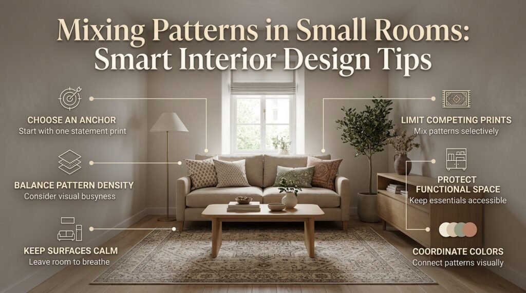
Small rooms can accommodate multiple patterns when their visual intensity is controlled and the layout includes enough plain surfaces. Instead of avoiding prints altogether, focus on selecting the right scale, limiting unnecessary contrast, and keeping the room’s main functions clear.
Choose a clear visual anchor
A compact living room might use a patterned rug with plain upholstery and two different cushion prints.
A small bedroom might feature patterned bedding with neutral walls and a simple headboard.
These arrangements introduce personality without requiring every surface to carry a decorative design.
Consider pattern density rather than size alone
A small-scale pattern isn’t automatically subtle.
Tiny, tightly repeated motifs can create a busy effect, while a large pattern with generous open space may feel surprisingly calm.
Compare how much background remains visible within each design. This helps you assess whether the combination feels balanced.
Protect functional space
Pattern mixing should support the room’s purpose rather than interfere with it.
In a small entryway, for example, a patterned runner and a decorative cushion may provide enough interest. Additional patterned storage baskets, wallpaper, artwork, and accessories could make an already busy area feel crowded.
Before decorating, consider where shoes, bags, coats, and everyday items need to go. The guide to Entryway Storage Capacity Planning can help you balance appearance with practical storage needs.
How Do You Mix Patterns With Existing Furniture and Flooring?
Existing furniture and flooring should guide your pattern choices rather than become obstacles to the design. Identify their colors, undertones, textures, and visual intensity before introducing new textiles.
Work with existing furniture
Suppose your living room contains a charcoal sofa, medium-brown wood flooring, and plain cream walls.
You could introduce an olive botanical rug, rust-striped cushions, and a small geometric pillow that repeats the cream and olive shades.
The sofa grounds the composition, the floor adds warmth, and the textiles create contrast.
If the sofa already has a strong pattern, reverse the approach. Use simpler curtains and a rug with a less prominent design.
Consider permanent materials
Flooring, exposed brick, stone, cabinetry, and wood grain all contribute visual texture.
A room with strongly veined stone and decorative flooring may need fewer patterned textiles than a room with plain surfaces.
This doesn’t mean every material must be neutral. It means you should evaluate the entire room before adding more visual activity.
Use texture as a connecting element
Texture creates depth without necessarily introducing another strong pattern.
Linen, wool, velvet, woven fibers, and wood can complement printed fabrics while maintaining visual balance.
For example, a striped cushion and floral rug may look more cohesive when paired with a plain woven throw that introduces a related color and softer surface quality.
How Can Paint and Wallpaper Improve Pattern Mixing?
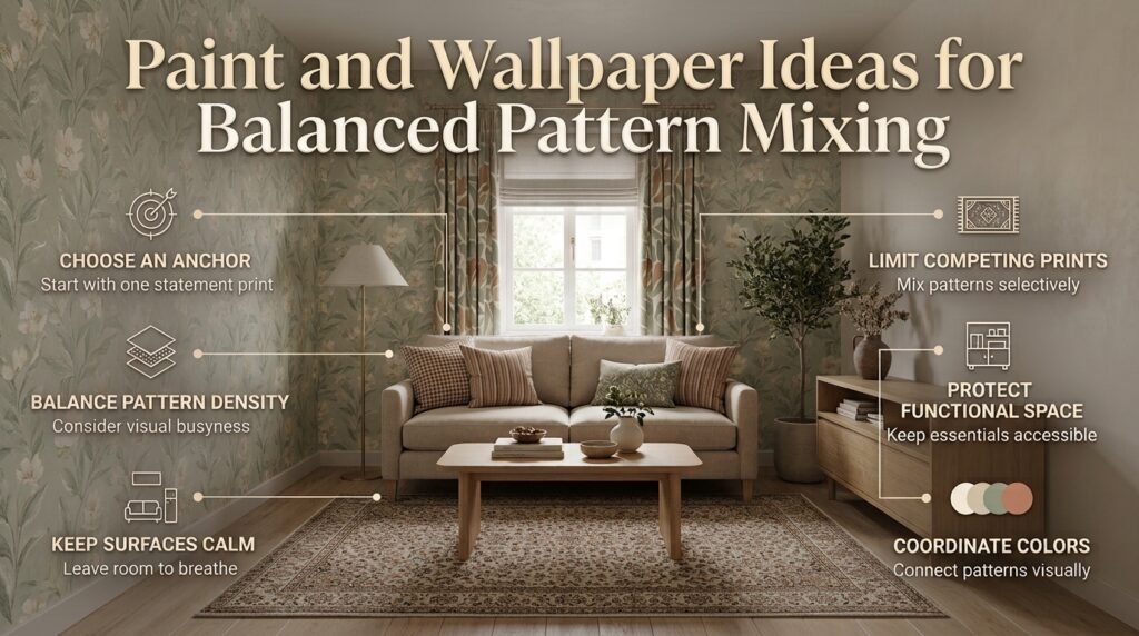
Paint and wallpaper can establish a background that allows patterned furniture and textiles to work together. Choose wall treatments according to the strength of the existing patterns rather than treating them as separate decorating decisions.
Use paint to create visual breathing room
When several textiles already feature patterns, a solid wall color can balance the composition.
Warm white, muted beige, soft sage, and other restrained shades may work well depending on the lighting and existing materials.
A bold accent wall can also be effective, but consider whether it competes with the rug, curtains, or upholstery.
Explore the Paint and Color category for additional inspiration when selecting a wall color.
Introduce wallpaper with intention
Patterned wallpaper can create a focal point or visually define a particular area.
A small-scale design may work well in a reading nook, bedroom, or home office. A larger print can make a stronger statement on a feature wall.
If you want to combine wallpaper with patterned furniture, compare their scales and contrast levels before installation.
Avoid decorating every surface
A room doesn’t need patterned wallpaper, printed curtains, an elaborate rug, and heavily patterned upholstery to feel finished.
Sometimes the most effective approach is to let one or two elements provide the decorative interest while paint and plain fabrics create balance.
How Do You Mix Patterns With Shelves, Artwork, and Decorative Accessories?
Accessories can connect a room’s patterns, but they can also increase visual clutter when too many competing elements are grouped together. Consider their colors, shapes, and placement alongside the room’s larger patterns.
Keep shelving arrangements selective
Open shelving often contains books, ceramics, framed photographs, baskets, and decorative objects with different colors and shapes.
If the surrounding room already has several strong patterns, avoid filling every shelf with additional decorative motifs.
Use some solid objects, leave a little empty space, and repeat a few colors from the room.
For practical ideas on arranging and using shelves, explore Wall Shelves Ideas.
Coordinate artwork without matching everything
Artwork can repeat a color from a rug or cushion without copying its pattern.
For example, an abstract painting may include the same muted blue found in a striped curtain. A botanical print may complement a geometric pillow through its color rather than its motif.
When arranging several pictures, consider their overall composition and the spacing between frames. The Gallery Wall Spacing Formula provides additional guidance for creating a more balanced wall arrangement.
Use accessories to finish, not overload
Choose accessories according to what the room needs.
A plain ceramic vase may create a useful visual pause beside patterned curtains. A textured basket may introduce depth without adding another prominent print.
If the arrangement already feels complete, resist the urge to fill every empty surface.
How Do You Mix Patterns Across Different Rooms?
Patterns can create continuity between rooms when selected colors, materials, or design elements repeat throughout the home. This doesn’t mean every room should use the same prints or decorating style.
Repeat colors instead of identical patterns
A living room might feature a botanical rug, while the adjacent dining room uses a geometric runner. If both include muted green and warm ivory, the rooms can feel connected without looking identical.
This approach is particularly useful in open-plan homes where several spaces are visible at once.
Adapt the pattern intensity to each room
A living room may accommodate bold cushions and an expressive rug, while a bedroom may benefit from softer prints.
A home office might use restrained geometric patterns, while a dining area could introduce a more decorative table runner.
Each room should meet its own functional needs while maintaining a relationship with the wider interior.
Use a consistent design direction
Choose a few connecting elements, such as related wood tones, complementary colors, or similar metal finishes.
These details create continuity even when the pattern types differ.
For a broader approach to coordinating spaces, explore Interior Design.
What Are the Most Common Pattern-Mixing Mistakes?
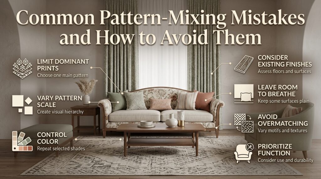
The most common mistakes occur when patterns are selected independently, their visual intensity is ignored, or too many decorative elements are introduced without a clear hierarchy.
Mistake 1: Using too many dominant patterns
Why it happens: Each print looks attractive on its own, so the decorator assumes they will work equally well together.
Why it creates problems: Several dominant patterns compete for attention, making it difficult to identify a focal point.
How to avoid it: Choose one main pattern and use less prominent designs to support it.
Mistake 2: Repeating the same pattern scale
Why it happens: Similar motifs may appear coordinated when viewed individually.
Why it creates problems: The room lacks a clear visual hierarchy, especially when several patterns have similar contrast.
How to avoid it: Combine noticeably different scales and include at least one quieter element.
Mistake 3: Using too many unrelated colors
Why it happens: New fabrics are chosen according to personal preference without considering the existing palette.
Why it creates problems: The patterns compete through both color and shape.
How to avoid it: Select a few principal colors and repeat them selectively across the room.
Mistake 4: Ignoring existing flooring and finishes
Why it happens: The decorator focuses on new textiles rather than the complete room.
Why it creates problems: Flooring, cabinetry, stone, and upholstery may already introduce significant visual detail.
How to avoid it: Assess permanent finishes before choosing additional prints.
Mistake 5: Making every surface decorative
Why it happens: Empty surfaces are mistaken for unfinished spaces.
Why it creates problems: The room loses visual breathing room.
How to avoid it: Keep some walls, upholstery, and accessories relatively plain.
Mistake 6: Matching everything too closely
Why it happens: Matching sets feel like a safe choice.
Why it creates problems: The result can appear predictable or overly coordinated.
How to avoid it: Repeat selected colors while varying the motifs, scale, and texture.
Mistake 7: Forgetting practical needs
Why it happens: Decorative appearance takes priority over everyday use.
Why it creates problems: Delicate upholstery, difficult-to-clean fabrics, or poorly positioned accessories can make the room less functional.
How to avoid it: Consider durability, maintenance, circulation, and how the household uses the space.
What Practical Techniques Do Interior Design Professionals Use?
A successful pattern combination depends on more than selecting attractive fabrics. Professionals also evaluate sightlines, room proportions, lighting, material quality, and the relationship between new purchases and existing furnishings.
Test samples before making major purchases
Small swatches may not reveal how a pattern will look across an entire sofa or wall.
Whenever possible, compare larger samples and place them next to the existing materials.
Review them at different times of day because natural and artificial lighting can change how colors appear.
Evaluate the room from several viewpoints
A pattern combination may look balanced when viewed close up but feel overwhelming from the entrance.
Step back and assess which elements attract attention first.
If several patterns compete, try changing their placement or reducing the contrast of one element.
Balance pattern with texture
When a room already contains multiple prints, introduce additional interest through material rather than another pattern.
A plain linen cushion, a woven throw, or a natural wood accessory can create depth without increasing visual competition.
Consider long-term use
Pattern choices should reflect the way a room functions.
For a busy family living room, durable upholstery and removable cushion covers may be more important than selecting a delicate fabric solely for its appearance.
For a bedroom, comfort and easy maintenance should remain priorities even when the design is highly decorative.
If you’re planning a larger decorating or renovation project, review Interior Designer Contract Essentials to understand important considerations when agreeing on the project’s scope, materials, responsibilities, and costs.
You can also use Questions to Ask an Interior Design Consultant to prepare for a conversation about your preferred style, budget, and practical requirements.
How Can You Refresh a Room Without Replacing Everything?
You can often improve pattern balance by rearranging existing items, removing unnecessary accessories, and introducing one carefully selected textile. A complete furniture replacement is rarely the first step required to create a more coordinated interior.
Start with a simple assessment
Look at the room and identify the three elements that attract the most attention.
Ask yourself:
- Do the patterns share any colors?
- Are several designs competing at the same scale?
- Does the room have enough plain surfaces?
- Is the existing furniture arranged to support the focal point?
- Would removing one item improve the composition?
These questions help identify the real problem before you spend money.
Rearrange before purchasing
Try moving patterned cushions between different seating areas or replacing a patterned throw with a solid one.
If a rug feels too dominant, test the room with a quieter arrangement of nearby accessories.
Small changes can reveal whether you need another pattern or simply better balance.
Use DIY projects selectively
Simple projects, such as refreshing a cushion cover, painting a small decorative object, or updating an accessory, can help connect existing colors.
Choose projects that support the overall design instead of introducing unrelated decorative details.
Browse DIY Home Projects for additional ideas when you want to update your surroundings without undertaking a full renovation.
For broader home improvement planning, the Home Improvement category offers another starting point for organizing practical upgrades.
A Step-by-Step Pattern-Mixing Checklist
Before purchasing fabrics or rearranging your décor, use the following checklist to assess whether your pattern combination is likely to work.
- Identify the main pattern. Choose the rug, upholstery, curtains, or wallpaper that will lead the design.
- Select a connected color palette. Use a few compatible colors and repeat them where appropriate.
- Vary the pattern scales. Combine larger motifs with medium or smaller designs instead of making every pattern equally prominent.
- Compare contrast levels. Avoid clustering several high-contrast patterns in the same visual area.
- Include quieter elements. Use plain fabrics, solid-colored accessories, or understated materials to balance the prints.
- Consider existing finishes. Evaluate flooring, cabinetry, wood grain, and other permanent surfaces before adding more patterns.
- Test samples together. Review the materials under the lighting conditions in which they’ll be used.
- Assess the room from the entrance. Check whether the main focal point is easy to identify.
- Make gradual adjustments. Move or remove one element at a time instead of replacing everything immediately.
- Prioritize everyday comfort. Make sure the finished arrangement remains practical for the people using the room.
How do you mix different patterns in a room without making it look cluttered?
Mixing patterns successfully starts with creating a clear visual hierarchy. Choose one dominant pattern, such as a floral rug, patterned sofa, or decorative wallpaper, and use smaller or less intense patterns to support it. The goal is to create contrast without allowing every element to compete for attention.
A coordinated color palette also makes a significant difference. When stripes, florals, checks, and geometric prints share one or two colors, they feel connected even when their designs are different. Balance these patterns with solid-colored furniture, plain walls, or understated accessories to give the eye a place to rest.
Practical tips:
Start with one statement pattern and build the rest of the room around it.
Combine large, medium, and small pattern scales to create visual variety.
Repeat selected colors instead of matching every print exactly.
Avoid placing several high-contrast patterns directly beside one another.
Step back and view the room from the entrance to identify competing focal points.
What patterns work best together in interior design?
Stripes, florals, geometric prints, checks, and organic patterns are among the most versatile choices for interior design. They work well together because their shapes and visual rhythms differ, allowing each pattern to contribute something distinctive. However, successful combinations depend on color, scale, contrast, and the amount of detail in each design.
For example, a large botanical rug can complement striped cushions because the curved floral shapes contrast with the stripes’ orderly lines. A geometric throw can introduce another layer of interest when it shares a color with the rug or cushions. If the main pattern is already bold, choose supporting prints with softer colors or simpler motifs.
Pattern combinations worth trying:
Florals and stripes: Create a balanced look by combining organic shapes with structured lines.
Geometric and botanical prints: Introduce contrast between angular forms and natural motifs.
Checks and small florals: Create a relaxed, traditional atmosphere when the colors are coordinated.
Abstract and striped patterns: Add contemporary character without requiring identical designs.
Plaid and subtle geometric prints: Work well in layered interiors when their scales differ.
How many patterns should you use in one room?
Three patterns are a useful starting point for most decorating projects because they allow you to introduce a dominant design and two supporting prints. However, there is no fixed number that works for every room. A small bedroom may look balanced with two patterns, while a larger eclectic living room can accommodate more if their colors, scales, and visual intensity are carefully managed.
The more patterns you introduce, the more important it becomes to consider the room’s existing details. Flooring, wood grain, stone surfaces, artwork, and furniture upholstery already contribute visual information. Adding several bold prints without accounting for these elements can make even a spacious room feel busy.
A practical way to plan your patterns:
First pattern: Choose the main visual feature, such as a rug or upholstered chair.
Second pattern: Introduce a contrasting design through cushions, curtains, or a throw.
Third pattern: Add a smaller-scale print to create detail.
Supporting elements: Use plain fabrics, natural textures, and solid colors to maintain balance.
Remember that three bold patterns can look more cluttered than five subtle ones. Focus on visual weight rather than counting prints alone.
How do you choose colors when mixing patterned fabrics and furniture?
The most effective way to coordinate patterned fabrics is to build a color palette around an existing element, such as a rug, sofa, artwork, or flooring. Choose two or three principal colors and repeat them selectively across the room. This creates a visual connection without requiring every fabric to contain the same shades.
For example, a living room with a cream sofa and an olive-and-rust botanical rug could include olive geometric cushions, a rust-striped throw, and plain ivory curtains. Each item has a different design or texture, but the repeated colors make the arrangement feel intentional.
Pay attention to undertones as well. Warm beige, yellow-based cream, and terracotta can create a natural relationship, while cool gray and blue may produce a more contemporary atmosphere. These combinations are not strict rules, but comparing samples under the room’s actual lighting helps prevent unexpected clashes.
Professional color-coordination tips:
Choose a dominant shade that establishes the room’s overall atmosphere.
Repeat one or two colors across different patterns.
Introduce accent colors selectively rather than distributing them everywhere.
Compare fabric samples with existing flooring and upholstery.
Check the combination in daylight and under evening lighting before buying.
How can you mix patterns in a small living room or bedroom?
Pattern mixing works in small rooms when the designs are selected according to their scale, density, and contrast. Instead of avoiding patterns altogether, choose a few complementary prints and keep some large surfaces relatively quiet. This creates visual interest without making the room feel unnecessarily crowded.
A small living room, for example, might feature a muted geometric rug, a plain sofa, and two cushions with different but coordinated prints. In a bedroom, patterned bedding can become the main focal point while the headboard, walls, and curtains remain understated. This approach allows the patterns to stand out without overwhelming the available space.
Pattern density matters just as much as pattern size. Tiny, closely repeated motifs can feel busier than a larger design with generous open space. High-contrast prints may also attract more attention than softer designs, so consider how strongly each element stands out.
Small-room decorating tips:
Choose one dominant pattern rather than decorating every surface.
Use a limited color palette to create continuity.
Combine patterns with different scales and levels of detail.
Keep some walls, furniture, or accessories plain.
Prioritize clear circulation and functional furniture placement.
Test fabric samples together before purchasing multiple items.
The best result is a room that feels layered and personal while remaining comfortable, practical, and easy to visually navigate.
Conclusion
Mixing patterns without visual chaos is all about creating balance, maintaining a clear color relationship, and giving every design element enough space to stand out. You do not need to limit your interior to plain fabrics or matching prints to achieve a polished look. Instead, combine patterns with different scales, repeat a few complementary colors, and balance bold designs with subtle textures and solid surfaces. These simple decisions help create a room that feels layered, personal, and visually connected rather than overcrowded.
Before introducing a new pattern, consider how it relates to the existing furniture, wall colors, flooring, and decorative accessories. A large floral print can work beautifully with delicate stripes, while geometric cushions can add structure to a room featuring softer organic motifs. The key is to establish a visual hierarchy, allowing one pattern to lead while the others provide supporting detail. In smaller rooms, thoughtful placement and controlled contrast are particularly important for maintaining an open, comfortable atmosphere.
Ultimately, successful pattern mixing comes from experimenting with intention rather than following rigid decorating rules. Start with a color palette you love, introduce patterns gradually, and step back to evaluate the overall composition before adding more. With a thoughtful approach, you can create an interior that feels distinctive, welcoming, and professionally styled. For more inspiration, explore Pure Home and discover practical ideas for bringing personality and harmony into every room of your home.