
Introduction
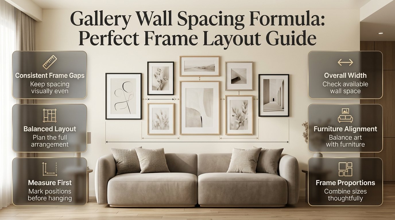
Gallery Wall Spacing Formula | A gallery wall can turn an ordinary living room, bedroom, hallway, or home office into a space that feels personal and professionally styled. Yet even beautiful artwork can look awkward when frames are positioned too far apart, the gaps are inconsistent, or the entire arrangement is out of proportion with the furniture. The solution is to plan the measurements before hanging anything. With the right guidance from DesignMode24 Interior Design, you can approach this project with a clear layout, practical measurements, and a more confident design plan.
The gallery wall spacing formula helps you calculate the distance between frames, determine the overall dimensions of your arrangement, and position artwork within the available wall space. You don’t need expensive design software or professional installation equipment. A tape measure, calculator, painter’s tape, and paper templates are enough for most projects.
This guide explains the formulas, spacing measurements, layout methods, furniture proportions, and installation techniques that make gallery walls look balanced. You’ll also learn how to arrange different frame sizes, plan displays above sofas and beds, avoid common mistakes, and choose a layout that complements your home’s existing design.
What Is the Gallery Wall Spacing Formula?
The gallery wall spacing formula calculates the overall width or height of a picture arrangement by combining the outside dimensions of the frames with the gaps between them. For most home interiors, 2–3 inches between neighboring frames is a practical starting point. The ideal spacing depends on frame size, wall dimensions, furniture placement, and the visual style you want to achieve.
The formula is especially useful when several pictures need to fit within a specific area. Instead of estimating the position of each frame, you can calculate the complete arrangement before making any holes in the wall.
The basic formula for horizontal spacing
Total gallery width = Sum of frame widths + Sum of horizontal gaps
For equally sized frames arranged in one row, use:
[
W=(n\times f)+((n-1)\times g)
]
Where:
- (W) represents the total width of the gallery.
- (n) represents the number of frames.
- (f) represents the outside width of each frame.
- (g) represents the distance between neighboring frames.
The number of gaps is always one less than the number of frames in a single row.
For example, suppose you want to arrange four frames, each 12 inches wide, with 3 inches between neighboring frames.
- Combined frame width: 4 × 12 = 48 inches.
- Number of gaps: 4 − 1 = 3.
- Combined gap width: 3 × 3 = 9 inches.
- Total gallery width: 48 + 9 = 57 inches.
The complete arrangement will occupy 57 inches from its leftmost frame edge to its rightmost frame edge.
This calculation helps you determine whether the arrangement will fit above a sofa, bed, console table, fireplace, or another architectural feature.
How to calculate the total gallery height
The same principle applies vertically.
Total gallery height = Frame heights across the rows + Vertical gaps between those rows
Suppose your arrangement contains two rows. The upper row is 16 inches high, the lower row is 20 inches high, and the vertical gap between them is 3 inches.
The calculation is:
16 + 20 + 3 = 39 inches.
For a mixed-size arrangement, calculate the actual overall height from the highest frame edge to the lowest frame edge. Simply adding every frame height together can produce an incorrect result when frames sit beside one another rather than directly above one another.
How to calculate the side margins
After finding the total gallery width, calculate the remaining space on each side of the wall.
[
M=\frac{U-W}{2}
]
Where:
- (M) is the margin on each side.
- (U) is the usable wall width.
- (W) is the gallery width.
For a 96-inch usable wall and a 60-inch gallery:
[
M=\frac{96-60}{2}=18\text{ inches}
]
The centered arrangement will have 18 inches of wall space on each side.
Pro Tip: Always calculate using the outside dimensions of the frames, including their mouldings. The visible artwork may be much smaller because of matting and borders.
How Much Space Should You Leave Between Picture Frames?
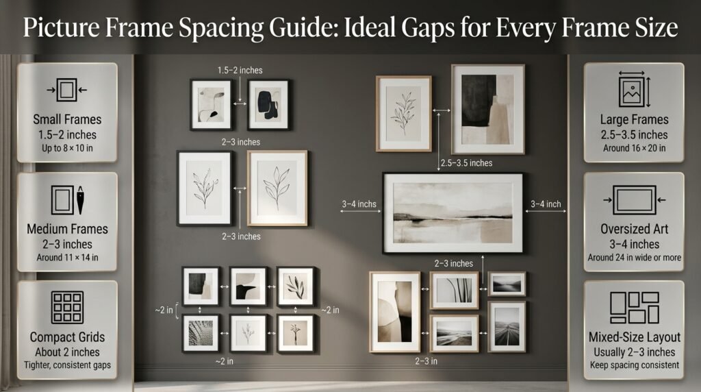
For most residential gallery walls, a gap of 2–3 inches between frame edges creates a balanced appearance. Smaller frames can work well with narrower gaps, while large statement pieces may need more breathing room. Consistency is usually more important than choosing one supposedly perfect measurement.
Use the following table as a starting point.
| Frame size or layout | Suggested gap |
|---|---|
| Small frames up to 8 × 10 inches | 1.5–2 inches |
| Medium frames around 11 × 14 inches | 2–3 inches |
| Larger frames around 16 × 20 inches | 2.5–3.5 inches |
| Oversized frames around 24 inches wide or more | 3–4 inches |
| Compact picture grids | Approximately 2 inches |
| Mixed-size gallery arrangements | Usually 2–3 inches |
These measurements are flexible design guidelines. A compact salon-style gallery may use tighter gaps, while a spacious contemporary arrangement can accommodate more separation.
Why consistent gaps make a gallery wall look professional
When neighboring frames have similar gaps, the eye recognizes a visual pattern. That pattern makes separate pictures feel like one carefully planned composition.
Imagine three frames hanging above a console table. The first gap measures 2 inches, but the second measures 5 inches. Even if the pictures themselves are attractive, the uneven distance can make the arrangement appear accidental.
Now imagine both gaps measuring 2.5 inches. The consistent rhythm creates a more organized appearance.
There are exceptions. An eclectic display can use slightly different distances to accommodate unusual frame sizes or establish separate visual groups. However, those differences should be intentional.
Expert Tip: Measure from the outer edge of one frame to the outer edge of the next. Measuring from the visible print or photograph will not give you the actual gap between the frames.
How to Calculate Gallery Wall Spacing Step by Step
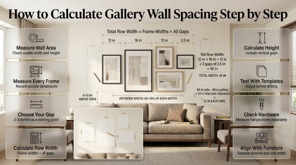
A little planning before installation can save time, protect the wall, and prevent unnecessary adjustments. Follow these steps to create a measured layout.
Step 1: Measure the available wall area
Measure the width and height of the area where you want the gallery wall.
Don’t automatically use the entire wall. Windows, doors, switches, curtains, furniture, and architectural details may limit the usable space.
For example, an 84-inch-wide sofa might work well with an artwork arrangement around 56–64 inches wide. However, the appropriate size depends on the room, frame selection, ceiling height, and surrounding decor.
Record the measurements before deciding how many frames to use.
Step 2: Measure every frame individually
Measure each frame from its outer left edge to its outer right edge, then measure its full height.
Write down the measurements so you can calculate the complete arrangement accurately.
For example:
- Frame A: 12 × 16 inches.
- Frame B: 16 × 20 inches.
- Frame C: 10 × 12 inches.
- Frame D: 12 × 16 inches.
If your frames have different moulding widths, consider how their visual weight affects the arrangement. A thick, dark frame can look more prominent than a thin frame of the same outside dimensions.
Step 3: Select your spacing measurement
Choose a starting gap before arranging the frames.
For a typical mixed-size display, 2.5 inches is a practical option. It provides separation without making the collection feel disconnected.
You might select:
- 2 inches for a compact gallery.
- 2.5 inches for a balanced everyday arrangement.
- 3 inches for a more open composition.
Try to maintain the selected gap throughout the layout unless there is a specific design reason to vary it.
Step 4: Calculate the overall width
Add the widths of all frames in a horizontal row and then add the gaps between neighboring frames.
Suppose three frames measure 12, 16, and 12 inches wide, with 2.5 inches between each frame.
[
W=12+16+12+(2\times2.5)
]
[
W=45\text{ inches}
]
The complete row will measure 45 inches wide.
If your gallery contains multiple rows, calculate the width of each row separately. You can then decide whether to center the rows, align their left edges, or use another arrangement.
Step 5: Calculate the height
Use the actual frame positions to determine the total height.
If two rows measure 16 and 20 inches high and have a 3-inch vertical gap, the arrangement is 39 inches tall.
For mixed layouts, sketch the arrangement before calculating the outer boundaries. Two small frames stacked vertically may occupy the same overall height as one larger frame positioned beside them.
Step 6: Mark the arrangement with templates
Cut paper templates that match the outside dimensions of the frames.
Tape the templates to the wall and adjust their positions until the composition looks balanced. Use a pencil to mark the reference points only after you’re satisfied with the layout.
Check the arrangement from the doorway and from the places where people normally sit. A gallery wall should work from the room’s main viewing positions, not just when you’re standing directly in front of it.
Step 7: Confirm the hanging points
Once the frame positions are finalized, measure the hanging hardware separately.
Different frames may have wire hangers, sawtooth brackets, D-rings, or other hardware positioned at different heights.
The distance between frame edges and the distance between nail positions are not the same measurement. Calculate them separately to keep the visual layout accurate.
How to Space a Gallery Wall Above a Sofa
A gallery wall above a sofa should feel visually connected to the furniture. A practical starting point is to leave approximately 6–10 inches between the sofa back and the bottom of the lowest frame. The overall arrangement often looks balanced when it measures around 60–75% of the sofa’s width.
These are guidelines rather than fixed rules. A tall sofa, low ceiling, or unusually large artwork may require a different proportion.
Example: Planning a gallery wall above an 84-inch sofa
Suppose your sofa is 84 inches wide and your planned arrangement is 60 inches wide.
The side margins will be:
[
\frac{84-60}{2}=12\text{ inches}
]
That leaves 12 inches of sofa width beyond the gallery on each side.
Now imagine three frames measuring 16, 20, and 16 inches wide, with two 3-inch gaps.
[
W=16+20+16+6=58\text{ inches}
]
The arrangement would leave 13 inches on either side of the sofa.
This is a useful example of how a simple formula can help you judge proportions before installation.
How high should artwork hang above a sofa?
Start with approximately 6–10 inches between the sofa back and the lowest frame. Then assess the composition in relation to the ceiling, nearby lamps, windows, and other furniture.
If the gallery appears disconnected from the sofa, it may be too high. If the bottom frames nearly touch the sofa, the arrangement may feel crowded.
The overall width matters too. A small gallery can look lost above a large sectional, while an excessively wide arrangement may compete with adjacent windows or shelving.
For more guidance on scale and proportion, explore Understanding Furniture Proportions.
How to Space a Gallery Wall Above a Bed
Artwork above a bed should feel connected to the headboard while leaving enough breathing room. A gap of approximately 6–10 inches between the headboard and the lowest frame is a useful starting point, although taller headboards and low ceilings may call for adjustments.
Center the complete arrangement over the bed or headboard unless an intentional asymmetrical layout better suits the room.
Consider these practical recommendations:
- Keep neighboring frame gaps consistent.
- Choose artwork that is proportionate to the bed’s width.
- Avoid positioning the arrangement too close to the ceiling.
- Use suitable hanging hardware for the frame weight and wall material.
- Check whether bedside lamps create reflections on framed artwork.
A king-size bed may suit a collection of medium-sized frames better than a single small picture surrounded by a large amount of empty wall.
The artwork should also complement the room’s existing textiles and finishes. If the bedroom already contains patterned bedding, textured cushions, and decorative lamps, consider frames that repeat selected colors or materials without making every element identical.
For additional decorating ideas, read Layering Textures Without Overcrowding.
How to Arrange Different Frame Sizes Without Losing Balance
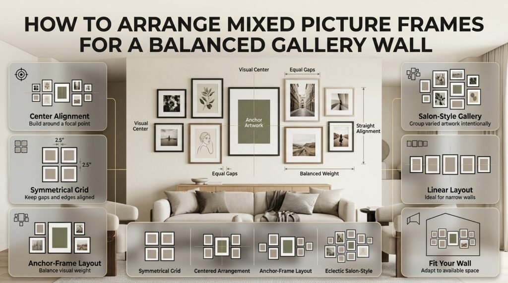
Mixed-size gallery walls can feel personal and collected, but they need a clear visual structure. The most reliable approach is to establish an anchor, alignment line, or overall shape before deciding where each frame belongs.
Use the center-alignment method
Identify the approximate center of the complete composition.
Position a visually important piece near that point and arrange the remaining frames around it. The anchor doesn’t have to be the largest frame. A smaller photograph or illustration can become the focal point because of its color, subject, or personal significance.
This approach works well for family photographs, travel pictures, illustrations, and collections of different artwork.
Use a symmetrical grid
A grid arrangement relies on repeated frame sizes, straight alignment, and consistent gaps.
For example:
[ Frame 1 ]  2.5"  [ Frame 2 ]

       2.5" vertical gap

[ Frame 3 ]  2.5"  [ Frame 4 ]
This layout is straightforward to calculate because the frames share the same dimensions.
Use a level and measure the horizontal and vertical gaps carefully. Small alignment errors become noticeable when several frame edges are intended to form straight lines.
Use an anchor-frame layout
Begin with one prominent frame and position smaller pieces around it.
This approach creates a relaxed appearance without sacrificing structure. Arrange the smaller pieces so the overall visual weight feels balanced.
Avoid putting every dark or oversized frame on one side. That can make the composition feel heavier in one direction, even when the measured gaps are consistent.
Choose the right layout for your room
| Layout style | Best suited to | Main planning priority |
|---|---|---|
| Symmetrical grid | Matching frames and formal interiors | Equal gaps and straight edges |
| Centered arrangement | Artwork above furniture | Overall width and center point |
| Anchor-frame layout | Mixed photographs and prints | Balanced visual weight |
| Salon-style arrangement | Eclectic collections | Intentional grouping |
| Linear arrangement | Hallways and narrow walls | Consistent alignment |
If your room has unusual architectural angles, adapt the arrangement to the available wall area rather than forcing a standard grid. You can find related ideas in Furniture for Rooms With Angled Walls.
How to Center a Gallery Wall Correctly
Centering a gallery wall means positioning the complete arrangement, not automatically placing one particular frame in the middle of the wall.
This distinction matters when the collection contains frames of different widths and heights.
Use the following formula:
Left margin = (Usable wall width − Gallery width) ÷ 2
If the usable wall area is 120 inches wide and your gallery is 84 inches wide:
[
\frac{120-84}{2}=18\text{ inches}
]
The arrangement should begin 18 inches from the left edge of the usable area and finish 18 inches from the right edge.
Should you center the gallery on the wall or the furniture?
If the arrangement is designed to sit above a sofa, bed, or console, centering it over that furniture is generally the better option.
For example, a console may sit toward one side of a large wall. Artwork centered over the console can create a strong visual connection even when the wall margins are unequal.
If the arrangement is independent of the furniture, center it within the usable wall area instead.
How high should the center of the gallery sit?
For artwork displayed independently of furniture, a center point around 57–60 inches above the floor is a useful starting point.
For a multi-frame arrangement, use the center of the complete composition rather than the center of every individual picture.
When artwork hangs above furniture, the furniture relationship usually matters more than a universal eye-level measurement.
For more room-planning inspiration, explore Interior Design.
Should Horizontal and Vertical Gallery Wall Gaps Match?
For a symmetrical grid, horizontal and vertical gaps should generally match. The same measurement on both axes creates a predictable rhythm and makes the arrangement easier to align.
For example, a grid with 2.5-inch gaps horizontally and vertically will feel consistent.
Mixed-size galleries can be more flexible. Different gaps may work when separate groups need visual distinction, artwork must fit around an architectural feature, or a deliberately relaxed layout is desired.
However, spacing should not change randomly. If one section uses 2 inches between frames and another uses 6 inches without a clear reason, the composition may look disconnected.
Expert Tip: Choose one standard gap first. Experiment with the positions and sizes of the frames before changing the spacing itself.
How to Plan a Gallery Wall Across a Large Wall
Large walls require careful planning because the arrangement must work with the room’s overall scale.
Suppose your wall is 120 inches wide and your intended gallery width is 84 inches.
The side margins are:
[
\frac{120-84}{2}=18\text{ inches}
]
Now imagine five frames, each 14 inches wide, with four gaps of 2.5 inches.
[
W=(5\times14)+(4\times2.5)
]
[
W=80\text{ inches}
]
The arrangement occupies 80 inches, leaving 20 inches on each side of the 120-inch wall.
This calculation helps you determine whether the selected frames will produce the intended proportions before installation.
Why you shouldn’t fill every inch of wall space
A large wall doesn’t necessarily require more frames. Empty space can help artwork stand out and give the room a more deliberate appearance.
If the arrangement looks too small, consider larger frames or one additional piece instead of automatically filling every available gap.
Also consider other features in the room. A large gallery wall may compete with a prominent window, television, shelving unit, or fireplace if it occupies too much of the visual field.
For further room-by-room inspiration, visit Find Expert Ideas for Every Room in Your Home.
How to Coordinate Gallery Wall Spacing With Existing Decor
Spacing creates the structure of the gallery, but the frames also need to work with the rest of the room. Consider colors, materials, furniture finishes, lighting, and other decorative elements before finalizing the arrangement.
Repeat a few frame finishes
Not every frame needs to match. However, repeating two or three finishes can help different artworks feel connected.
Black frames can unify a collection of photographs, while natural wood can complement a warm, neutral interior. Mixing several finishes can work when the colors relate to existing furniture or decorative accents.
Consider the wall color and existing flooring
A dark frame against a light wall creates strong contrast, while a pale frame may blend into a similarly colored surface.
Neither choice is inherently better. The right combination depends on whether you want the artwork to stand out or become part of a quieter decorative scheme.
The same principle applies to flooring. If the room has warm wood floors, natural wood frames can reinforce that warmth. If the floor has strong grain or a prominent pattern, simpler frames may prevent the space from becoming visually busy.
For related styling advice, explore Decorating Around Existing Flooring.
Avoid visual competition
A gallery wall may compete with patterned wallpaper, decorative shelves, or bold furniture if every element demands attention.
If the artwork is colorful and varied, simpler frames can create continuity. If the frames are highly decorative, a more restrained selection of artwork may be easier to coordinate.
For wall-mounted displays and additional vertical storage ideas, see Wall Shelves Ideas.
Common Gallery Wall Spacing Mistakes and How to Avoid Them
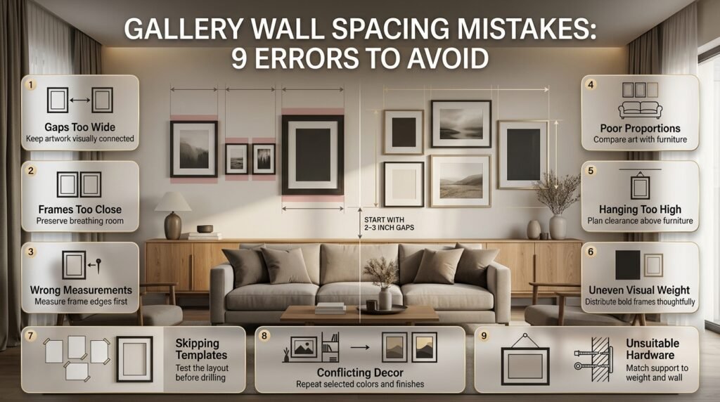
Even attractive artwork can look poorly arranged when the spacing, proportions, or installation method is wrong.
Mistake 1: Leaving gaps that are too large
Wide gaps can make a gallery wall feel disconnected.
Why it happens: Each picture is positioned individually instead of being planned as one composition.
How to avoid it: Start with 2–3 inches between neighboring frames and review the entire arrangement before installation.
Mistake 2: Placing frames too close together
Frames that almost touch can make the display feel crowded.
Why it happens: Too many pictures are being fitted into a limited area.
How to avoid it: Reduce the number of frames or choose smaller pieces rather than sacrificing all the breathing room.
Mistake 3: Measuring nail positions instead of frame edges
Hanging hardware can sit at different distances from the top of different frames.
Why it happens: Measuring the hooks seems quicker than planning the frame dimensions.
How to avoid it: Calculate the arrangement using outside frame edges first. Determine the hanging points separately.
Mistake 4: Ignoring furniture proportions
A gallery may look too small or too wide when compared with the sofa, bed, or console beneath it.
Why it happens: The wall is measured without considering the furniture.
How to avoid it: Compare the total gallery width with the furniture dimensions before installation.
Mistake 5: Hanging everything too high
Artwork can look disconnected from furniture when it is positioned too close to the ceiling.
Why it happens: The arrangement is centered vertically on the wall rather than positioned in relation to the furniture.
How to avoid it: Establish the clearance above the furniture first, then determine the arrangement’s position.
Mistake 6: Ignoring frame thickness and visual weight
Dark, thick frames can dominate a collection even when their dimensions match those of lighter frames.
Why it happens: Measurements alone do not account for contrast, materials, and frame profiles.
How to avoid it: Distribute visually heavy frames across the arrangement and repeat selected finishes.
Mistake 7: Skipping paper templates
Hanging artwork without testing the arrangement can lead to unnecessary holes and repeated adjustments.
Why it happens: The layout appears straightforward when imagined.
How to avoid it: Create paper templates, tape them to the wall, and inspect the composition before drilling.
Mistake 8: Forgetting the surrounding decor
A gallery wall may compete with nearby shelves, patterned walls, or strong furniture colors.
Why it happens: Artwork is selected without considering the rest of the room.
How to avoid it: Repeat a few colors or finishes that already appear in the space.
Mistake 9: Choosing unsuitable hanging hardware
A carefully planned arrangement can still become unsafe if the hardware isn’t suitable for the frame weight or wall material.
Why it happens: All frames are treated as if they require the same type of support.
How to avoid it: Check the frame weight, wall construction, and hardware specifications before hanging. Use suitable anchors or stud attachment where needed.
Expert Tips for a Professional-Looking Gallery Wall
A polished gallery wall depends on more than accurate measurements. The relationship between artwork, lighting, furniture, and surrounding finishes also matters.
Choose a visual anchor
Select one artwork that establishes the character of the arrangement. It might be a large photograph, a colorful print, or a meaningful personal piece.
Position the remaining frames around it so the collection has a clear focal point.
Balance color and contrast
A dark, detailed image can attract more attention than a pale print of the same size.
Distribute visually strong pieces across the arrangement instead of clustering them in one corner. Step back regularly to assess the overall balance.
Check lighting before hanging
Reflections from windows and lamps can make framed artwork difficult to see.
Check how daylight moves across the wall and whether nearby fixtures create glare. If you intend to install picture lights, consider their positions before drilling any holes.
For more decorating ideas involving wall finishes and color combinations, explore the Paint & Color category.
Plan the complete project before buying additional frames
Measure the wall and arrange the frames you already own before purchasing more. You may find that a smaller collection creates a more balanced result than a larger one.
If you need professional guidance on broader design decisions, Questions to Ask an Interior Design Consultant can help you prepare for a useful consultation.
For larger decorating or renovation projects, reviewing Interior Designer Contract Essentials can also help you understand the importance of clear project scope, responsibilities, and agreed deliverables.
Measure carefully when furniture or storage is nearby
If the gallery sits near a console, entry bench, or storage furniture, make sure the frames do not interfere with practical use of the space.
A picture should not obstruct a cabinet door, overlap a wall switch, or sit where a tall object placed on the furniture will repeatedly hit it.
For related planning guidance, explore Entryway Storage Capacity Planning.
When purchasing frames or coordinating furniture for the room, remember to check the outside dimensions and how items will fit through doorways and access routes. Choosing Furniture Delivery Dimensions offers related advice on planning around dimensions and access.
A Practical Gallery Wall Planning Checklist
Before hanging the first frame, use this checklist to confirm the arrangement.
- Measure the usable wall width and height.
- Record the outside dimensions of every frame.
- Choose a consistent starting gap, usually 2–3 inches.
- Calculate the total width and height of the arrangement.
- Check the gallery’s proportions against nearby furniture.
- Make paper templates for each frame.
- Tape the templates to the wall and review the composition.
- Use a level to check alignment.
- Confirm the height relative to the floor or furniture.
- Select hardware appropriate for the frame weight and wall construction.
- Check lighting, switches, doors, and nearby furniture.
- Recheck all measurements before making permanent holes.
This method is particularly useful for renters, homeowners working with freshly painted walls, and anyone planning a gallery wall with several frame sizes.
For additional project inspiration and practical DIY guidance, browse DIY Home Projects.
What is the ideal spacing between pictures on a gallery wall?
The ideal spacing between pictures on a gallery wall is usually 2 to 3 inches between frames. This distance creates a balanced arrangement that allows each artwork to remain visually distinct without making the overall display look disconnected. However, the right measurement depends on the size of the frames, the available wall space, and the style you want to achieve. Smaller frames generally look better with tighter spacing, while larger artwork can accommodate slightly wider gaps.
For a professional-looking result, measure the distance between the outer edges of the frames rather than estimating the gaps by eye. Keeping the spacing consistent throughout the arrangement creates visual rhythm, even when the frames have different sizes or orientations.
Practical tips:
Use 1.5–2 inches between small frames in a compact gallery wall.
Choose 2–3 inches for most standard living room and bedroom arrangements.
Consider 3–4 inches between larger frames when the wall has plenty of open space.
Measure every gap before hanging the artwork to prevent uneven spacing.
How do you calculate the spacing for a gallery wall?
To calculate gallery wall spacing, first measure the total width and height of the available wall area, then determine how much space the frames will occupy. Next, decide how many frames you want in each row and choose a consistent gap between them. The total arrangement should fit comfortably within the wall area without appearing cramped or disproportionately small.
For example, if you are arranging three frames that are each 16 inches wide with a 2-inch gap between them, the total width will be 52 inches: 16 + 16 + 16 + 2 + 2 = 52 inches. This simple calculation helps you plan the display before making holes in the wall. For more complex arrangements, measure the complete outer dimensions of the layout, including all horizontal and vertical gaps.
Practical tips:
Measure the frames individually before calculating the overall arrangement.
Multiply the number of gaps by the chosen spacing measurement.
Add the frame widths and gaps together to calculate the total display width.
Use paper templates to test the arrangement before hanging the actual frames.
Keep the entire composition proportional to the furniture and wall beneath it.
How high should a gallery wall be hung above a sofa?
A gallery wall above a sofa should generally begin around 6–10 inches above the sofa back, depending on the sofa’s height and the dimensions of the artwork. This spacing visually connects the artwork with the furniture instead of making the frames appear to float too high on the wall. The arrangement should also be wide enough to complement the sofa without extending excessively beyond its edges.
For many living rooms, positioning the center of the complete gallery arrangement around seated eye level can create a comfortable visual balance. However, the sofa relationship matters more than following a single universal height rule. If the artwork is too high, the wall can feel disconnected; if it is too low, the arrangement may look crowded against the furniture.
Practical tips:
Leave approximately 6–10 inches between the sofa back and the bottom of the lowest frame.
Center the gallery wall over the sofa rather than automatically centering it on the entire wall.
Aim for an arrangement that is roughly two-thirds to three-quarters of the sofa’s width, adjusting for the room’s proportions.
Check the layout from the main seating position before final installation.
Account for tall sofa backs, lamps, shelves, and other objects that may affect the spacing.
Should all pictures on a gallery wall have equal spacing?
Equal spacing is usually the best choice for a gallery wall because it creates a consistent visual rhythm and makes the arrangement feel intentional. When frames have different sizes, maintaining similar gaps helps the display look unified rather than scattered. This approach works particularly well in modern, contemporary, minimalist, and symmetrical interiors.
However, equal spacing does not mean every frame must have the same dimensions or that every artwork must follow a rigid grid. An eclectic gallery wall can include photographs, illustrations, paintings, and decorative objects while still maintaining consistent gaps between their outer edges. In some artistic arrangements, slightly varied spacing may be appropriate, but the differences should appear deliberate rather than accidental.
Practical tips:
Maintain consistent gaps between neighboring frames, including frames of different sizes.
Use a paper template or measuring guide to keep the layout organized.
Align selected frame edges or centers to establish visual structure.
Keep larger gaps intentional and repeat them where possible.
Avoid adjusting individual frames randomly after installation, as this can disrupt the overall balance.
How do you plan gallery wall spacing for a small room?
In a small room, gallery wall spacing should help the display feel organized without overwhelming the available wall space. Tighter gaps, appropriately sized frames, and a carefully planned arrangement can create a cohesive feature without making the room feel crowded. Spacing of approximately 1.5–2 inches often works well for smaller frames, although the final measurement should suit the overall composition.
The most effective approach is to treat the gallery wall as one complete visual unit. Instead of spreading pictures across every available section of the wall, choose a defined area above a console, desk, bed, or sofa. A compact arrangement with coordinated frame finishes or a shared color palette can look more polished than a larger display with inconsistent proportions.
Practical tips:
Choose fewer, well-proportioned frames instead of overcrowding the wall with too many pictures.
Use 1.5–2-inch gaps when the frames are small and the wall area is limited.
Arrange artwork vertically when you need to emphasize ceiling height.
Keep the display visually connected to nearby furniture and architectural features.
Test the arrangement with paper templates before drilling holes or installing hanging hardware.
conclusion
Conclusion
Creating a balanced gallery wall becomes much easier when you follow a consistent gallery wall spacing formula and plan the arrangement before hanging your artwork. Although 2–3 inches between frames works well for most gallery walls, the ideal distance depends on the size of the pictures, the available wall space, and the furniture surrounding the display. Careful measurements help every frame feel connected while allowing individual pieces to stand out.
Before installation, measure your wall, calculate the complete arrangement width and height, and use paper templates to test the layout. Pay attention to the distance between frames, the space above furniture, and the overall proportions of the display. These small details can make a significant difference in the finished result.
Whether you are decorating a living room, bedroom, hallway, or home office, the goal is to create a gallery wall that feels intentional, cohesive, and suited to your interior style. With thoughtful spacing, well-positioned artwork, and a little preparation, you can transform an ordinary wall into a polished focal point that enhances the entire room.