
Introduction
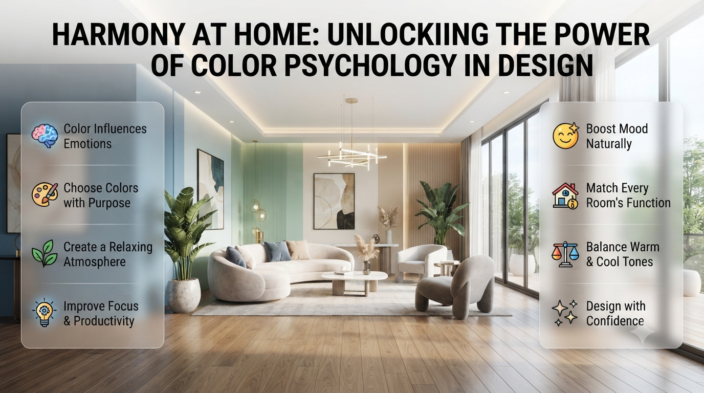
Have you ever entered a room and instantly felt calm, happy, focused, or even uncomfortable without knowing why? The furniture may look beautiful, but in many cases, it’s the color that creates the strongest emotional impact. The colors surrounding us quietly influence our mood, energy, and even the way we experience a space.
Color Psychology is the study of how different colors affect human emotions, behavior, and perception. Whether you’re choosing paint for your home, decorating a new office, or refreshing a single room, understanding color psychology helps you make smarter design decisions instead of relying only on trends.
In this complete guide, you’ll learn how color psychology works, the science behind it, what each color represents, and how professional interior designers use colors to create beautiful, functional spaces. You’ll also discover practical tips that will help you choose colors with confidence.
What Is Color Psychology?
Color psychology is the study of how colors influence human emotions, thoughts, behaviors, and decision-making. Different colors can create different emotional responses, making them an important part of interior design, branding, marketing, healthcare, education, and everyday living.
Color is much more than decoration. Every shade sends subtle signals to the brain that influence how we feel about a room.
Think about these examples:
- A soft blue bedroom often feels peaceful and relaxing.
- A bright yellow kitchen feels cheerful and energetic.
- A dark grey office can appear modern and professional.
- A green living room creates a refreshing connection with nature.
These emotional reactions are exactly why interior designers carefully select color palettes rather than choosing colors randomly.
Color psychology isn’t an exact science because personal experiences and cultural backgrounds also influence how we perceive colors. However, many emotional responses are shared by most people, making color psychology an incredibly useful design tool.
💡 Pro Tip: Before selecting paint colors, ask yourself one question: “How do I want this room to feel?” The answer should guide your color choices more than current design trends.
If you’re looking for more decorating inspiration, explore Interior Design Mode 24 for expert home design ideas, colour guides, and practical decorating advice.
Why Is Color Psychology Important?
Color affects nearly every part of our daily lives, often without us even noticing.
The right colors can:
- Improve mood
- Reduce stress
- Increase focus
- Encourage relaxation
- Boost creativity
- Make rooms appear larger
- Create warmth and comfort
- Improve first impressions
- Support better productivity
Because of these effects, architects, interior designers, hospitals, schools, hotels, restaurants, and workplaces all carefully consider color psychology when designing spaces.
For homeowners, understanding color psychology helps avoid expensive repainting mistakes while creating rooms that genuinely support the way they live.
For example, painting a bedroom bright red might look dramatic, but it could make the space feel too stimulating for restful sleep. A calming blue or soft green would usually create a more relaxing environment.
How Does Color Psychology Work?
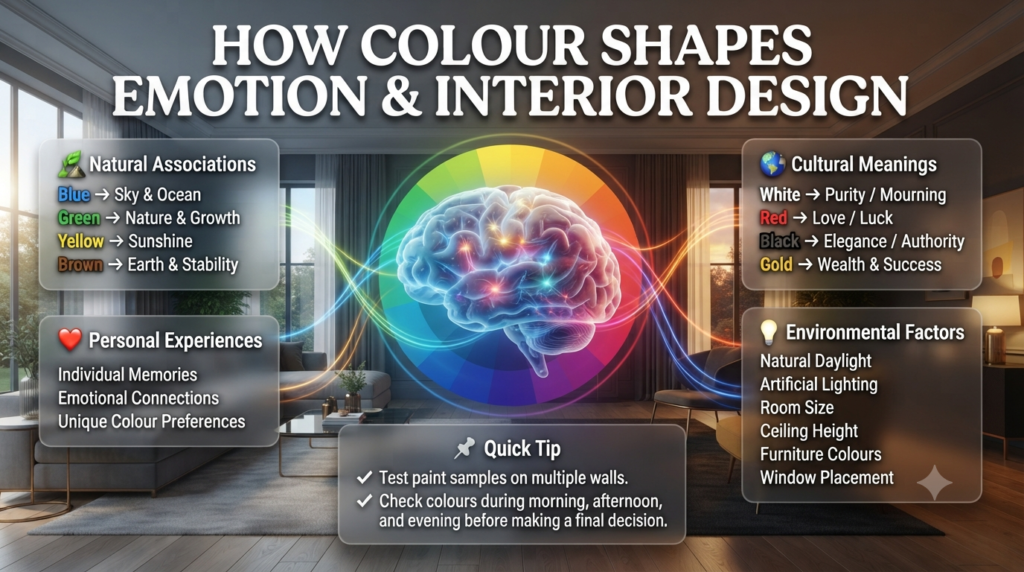
Color psychology works because the brain naturally connects colors with emotions, memories, cultural meanings, and experiences found in nature. These associations influence how people think, feel, and behave in different environments.
Although every individual has unique preferences, our emotional response to color usually comes from four main factors.
1. Natural Associations
Humans naturally associate colors with the world around them.
Examples include:
- Blue reminds us of clear skies and calm oceans.
- Green represents healthy forests, plants, and growth.
- Yellow is connected with sunshine and warmth.
- Brown often reminds us of earth and stability.
Because these associations have existed throughout human history, they continue to influence our emotions today.
2. Personal Experiences
Not everyone reacts to colors in exactly the same way.
Someone who grew up near the beach may associate blue with happy childhood memories, while another person might connect it with a completely different experience.
This explains why color psychology combines scientific patterns with personal interpretation.
3. Cultural Meanings
Different cultures assign different meanings to colors.
| Color | Common Western Meaning | Meaning in Some Eastern Cultures |
|---|---|---|
| White | Purity, cleanliness | Mourning in some traditions |
| Red | Love, excitement | Luck, prosperity, celebration |
| Black | Luxury, elegance | Authority or mourning |
| Gold | Wealth, prestige | Success and prosperity |
Professional interior designers always consider the cultural background of homeowners before recommending dominant colors.
4. Environmental Factors
The same paint color can look completely different depending on the room.
Several factors affect how colors appear:
- Natural daylight
- Artificial lighting
- Ceiling height
- Room size
- Flooring materials
- Furniture colours
- Window placement
- Decorative accessories
A navy blue wall may feel elegant in a bright living room but dark and heavy in a small hallway with limited natural light.
📌 Quick Tip: Always test paint samples on multiple walls and view them during the morning, afternoon, and evening before making your final decision.
For more guidance on selecting the right paint shades, visit the Paint Color section, where you’ll find expert advice on choosing colours for every room.
The Science Behind Color Psychology
Although emotions are personal, scientific research has shown that colors can influence both psychological and physical responses.
Studies suggest that color may affect:
- Heart rate
- Blood pressure
- Mental focus
- Stress levels
- Appetite
- Memory
- Productivity
- Emotional comfort
- Purchasing decisions
Warm colors such as red, orange, and yellow generally increase stimulation and energy.
Cool colors like blue, green, and soft grey are often linked to relaxation, concentration, and emotional balance.
This is why healthcare facilities frequently use calming colours in patient areas, while fitness centres often include energetic accent colours that encourage activity.
The goal isn’t to claim that every person reacts identically. Instead, color psychology identifies consistent emotional patterns that help designers create spaces suited to specific purposes.
⭐ Expert Tip: The most successful interiors rarely rely on a single colour. Designers combine warm and cool tones to create balance, depth, and visual interest throughout a home.
Warm Colours vs Cool Colours
Understanding the difference between warm and cool colours makes choosing a paint palette much easier.
| Warm Colours | Cool Colours |
|---|---|
| Red | Blue |
| Orange | Green |
| Yellow | Teal |
| Coral | Aqua |
| Peach | Purple (Blue-Based) |
Warm Colours
Warm colours usually create feelings of:
- Energy
- Comfort
- Passion
- Optimism
- Conversation
- Excitement
They work especially well in:
- Dining rooms
- Family rooms
- Kitchens
- Entertainment spaces
If you’re planning a cosy and inviting interior, explore these professionally selected Warm Color Palettes for inspiration.
Cool Colours
Cool colours generally encourage:
- Relaxation
- Peace
- Focus
- Freshness
- Mental clarity
- Balance
They are ideal for:
- Bedrooms
- Bathrooms
- Home offices
- Reading rooms
- Meditation spaces
If you’re creating a relaxing bedroom or workspace, combining cool colours with carefully selected Neutral Color Schemes often produces timeless results.
Color Psychology at a Glance
The table below provides a quick overview of the emotional meaning behind the most common colors.
| Color | Emotional Effect | Best Interior Uses |
|---|---|---|
| Red | Passion, energy, excitement | Dining rooms, accent walls |
| Blue | Calm, trust, focus | Bedrooms, offices |
| Green | Balance, freshness, nature | Living rooms, home offices |
| Yellow | Happiness, creativity | Kitchens, breakfast areas |
| Orange | Warmth, enthusiasm | Gyms, playrooms |
| Purple | Luxury, creativity | Bedrooms, reading corners |
| Pink | Comfort, kindness | Nurseries, bedrooms |
| White | Cleanliness, openness | Small spaces, modern homes |
| Black | Sophistication, drama | Accent features |
| Grey | Elegance, neutrality | Contemporary interiors |
| Brown | Stability, warmth | Rustic and traditional homes |
In Part 2, we’ll explore each of these colours in detail, including where they work best, common mistakes to avoid, and how to use them effectively in different rooms.
Benefits of Understanding Color Psychology
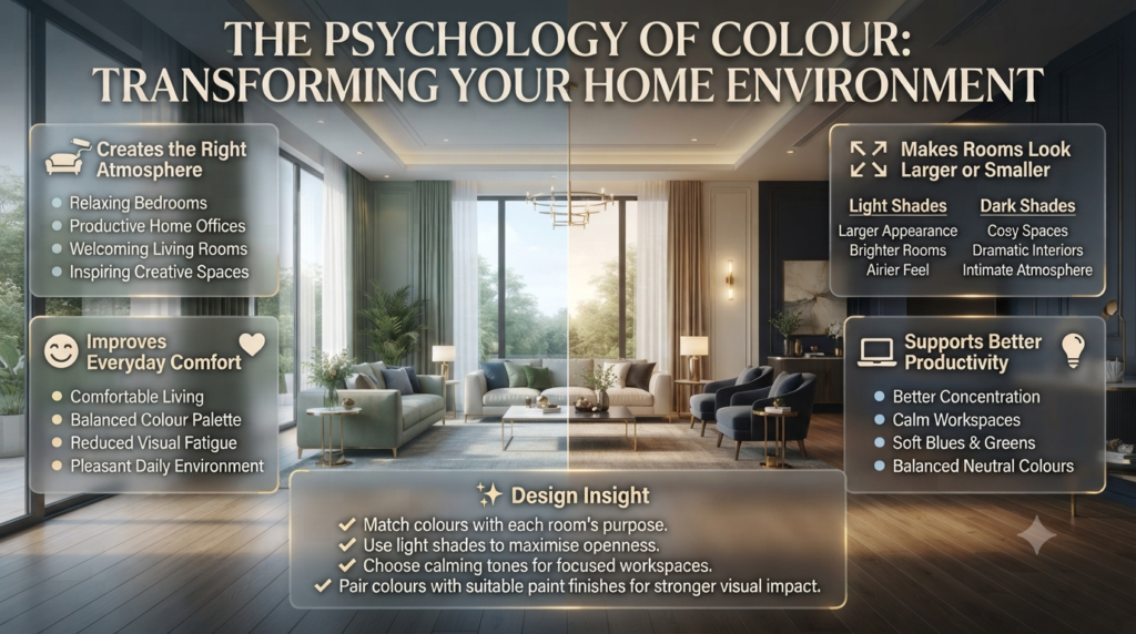
Learning how colors affect emotions helps you create spaces that not only look beautiful but also improve everyday living.
Creates the Right Atmosphere
Every room has a different purpose.
Understanding color psychology allows you to match the room’s mood with its function.
Examples include:
- Relaxing bedrooms
- Productive home offices
- Welcoming living rooms
- Inspiring creative spaces
Improves Everyday Comfort
The right colors make people feel comfortable without them even realizing why.
Balanced color palettes reduce visual fatigue and create environments where family members naturally enjoy spending time.
Makes Rooms Look Larger or Smaller
Color can completely change the way a room feels.
Light shades reflect more natural light, making spaces appear:
- Larger
- Brighter
- Airier
Dark colors absorb light, creating:
- Cosy environments
- Dramatic interiors
- Intimate gathering spaces
Pairing the right colour with the right Paint Finishes can enhance these visual effects even further.
Supports Better Productivity
Workspaces benefit greatly from thoughtful colour selection.
Soft blues, greens, and balanced neutrals often improve concentration, while overly bright colours may become distracting over long periods.
That’s why many modern home offices use calming colour palettes rather than highly saturated shades.
Helps Express Your Personal Style
Color psychology doesn’t tell you what you must choose—it helps you make intentional decisions.
Whether you love modern minimalism, cosy farmhouse interiors, or bold contemporary designs, understanding color psychology allows you to create spaces that reflect your personality while supporting everyday activities.
If you’re considering adding visual interest without repainting an entire room, an Accent Wall can introduce colour while maintaining balance.
⚠ Common Mistake: Choosing paint colours based only on social media photos or current trends often leads to disappointment. Lighting, ceiling height, flooring, and surrounding décor all change how a colour appears inside your own home.
For even better results, don’t overlook the “fifth wall.” Choosing the right Ceiling Colors can make a room feel taller, brighter, or more intimate depending on your design goals.
Understanding the Psychology of Every Color
Choosing the right color isn’t just about personal taste. Every color creates a different emotional response and works best in specific rooms. Professional interior designers rarely choose paint based on trends alone—they consider how people will feel in the space every day.
The following guide explains what each color represents, where it works best, its advantages, potential drawbacks, and practical ways to use it in your home.
Red Color Psychology
Red is associated with passion, energy, confidence, excitement, and warmth. It naturally attracts attention and creates a lively atmosphere, making it ideal for social spaces and statement features.
Red is one of the most emotionally powerful colors. It stimulates conversation, increases energy, and creates a sense of excitement. That’s one reason restaurants often incorporate red into their branding and interiors.
Best Rooms for Red
- Dining rooms
- Entertainment areas
- Home bars
- Accent walls
- Entryways
Benefits
- Creates warmth
- Encourages conversation
- Adds visual drama
- Makes large rooms feel more intimate
Drawbacks
- Can feel overwhelming if overused
- Not ideal for relaxing bedrooms
- May make small rooms appear smaller
Professional Example
Instead of painting an entire room bright red, many designers use it on a single Accent Wall while keeping the remaining walls neutral. This creates impact without overwhelming the space.
⭐ Expert Tip: Deep burgundy and terracotta often provide the warmth of red while feeling more sophisticated than bright crimson.
Blue Color Psychology
Blue represents calmness, trust, focus, and emotional stability. It is one of the most popular interior paint colors because it creates peaceful, relaxing environments.
Blue naturally reminds people of clear skies and water, making it one of the easiest colors to live with.
Best Rooms
- Bedrooms
- Bathrooms
- Home offices
- Reading rooms
Benefits
- Encourages relaxation
- Improves concentration
- Creates a spacious feeling
- Timeless appearance
Drawbacks
- Dark blues may feel cold in poorly lit rooms
- Excessive blue can reduce warmth
For elegant combinations, pair blue with the soft shades featured in Neutral Color Schemes to create a balanced and timeless interior.
📌 Quick Tip: Navy blue works beautifully as an accent wall, while lighter blues make small rooms appear larger.
Green Color Psychology
Green symbolises nature, balance, health, renewal, and relaxation. It creates one of the most comfortable and refreshing environments for everyday living.
Green connects indoor spaces with nature and helps create a calming atmosphere.
Best Rooms
- Living rooms
- Bedrooms
- Home offices
- Sunrooms
Benefits
- Reduces visual stress
- Feels fresh
- Complements wood furniture
- Works with modern and traditional styles
Drawbacks
- Very bright greens may appear artificial
- Incorrect undertones may clash with flooring
Soft sage, olive, and eucalyptus green are among today’s most versatile interior colors.
Yellow Color Psychology
Yellow represents optimism, happiness, creativity, and energy. Used correctly, it brightens interiors and creates cheerful spaces filled with natural warmth.
Yellow reflects light extremely well, making darker rooms feel brighter.
Best Rooms
- Kitchens
- Breakfast areas
- Children’s study spaces
- Craft rooms
Benefits
- Adds brightness
- Improves mood
- Makes spaces feel welcoming
- Enhances natural light
Drawbacks
- Bright yellow can become overwhelming
- Too much yellow may create visual fatigue
If you love warm interiors, explore these designer-inspired Warm Color Palettes to discover harmonious combinations.
⚠ Common Mistake: Choosing an extremely bright yellow often creates glare. Softer buttery or muted mustard tones are usually easier to live with.
Orange Color Psychology
Orange combines the excitement of red with the optimism of yellow. It creates energetic, welcoming spaces that encourage activity and social interaction.
Orange adds warmth without feeling as intense as red.
Best Rooms
- Home gyms
- Playrooms
- Family rooms
- Creative studios
Benefits
- Encourages enthusiasm
- Feels inviting
- Adds warmth
- Creates positive energy
Drawbacks
- Bright orange may dominate small rooms
- Requires balanced neutral colours
Terracotta and burnt orange remain among the most popular designer choices because they feel sophisticated rather than overpowering.
Purple Color Psychology
Purple represents creativity, luxury, imagination, and elegance. Depending on the shade, it can feel dramatic, calming, or highly sophisticated.
Deep purples create luxury, while lighter lavender shades feel peaceful.
Best Rooms
- Bedrooms
- Reading corners
- Guest rooms
- Dressing rooms
Benefits
- Elegant appearance
- Adds personality
- Works beautifully with metallic accents
Drawbacks
- Dark shades require good lighting
- Overuse can make rooms feel heavy
Lavender, mauve, and plum remain timeless favourites for elegant interiors.
Pink Color Psychology
Pink symbolises comfort, compassion, softness, and warmth. Modern interior designers now use pink in many sophisticated ways beyond children’s bedrooms.
Muted blush pink has become increasingly popular in contemporary interiors.
Best Rooms
- Bedrooms
- Nurseries
- Dressing rooms
- Reading spaces
Benefits
- Creates warmth
- Softens modern interiors
- Pairs beautifully with grey and white
Drawbacks
- Bright pink may feel overpowering
- Incorrect shades may quickly feel dated
Black Color Psychology
Black represents sophistication, elegance, power, and contrast. Used carefully, it creates dramatic and luxurious interiors.
Black works best as an accent rather than a dominant wall color.
Best Uses
- Feature walls
- Doors
- Window frames
- Built-in shelving
- Decorative furniture
Benefits
- Creates contrast
- Adds luxury
- Highlights architectural details
Drawbacks
- Makes rooms appear smaller
- Requires good lighting
⭐ Expert Tip: Matte black paired with warm wood creates one of today’s most popular modern interior styles.
White Color Psychology
White symbolises cleanliness, simplicity, openness, and freshness. It reflects light exceptionally well, making rooms feel brighter and larger.
White remains one of the most versatile interior colors.
Best Rooms
- Kitchens
- Bathrooms
- Small bedrooms
- Hallways
Benefits
- Makes rooms feel spacious
- Reflects natural light
- Timeless appearance
- Matches every decorating style
Drawbacks
- May appear sterile without texture
- Requires regular cleaning
White walls become more inviting when combined with wood, textiles, greenery, and artwork.
Grey Color Psychology
Grey represents balance, sophistication, neutrality, and modern elegance. It provides an excellent foundation for colourful décor and furniture.
Grey remains one of the most versatile neutral colours.
Best Rooms
- Living rooms
- Home offices
- Hallways
- Bedrooms
Benefits
- Matches almost everything
- Modern appearance
- Excellent background colour
Drawbacks
- Cool greys may feel cold
- Poor lighting can make grey appear dull
Combining grey with warm timber and natural fabrics prevents the room from feeling lifeless.
Brown Color Psychology
Brown represents stability, comfort, security, and nature. It creates warm, welcoming interiors filled with timeless character.
Brown works especially well in homes featuring natural materials.
Best Rooms
- Living rooms
- Libraries
- Dining rooms
- Rustic interiors
Benefits
- Warm atmosphere
- Timeless appearance
- Pairs beautifully with green and cream
Drawbacks
- Dark browns require adequate lighting
- Excessive brown may feel heavy
Natural wood flooring often provides enough brown without requiring additional brown wall colors.
Room-by-Room Color Psychology Guide
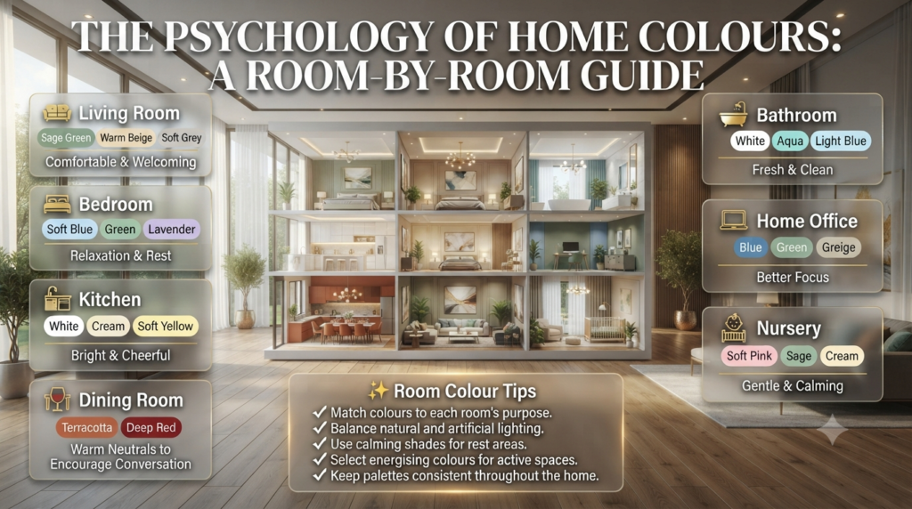
Choosing colors becomes much easier when you consider how each room is used.
| Room | Best Colors | Why They Work |
|---|---|---|
| Living Room | Sage Green, Warm Beige, Soft Grey | Comfortable and welcoming |
| Bedroom | Soft Blue, Green, Lavender | Encourages relaxation |
| Kitchen | White, Cream, Soft Yellow | Bright and cheerful |
| Dining Room | Terracotta, Deep Red, Warm Neutral | Encourages conversation |
| Bathroom | White, Aqua, Light Blue | Fresh and clean |
| Home Office | Blue, Green, Greige | Improves focus |
| Nursery | Soft Pink, Sage, Cream | Gentle and calming |
If you’re planning a complete home makeover, browse the Interior Design category for room-by-room decorating ideas and practical design inspiration.
How Paint Finish Changes Color Psychology
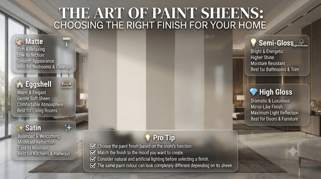
Many homeowners focus only on paint colour, but the finish also changes how a colour looks and feels.
| Paint Finish | Emotional Effect | Best For |
|---|---|---|
| Matte | Soft and relaxing | Bedrooms, ceilings |
| Eggshell | Warm and elegant | Living rooms |
| Satin | Balanced and welcoming | Kitchens, hallways |
| Semi-Gloss | Bright and energetic | Bathrooms, trim |
| High Gloss | Dramatic and luxurious | Doors, furniture |
Even the perfect colour can look completely different with the wrong finish. Before making your final decision, learn how different Paint Finishes affect appearance, durability, and light reflection.
💡 Pro Tip: Always choose the paint finish based on both the room’s function and the mood you want to create—not just appearance.
Choosing the Right Ceiling Color
The ceiling, often called the “fifth wall,” plays a major role in how spacious or cosy a room feels.
- White ceilings make rooms appear taller.
- Soft cream creates warmth.
- Light grey adds subtle elegance.
- Dark ceilings make large rooms feel more intimate.
- Pale blue ceilings create an airy, open atmosphere.
For expert guidance, explore Ceiling Colors to learn how ceiling paint can transform the proportions and atmosphere of any room.
Common Color Psychology Mistakes
Even the most beautiful paint colour can produce disappointing results if it isn’t used correctly. Professional interior designers consider lighting, room size, function, and existing décor before making a recommendation.
Here are the most common mistakes homeowners make—and how to avoid them.
1. Choosing Colours Based Only on Trends
A colour that’s popular on social media may not suit your home.
Trendy colours often look different depending on:
- Natural light
- Room size
- Ceiling height
- Furniture
- Flooring
- Existing décor
Why It Happens
People often choose colours because they look attractive in photos rather than considering how they’ll feel every day.
How to Avoid It
- Choose colours based on the room’s purpose.
- Test paint samples before buying.
- Prioritise timeless shades over short-lived trends.
⚠ Common Mistake: Never select a paint colour without viewing it in your home’s lighting during the morning, afternoon, and evening.
2. Ignoring Natural Lighting
Lighting changes everything.
A warm beige can appear cream in bright daylight but look yellow under warm artificial lighting.
North-facing rooms usually receive cooler light, while south-facing rooms feel warmer throughout the day.
Professional Advice
Always paint large sample areas instead of relying on tiny paint chips.
3. Using Too Many Bold Colours
Every room doesn’t need to make a dramatic statement.
Too many bright colours compete for attention and create visual clutter.
Instead, follow the 60-30-10 rule:
| Percentage | Purpose |
|---|---|
| 60% | Primary wall colour |
| 30% | Secondary colour |
| 10% | Accent colour |
This simple approach creates balance without making a room feel busy.
4. Forgetting About Paint Finish
Many homeowners focus only on colour and overlook the finish.
The same paint colour looks completely different in:
- Matte
- Eggshell
- Satin
- Semi-gloss
- High-gloss
Before choosing your paint, read Paint Finishes to understand which finish works best for each room.
5. Ignoring Ceiling Colour
Many people automatically paint every ceiling white.
While white ceilings work well in many homes, soft greys, creams, pale blues, and other subtle shades can completely change a room’s atmosphere.
Learn more in Ceiling Colors.
Step-by-Step Guide to Choosing the Right Colours
Step 1 – Decide How You Want the Room to Feel
Ask yourself:
- Relaxing?
- Energetic?
- Elegant?
- Cosy?
- Spacious?
Your answer should determine the colour—not the latest trend.
Step 2 – Consider the Room’s Purpose
Different rooms require different emotional experiences.
| Room | Desired Feeling |
|---|---|
| Bedroom | Calm |
| Kitchen | Bright |
| Living Room | Welcoming |
| Home Office | Focused |
| Bathroom | Fresh |
Step 3 – Study Natural Light
Observe the room throughout the day.
Morning, afternoon, and evening light can completely change how paint appears.
Step 4 – Choose a Balanced Colour Palette
Professional designers rarely rely on a single colour.
Instead, combine:
- Main wall colour
- Neutral supporting colour
- Accent colour
- Natural textures
Need inspiration? Explore Neutral Color Schemes and Warm Color Palettes for professionally curated combinations.
Step 5 – Test Before Painting
Purchase sample pots.
Paint large sections on different walls.
Live with the colour for several days before making a final decision.
⭐ Expert Tip: A colour you love in the shop may feel completely different once it’s surrounded by your flooring, furniture, curtains, and lighting.
Expert Interior Designer Recommendations
Interior designers don’t choose colours randomly. They create spaces that support how people live and feel.
Here are some practical recommendations professionals follow:
- Choose calming colours for spaces where you relax.
- Reserve bold colours for accents rather than entire rooms.
- Repeat colours throughout the home to create visual flow.
- Mix warm and cool tones for better balance.
- Introduce natural materials such as wood and stone to soften painted surfaces.
- Use indoor plants to complement almost any colour palette.
- Select paint finishes based on durability as well as appearance.
- Don’t overlook the impact of ceiling colour on the overall design.
💡 Pro Tip: If you’re unsure about a bold colour, start with an Accent Wall. It allows you to introduce personality without overwhelming the room.
How does color psychology influence mood in your home?
Color psychology influences mood by affecting how your brain interprets the environment around you. While personal preferences and cultural experiences play a role, certain colors consistently create similar emotional responses. Soft blues and greens often promote calmness, warm neutrals create comfort, and bold shades like red or orange increase energy and excitement. That’s why professional interior designers choose colors based on a room’s purpose rather than simply following trends.
A thoughtfully selected color palette can make a home feel more welcoming, improve relaxation, increase productivity, and even change how spacious a room appears. The goal isn’t to choose the “best” color but the right color for the experience you want to create.
Key Points:
Match colors to the room’s purpose rather than current trends.
Consider natural and artificial lighting before choosing a shade.
Balance bold colors with neutral tones for long-term appeal.
Test paint samples in different lighting conditions before making a final decision.
What is the best color for each room in a house?
There isn’t one perfect color for every home because every room serves a different purpose. The best color depends on how you want the space to feel and function. Bedrooms usually benefit from calming shades like blue or sage green, while kitchens often look brighter with soft white, cream, or muted yellow. Living rooms work well with warm neutrals, earthy greens, or light greys because they create a welcoming atmosphere.
Professional designers also consider room size, natural light, ceiling height, and existing furniture before recommending a paint color. A balanced palette creates a smooth visual flow throughout the home.
Best Color Ideas by Room:
Living Room: Sage green, warm beige, greige, soft grey.
Bedroom: Light blue, eucalyptus green, lavender.
Kitchen: White, cream, soft yellow.
Bathroom: Aqua, pale blue, crisp white.
Home Office: Blue, green, muted neutrals.
Which colors make a room look bigger and brighter?
Light-reflective colors naturally make a room appear larger, brighter, and more open. Shades such as white, off-white, light grey, pale blue, and soft beige bounce natural light around the room, reducing shadows and creating a spacious appearance. This technique is especially useful for small bedrooms, apartments, hallways, and compact living rooms.
However, color alone isn’t enough. The right paint finish, ceiling color, mirrors, and lighting all work together to maximise the feeling of space. Many interior designers pair light wall colors with matching ceilings to create a seamless, open look.
Professional Tips:
Use light colors on both walls and ceilings.
Choose satin or eggshell finishes for better light reflection.
Keep trim slightly lighter than wall colors for a cleaner appearance.
Minimise strong color contrasts in small rooms.
Can color psychology really improve productivity and relaxation?
Yes, when used correctly, color psychology can support both productivity and relaxation by creating an environment that suits the activity taking place in the room. Calm colors like blue and green reduce visual stress and help improve concentration, making them ideal for home offices and study areas. Soft neutrals and muted earth tones create peaceful spaces that encourage relaxation after a busy day.
While paint color won’t completely change someone’s behaviour, it contributes to a more comfortable environment that supports focus, creativity, or rest depending on the room’s purpose.
Best Practice Recommendations:
Choose blue or green for workspaces.
Use warm neutrals in family rooms for comfort.
Avoid overly bright colors in bedrooms.
Combine natural light with calming colors for the best results.
What are the biggest mistakes people make when choosing paint colors?
One of the biggest mistakes is selecting paint colors based only on online photos or social media inspiration. Colors change dramatically depending on lighting, room size, flooring, furniture, and surrounding décor. Another common mistake is using too many bold colors throughout the home, which creates visual clutter instead of harmony.
Professional designers recommend testing paint samples, considering the room’s function, and creating a balanced color palette before making a final decision. This approach helps avoid costly repainting and ensures the finished space feels comfortable for years to come.
Mistakes to Avoid:
Choosing colors without testing samples.
Ignoring natural and artificial lighting.
Following trends instead of personal lifestyle needs.
Forgetting that paint finish affects the final appearance.
Using too many strong colors in one space without neutral balance.
Conclusion
Color psychology is much more than choosing a paint color that looks attractive—it’s about creating spaces that support the way you live, work, and feel every day. From calming blues that encourage relaxation to warm earth tones that make a room feel welcoming, every color has the power to shape the atmosphere of your home.
The key to using color psychology successfully is to look beyond trends. Consider each room’s purpose, the amount of natural light it receives, your existing décor, and the mood you want to create. Testing paint samples, selecting the right paint finish, and balancing bold colors with timeless neutrals will help you achieve results that remain stylish and functional for years.
Remember, there is no universal “perfect” color. The best choice is the one that complements your lifestyle, reflects your personality, and enhances the comfort of your home. By applying the principles of color psychology thoughtfully, you can transform any space into one that feels more inviting, productive, relaxing, or inspiring.
If you’re planning your next decorating project, continue exploring Interior Design Mode 24 for expert guidance on Paint Color, Accent Walls, Neutral Color Schemes, Warm Color Palettes, Ceiling Colors, and Paint Finishes. With the right knowledge and a well-planned color palette, you can create a home that not only looks beautiful but also feels exactly the way you want it to.

Leave a Reply