
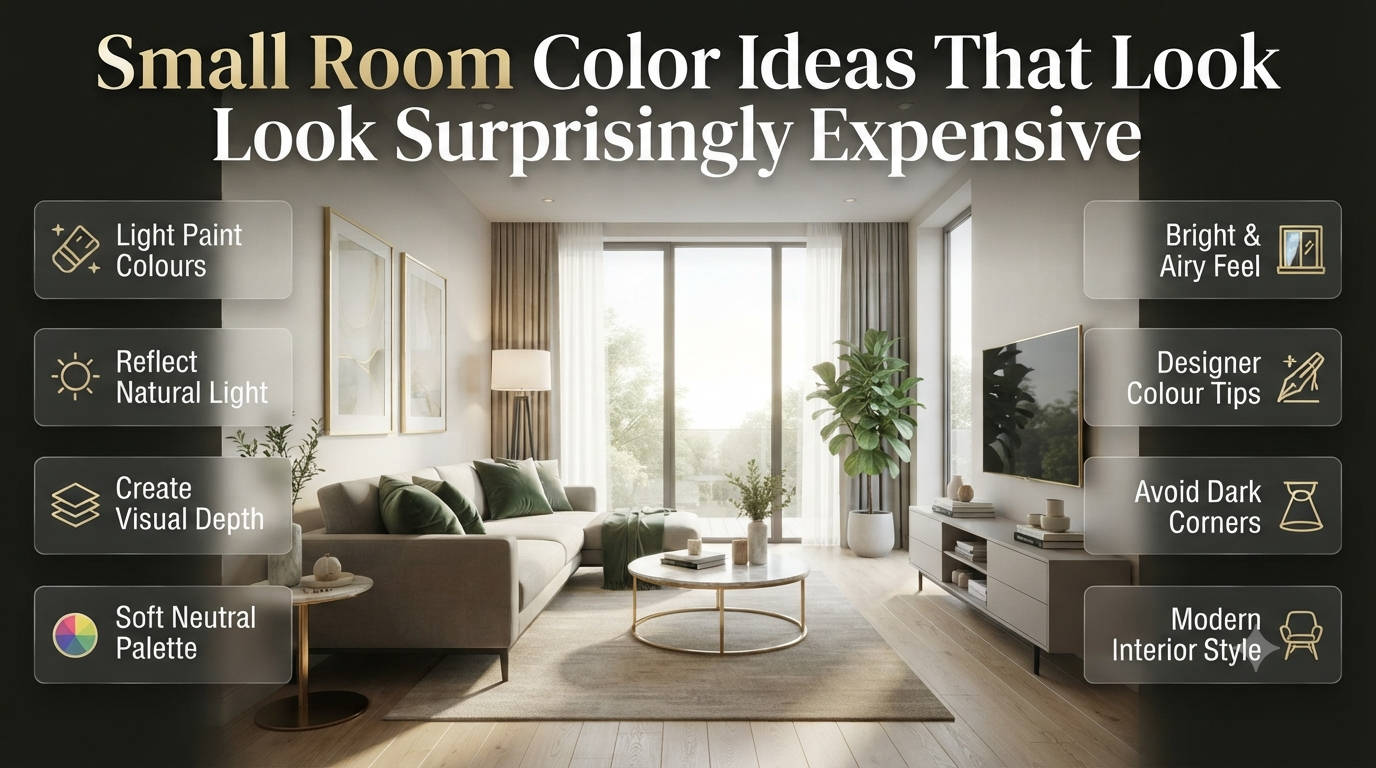
Introduction
Have you ever painted a small room only to find it still feels cramped or even smaller than before? You’re not alone. Choosing the wrong paint colour is one of the biggest reasons compact spaces fail to reach their full potential.
The good news is that the right colour can completely transform how a room looks and feels. Whether you’re decorating a tiny bedroom, a narrow hallway, a compact home office, or a small living room, smart colour choices can create the illusion of more space, improve natural light, and make your home feel more welcoming.
In this guide, you’ll discover the best Small Room Color Ideas, learn which colours work in different lighting conditions, avoid common decorating mistakes, and explore expert techniques that interior designers use to make even the smallest rooms look larger and more luxurious.
Why Does Paint Colour Matter in Small Rooms?
Paint colour influences how large, bright, and inviting a small room feels. Light-reflecting colours, balanced undertones, and the right finish can visually expand walls, improve lighting, and create a more open atmosphere without changing the room’s actual size.
Many homeowners assume furniture layout is the biggest challenge in a compact room. In reality, wall colour often has an even greater impact.
Paint affects how light travels across the room. It also changes visual depth, making walls appear closer or farther away depending on the shade you choose.
The right colour can:
- Make ceilings appear higher
- Reflect more natural light
- Reduce visual clutter
- Create a calming atmosphere
- Make furniture blend naturally into the space
- Improve the overall flow between rooms
If you’re planning a complete makeover, you may also enjoy our Interior Design guides for additional inspiration.
How Our Eyes Perceive Space Through Colour
Interior designers don’t simply choose colours because they’re trendy. They understand how the human eye reacts to brightness, contrast, and depth.
Here’s a simple comparison.
| Colour Characteristic | Visual Effect |
|---|---|
| High Light Reflectance | Room appears larger |
| Dark Saturated Colours | Creates intimacy and depth |
| Warm Undertones | Makes spaces feel cosy |
| Cool Undertones | Adds openness and freshness |
| Low Contrast | Creates continuous visual flow |
| Strong Contrast | Defines edges and makes rooms feel segmented |
The smoother your colour transitions, the larger your room usually appears.
💡 Pro Tip
Paint isn’t working alone. Wall colour, flooring, ceiling colour, curtains, and furniture should all complement each other to maximise the feeling of space.
What Are the Best Small Room Color Ideas?
The best colours for small rooms include warm white, soft beige, greige, sage green, dusty blue, pale grey, blush pink, muted olive, and light taupe. These colours reflect light, reduce harsh contrasts, and create a spacious appearance.
Let’s explore the most effective options.
1. Warm White
Warm white remains the safest and most versatile choice.
Unlike stark white, it feels soft rather than clinical while reflecting plenty of light.
Best For
- Living rooms
- Small kitchens
- Hallways
- Home offices
- Apartments
Benefits:
- Maximises brightness
- Matches almost every decorating style
- Creates a timeless look
- Makes ceilings feel taller
Popular combinations include oak furniture, linen fabrics, and natural stone accents.
2. Greige
Greige combines grey and beige into one balanced neutral.
It delivers warmth without becoming yellow and sophistication without feeling cold.
Greige works exceptionally well when you want a modern yet welcoming interior.
Best paired with:
- White trim
- Black accents
- Wooden flooring
- Brass hardware
For more neutral decorating inspiration, explore Neutral Color Schemes.
3. Sage Green
Sage green continues to dominate interior design trends because it introduces colour without overwhelming a room.
It creates a relaxing atmosphere while maintaining an airy appearance.
Perfect for:
- Bedrooms
- Reading corners
- Home offices
- Bathrooms
It pairs beautifully with:
- Cream
- Warm white
- Light oak
- Soft beige
4. Dusty Blue
Dusty blue creates a peaceful environment while visually pushing walls outward.
This subtle colour works especially well in rooms receiving abundant natural light.
Ideal for:
- Bedrooms
- Bathrooms
- Guest rooms
Its understated elegance suits both modern and traditional interiors.
5. Soft Beige
Soft beige adds warmth without making a room feel enclosed.
Unlike darker tans or golden browns, lighter beige tones keep spaces feeling open.
Great for:
- Family rooms
- Hallways
- Dining spaces
Soft beige also hides minor wall imperfections better than bright white.
6. Pale Grey
Pale grey remains popular because of its versatility.
The key is selecting a grey with warm undertones rather than icy blue undertones.
Warm grey creates balance while maintaining brightness.
Works best with:
- White ceilings
- Soft wood finishes
- Black fixtures
- Indoor plants
7. Blush Pink
Modern blush isn’t overly feminine.
Instead, it provides warmth, softness, and subtle sophistication.
It complements:
- Scandinavian interiors
- Minimalist homes
- Modern apartments
Blush also reflects warm light beautifully during the evening.
8. Light Taupe
Taupe bridges the gap between beige and grey.
It’s ideal for homeowners seeking a luxurious yet understated palette.
Taupe complements:
- Marble
- Walnut furniture
- Gold fixtures
- Textured fabrics
⭐ Expert Tip
Rather than choosing the lightest paint on the colour card, select a shade one or two steps darker. Paint often appears much lighter once applied across an entire room.
Light vs Dark Colours: Which Is Better for Small Rooms?
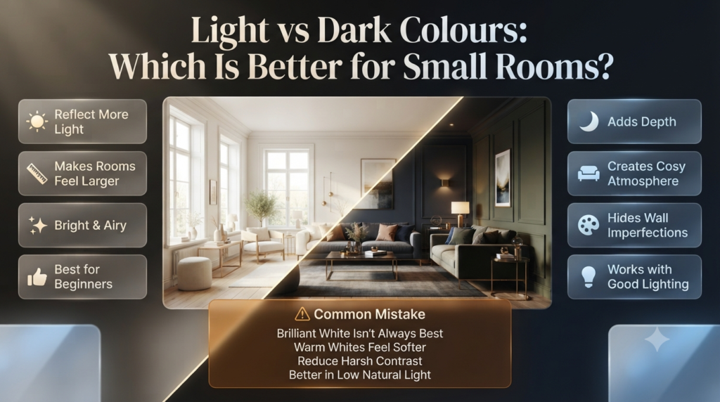
Light colours generally make small rooms appear larger by reflecting more light, while darker colours add depth and character. The best choice depends on lighting, ceiling height, furniture, and the atmosphere you want to create.
Many people believe dark paint should never be used in compact rooms.
That’s not entirely true.
When used correctly, darker shades can blur corners and create an illusion of depth.
Here’s a comparison.
| Feature | Light Colours | Dark Colours |
|---|---|---|
| Brightness | Excellent | Moderate |
| Makes Room Feel Larger | Excellent | Good (when styled correctly) |
| Reflects Light | High | Low |
| Hides Wall Imperfections | Moderate | Excellent |
| Creates Cosy Atmosphere | Moderate | Excellent |
| Suitable for Beginners | Excellent | Moderate |
The safest option for most homeowners is still a soft neutral with good light reflectance.
⚠ Common Mistake
Many people choose brilliant white believing it automatically makes a room larger.
In reality, extremely bright white can create harsh contrasts, highlight imperfections, and feel cold—especially in rooms with limited natural light.
Warm whites often deliver a softer, more spacious appearance.
Trending Small Room Paint Colours in 2026
Interior colour trends continue shifting away from cool greys and stark whites toward warmer, more natural palettes inspired by organic materials and biophilic design.
Here are some of the most popular colours designers are recommending for compact spaces this year.
| Trending Colour | Why It’s Popular | Best Room |
|---|---|---|
| Warm White | Timeless brightness | Living Room |
| Greige | Modern neutral | Entire Home |
| Sage Green | Nature-inspired calm | Bedroom |
| Soft Beige | Warm minimalism | Hallway |
| Dusty Blue | Relaxing atmosphere | Bathroom |
| Olive Green | Rich yet sophisticated | Dining Room |
| Muted Terracotta | Earthy warmth | Reading Nook |
| Pale Taupe | Luxury without heaviness | Home Office |
These colours create depth without overwhelming smaller interiors and pair beautifully with natural wood, stone, linen, and matte finishes.
📌 Quick Tip
Before committing to any paint colour, test large sample swatches on multiple walls and observe them in morning, afternoon, and evening light. The same colour can look dramatically different throughout the day.
Planning More Than Just Wall Colours?
If you’re refreshing an entire room, these related guides can help you make more confident design decisions:
- Paint Color for the latest colour inspiration.
- Paint Finishes to choose the right sheen for each room.
- Ceiling Colors for techniques that make ceilings appear higher.
- Accent Walls if you’re considering adding visual interest without making the room feel smaller.
How Does Lighting Change Paint Colours in Small Rooms?
Lighting has a major impact on how paint colours appear. Natural daylight, warm LED bulbs, cool white lighting, and the direction a room faces can all make the same paint colour look lighter, darker, warmer, or cooler. Always test paint samples under your room’s actual lighting before making a final decision.
Many homeowners blame the paint when a room doesn’t look the way they expected. In reality, lighting is often the biggest reason a colour changes after it’s on the wall.
A soft beige that looks bright in a showroom might appear dull in a north-facing bedroom. Likewise, a cool grey can suddenly take on blue tones under certain LED lights.
Understanding this relationship helps you choose colours that look beautiful throughout the day—not just under shop lighting.
Natural Light vs Artificial Light
| Lighting Type | Colour Effect | Best Colour Choices |
|---|---|---|
| North-facing light | Cooler and slightly darker | Warm white, greige, beige |
| South-facing light | Bright and warm | Sage green, pale grey, dusty blue |
| East-facing light | Warm mornings, cooler afternoons | Soft beige, blush pink |
| West-facing light | Cooler mornings, warm evenings | Taupe, olive green, greige |
| Warm LED (2700K–3000K) | Enhances warm tones | Beige, cream, terracotta |
| Cool White LED (4000K+) | Highlights cool tones | Pale grey, blue, white |
Choosing paint without considering lighting is one of the quickest ways to end up disappointed.
💡 Pro Tip
Paint large sample boards instead of relying on tiny colour chips. Move them around the room and check them in daylight, evening light, and with your lamps switched on.
Choosing the Right Paint Finish for a Small Room
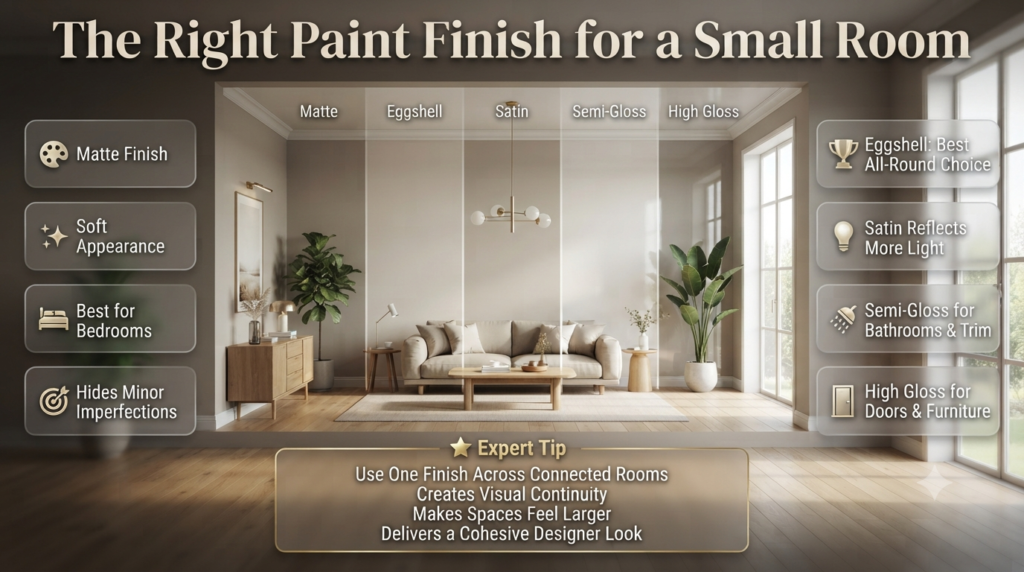
Eggshell and satin finishes are usually the best choice for small rooms because they reflect a gentle amount of light while remaining durable. Matte finishes create a soft look, while semi-gloss works well on trim and doors.
Colour gets most of the attention, but paint finish also affects how spacious a room feels.
A finish determines how much light bounces off your walls, how easy they are to clean, and how noticeable wall imperfections become.
Paint Finish Comparison
| Finish | Appearance | Durability | Best Used In |
|---|---|---|---|
| Matte | Soft and smooth | Medium | Bedrooms, ceilings |
| Eggshell | Slight sheen | Good | Living rooms |
| Satin | Soft glow | Very Good | Kitchens, hallways |
| Semi-Gloss | Reflective | Excellent | Bathrooms, trims |
| High Gloss | Mirror-like shine | Excellent | Doors and furniture |
If you’re unsure, eggshell is often the safest all-round option for living spaces.
For a detailed comparison, see Paint Finishes before choosing your paint.
⭐ Expert Tip
Using the same finish throughout connected spaces creates visual continuity, making your home feel larger and more cohesive.
Best Small Room Colour Ideas by Room
Every room serves a different purpose, so the best colour isn’t always the same. Here’s how professionals match colours to each space.
Small Living Room
The living room is where most families spend their time, so it should feel open, bright, and comfortable.
Recommended Colours
- Warm White
- Greige
- Soft Beige
- Pale Taupe
- Sage Green
These colours reflect natural light while providing a timeless backdrop for furniture and décor.
Small Bedroom
Bedrooms should feel calm rather than overly bright.
Soft colours help reduce visual stress and create a peaceful environment.
Best Choices
- Dusty Blue
- Sage Green
- Warm White
- Blush Pink
- Soft Grey
Natural wood furniture and textured bedding complement these shades beautifully.
Small Kitchen
Compact kitchens often benefit from colours that maximise brightness while hiding everyday wear.
Recommended options include:
- Warm White
- Cream
- Greige
- Soft Beige
- Light Olive
Pair them with under-cabinet lighting to make the room feel larger.
Small Bathroom
Bathrooms usually have limited natural light, making colour selection especially important.
Best colours include:
- Crisp White
- Dusty Blue
- Pale Sage
- Soft Grey
- Aqua Green
Light-reflecting finishes can also help brighten darker bathrooms.
Small Home Office
A home office should encourage focus without feeling confined.
Top colour choices:
- Pale Taupe
- Sage Green
- Soft Grey
- Warm White
- Muted Blue
These colours reduce visual distractions while maintaining a professional atmosphere.
Small Hallway
Hallways connect the home, so consistency matters.
Use colours that flow naturally into adjoining rooms.
Excellent options include:
- Warm White
- Greige
- Soft Beige
- Light Taupe
If you’re repainting multiple areas, browse more inspiration in Home Improvement.
Colour Combinations That Make Small Rooms Feel Bigger
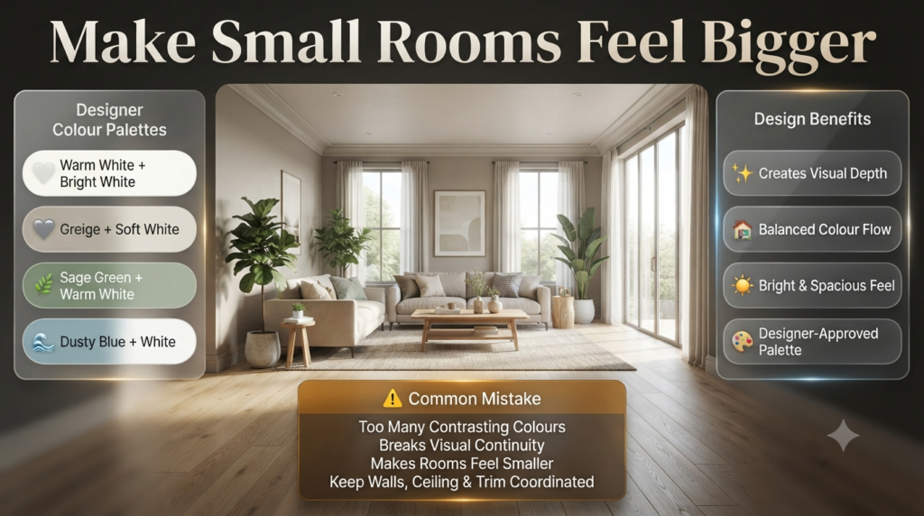
Instead of choosing just one paint colour, designers often use coordinated palettes to add depth while maintaining openness.
| Wall Colour | Ceiling | Trim | Overall Style |
|---|---|---|---|
| Warm White | Bright White | White | Classic |
| Greige | Soft White | White | Modern |
| Sage Green | Warm White | Cream | Nature Inspired |
| Dusty Blue | White | White | Coastal |
| Taupe | Ivory | White | Luxury |
| Soft Beige | Cream | Warm White | Traditional |
Using complementary colours creates a balanced look without overwhelming a compact room.
If you’re considering a feature wall, explore Accent Walls for ideas that work in smaller spaces.
⚠ Common Mistake
Painting every surface—including walls, ceiling, trim, and doors—in contrasting colours can visually break up a small room, making it feel busier and smaller than it really is.
Step-by-Step Guide to Choosing the Perfect Paint Colour
Selecting paint doesn’t have to be overwhelming. Follow this simple process used by many interior designers.
Step 1: Evaluate the Room
What to Do
Look at the room’s size, shape, windows, ceiling height, and existing furniture.
Why It Matters
A room with limited daylight needs different colours than one flooded with sunlight.
Professional Advice
Take photos at different times of the day to understand how light changes.
Common Mistake
Choosing colours based only on online photos.
Quick Example
A north-facing bedroom often looks warmer with greige than with icy white.
Step 2: Define the Mood
What to Do
Decide how you want the room to feel.
Why It Matters
Colour influences mood as much as appearance.
Professional Advice
Choose relaxing colours for bedrooms and energising colours for workspaces.
Common Mistake
Following trends without considering how you use the room.
Quick Example
Dusty blue creates a calm bedroom, while warm white feels brighter in a study.
Step 3: Test Paint Samples
What to Do
Paint large sample patches or use peel-and-stick samples.
Why It Matters
Colours often look completely different on full walls.
Professional Advice
View samples in daylight and at night before making a decision.
Common Mistake
Making a choice from a tiny paint card.
Quick Example
A beige sample may appear creamy in the morning but slightly grey in the evening.
Step 4: Coordinate with Existing Décor
What to Do
Match paint with flooring, furniture, curtains, and accessories.
Why It Matters
A harmonious palette creates a larger, more polished appearance.
Professional Advice
Work with your largest fixed elements, such as flooring or built-in cabinets.
Common Mistake
Buying furniture first and trying to force a paint colour later.
Quick Example
Light oak flooring pairs beautifully with sage green or warm white.
📌 Quick Tip
When choosing between two similar shades, the slightly softer option usually creates a more timeless look and is easier to style over the years.
Common Mistakes When Painting Small Rooms
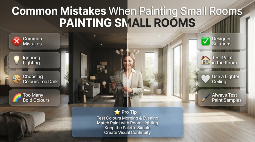
Even beautiful colours can produce disappointing results if they’re used incorrectly.
1. Ignoring Lighting
Always test paint in the actual room.
2. Choosing Colours That Are Too Dark
Dark colours aren’t wrong, but they require balanced lighting and thoughtful styling.
3. Using Too Many Bold Colours
Too many contrasting shades create visual clutter.
Stick to one main colour supported by complementary accents.
4. Forgetting the Ceiling
A lighter ceiling often makes the room appear taller.
For more inspiration, visit Ceiling Colors.
5. Skipping Sample Testing
Paint looks different on screens, brochures, and walls.
Always test before buying multiple tins.
Expert Designer Advice for Small Rooms
Professional designers rarely rely on colour alone. They combine several techniques to maximise the feeling of space.
Here are some of their favourite strategies:
- Choose colours with similar undertones for a seamless look.
- Use larger mirrors to reflect natural light.
- Keep window treatments light and simple.
- Limit strong colour contrasts.
- Repeat the same colour family throughout adjoining rooms.
- Introduce texture with fabrics instead of adding too many colours.
- Select furniture that visually blends with the wall colour for a cleaner, more spacious appearance.
These small decisions work together to create a room that feels brighter, calmer, and noticeably larger without any structural changes.
What paint colors make a small room look instantly more expensive?
The most luxurious-looking paint colours for small rooms are those with rich undertones, subtle depth, and timeless appeal rather than overly bright or trendy shades. Interior designers often choose colours that create a calm, cohesive backdrop, allowing furniture, lighting, and textures to stand out. Instead of relying on stark white, modern luxury homes favour softer neutrals and nature-inspired hues that feel elegant in both natural and artificial light.
Colours such as warm white, greige, soft taupe, sage green, muted olive, charcoal, dusty blue, and mushroom beige instantly elevate a compact space. These shades add sophistication without making the room feel smaller. Pairing them with high-quality finishes, layered lighting, and minimal clutter further enhances the premium look.
Best luxury paint colours for small rooms:
Warm White – Bright, timeless, and elegant.
Greige – A perfect blend of grey and beige for a refined look.
Soft Taupe – Creates warmth with understated luxury.
Sage Green – Adds a calming, designer-inspired feel.
Dusty Blue – Sophisticated and relaxing.
Muted Olive – Rich, earthy, and modern.
Mushroom Beige – Soft, warm, and highly versatile.
Charcoal Grey – Dramatic yet luxurious when balanced with good lighting.
Should you use light or dark colors in a small room to achieve a luxury look?
Neither light nor dark colours are automatically more luxurious—the best choice depends on the room’s lighting, proportions, and the atmosphere you want to create. Luxury interiors focus on balance, depth, and harmony rather than simply making a room appear larger.
Light colours like warm white, greige, and soft beige create an open, airy feel and reflect more light, making them ideal for compact rooms with limited daylight. Dark colours such as deep navy, charcoal, forest green, or rich brown create intimacy and depth, giving a room a boutique hotel or high-end designer aesthetic when paired with quality lighting and carefully selected furnishings.
The key is to avoid harsh contrasts and instead build a cohesive colour palette with complementary textures and finishes.
Professional recommendations:
Use light colours in rooms with little natural light.
Choose dark colours only if the room has good lighting.
Maintain a consistent colour palette throughout the room.
Balance dark walls with lighter furniture and accessories.
Layer lighting to prevent dark colours from feeling heavy.
What paint sheen or finish screams “high-end” in a compact space?
A high-end interior isn’t defined by glossy walls—it comes from choosing the right finish for the right surface. Most luxury homes use matte or eggshell finishes on walls because they create a soft, seamless appearance that feels sophisticated rather than reflective.
Matte paint absorbs light, giving walls a velvety texture that hides minor imperfections and creates a premium look. Eggshell adds a subtle sheen that gently reflects light without appearing shiny, making it a popular choice for living rooms, bedrooms, and hallways. Satin finishes work well in kitchens and bathrooms, while semi-gloss is best reserved for trim, doors, and mouldings.
Paint Finish
Luxury Appearance
Best For
Matte
Soft, elegant, modern
Bedrooms, living rooms
Eggshell
Refined with subtle sheen
Hallways, dining rooms
Satin
Smooth and durable
Kitchens, bathrooms
Semi-Gloss
Crisp architectural detail
Doors, trim, skirting
High Gloss
Bold statement, limited use
Feature furniture and doors
For the most luxurious result:
Choose matte or eggshell for walls.
Use semi-gloss only on trims and doors.
Avoid overly shiny walls in small spaces.
Invest in premium-quality paint for a smoother finish.
How can the “Color Drenching” technique elevate a small room’s luxury factor?
Color Drenching is one of the biggest interior design trends because it creates a seamless, immersive look by painting the walls, ceiling, trim, doors, and sometimes built-in furniture in the same colour or closely related shades.
In a small room, this technique blurs the visual boundaries between surfaces, making the space feel more cohesive and surprisingly larger. Instead of the eye stopping at contrasting trim or ceilings, it moves smoothly around the room, creating a sophisticated, designer-quality finish.
This approach works exceptionally well with colours like greige, taupe, sage green, dusty blue, deep olive, or warm neutrals. Layering different textures—linen curtains, timber furniture, stone accents, and soft fabrics—prevents the monochromatic palette from feeling flat.
Benefits of Color Drenching:
Creates a seamless, high-end appearance.
Makes walls and ceilings feel more expansive.
Highlights architectural details without strong contrasts.
Produces a calm, luxurious atmosphere.
Works beautifully in both modern and traditional interiors.
⭐ Expert Tip: Use different finishes within the same colour family—for example, matte on walls and eggshell on trim—to add subtle depth while maintaining a cohesive look.
What common paint mistakes make a small room look cheap instead of rich?
Even an expensive paint colour can lose its impact if it’s applied without careful planning. Many small rooms look less polished because of avoidable decorating mistakes rather than the paint itself.
One of the biggest errors is choosing paint solely because it’s trendy without considering lighting, furniture, or the room’s purpose. Overusing bright white, selecting colours with clashing undertones, or combining too many bold shades can make a compact room feel disjointed and inexpensive. Poor surface preparation and low-quality paint also reduce the overall finish, leaving walls looking uneven or patchy.
Common mistakes to avoid:
Choosing paint without testing samples in the room.
Using stark white in spaces with little natural light.
Mixing too many contrasting colours.
Ignoring the ceiling when planning the colour scheme.
Using glossy paint on every wall.
Skipping wall preparation before painting.
Buying low-quality paint that provides poor coverage.
Failing to coordinate paint with flooring, furniture, and lighting.
📌 Quick Tip: A luxurious room is created through consistency. Keep your colour palette simple, invest in quality paint, use the right finish, and let texture, lighting, and carefully chosen décor provide visual interest rather than relying on multiple bold colours.
Conclusion
The right paint colour can completely transform a small room, making it feel brighter, larger, and far more luxurious without the cost of a major renovation. While timeless shades like warm white, greige, soft taupe, and sage green remain designer favourites, achieving a high-end look is about more than colour alone. Lighting, paint finish, texture, and a cohesive colour palette all work together to create a polished and sophisticated space.
Whether you prefer an airy neutral scheme or a bold Color Drenching approach, always test paint samples in your room’s natural and artificial lighting before making a final decision. Pair premium-quality paint with the right sheen, thoughtful décor, and minimal visual clutter to maximise the sense of space and elegance.
Ultimately, the most expensive-looking small rooms aren’t defined by their size—they’re defined by smart design choices. By selecting colours that suit your home’s lighting, maintaining a consistent palette, and avoiding common painting mistakes, you can create a compact room that feels stylish, welcoming, and effortlessly luxurious for years to come.

Leave a Reply