
Introduction
Developing an Interior Design Color Eye | A room can contain beautiful furniture, expensive flooring, elegant curtains, and carefully selected decorations but still feel visually uncomfortable. Sometimes, the problem isn’t the quality of the materials or the furniture arrangement. It’s the way different colors interact with one another. A beige wall may look warm and inviting in one room but appear dull or yellow in another. Similarly, a beautiful sofa can feel disconnected when its color doesn’t complement the surrounding finishes.
This is why developing an interior design color eye is such a valuable skill for homeowners, decorators, and anyone interested in creating better living spaces. It involves learning to recognize undertones, understand color relationships, notice differences in lighting, and identify combinations that create visual harmony.
You don’t need a professional design qualification to develop this ability. What you need is consistent observation, a basic understanding of color theory, and the confidence to experiment with different combinations.
Whether you’re decorating your first apartment, refreshing an existing living room, selecting paint for a bedroom, or planning a complete home makeover, understanding color can help you make more confident decisions. At DesignMode24 Interior Design, the goal is to make interior design knowledge practical and accessible so homeowners can create spaces that look attractive and work comfortably in everyday life.
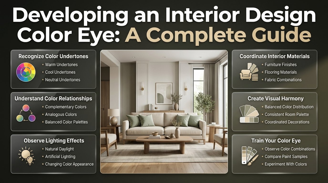
This guide explains how to train your eye, recognize undertones, build balanced palettes, evaluate lighting, coordinate materials, avoid common decorating mistakes, and develop a practical approach to choosing colors for every room.
What Does Developing an Interior Design Color Eye Actually Mean?
Developing an interior design color eye means improving your ability to recognize, compare, and evaluate colors in real spaces. It involves understanding how hue, undertone, saturation, brightness, contrast, materials, and lighting influence the appearance of an interior.
It is not simply about identifying attractive colors or memorizing popular combinations. It’s about understanding why certain shades work together and why others create an uncomfortable visual result.
Consider a living room with warm white walls, a beige sofa, natural oak furniture, and dark green cushions. Each item might look attractive individually, but the complete arrangement depends on how their colors relate.
A trained eye can recognize whether the wall color has a yellow undertone, whether the oak looks too orange beside the upholstery, and whether the green cushions provide enough contrast.
This ability becomes particularly useful when:
- Selecting wall colors that complement existing furniture.
- Comparing similar paint shades before purchasing.
- Coordinating flooring, countertops, cabinetry, and fabrics.
- Creating a consistent appearance throughout the home.
- Choosing accent colors without making the room overwhelming.
- Understanding why a space feels too cold, dark, bright, or visually flat.
- Making decorating decisions before spending money on unnecessary replacements.
The important difference is that an inexperienced decorator may choose colors based on individual appearance, while someone with stronger color awareness considers the complete environment.
Why Is Color Awareness Important in Interior Design?
Color influences how people experience an interior. It affects visual balance, perceived depth, atmosphere, and the way different objects relate to each other.
A carefully selected palette can make an ordinary room feel more comfortable and organized without requiring expensive furniture or structural changes.
It Helps You Recognize Visual Harmony
Visual harmony happens when different colors work together without competing unnecessarily for attention.
For example, warm beige, natural oak, cream, and muted olive can create a connected appearance because their overall character is relatively soft and earthy.
However, adding a highly saturated electric blue without considering the rest of the palette might make the arrangement feel disconnected.
This doesn’t mean strong colors should never be used. It means they need a clear purpose and appropriate placement.
When you understand color relationships, you can recognize whether an accent adds useful contrast or creates unnecessary visual distraction.
It Reduces Expensive Decorating Mistakes
Paint, furniture, flooring, curtains, and decorative accessories can become costly when homeowners repeatedly replace items that don’t work together.
A common situation involves choosing a wall color before checking the undertone of the existing flooring.
A homeowner might select a cool gray paint because it looks attractive on a sample card. After application, the gray may appear noticeably blue beside warm orange-toned wood.
Understanding undertones before purchasing helps prevent this type of mistake.
It Improves the Overall Appearance of a Home
A coordinated home doesn’t need the same color in every room.
Instead, consistency can come from repeating related undertones, materials, and selected accent shades.
For example:
- A living room may use warm white and natural oak.
- A bedroom may introduce muted sage and cream.
- A dining area may use soft taupe and dark brown.
- A hallway may connect these spaces through a similar warm neutral.
The individual rooms remain different, but the shared color characteristics create a natural transition.
For additional guidance on creating functional and attractive interiors, explore Interior Design.
Understand the Basic Elements of Color Before Decorating
Before you can evaluate combinations confidently, you need to understand what makes one color different from another.
Interior designers generally examine hue, undertone, saturation, value, and temperature when selecting a palette.
Hue: Identifying the Actual Color
Hue refers to the basic identity of a color, such as red, blue, green, yellow, or violet.
However, interior design involves many variations within each color family.
For example, green may appear as:
- Yellow-green, which can feel fresh and energetic.
- Blue-green, which often creates a cooler appearance.
- Olive green, which offers an earthy character.
- Sage green, which appears softer and more muted.
- Forest green, which introduces depth and visual weight.
Understanding these variations allows you to select more precise shades instead of treating every green or blue as interchangeable.
A useful exercise is to compare several shades from one color family and identify which ones look warmer, cooler, brighter, or darker.
Undertones: The Hidden Characteristics of Interior Colors
Undertones are subtle color influences that affect how a shade appears beside other materials.
They are particularly important when selecting neutral colors because two paints that appear almost identical on small sample cards may look completely different on a large wall.
Common undertones include:
| Color family | Possible undertones | Appearance |
|---|---|---|
| White | Yellow, pink, blue, green | Warm or crisp |
| Beige | Yellow, orange, pink | Creamy or earthy |
| Gray | Blue, green, violet, brown | Cool or warm |
| Greige | Beige, gray, violet | Muted and balanced |
| Brown | Red, orange, yellow | Rich or earthy |
| Green | Yellow, blue, gray | Fresh or subdued |
To identify an undertone, compare several similar shades together.
For example, place a warm white sample beside a cool white sample. The warm option may appear creamy, while the cooler one may look cleaner or slightly blue.
The difference becomes easier to recognize when both shades are visible at the same time.
Professional advice: Never select a neutral paint color without considering the permanent materials in the room. Compare it with flooring, countertops, cabinetry, and large furniture before making a final decision.
Saturation: Understanding Color Intensity
Saturation describes how strong or muted a color appears.
A highly saturated blue looks vivid and noticeable, while a low-saturation blue appears softer and more subdued.
This difference affects the atmosphere of an interior.
Highly saturated colors can create energy and visual emphasis. Muted colors often work well when the goal is a quieter, more relaxed appearance.
For example, a living room with pale beige walls and muted blue upholstery may feel balanced. Replacing the upholstery with extremely bright blue could create a much stronger visual effect.
Neither choice is automatically wrong. The important factor is whether the intensity suits the room and the other selected colors.
Value: Recognizing Light and Dark Shades
Value describes how light or dark a color appears.
A pale blue and navy blue belong to the same general color family, but they have different values.
Value helps create depth and contrast.
Consider a room with:
- Pale cream walls.
- Medium-tone oak furniture.
- Dark brown side tables.
- Deep green decorative details.
The different levels of lightness create visual structure.
If every item is equally pale, the room may look flat. If everything is extremely dark, it may feel visually heavy.
A developed color eye helps you recognize when a room needs more contrast and when additional dark elements would make it uncomfortable.
Color Temperature: Warm and Cool Relationships
Warm colors generally contain red, yellow, or orange influences. Cool colors generally lean toward blue, green, or violet.
However, many interior colors sit between these categories.
A gray can be warm or cool. Beige can contain pink or yellow undertones. Green can lean toward either yellow or blue.
Learning to identify these relationships helps you avoid combinations that feel unintentionally disconnected.
How to Recognize Warm and Cool Colors in Real Interiors
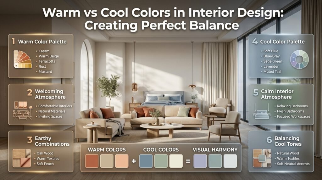
Warm and cool colors can create very different experiences, but successful interiors often combine both.
Using Warm Colors for a Welcoming Atmosphere
Warm colors can make a room feel comfortable, inviting, and connected to natural materials.
Common examples include:
- Cream.
- Warm beige.
- Terracotta.
- Rust.
- Mustard.
- Warm brown.
- Soft peach.
- Muted ochre.
These shades can work particularly well in living rooms, dining areas, and spaces where people gather.
For example, a living room with warm white walls, oak flooring, beige upholstery, and terracotta cushions can feel welcoming without relying on strong colors.
The key is to maintain a sensible balance between the dominant warm shades and smaller decorative accents.
Using Cool Colors for a Calm Appearance
Cool colors can create a fresh, relaxed, and understated atmosphere.
Common options include:
- Soft blue.
- Blue-gray.
- Sage green.
- Lavender.
- Cool white.
- Muted teal.
- Charcoal with blue undertones.
These colors can work well in bedrooms, bathrooms, and home offices.
However, using only cool colors may make some rooms feel less welcoming, particularly when the lighting is limited.
Natural wood, warm textiles, and softer neutral accessories can help balance the appearance.
Combining Warm and Cool Colors Successfully
Warm and cool colors can work beautifully together when their proportions and undertones are considered.
Imagine a bedroom with warm white walls, oak bedside tables, muted blue bedding, cream curtains, and dark bronze lighting.
The blue introduces a cooler element, while the wood, cream, and bronze provide warmth.
A useful approach is to establish one overall temperature direction and use the opposite temperature as a supporting element.
This creates contrast without making the room feel disconnected.
How to Train Your Eye to Recognize Colors More Accurately
Developing color awareness takes practice. You become better at recognizing differences by examining actual materials, comparing shades, and studying how colors behave in different environments.
1. Compare Similar Shades Instead of Studying One Color Alone
Choose one color family and collect five or six variations.
For example, compare:
- Warm white.
- Cool white.
- Cream.
- Pale beige.
- Gray-white.
- Soft ivory.
Place the samples together and observe their differences.
Ask yourself:
- Which shade looks more yellow?
- Which one has a pink influence?
- Which looks slightly gray?
- Which appears brighter?
- Which works best beside natural wood?
Repeat this exercise with green, gray, blue, and brown.
This practice improves your ability to notice subtle differences that are easy to miss when colors are viewed individually.
2. Study Professionally Designed Rooms
Interior photographs can teach you a great deal when you examine them carefully.
Instead of simply saving attractive rooms, identify the elements responsible for their appearance.
Look at the dominant wall color, large furniture, flooring, curtains, and decorative accents.
Then ask why the designer selected those combinations.
For example, if a room features a dark green sofa, notice whether green appears elsewhere through artwork, cushions, or decorative accessories.
This repetition creates visual connections and helps the furniture feel integrated into the space.
3. Build a Personal Color Reference Collection
Create a physical or digital collection of colors you find attractive.
Organize it into practical groups:
- Warm neutrals.
- Cool neutrals.
- Earthy shades.
- Muted greens.
- Soft blues.
- Deep accent colors.
- Natural wood finishes.
Add short notes explaining why you selected each shade.
For example, you might record that a particular beige works well with oak but looks too yellow beside cool gray flooring.
These observations become useful when planning future decorating projects.
4. Examine Natural Materials
Natural materials are excellent references for understanding color relationships.
Wood, stone, linen, leather, and plants contain subtle variations that are often more complicated than a single paint shade.
Compare oak with walnut, warm stone with gray marble, or cream linen with cool gray upholstery.
Notice how the surrounding materials influence the appearance of each color.
This is especially important because interior design involves coordinating materials rather than selecting paint colors in isolation.
5. Use the Grayscale Observation Exercise
A grayscale photograph removes the visible color information and makes lightness and darkness easier to compare.
Choose a photograph of a room and examine it in grayscale.
Notice whether:
- The walls and furniture have similar brightness.
- Dark elements are distributed evenly.
- One object dominates the composition.
- The room contains enough contrast.
- The overall arrangement feels visually balanced.
This exercise helps you understand value without being distracted by attractive hues.
6. Practice With Small Decorating Experiments
You don’t need to repaint an entire room to improve your judgment.
Start with inexpensive samples.
Place three cushion fabrics beside your existing sofa. Compare a warm beige, a muted green, and a dusty blue.
Observe which combination works best with the sofa, rug, and flooring.
Try the same exercise with curtain samples, decorative objects, or small furniture finishes.
The goal is to learn through comparison before making expensive decisions.
Understand How Natural and Artificial Lighting Change Colors
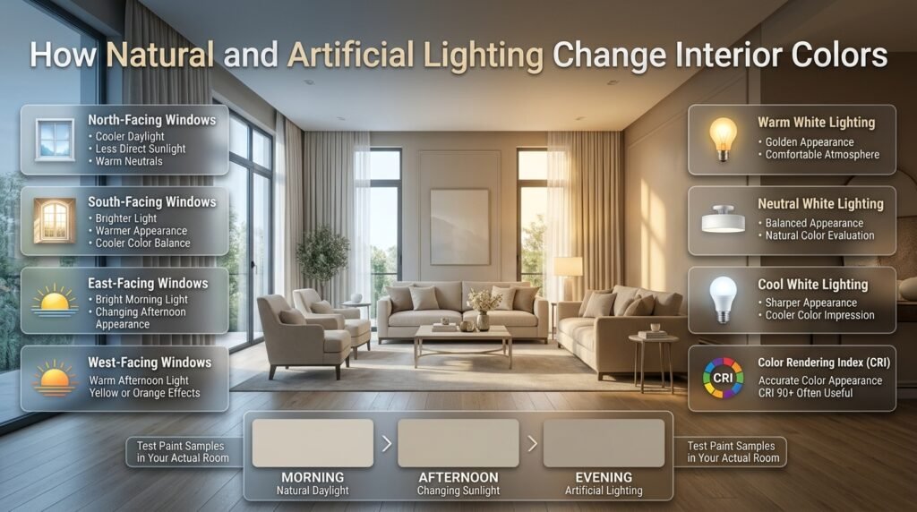
Lighting is one of the biggest reasons a color looks different after installation.
A paint shade that appears neutral in a store may look yellow, gray, or green at home.
Developing an interior design color eye means learning to evaluate colors under the actual lighting conditions of the room.
How Window Direction Influences Color Appearance
Natural light changes throughout the day and varies according to window direction, surrounding buildings, weather, and glazing.
The following tendencies are useful starting points:
| Window direction | General light characteristics | Practical color consideration |
|---|---|---|
| North-facing | Often cooler and less direct | Warm neutrals can add warmth |
| South-facing | Often brighter and warmer | Cooler shades may balance the warmth |
| East-facing | Brighter morning light | Check colors later in the day |
| West-facing | Warmer afternoon light | Test for excessive yellow or orange effects |
These are general tendencies, not guaranteed results. Local surroundings and window design can change the appearance considerably.
For example, a north-facing bedroom with limited daylight may benefit from a warm neutral rather than a strongly cool gray.
However, always test samples in the actual space before deciding.
For more guidance, read Natural Light and Floor Plan Orientation.
Understand Artificial Lighting and Color Temperature
Artificial lighting also changes how surfaces appear.
Warm white bulbs generally produce a more golden appearance, while cooler lighting can make some interiors feel sharper.
Neutral white lighting offers another option for spaces where a balanced appearance is preferred.
When evaluating lighting, consider:
- Color temperature.
- Brightness.
- Fixture placement.
- Light distribution.
- Color Rendering Index.
The Color Rendering Index, or CRI, indicates how accurately a light source reveals colors compared with a reference source.
A CRI of 90 or higher is often useful when accurate color appearance is important, although the best lighting choice depends on the application.
A warm bedroom may benefit from softer lighting, while a work area may require clearer illumination.
Test Paint Samples at Different Times
Before purchasing paint for an entire room, test the selected colors properly.
Follow this process:
- Purchase small sample quantities.
- Apply the colors to large sample boards.
- Place the boards against different walls.
- Observe them during morning daylight.
- Check their appearance in afternoon light.
- Evaluate them under evening lighting.
- Compare them with furniture and flooring.
Don’t rush this stage.
A shade that appears attractive for ten minutes in a showroom may behave very differently throughout the day.
Learn the Main Color Schemes Used in Interior Design
Color schemes help you understand how different hues relate to one another.
They provide a useful starting point, but they should not become strict rules that limit creativity.
Monochromatic Color Scheme
A monochromatic palette uses different variations of one basic hue.
For example, a neutral living room might include pale cream walls, beige upholstery, taupe cushions, and dark brown furniture.
The shades belong to a related color family, creating a coordinated appearance.
Benefits:
- Easy to coordinate.
- Creates visual continuity.
- Works well in minimalist interiors.
- Allows materials and textures to become more noticeable.
Possible drawback: If all surfaces have similar brightness and texture, the room may appear flat.
Introduce darker accents, varied materials, and different finishes to create depth.
Analogous Color Scheme
An analogous scheme combines colors located next to each other on the traditional color wheel.
Examples include:
- Blue, blue-green, and green.
- Yellow, yellow-green, and green.
- Red, red-orange, and orange.
These combinations generally create a harmonious appearance because the colors share related characteristics.
A bedroom featuring sage green, muted olive, and warm cream can create a relaxed atmosphere.
The important consideration is controlling the intensity of each shade.
Complementary Color Scheme
Complementary colors sit opposite one another on the traditional color wheel.
Examples include blue and orange, red and green, and yellow and violet.
These combinations create stronger contrast and can help highlight selected features.
For example, a navy living room could include terracotta cushions or decorative accessories.
However, using two highly saturated complementary colors across equally large areas may create excessive visual competition.
A more balanced approach is to use one dominant color and introduce the other in smaller amounts.
Triadic Color Scheme
A triadic palette uses three colors spaced approximately equally around the color wheel.
Red, yellow, and blue are a familiar example.
This approach can create an energetic appearance, but it requires careful control.
Choose one dominant color, one supporting color, and a smaller accent.
For example, a creative room might use muted blue as the main shade, warm yellow in selected accessories, and restrained red details in artwork.
Comparison of Common Color Schemes
| Scheme | Main characteristic | Suitable application |
|---|---|---|
| Monochromatic | Variations of one hue | Calm and coordinated interiors |
| Analogous | Neighboring hues | Natural and harmonious spaces |
| Complementary | Opposite hues | Strong contrast and focal points |
| Triadic | Three evenly spaced hues | Energetic and expressive interiors |
How to Build a Balanced Color Palette for Your Home
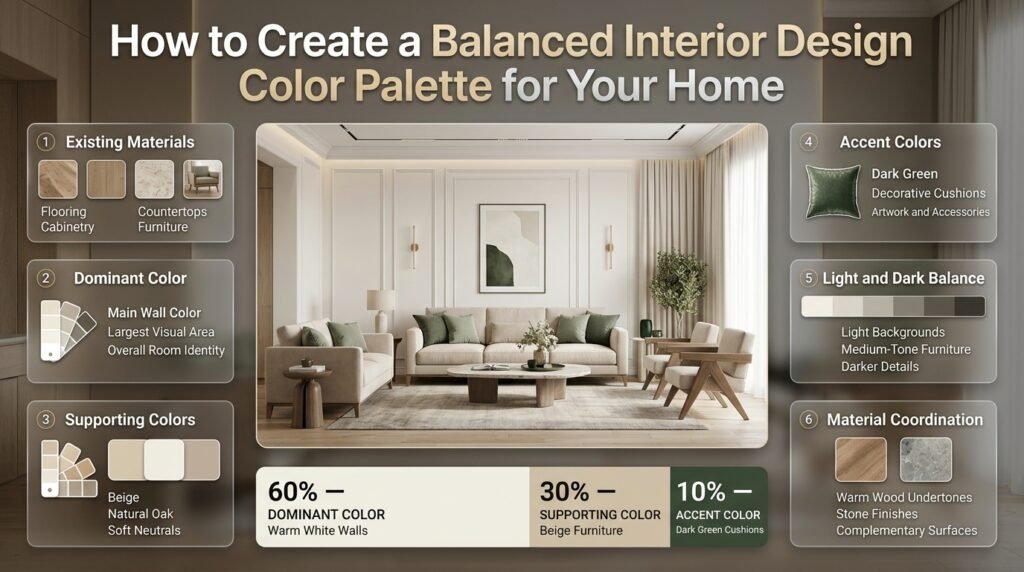
A successful palette should begin with the elements that already exist in the room.
Instead of immediately selecting a wall color, examine the flooring, cabinetry, countertops, furniture, and other permanent finishes.
These materials often determine which colors will work successfully.
Step 1: Identify the Existing Permanent Materials
Start with the surfaces that are difficult or expensive to change.
These may include:
- Flooring.
- Kitchen cabinets.
- Bathroom tiles.
- Stone countertops.
- Built-in wardrobes.
- Large furniture pieces.
Identify their dominant colors and undertones.
For example, orange-toned oak flooring may create a different relationship with gray paint than pale natural oak.
Similarly, a countertop with warm beige veining may work better with a different wall shade than one with cool gray veining.
Your palette should respond to these existing materials rather than ignoring them.
Step 2: Select a Dominant Color
The dominant color occupies the largest visual area or creates the strongest overall impression.
It may appear on walls, large furniture, flooring, or cabinetry.
For a calm living room, warm white could become the dominant color.
For a more expressive dining room, muted green might become the main visual element.
Choose a shade that supports the purpose of the room and works with its natural and artificial lighting.
Step 3: Choose Supporting Colors
Supporting colors add depth without competing with the dominant shade.
For example:
- Warm white walls.
- Beige upholstery.
- Natural oak furniture.
- Muted sage accessories.
These colors are different but share a relatively soft appearance.
Supporting colors can appear through rugs, curtains, furniture, upholstery, and decorative objects.
Step 4: Introduce Accent Colors
Accent colors create visual interest and help highlight specific areas.
They can appear through:
- Cushions.
- Artwork.
- Lamps.
- Decorative pottery.
- Small furniture pieces.
- Rugs.
- Books and accessories.
A dark green accent can add depth to a neutral room without requiring major changes.
Keep accent colors intentional rather than adding unrelated shades simply because individual accessories look attractive.
Step 5: Check Light and Dark Balance
Examine the value of the complete palette.
A room with only pale colors may appear washed out, while a room with too many dark surfaces can feel visually heavy.
Try combining:
- Light background surfaces.
- Medium-tone furniture.
- Darker decorative details.
- A few stronger accent colors.
The aim is to create enough contrast for the room to feel structured without making it uncomfortable.
Understanding the 60-30-10 Color Rule
The 60-30-10 rule is a popular starting point for distributing colors.
| Proportion | Purpose | Example |
|---|---|---|
| 60% | Dominant color | Warm white walls |
| 30% | Supporting color | Beige furniture |
| 10% | Accent color | Dark green cushions |
These percentages are guidelines rather than fixed measurements.
A room may need a different distribution depending on its architecture, furniture, and materials.
A large dark sofa, for example, may have more visual weight than several smaller decorative accessories.
Use the rule to organize your initial palette, then adjust it according to the actual space.
How to Coordinate Paint, Furniture, Flooring, and Fabrics
One of the most challenging parts of decorating is making different materials look connected.
A paint color may be beautiful on its own but unsuitable beside a particular sofa or floor finish.
The solution is to evaluate materials together.
Coordinate Wall Paint With Existing Furniture
Start by identifying the main color and undertone of your largest furniture pieces.
A warm beige sofa may work naturally with creamy walls and oak furniture.
A cool gray sofa might look better beside a more neutral or cooler wall shade.
However, don’t assume matching undertones are always necessary.
A warm sofa can work with cooler walls when the contrast is intentional and supported by other materials.
Match Flooring With the Overall Palette
Flooring creates a large visual foundation.
Warm wood floors often contain orange, red, or yellow influences. Gray flooring may have blue or brown undertones. Natural stone can contain several colors within one surface.
Take flooring samples or clear photographs when selecting paint, rugs, and furniture.
A rug should not be selected only because its main color looks attractive. Its smaller secondary colors may be just as important for connecting the room.
Select Curtains According to the Room’s Existing Colors
Curtains occupy a significant area, especially when windows are large.
They can blend into the wall color or provide controlled contrast.
For example, a warm neutral room might use cream curtains for continuity or muted olive curtains for added depth.
Consider fabric texture and light transmission as well as color.
Heavy fabrics may make a room feel darker, while lightweight materials can allow more daylight to pass through.
Combine Different Materials Without Creating Clashes
Material selection becomes easier when you understand the relationship between color and texture.
A room may combine:
- Natural oak.
- Linen upholstery.
- Travertine-style surfaces.
- Dark metal.
- Wool rugs.
These materials don’t need identical colors.
Instead, their tones, textures, and finishes should create a coherent visual arrangement.
For more practical guidance, explore Styling Open Shelves Without Clutter.
How to Choose Colors for Different Rooms

Each room has its own lighting, purpose, furniture requirements, and visual priorities.
A color that works well in a living room may not produce the same result in a bathroom or bedroom.
Living Room Color Selection
Living rooms often contain several large visual elements, including sofas, rugs, curtains, flooring, artwork, and decorative accessories.
Start with the largest pieces and develop the palette around them.
A practical combination could include:
- Warm white walls.
- Beige or taupe upholstery.
- Natural wood furniture.
- Olive green cushions.
- Dark bronze accessories.
If the room is small, use contrast carefully so that the furniture doesn’t visually overwhelm the space.
If the room is large, deeper shades can help create a more intimate atmosphere.
Bedroom Color Selection
Bedrooms generally benefit from colors that support relaxation and visual comfort.
Consider:
- Muted sage.
- Soft blue-gray.
- Warm white.
- Dusty rose.
- Pale taupe.
- Soft olive.
Don’t select colors only because they look attractive in photographs.
Check their appearance under bedside lamps and natural morning light.
Bedding, wardrobes, flooring, and curtains should also be considered as part of the complete palette.
Kitchen Color Selection
Kitchen colors need to work with cabinetry, countertops, flooring, appliances, and backsplash materials.
If your cabinets are warm white, a strongly blue-gray wall color may create an unexpected contrast.
Compare several neutral samples against the actual cabinet finish.
Also examine the veining and undertones of your countertop.
For kitchens with natural wood cabinetry, softer greens, warm whites, and earthy neutrals may provide useful starting points.
Bathroom Color Selection
Bathrooms often contain reflective surfaces, tiles, mirrors, and artificial lighting.
Warm white, pale beige, soft stone, and muted green can create a comfortable appearance.
However, reflective surfaces can influence how colors appear, so always evaluate samples beside the actual tiles and vanity finish.
Avoid selecting wall colors without considering grout, flooring, fixtures, and lighting.
Home Office Color Selection
A home office should support concentration while remaining visually comfortable.
Muted green, soft blue, warm gray, and neutral beige can be useful choices.
Consider the amount of daylight, screen reflections, and the visual background during video meetings.
A strong accent wall can introduce personality, but it shouldn’t create unnecessary distraction.
Common Beginner Mistakes When Developing an Interior Design Color Eye
Understanding mistakes is just as important as learning color theory.
Many decorating problems happen because homeowners evaluate individual products instead of considering the complete room.
Choosing Paint Without Considering Undertones
Why it happens: A shade looks attractive on a small sample card, so the homeowner assumes it will work everywhere.
Why it’s harmful: The paint may clash with flooring, cabinetry, or furniture.
How to avoid it: Compare samples with permanent materials and evaluate them under the room’s actual lighting conditions.
Selecting Too Many Accent Colors
Why it happens: Decorative objects are purchased individually without a planned palette.
Why it’s harmful: Different colors compete for attention and make the room feel disconnected.
How to avoid it: Establish dominant, supporting, and accent colors before purchasing accessories.
Ignoring Lighting Conditions
Why it happens: People evaluate paint under showroom lighting or during only one part of the day.
Why it’s harmful: The finished room may appear completely different under morning, afternoon, and evening lighting.
How to avoid it: Test large samples at different times and under the artificial lighting used in the room.
Matching Everything Too Closely
Why it happens: Beginners sometimes believe a coordinated room requires every item to have exactly the same color.
Why it’s harmful: The space may look flat and lack visual depth.
How to avoid it: Introduce variations in value, texture, and finish while maintaining a related overall palette.
Following Trends Without Considering the Space
Why it happens: A popular shade looks attractive in magazines or social media photographs.
Why it’s harmful: The color may not suit the home’s lighting, architecture, or existing materials.
How to avoid it: Evaluate trends against your actual room rather than copying a complete palette without modification.
Forgetting Texture and Material Variation
Why it happens: Homeowners focus heavily on paint and overlook the importance of materials.
Why it’s harmful: Even a good palette can look uninteresting when every surface has the same finish.
How to avoid it: Combine materials such as linen, wood, stone, wool, leather, and metal.
Making Too Many Changes at Once
Why it happens: Once homeowners identify a color they like, they may want to repaint walls, replace furniture, and change accessories immediately.
Why it’s harmful: It becomes difficult to understand which change actually improved or weakened the room.
How to avoid it: Introduce changes gradually. Test paint first, evaluate the result, and then adjust smaller elements.
Professional Techniques for Making Better Color Decisions
Experienced designers don’t select colors simply because they look attractive.
They consider how the complete room functions, how the materials interact, and where the eye should naturally move.
Work From Large Surfaces to Smaller Details
Start with flooring, walls, cabinetry, and large furniture.
These elements establish the visual foundation of the room.
Once they work together, introduce curtains, rugs, cushions, artwork, and decorative accessories.
This approach reduces the likelihood of buying items that don’t fit the overall palette.
Use Existing Materials as Your Reference
If you’re decorating around existing flooring or furniture, take a sample or photograph when shopping.
Pay attention to undertones and the way different finishes interact.
For example, a beige rug that looks neutral in a showroom may appear noticeably pink beside a warm oak floor.
Evaluating materials together helps prevent these surprises.
Repeat Accent Colors Strategically
Color repetition creates visual rhythm.
If you introduce dark green through a living room cushion, consider repeating a related shade in artwork, a vase, or another decorative feature.
The colors don’t need to match perfectly.
They simply need to feel related enough to create a visual connection.
Consider Architectural Features
Don’t treat every wall as an empty surface.
Door frames, window trims, ceiling details, built-in shelving, and entrance areas influence how colors are perceived.
A carefully selected shade can highlight these features, while an unsuitable contrast may make them appear disconnected.
For additional ideas, explore Outdoor Entrance Design Proportions.
Evaluate the Complete Decorating Plan
Color decisions should be considered alongside furniture placement, renovation work, storage, and everyday use.
If a room is undergoing renovation, make sure the order of decisions is practical.
Selecting paint before confirming major material choices can lead to unnecessary revisions.
A useful reference is Renovation Work Order for Homeowners.
Understand That Color Is Only One Part of the Interior Experience
A beautiful room also depends on lighting, furniture proportions, materials, storage, sound, and circulation.
For example, a hospitality interior may use warm wood, muted upholstery, and soft finishes to create a welcoming atmosphere while also addressing acoustic requirements.
Color decisions become more effective when they support the entire experience rather than being treated as an isolated decorating activity.
How to Use Digital Tools Without Depending on Them Completely
Digital tools can make color exploration easier, especially when you’re beginning a decorating project.
However, they should support your judgment rather than replace physical testing.
Create Digital Mood Boards
A mood board allows you to collect paint colors, furniture references, fabric samples, and flooring ideas in one place.
It helps you compare possible combinations before making purchases.
Include the actual materials you plan to use rather than relying entirely on decorative photographs.
Remember that screen brightness and image quality can change how colors appear.
Explore Color Palette Generators
Color palette tools can suggest combinations based on a selected shade or photograph.
They are useful when you need ideas for supporting and accent colors.
However, a generated palette doesn’t understand the exact lighting, flooring, and materials in your room.
Use its suggestions as a starting point.
Organize Your Decorating Research
You can also organize your ideas using digital home planning resources and practical design guidance.
For example, How to Set Up My Home Decoradtech can be explored as part of your wider approach to organizing home design information.
Similarly, LLBlogHome Upgrades by Lovelolablog provides another related resource to explore when considering home improvement ideas.
When using online information, focus on the practical details that relate to your actual project rather than collecting inspiration without a clear purpose.
Keep Track of Your Final Selections
Record the names, finishes, and details of your selected materials.
For example:
- Wall paint and finish.
- Cabinet color.
- Flooring type.
- Main upholstery fabric.
- Accent colors.
- Lighting temperature.
This record becomes useful when purchasing additional materials, making repairs, or decorating another room.
You can also review Latest News DecoratorAdvice for related decorating information and ideas.
How to Develop a Color Eye Through a Practical 14-Day Routine
A structured routine can help you move from basic color recognition to making more confident decorating decisions.
You don’t need to spend hours every day. Short exercises are enough to begin developing useful observation habits.
| Day | Practical exercise | Skill developed |
|---|---|---|
| 1 | Compare five white paint shades | Undertone recognition |
| 2 | Compare warm and cool beige | Color temperature |
| 3 | Study three living room palettes | Color relationships |
| 4 | Compare oak and walnut samples | Material awareness |
| 5 | Identify light and dark values | Visual contrast |
| 6 | Build a monochromatic palette | Color coordination |
| 7 | Create an analogous palette | Harmonious combinations |
| 8 | Examine a room in morning and evening light | Lighting awareness |
| 9 | Compare three upholstery fabrics | Fabric coordination |
| 10 | Build a complementary color palette | Accent selection |
| 11 | Analyze your existing bedroom | Practical observation |
| 12 | Create a living room mood board | Palette planning |
| 13 | Test paint samples beside flooring | Real-world evaluation |
| 14 | Review your choices and explain them | Independent judgment |
At the end of the routine, ask yourself whether you can explain why your selected colors work together.
The objective isn’t to memorize attractive combinations. It’s to understand the characteristics that make those combinations successful.
How Can You Develop an Eye for Color in Interior Design?
Developing an eye for color in interior design requires learning to recognize subtle differences between shades, undertones, brightness, and saturation. Instead of choosing colors simply because they look attractive, start observing how they interact with furniture, flooring, lighting, and other materials. Professional designers develop this ability through regular comparison, experimentation, and studying completed interiors.
One of the most effective ways to improve is to compare similar colors side by side. For example, examine warm beige, cool beige, cream, and greige together. Although these shades may initially look similar, their undertones become more noticeable when placed next to each other.
Practical ways to improve your color observation:
Compare several paint shades from the same color family.
Study how natural daylight changes wall colors.
Examine furniture, flooring, and fabric undertones.
Create small color palettes before decorating.
Analyze professionally designed rooms to understand their color relationships.
The more you practice identifying these differences, the more confidently you’ll select colors for your own interiors.
How Do Interior Designers Choose Colors That Work Well Together?
Interior designers choose colors by considering the complete room rather than selecting individual shades independently. They examine existing materials, natural lighting, furniture finishes, room proportions, and the atmosphere they want to create. A successful palette usually contains a dominant color, supporting shades, and carefully selected accents that create visual balance.
For example, if a living room already has warm oak flooring and a beige sofa, a designer might introduce warm white walls, muted olive accessories, and darker wooden details. These colors create contrast while maintaining a connected appearance.
Important considerations when creating a coordinated palette:
Identify the undertones of permanent materials first.
Choose a dominant color that suits the room’s lighting.
Introduce supporting colors that complement the main shade.
Use stronger accent colors in controlled proportions.
Repeat selected colors through cushions, artwork, rugs, and accessories.
The goal isn’t to make everything match perfectly. It’s to create a relationship between different elements so the room feels thoughtfully designed.
How Does Lighting Affect Color Selection in Interior Design?
Lighting can significantly change how interior colors appear. The same paint shade may look warm in afternoon sunlight, cooler in a north-facing room, or more yellow under warm artificial bulbs. This is why selecting paint from a small sample card or online photograph can lead to disappointing results after application.
Professional color selection involves evaluating samples under the actual lighting conditions of the space. Both natural daylight and artificial lighting should be considered because homeowners experience their rooms at different times of the day.
Before finalizing a paint color:
Test samples on large boards rather than relying on small cards.
Observe the colors during morning and afternoon daylight.
Check their appearance under evening lighting.
Compare samples beside flooring and furniture.
Consider bulb color temperature and light distribution.
A color that looks beautiful in a showroom isn’t necessarily the right choice for your home. Testing it in its intended environment provides a much more reliable result.
What Are the Biggest Color Mistakes to Avoid When Decorating a Home?
The biggest color mistakes usually happen when homeowners select paint, furniture, and decorative accessories without considering how they interact. A room may contain individually attractive products but still look unbalanced because their undertones, saturation, or brightness levels conflict.
One common example is choosing a cool gray wall color for a room with strongly warm wooden flooring. The contrast may make the wall appear unexpectedly blue. Another mistake is introducing too many unrelated accent colors, which can make the interior feel visually crowded.
Common mistakes and better approaches:
Ignoring undertones: Compare paint with existing flooring and furniture.
Using too many colors: Establish a clear dominant and supporting palette.
Following trends blindly: Consider your room’s lighting and existing finishes.
Matching everything: Introduce contrast through texture and different color values.
Skipping sample testing: Evaluate paint in the actual room before purchasing.
Overusing bright accents: Use saturated shades strategically rather than everywhere.
Avoiding these mistakes helps create interiors that remain visually comfortable and coordinated over time.
What Is the Best Way to Create a Balanced Color Palette for an Entire Home?
Creating a balanced color palette for an entire home starts with identifying shared characteristics between rooms. Every room doesn’t need identical wall colors, but using related undertones, repeated accent shades, and complementary materials can make the home feel connected.
For example, a living room might feature warm white walls and natural oak, while a bedroom uses muted sage and cream. A dining area could introduce taupe and darker wood. Although each room has its own identity, the shared warm neutrals and natural materials create continuity.
The 60-30-10 approach can provide a useful starting point when distributing colors within individual rooms.
A practical home-wide color planning approach:
Choose two or three versatile base colors.
Identify the permanent flooring and cabinetry finishes.
Select supporting shades for individual rooms.
Repeat a few accent colors to connect different spaces.
Adjust colors according to each room’s natural lighting.
Maintain variation through textures, materials, and furniture finishes.
A well-coordinated home should feel connected without making every room look identical. The best palette supports the character and function of each space while maintaining a consistent overall design direction.
Conclusion
Developing an interior design color eye is a skill that grows through observation, experimentation, and a better understanding of how colors interact with different materials, lighting conditions, and room layouts. It is not simply about knowing which shades look attractive together. It is about recognizing why certain combinations feel balanced, how colors influence the atmosphere of a space, and how to select shades that support the purpose of each room.
Start by observing colors in everyday surroundings, comparing warm and cool undertones, and noticing how natural and artificial light change the appearance of different finishes. Practice with small color combinations before making major decorating decisions. Pay attention to the relationship between wall colors, furniture, flooring, textiles, and decorative accessories rather than evaluating each element separately.
Most importantly, avoid choosing colors based only on trends or attractive photographs. A successful color scheme should work in the actual space, complement the existing features, and reflect the people who use the room. With regular practice and thoughtful experimentation, you can become more confident in identifying suitable shades, creating harmonious palettes, and making interior design decisions that feel intentional.
A trained color eye does not develop overnight, but every comparison, sample, and design decision helps improve your judgment. Over time, you will be able to recognize color relationships more naturally and create interiors that feel comfortable, cohesive, and visually appealing.