
Introduction
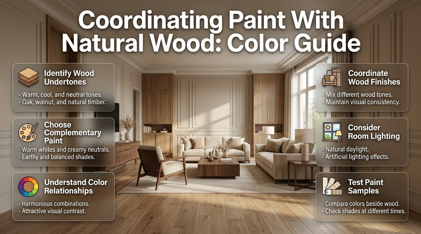
Coordinating Paint With Natural Wood | Choosing wall paint becomes surprisingly difficult when a room already contains natural wood. You might love the appearance of your oak flooring, walnut furniture, or wooden kitchen cabinets, but the wrong wall color can make these beautiful materials look too yellow, orange, dark, or outdated. A paint shade that looks attractive in a store may also appear completely different when placed beside your existing wood finishes.
The secret to coordinating paint with natural wood is understanding how different colors, undertones, textures, and lighting conditions work together. You don’t need to make every wooden surface match or paint every room white to achieve a beautiful interior. Instead, you need a color combination that supports the natural character of the wood while making the room feel comfortable and visually connected.
Whether you’re refreshing a living room, renovating a kitchen, decorating a bedroom, or selecting paint for an entire home, the right approach can make your existing wooden features look more attractive.
In this guide, we’ll explore how to identify wood undertones, choose complementary wall colors, coordinate multiple wood finishes, and create practical color combinations for different rooms. You’ll also learn how to test paint samples, avoid expensive decorating mistakes, and make confident decisions without relying on short-lived color trends.
If you’re looking for more ideas about creating comfortable, attractive interiors, DesignMode24 Interior Design offers additional inspiration for planning spaces that balance appearance and everyday functionality.
Why Is Coordinating Paint With Natural Wood Important?
Coordinating paint with natural wood means selecting wall, ceiling, and trim colors that complement the natural undertones, grain, and finish of wooden surfaces. The purpose is to create a balanced interior where paint and timber support one another instead of competing for attention.
Natural wood already introduces color and texture into a room. Oak might contain golden undertones, walnut can have rich brown shades, and ash often appears lighter and more neutral. These differences influence how surrounding paint colors look.
For example, a warm white wall can make honey oak flooring appear welcoming, while a strong yellow wall may exaggerate its golden appearance. Similarly, a muted green wall can provide an attractive contrast against medium walnut furniture.
Good coordination matters for several reasons:
- Visual balance: Paint helps connect flooring, furniture, cabinets, and architectural woodwork.
- Natural character: Appropriate wall colors allow the wood grain to remain an attractive feature.
- Better proportions: Light and dark combinations can make rooms feel more open or intimate.
- Consistent design: Related colors help connected rooms feel like parts of the same home.
- Long-term appeal: Natural materials and balanced neutrals can remain attractive beyond temporary decorating trends.
A successful color scheme doesn’t need expensive furniture or complicated decoration. Sometimes changing the wall color is enough to make existing wooden features look completely different.
How Do You Identify the Undertones of Natural Wood?
Before choosing paint, examine the dominant undertone of your existing wood. This means identifying the subtle color beneath its main brown, golden, or gray appearance.
Wood undertones are important because two finishes can have similar darkness but behave differently beside the same paint color.
1. Warm Wood Undertones
Warm wood contains golden, honey, reddish, amber, or orange qualities. It generally creates a welcoming and traditional appearance, although it can also work beautifully in contemporary interiors.
Common examples include:
- Honey oak
- Golden oak
- Cherry wood
- Natural pine
- Teak
- Many warm walnut finishes
These finishes usually work well with creamy white, warm beige, taupe, muted olive, and earthy green.
Practical example: Imagine a living room with honey oak flooring and a wooden coffee table. Using warm ivory walls can create a comfortable appearance without making the floor look excessively orange.
However, avoid assuming that every warm color will complement warm wood. Strong yellow, orange, or reddish walls can sometimes exaggerate the same qualities already present in the timber.
2. Cool Wood Undertones
Cool wood finishes often contain gray, ashy, or subdued brown qualities. They can make a room feel understated, contemporary, and visually calm.
Common examples include:
- Weathered oak
- Gray-washed timber
- Ash wood
- Some cool-toned walnut finishes
- Certain driftwood-inspired finishes
Suitable paint colors include muted blue, soft gray, cool white, and restrained green.
Practical example: A bedroom with gray-washed oak furniture can look attractive with pale blue-gray walls, light bedding, and neutral curtains.
The combination creates contrast without introducing unnecessary warmth.
3. Neutral Wood Undertones
Neutral wood has a relatively balanced appearance. It doesn’t strongly lean toward golden, red, orange, or gray.
This makes it easier to coordinate with different paint families.
Useful options include:
- Soft white
- Greige
- Neutral beige
- Muted sage
- Balanced taupe
Neutral wood is particularly helpful in homes where furniture and flooring come from different sources.
How Can You Identify Wood Undertones at Home?
You don’t need professional color equipment to begin.
Follow these simple checks:
- Examine the wood in natural daylight.
- Place a plain white sheet of paper beside it.
- Look for golden, reddish, gray, or neutral qualities.
- Compare the wood with other materials already in the room.
- Repeat the observation under your normal evening lighting.
Remember that stains and protective finishes can change a wood’s appearance. A natural oak surface and a heavily stained oak cabinet may have very different undertones.
What Are the Best Paint Colors for Natural Wood?
The best paint colors depend on the wood finish, room lighting, and atmosphere you want to create. However, several color families are particularly useful because they complement natural timber without overpowering its texture.
1. Warm White: Best for a Bright and Welcoming Interior
Warm white is one of the most reliable choices for rooms containing natural wood.
Unlike an extremely stark white, warm white usually contains subtle creamy or beige qualities. These undertones help it sit comfortably beside golden oak, pine, and many medium-brown finishes.
Consider warm white when you want:
- A bright living room with oak flooring.
- A clean kitchen with natural wooden cabinets.
- A relaxing bedroom with walnut furniture.
- A simple background for wooden shelves and decorative pieces.
For example, light oak floors, warm white walls, and natural linen curtains create an airy interior without looking overly cold.
Potential drawback: Some warm whites may appear too yellow beside strongly golden timber. Test the actual combination before committing.
2. Beige: Best for a Soft and Comfortable Atmosphere
Beige creates a natural connection with wooden surfaces because both have earthy qualities.
It is particularly useful when you want a comfortable interior rather than a sharp contrast between walls and furniture.
Try these combinations:
- Light beige with medium oak flooring.
- Sand-colored walls with walnut furniture.
- Warm beige with natural pine cabinets.
- Pale mushroom beige with darker wooden furniture.
Beige is also useful in open-plan spaces because it can connect several rooms without making the overall design feel repetitive.
Professional advice: If your wood already has strong golden undertones, select a more balanced beige rather than one with excessive yellow.
3. Greige: Best for Modern Homes With Mixed Wood Finishes
Greige combines gray and beige, providing a useful middle ground between warm and cool neutrals.
It works especially well when a room contains different wood species.
For example, an open-plan living area might include:
- Light oak flooring.
- A medium walnut dining table.
- Ash wood shelving.
- Neutral upholstered furniture.
A balanced greige wall color can connect these materials without forcing them to match.
Greige also works well in contemporary interiors where homeowners want a neutral background with slightly more depth than plain white.
4. Sage Green: Best for Natural and Relaxed Interiors
Sage green is an excellent choice when you want to bring a subtle outdoor influence into your home.
Its muted green appearance works particularly well with oak, walnut, and pine.
Popular combinations include:
- Pale sage with light oak.
- Muted olive with medium walnut.
- Soft eucalyptus green with natural pine.
- Gray-green with weathered oak.
Sage can be used on all four walls or reserved for an accent wall.
In bedrooms and reading areas, it creates a quiet atmosphere. In kitchens, it can make natural wood cabinetry look more distinctive.
5. Soft Blue: Best for Gentle Contrast
Soft blue provides a cooler contrast against warm natural wood.
It works particularly well when you want to prevent a room from appearing too golden or visually warm.
Consider:
- Dusty blue with honey oak.
- Blue-gray with ash wood.
- Pale blue with medium walnut.
- Muted denim blue with natural oak furniture.
Avoid extremely bright blue if the wood is already a strong visual feature. A softer shade generally produces a more balanced result.
6. Terracotta: Best for Earthy and Characterful Spaces
Terracotta introduces warmth and personality into an interior.
It can look beautiful with medium-brown timber, walnut furniture, and natural oak flooring.
However, it is a stronger color than beige or warm white, so it needs careful placement.
Use it for:
- An accent wall.
- A dining area.
- A decorative niche.
- A small reading corner.
Balance terracotta with neutral curtains, simple furniture, and restrained decorative accessories.
7. Muted Charcoal: Best for Dramatic Contrast
Charcoal creates a sophisticated backdrop for lighter wooden furniture and architectural details.
It works particularly well with light oak, ash, and some walnut finishes.
However, darker paint absorbs more light visually and may make a poorly lit room feel smaller.
Use charcoal strategically, especially in smaller spaces.
Natural Wood and Paint Color Combinations: Which Ones Work Best?
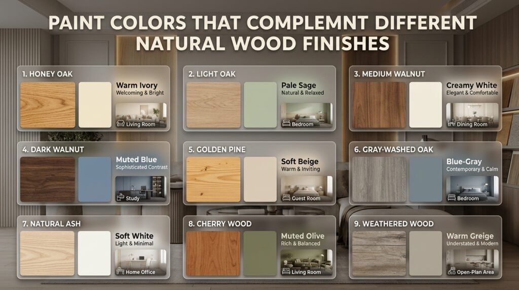
Choosing from individual paint colors can be confusing. It is often easier to compare complete combinations and understand the atmosphere each one creates.
| Wood finish | Recommended wall paint | Suitable atmosphere | Best room |
|---|---|---|---|
| Honey oak | Warm ivory | Welcoming and bright | Living room |
| Light oak | Pale sage | Natural and relaxed | Bedroom |
| Medium walnut | Creamy white | Elegant and comfortable | Dining room |
| Dark walnut | Muted blue | Sophisticated contrast | Study |
| Golden pine | Soft beige | Warm and inviting | Guest room |
| Gray-washed oak | Blue-gray | Contemporary and calm | Bedroom |
| Natural ash | Soft white | Light and minimal | Home office |
| Cherry wood | Muted olive | Rich and balanced | Living room |
| Weathered wood | Warm greige | Understated and modern | Open-plan area |
These combinations are starting points rather than universal rules. The actual result depends on the wood’s finish, paint undertone, lighting, and surrounding materials.
How Do You Match Paint With Different Types of Natural Wood?
Different wood species have different visual characteristics. Understanding these differences helps you select paint that highlights the material instead of fighting against it.
Oak Wood
Oak is popular because of its visible grain, durability, and range of natural finishes.
Light oak often looks attractive with warm white, greige, and pale green. Golden oak can work well with muted sage, balanced beige, and soft blue.
For darker oak, consider warm ivory or a restrained neutral to create contrast.
Oak is particularly useful in living rooms, kitchens, and bedrooms because it works with both traditional and contemporary furniture.
Walnut Wood
Walnut has a naturally rich brown appearance, often with attractive grain variations.
Because walnut can appear visually heavy, lighter walls are useful when you want to keep a room open.
Good combinations include:
- Cream with medium walnut.
- Warm white with dark walnut.
- Muted sage with natural walnut.
- Soft blue-gray with brown walnut.
If you prefer a dramatic interior, deep green can also work with walnut when the lighting and room proportions support it.
Pine Wood
Pine is generally lighter and may contain noticeable golden or yellow qualities.
It works well with warm white, soft beige, muted green, and understated blue.
If your pine furniture looks excessively yellow, avoid automatically adding more yellow-based paint.
A more balanced neutral or muted green may provide a better visual relationship.
Ash Wood
Ash generally has a relatively light appearance and noticeable grain.
It works particularly well with:
- Soft white.
- Light greige.
- Pale blue.
- Muted gray.
- Soft sage.
These combinations are useful in modern, Scandinavian-inspired, and minimalist interiors.
Cherry Wood
Cherry can have warm reddish or reddish-brown qualities.
It often looks attractive with taupe, creamy white, muted olive, and restrained neutral shades.
Avoid introducing too many strong red or orange elements because they may make the overall room feel overly warm.
How Do You Coordinate Paint With Natural Wood Flooring?
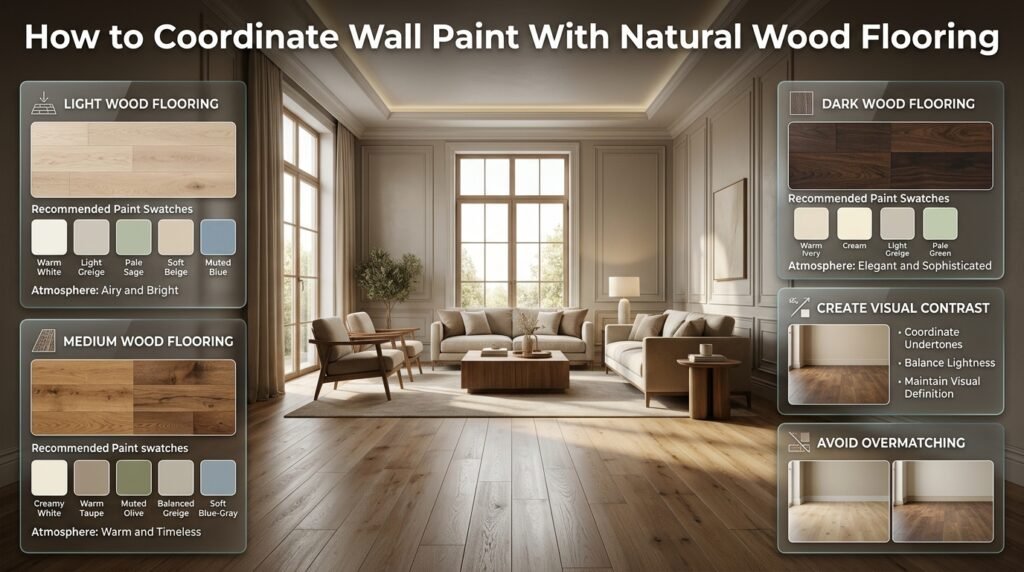
Wood flooring is one of the most influential elements in a room because it covers a large surface area and connects different furniture arrangements.
The wall color should complement the flooring without competing with its grain or finish.
Light Wood Flooring
Light oak, pale maple, and ash flooring can help create an airy appearance.
Suitable wall colors include:
- Warm white.
- Light greige.
- Pale sage.
- Soft beige.
- Muted blue.
If your room receives limited natural light, avoid selecting a white that appears too cold against the floor.
Medium Wood Flooring
Medium oak and brown timber flooring offer greater flexibility.
You can choose a lighter neutral for contrast or a similar-depth color for a softer appearance.
Good options include:
- Creamy white.
- Warm taupe.
- Muted olive.
- Balanced greige.
- Soft blue-gray.
For a practical living room, medium oak flooring, warm greige walls, and neutral upholstery can create a timeless combination.
Dark Wood Flooring
Dark walnut and deep brown flooring create a strong visual foundation.
Lighter walls usually help prevent the room from feeling too heavy.
Consider warm ivory, cream, light greige, or pale green.
If you want dark walls, balance them with suitable artificial lighting, lighter rugs, and furniture that provides some contrast.
Should the Flooring and Wall Paint Match?
No. Matching them too closely can reduce visual definition.
Instead, consider the relationship between their undertones and lightness.
For example, medium brown flooring can look attractive with a lighter beige wall. The two materials remain connected through their warmth while maintaining enough contrast to make the room interesting.
How Do You Coordinate Paint With Natural Wood Cabinets?
Wooden cabinets are often one of the largest visual features in kitchens, utility rooms, and storage areas.
The challenge is selecting wall paint that supports the cabinets while also working with countertops, backsplashes, appliances, and flooring.
Oak Kitchen Cabinets
Oak cabinets often contain noticeable grain and golden or neutral undertones.
Suitable wall colors include:
- Warm white.
- Pale sage.
- Balanced greige.
- Soft beige.
For a contemporary kitchen, light oak cabinets with greige walls and simple hardware can create a clean appearance.
Walnut Kitchen Cabinets
Walnut cabinets are richer and darker.
Use cream, warm white, or soft taupe to create contrast.
If you prefer a more distinctive design, muted green can introduce color without overpowering the wood.
Natural Pine Cabinets
Pine cabinets often have a light, warm appearance.
Warm white and soft neutral walls are useful when you want to maintain brightness.
If the pine is strongly yellow, test a muted green or balanced greige to create a more controlled contrast.
Don’t Forget the Countertop
A paint color may complement your cabinets but still look wrong beside the countertop.
Before finalizing the scheme, consider:
- Countertop background color.
- Veining or surface patterns.
- Backsplash materials.
- Cabinet handles.
- Flooring undertones.
- Appliance finishes.
The kitchen should be treated as one connected design rather than a collection of individually selected colors.
Should Paint Be Lighter or Darker Than Natural Wood?
Both approaches can work. Lighter paint generally creates a brighter appearance and highlights darker timber, while darker paint introduces depth and can make lighter wood stand out.
Your decision should depend on the room’s proportions, lighting, and intended atmosphere.
| Paint approach | Main benefit | Best application | Possible limitation |
|---|---|---|---|
| Lighter than wood | Creates contrast | Dark flooring and cabinets | Can look too stark |
| Similar depth | Creates a soft transition | Neutral interiors | May lack definition |
| Darker than wood | Adds visual depth | Accent walls and large rooms | May reduce brightness |
For most homeowners, starting with a lighter neutral is practical.
However, darker paint shouldn’t be avoided simply because it is less common. When selected carefully, it can create a beautiful relationship with natural wood.
How Does Natural Lighting Affect Paint and Wood Combinations?
Lighting can change the appearance of both paint and wood. A wall color that looks creamy in the morning may appear yellow under warm evening bulbs.
This is why choosing paint from a small sample card alone can lead to disappointing results.
North-Facing Rooms
North-facing rooms often receive cooler, indirect daylight.
Warm white, beige, and soft earthy colors can help balance the cooler appearance.
If your room has oak flooring or golden pine furniture, these shades may create a more welcoming atmosphere.
South-Facing Rooms
South-facing rooms generally receive stronger and warmer daylight.
Paint colors can appear brighter and warmer, especially during sunny periods.
Muted green, balanced greige, and soft neutral shades are useful starting points.
East-Facing Rooms
East-facing rooms receive stronger morning sunlight, which changes as the day progresses.
A paint shade may appear brighter in the morning and more subdued later.
Test samples during different periods rather than judging them from one observation.
West-Facing Rooms
West-facing rooms often receive warmer afternoon and evening light.
Some warm neutral shades may look more golden under these conditions.
Balanced neutrals and muted cooler colors can help create contrast.
What About Artificial Lighting?
Artificial lighting also affects color appearance.
Warm LED bulbs can make beige and creamy whites appear more golden. Cooler bulbs can make some neutral colors look grayer.
Consider the lighting you actually use in the room.
For example, if your bedroom has warm bedside lamps, test the paint under those lamps before choosing the final shade.
Professional recommendation: Observe paint samples in daylight, afternoon light, and your normal evening lighting. This simple step can prevent expensive repainting.
How Do You Coordinate Different Wood Finishes in One Room?
Many homeowners worry that oak flooring, walnut furniture, and pine accessories won’t look good together.
In reality, different wood finishes can create a more natural and interesting interior when they are arranged thoughtfully.
1. Choose One Dominant Wood Finish
Start with the wood covering the largest surface area.
This is often flooring, cabinetry, or a large built-in feature.
Use it as the reference for your paint selection.
For example, if oak flooring occupies most of the living room, choose a wall color that complements the oak first.
Smaller walnut or ash furniture pieces can then introduce contrast.
2. Maintain a Related Color Temperature
Different woods don’t need identical shades, but their undertones should have a reasonable relationship.
For example:
- Light oak and warm walnut can work together.
- Pine and golden oak can create a connected appearance.
- Ash and weathered oak can support a cooler palette.
If your wood finishes have noticeably different temperatures, introduce a neutral wall color that helps connect them.
3. Create Contrast Through Lightness
A room with several medium-brown wooden surfaces can appear visually flat.
Introduce lighter walls, textiles, and accessories to create separation.
Likewise, a room with mostly pale wood can benefit from a darker furniture piece.
4. Repeat Selected Finishes
Repeating a particular wood finish in more than one location helps make the arrangement feel intentional.
For example, a walnut dining table can relate to walnut shelving or a small decorative frame elsewhere in the room.
You don’t need to repeat every material. Just create a few recognizable connections.
5. Use Textures to Connect Different Materials
Paint isn’t the only way to create harmony.
Linen, cotton, wool, natural stone, woven baskets, and textured rugs can connect different wood finishes.
These materials help soften strong contrasts and add depth without introducing too many colors.
For additional guidance on creating a balanced arrangement, explore styling principles for visually balanced homes.
How Do You Coordinate Paint With Natural Wood in Different Rooms?
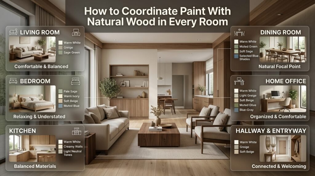
A successful whole-home color scheme should account for how each room is used. Living rooms, bedrooms, kitchens, and workspaces have different practical requirements.
Living Room: Create a Comfortable and Balanced Space
The living room often contains several wooden elements, including flooring, tables, cabinets, shelves, and decorative accessories.
For a simple starting point, combine:
- Light or medium oak flooring.
- Warm white or greige walls.
- Walnut coffee table.
- Neutral sofa.
- Natural fabric curtains.
This creates a comfortable background without making the wood feel overly decorative.
If you want additional character, introduce sage green through an accent wall or selected accessories.
You should also consider the placement of larger furniture pieces. A beautiful wooden coffee table may lose its visual importance if surrounded by too many competing objects.
Use room focal point planning principles to help establish a clear visual center and arrange furniture around the room’s main features.
Bedroom: Choose Relaxing and Understated Colors
Bedrooms benefit from softer color combinations that support a calm atmosphere.
Consider:
- Pale sage with light oak.
- Warm ivory with walnut.
- Soft beige with natural pine.
- Muted blue with medium-brown furniture.
Avoid introducing too many bright colors if your goal is a peaceful sleeping environment.
Lighting also matters. Bedside lamps, ceiling fixtures, and natural daylight can make the same wall color appear different.
A well-planned lighting arrangement can improve the relationship between wooden furniture and painted walls. For more ideas, read Japandi lighting composition.
Kitchen: Balance Cabinets, Walls, and Work Surfaces
Kitchens need more careful coordination because several permanent materials are visible together.
Start with the cabinets, then consider countertops, backsplash, flooring, and wall paint.
For example, natural oak cabinets can look attractive with warm white walls, a light stone countertop, and understated hardware.
Walnut cabinets may benefit from creamy walls and lighter surfaces that prevent the kitchen from appearing too dark.
Avoid selecting wall paint before checking how it looks beside the countertop and backsplash.
Dining Room: Let the Table Become a Feature
A natural wood dining table can become the main visual feature of a dining room.
Walnut furniture works well with warm white, muted green, and selected blue shades.
Oak tables can look attractive with beige, soft sage, or warm neutrals.
If the table is particularly large or has prominent grain, keep the surrounding decoration relatively simple.
Home Office: Maintain a Clear and Comfortable Environment
A home office should feel organized without becoming visually distracting.
Light oak desks with warm white walls create a bright working environment.
Walnut desks can work with light greige or soft beige.
For a more distinctive space, muted olive or blue-gray can provide character.
Consider the location of your computer screens and windows when selecting paint. Strong reflections and excessive contrast can make a workspace less comfortable.
Hallways and Entryways: Make Small Spaces Feel Connected
Hallways often connect rooms with different flooring, furniture, and decorative styles.
A neutral wall color can help create continuity.
Warm white, greige, and soft beige are practical options.
If your entryway contains a wooden console table or coat storage, choose paint that supports its undertone without making the narrow space feel crowded.
How Do You Select Paint for Wooden Trim, Doors, and Ceiling Beams?
Walls aren’t the only painted surfaces that influence natural wood.
Trim, doors, ceiling beams, and built-in features can change the overall appearance of a room.
Wooden Trim
If your trim is natural wood, decide whether it should blend with the surrounding walls or stand out as a decorative feature.
Light walls can highlight darker trim, while related neutral shades create a softer appearance.
Avoid automatically painting all trim bright white. A warmer white may be more suitable beside golden oak or pine.
Wooden Doors
Wooden doors often have a darker or richer finish than the surrounding walls.
Cream, greige, and muted neutrals can create a comfortable contrast.
If several doors are visible from one hallway, consider using consistent paint colors around them.
Ceiling Beams
Exposed wooden beams can become an attractive architectural feature.
Light ceilings often help darker beams stand out.
If the beams are light oak, a slightly contrasting ceiling color can provide definition without making the ceiling appear visually busy.
Built-In Wooden Shelves
Built-in shelves should work with the surrounding walls and furniture.
If the shelving is dark walnut, lighter wall paint can help create separation.
If the shelves are pale oak, warm white or soft greige can create a connected appearance.
For practical ideas about organizing and presenting decorative items, explore styling open shelves without clutter.
Step-by-Step: How to Choose the Right Paint Color Before Buying
Selecting a paint color should be a planned process rather than an impulse purchase.
Follow these steps to reduce guesswork and avoid unnecessary expense.
Step 1: Identify the Materials You Are Keeping
Before looking at paint colors, identify which materials will remain in the room.
These may include:
- Wood flooring.
- Kitchen cabinets.
- Built-in shelving.
- Large furniture pieces.
- Wooden doors and trim.
- Countertops and backsplashes.
Permanent materials should generally guide your paint selection.
Step 2: Determine the Dominant Wood Undertone
Examine the wood in daylight.
Decide whether it appears golden, reddish, gray, or relatively neutral.
If you have several finishes, identify the one that occupies the largest visual area.
Step 3: Decide What You Want the Room to Feel Like
Think about the atmosphere before choosing a specific color.
| Desired atmosphere | Paint color direction |
|---|---|
| Bright and spacious | Warm white or light greige |
| Warm and comfortable | Beige or cream |
| Natural and relaxed | Sage or muted olive |
| Modern and understated | Balanced greige |
| Elegant and dramatic | Deep green or charcoal |
| Calm and cool | Muted blue |
This gives you a clear starting point instead of testing unrelated colors.
Step 4: Choose Three Related Samples
Select three shades from the same color family.
For example, if you like sage green, compare:
- Pale sage.
- Medium sage.
- Muted olive.
This makes it easier to determine which level of color intensity works best with your wood.
Step 5: Test Large Samples
Small paint cards don’t always show the full appearance of a color.
Use larger sample boards or suitable sample patches.
Place them close to the wood surfaces and observe their relationship.
If possible, move sample boards around the room so you can compare different lighting conditions.
Step 6: Evaluate the Entire Room
Check the paint beside:
- Flooring.
- Furniture.
- Curtains.
- Rugs.
- Countertops.
- Decorative accessories.
A wall color may complement oak flooring but look wrong beside a large patterned sofa.
Step 7: Review the Samples at Different Times
Look at the samples in the morning, afternoon, and evening.
Also check them under the artificial lighting you normally use.
Don’t choose a shade simply because it looks attractive during one particular moment.
Step 8: Select the Appropriate Paint Finish
Different finishes have different appearances and maintenance requirements.
| Paint finish | Appearance | Common application |
|---|---|---|
| Matte | Low sheen | Walls with minor imperfections |
| Eggshell | Soft, subtle sheen | Living rooms and bedrooms |
| Satin | Noticeable gentle sheen | Areas needing regular cleaning |
| Semi-gloss | Reflective finish | Doors, trim, selected cabinetry |
| Gloss | High reflection | Selected detailed surfaces |
Always follow the manufacturer’s instructions and consider the surface condition before choosing a finish.
Step 9: Calculate the Paint Requirement
Measure the wall areas and check the manufacturer’s coverage information.
Remember to account for:
- Number of coats.
- Surface texture.
- Existing paint color.
- Primer requirements.
- Doors and windows.
- Additional touch-up material.
Buying the correct quantity helps prevent unnecessary interruptions during the project.
How Can You Create a Whole-Home Color Scheme Around Natural Wood?
A whole-home color scheme should feel connected without making every room look identical.
This is especially important in houses with open-plan living areas, visible hallways, and multiple rooms that share the same flooring.
Choose a Main Neutral
Start with a neutral color that complements the most prominent wood finish.
For example, warm white or greige can work as the main background in several connected rooms.
Introduce Secondary Colors
Use supporting colors in selected spaces.
A living room might have sage accents, while the bedroom uses muted blue and the kitchen maintains warm white walls.
These colors don’t need to be identical, but they should have a reasonable relationship.
Maintain Consistent Wood References
Repeat selected wood finishes through furniture, shelving, doors, or decorative details.
This creates connections between spaces without requiring identical furniture.
Consider Transitions Between Rooms
Pay attention to what can be seen from one room into another.
If the living room, dining area, and hallway are visually connected, avoid introducing abrupt color changes without a clear reason.
Think About Long-Term Flexibility
Natural wood is often a long-term material.
Choose wall colors that allow you to change curtains, rugs, cushions, and accessories without repainting the entire home.
For broader guidance on creating consistent interiors, characteristics of timeless interiors can help you understand why balanced materials and restrained color choices remain useful over time.
What Are the Most Common Mistakes When Coordinating Paint With Natural Wood?
Many decorating problems happen because homeowners select paint without considering how it interacts with existing materials.
Understanding these mistakes before starting can save time and money.
1. Ignoring the Wood’s Undertone
Why it happens: Homeowners select paint based on a popular color or an attractive photograph.
Why it’s harmful: The paint may emphasize unwanted orange, yellow, or gray qualities in the wood.
How to avoid it: Examine the actual wood before choosing a paint family. Test samples against the surface instead of relying on online photographs.
2. Matching Everything Too Closely
Why it happens: People assume that furniture, flooring, cabinets, and walls should have similar colors.
Why it’s harmful: The room may look flat because there isn’t enough visual contrast.
How to avoid it: Use related undertones but different levels of lightness. A light wall, medium wood floor, and darker furniture can create a more interesting arrangement.
3. Choosing Too Many Strong Colors
Why it happens: Homeowners fall in love with several paint colors and try to introduce all of them.
Why it’s harmful: The wood loses its visual importance, and the room may feel disconnected.
How to avoid it: Start with one dominant wall color, one supporting shade, and a limited number of accents.
4. Selecting Paint Without Testing It
Why it happens: A paint card looks attractive in a showroom.
Why it’s harmful: Lighting, surrounding materials, and wall conditions can change the appearance of the selected color.
How to avoid it: Test large samples inside the actual room and observe them at different times.
5. Forgetting About Flooring and Furniture
Why it happens: Attention is focused on the wall and one wooden feature.
Why it’s harmful: Other large surfaces may introduce competing colors and undertones.
How to avoid it: Evaluate the whole room, including upholstery, rugs, flooring, and decorative materials.
6. Using Dark Paint Without Considering Lighting
Why it happens: Dramatic dark interiors look attractive in professional photographs.
Why it’s harmful: A poorly lit room can feel smaller and less comfortable.
How to avoid it: Check window placement, daylight, artificial lighting, and furniture contrast before selecting deep colors.
7. Ignoring Paint Sheen
Why it happens: Homeowners concentrate only on color.
Why it’s harmful: A highly reflective finish may highlight surface imperfections or create unwanted glare.
How to avoid it: Choose a finish appropriate for the wall condition, room use, and maintenance requirements.
8. Following Trends Without Considering Existing Materials
Why it happens: A particular shade becomes popular in interior design content.
Why it’s harmful: The color may not work with the wood already installed in your home.
How to avoid it: Treat trends as inspiration, not instructions. Your existing materials should guide the final decision.
Professional Tips for Better Paint and Natural Wood Combinations
Professional interior planning involves more than selecting attractive colors. It requires understanding how materials, proportions, lighting, and daily use influence the final result.
Here are practical recommendations worth following.
1. Start With Permanent Materials
If you’re keeping your existing flooring and cabinets, choose paint around them.
It is generally easier and less expensive to change wall paint than to replace a complete floor or kitchen installation.
2. Consider Color Depth as Well as Undertones
Two colors can share similar undertones but still look unbalanced if their lightness levels are too close.
Introduce contrast through paint, furniture, rugs, and decorative materials.
3. Don’t Force Different Wood Species to Match
Oak, walnut, pine, and ash can all work in one home.
Focus on their relationship rather than trying to make every finish identical.
4. Use Natural Materials to Soften Contrast
Linen curtains, wool rugs, woven baskets, and stone accessories can help connect different finishes.
They also introduce texture without requiring additional strong colors.
5. Check Paint Against Existing Lighting
Lighting should be considered before the final color decision.
A wall shade that works in daylight may look completely different under warm ceiling fixtures.
6. Think About Practical Maintenance
Paint should suit the room’s everyday use.
A busy hallway, kitchen, or family living area may require a more washable finish than a rarely used decorative room.
7. Plan Renovations Before Making Multiple Changes
If you’re replacing flooring, repainting walls, and updating furniture together, establish the order of work.
A clear renovation plan can prevent newly painted surfaces from being damaged during later installation.
For help organizing home renovation work, read renovation work order for homeowners.
8. Understand the Relationship Between Design and Everyday Living
Color decisions should support how the room is actually used.
A beautiful bedroom should still feel comfortable at night, while a kitchen should remain practical to clean and maintain.
Interior design has changed considerably as homes have adapted to new lifestyles and expectations. For additional context, explore history of changing residential interiors.
9. Use DIY Projects Carefully
If you’re refreshing an existing room, smaller DIY updates can help improve the overall appearance without replacing everything.
Repainting a wall, updating wooden accessories, or refinishing a suitable piece of furniture can make a noticeable difference.
For more practical project ideas, visit DIY home projects.
You can also explore the broader Home Improvement section for ideas about improving the functionality and appearance of different spaces.
10. Treat Paint Selection as Part of the Complete Design
Paint shouldn’t be selected independently of furniture, lighting, and architectural features.
A coordinated room feels intentional because its elements support one another.
If you want to explore more color-related decorating ideas, visit the Paint Color category.
For additional interior planning guidance, the Interior Design section offers related ideas about materials, layouts, and room arrangements.
How Can Natural Wood Work With Other Home Design Details?
Natural wood rarely exists alone. Its appearance is influenced by lighting, storage, furniture construction, decorative arrangements, and even the way a room is used.
Considering these connections can help you create a more complete interior.
Coordinate Wood With Furniture Construction
The frame, legs, finish, and upholstery of furniture all contribute to its appearance.
For example, a walnut dining table with a heavy dark frame may create a different visual effect from a lighter walnut table with slim legs.
Consider both construction and finish when selecting furniture for a room with natural wood.
The guide to furniture frame construction comparison can help you understand how furniture construction influences appearance and practical use.
Coordinate Paint With Storage and Shelving
Storage units and open shelves often introduce additional wood finishes.
If you already have oak flooring, adding walnut shelving can create attractive contrast.
However, avoid filling every wall with competing wood tones.
Use neutral paint and carefully selected decorative objects to maintain a balanced arrangement.
Coordinate Natural Wood With Utility Spaces
Natural wood can also work in practical spaces such as laundry rooms.
For example, a wooden folding counter can look attractive with warm white walls and simple storage.
The important thing is to select suitable finishes that can withstand the moisture and cleaning requirements of the space.
For practical planning ideas, explore laundry folding counter height.
Consider How Materials Work Together Over Time
Wood can change appearance as it ages and receives exposure to light.
Some finishes become warmer, while others may fade or develop a different surface appearance.
Paint selection should account for the possibility that existing wood may not remain exactly the same over the years.
This is another reason to avoid choosing extremely restrictive color combinations.
What Is the Best Paint Color to Use With Natural Wood?
The best paint color for natural wood depends on its undertone, finish, and the atmosphere you want to create. However, warm white, soft beige, greige, and muted sage are among the most versatile choices. These shades complement many wood finishes without competing with their natural grain or making the room feel visually crowded.
For example, warm white walls can make honey oak flooring look welcoming, while greige creates a balanced background for mixed oak and walnut furniture. If you prefer a more natural interior, sage green works particularly well with light oak, pine, and medium-brown timber.
Before selecting a color, consider:
Warm wood: Try creamy white, beige, muted olive, or warm taupe.
Cool wood: Consider soft gray, muted blue, or balanced white.
Dark wood: Use lighter neutrals to introduce contrast.
Light wood: Experiment with sage, greige, or soft earthy colors.
The most reliable approach is to test paint samples beside your actual wooden surfaces rather than choosing a shade based on photographs.
How Do You Choose Wall Paint That Makes Natural Wood Look Less Orange?
When natural wood looks excessively orange, the solution is to choose a wall color that balances its warmth rather than introducing more yellow or orange into the room. Muted greens, soft blue-grays, balanced greige, and certain neutral whites can help reduce the visual dominance of orange-toned timber.
This is particularly useful with honey oak cabinets, golden oak flooring, and older pine furniture. Muted green provides a gentle contrasting effect, while greige offers a more understated appearance.
To achieve a balanced result:
Try muted sage: Its green undertone can create a pleasing contrast with orange-toned wood.
Consider blue-gray: A subdued blue can balance warm timber without making the room feel overly colorful.
Choose balanced neutrals: Greige and selected warm whites can reduce visual competition.
Avoid excessive yellow: Strong yellow-based paint may exaggerate the golden appearance of the wood.
Check the lighting: Warm artificial bulbs can make both paint and wood appear more golden.
One important detail is that you don’t necessarily need to change or refinish your wooden furniture. Sometimes the right wall color is enough to improve the overall appearance of an existing room.
Can You Mix Different Wood Tones With Different Paint Colors in One Room?
Mixing different wood tones can create a beautiful interior when the finishes have a considered relationship. You don’t need every wooden surface to match. Oak flooring, walnut furniture, ash shelving, and pine accessories can work together when their proportions, undertones, and surrounding paint colors are balanced.
The key is to establish one dominant wood finish and use the remaining finishes as supporting elements. For example, light oak flooring can provide the foundation, a walnut coffee table can introduce contrast, and warm greige walls can connect the materials.
Follow these practical principles:
Choose a dominant wood: Let flooring or large cabinetry establish the main visual direction.
Introduce secondary finishes: Use different woods through tables, shelving, and furniture.
Maintain color harmony: Avoid combining too many competing golden, reddish, and gray undertones.
Repeat selected finishes: Repeating walnut or oak in different parts of the room helps create continuity.
Use neutral paint: Warm white, beige, and greige can connect different wood finishes.
The goal isn’t to make everything identical. A thoughtfully mixed interior often feels more natural and interesting than a room where every wooden item has exactly the same finish.
Should Wall Paint Be Lighter or Darker Than Natural Wood Flooring and Furniture?
Wall paint can be lighter or darker than natural wood, depending on the room’s size, lighting, and desired appearance. Lighter walls generally create a brighter atmosphere and help darker wooden furniture stand out. Darker walls introduce depth and can make light-colored timber look more distinctive.
For most homes, lighter or medium neutral walls are a practical starting point because they work with a wide range of wooden finishes.
Consider these combinations:
Dark walnut furniture with warm white walls: Creates contrast and highlights the furniture.
Light oak flooring with sage green walls: Produces a soft, natural appearance.
Medium oak flooring with greige walls: Creates a balanced and understated interior.
Pale ash furniture with muted charcoal walls: Introduces a more dramatic contemporary style.
Before deciding, consider:
The amount of daylight entering the room.
The size and height of the space.
The darkness of the flooring and furniture.
The color of curtains, rugs, and upholstery.
The type of artificial lighting used in the evening.
A darker wall isn’t automatically unsuitable for a small room, but it requires more careful planning. Lighter furniture, appropriate lighting, and balanced decorative materials can help prevent the space from feeling too heavy.
How Do You Test Paint Colors Before Using Them With Natural Wood?
Testing paint before applying it to an entire room is one of the most important steps in achieving a successful wood-and-paint combination. Paint colors can look different depending on natural daylight, artificial lighting, wall texture, and the undertones of nearby materials.
A shade that looks attractive on a showroom color card may appear too yellow, gray, or dark when placed beside your existing flooring or cabinets.
Use this practical testing process:
Select three related shades: Choose colors from the same general family, such as warm white, creamy white, and soft ivory.
Prepare large samples: Use sample boards or suitable wall patches so you can see the color more accurately.
Place them beside natural wood: Check the samples against flooring, furniture, cabinets, or trim.
Observe morning daylight: Notice how the color appears when natural light enters the room.
Check afternoon and evening conditions: Look for changes caused by sunlight and artificial lighting.
Compare the complete room: Consider curtains, furniture, countertops, rugs, and other permanent finishes.
Make the final decision: Choose the shade that looks balanced throughout the day rather than one that looks attractive under only one lighting condition.
Professional tip: Don’t judge paint samples from a distance alone. Look closely at the meeting point between the painted surface and the wood. This is where competing undertones are often easiest to notice.
Taking time to test colors can prevent unnecessary repainting, reduce decorating costs, and help you achieve a more consistent result.
Conclusion
Coordinating paint with natural wood is about creating a balanced relationship between color, texture, warmth, and light. The right paint choice can highlight the natural beauty of wooden floors, furniture, cabinets, doors, and architectural details without making the room feel too dark, too warm, or visually disconnected.
The most important step is understanding the undertones of your wood before choosing a paint color. Oak, walnut, maple, pine, and cherry each have different natural characteristics, so a shade that works beautifully with one wood type may not create the same effect with another. Consider the room’s natural light, existing finishes, furniture, and overall design style before making your final decision.
Remember to test paint samples beside the actual wood rather than relying on small color cards or online inspiration alone. Observe the samples in morning, afternoon, and evening light to see how their appearance changes throughout the day. This simple step can help prevent costly mistakes and make the final result feel more intentional.
Whether you prefer warm neutrals, soft whites, earthy greens, muted blues, or deeper contrasting shades, the goal is to let both the paint and natural wood complement each other. With thoughtful color selection and a consistent design approach, you can create interiors that feel welcoming, comfortable, and timeless.
For more practical ideas and inspiration, explore DesignMode24 Interior Design and discover ways to make every material and color choice work beautifully together.