Introduction
Mood Boards | Have you ever saved dozens of beautiful interior images but still couldn’t explain what you actually wanted your room to look like? You may love a warm beige living room, a dark wood kitchen, a textured wall, and a modern sofa—but when all those ideas are placed together, the result can feel completely different from what you imagined.
This is exactly where mood boards become useful.
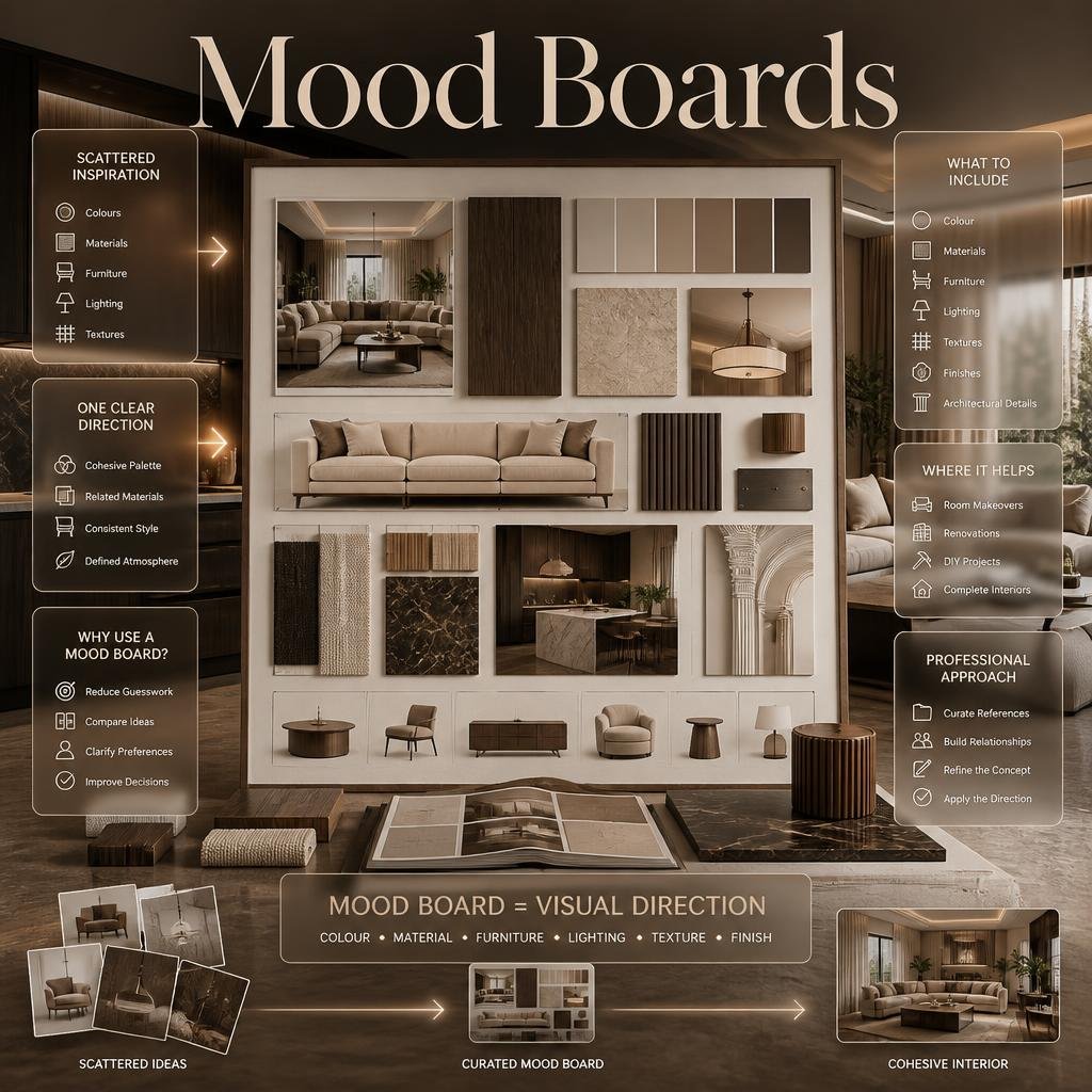
A mood board turns scattered inspiration into one clear visual direction. Instead of relying on memory or trying to explain a style with a few words, you can bring together colours, materials, furniture, lighting, textures, finishes, architectural details, and reference images in one place.
For anyone planning a room makeover, renovation, DIY project, or complete interior, a mood board can make design decisions much easier.
In this guide, you’ll learn what mood boards are, what they should contain, how to create one step by step, how professionals use them, which mistakes to avoid, and how to turn a collection of attractive images into a practical interior design concept.
What Is a Mood Board?
A mood board is a visual collection of images, colours, materials, textures, furniture references, lighting ideas, and design details used to communicate the overall feeling and direction of a project.
In interior design, it acts as a visual roadmap. Instead of deciding on every item separately, you first establish how the major elements should work together.
A mood board can be physical, using printed photographs and material samples, or digital, using images and design software.
A useful mood board usually answers questions such as:
- What should the room feel like?
- Which colours should dominate?
- Which materials belong together?
- What furniture style fits the concept?
- Should the room feel warm, minimal, luxurious, relaxed, dramatic, natural, or contemporary?
- Which details should receive attention?
- Which design choices should be avoided?
The purpose isn’t simply to make a pretty collage.
The real purpose is design clarity.
If you’re exploring broader interior ideas before creating your board, DesignMode24 Interior Design can provide additional context for thinking about how different design elements work together.
Why Are Mood Boards Important in Interior Design?
Mood boards are important because interior design involves many connected decisions. A colour that looks attractive on its own may clash with a particular flooring material. A beautiful sofa may feel too heavy next to delicate furniture. A dramatic wall finish may overpower a small room.
A mood board lets you evaluate these relationships before committing to purchases or construction.
They create a clear visual direction
Without a mood board, people often collect ideas one at a time.
They might choose:
- A sofa because they like its shape
- Curtains because they like the fabric
- Paint because the colour looks attractive
- Lighting because it looks luxurious
- Accessories because they look interesting
The problem appears when everything arrives in the same room.
Each individual item may be attractive, but the overall space can lack unity.
A mood board encourages you to make decisions as a group rather than individually.
They reduce expensive mistakes
Interior changes can become costly when decisions are made too late.
Changing a cushion is easy. Changing flooring, cabinetry, wall finishes, lighting positions, or custom furniture is much harder.
A mood board allows you to identify obvious visual conflicts earlier.
They improve communication
Design terminology can be interpreted differently.
If someone says, “I want a modern but warm living room,” several people may imagine completely different spaces.
A mood board gives that sentence a visual meaning.
You can point to:
- The colour palette
- Furniture proportions
- Material combinations
- Lighting mood
- Texture level
- Decorative direction
That makes communication much more precise.
What Should a Mood Board Include?

A strong mood board doesn’t need every possible design element. It needs the right elements to communicate the concept clearly.
A useful interior mood board may include:
| Element | Purpose |
|---|---|
| Main colour | Establishes the visual foundation |
| Secondary colours | Creates variation |
| Accent colour | Adds controlled contrast |
| Furniture | Defines shape and proportion |
| Materials | Establishes physical character |
| Textures | Adds depth and sensory interest |
| Lighting | Defines atmosphere |
| Flooring | Connects major surfaces |
| Wall treatment | Establishes architectural character |
| Accessories | Communicates finishing direction |
| Reference interiors | Shows the intended overall feeling |
The key is balance.
You don’t need twenty pictures of sofas. You need enough information to understand the design language.
Colour references
Colour is usually one of the most important components.
Your board might include:
- Wall colour
- Cabinet colour
- Upholstery colour
- Wood tone
- Metal finish
- Accent colour
- Textile colours
If colour is central to your concept, you can also explore Paint Color ideas to understand how different shades can influence the character of an interior.
Material references
Material samples help communicate the physical quality of a room.
Consider:
- Natural wood
- Stone
- Marble
- Metal
- Glass
- Linen
- Wool
- Leather
- Ceramic
- Concrete
- Textured plaster
A room with the same colour palette can feel completely different depending on its materials.
Cream with polished marble creates a different atmosphere from cream with rough plaster and natural oak.
Furniture references
Furniture images should communicate more than individual products.
Look for:
- Shape
- Scale
- Proportion
- Silhouette
- Upholstery
- Leg style
- Profile
- Visual weight
Don’t select furniture solely because it looks attractive in a photograph.
Ask whether its proportions would work in your actual room.
What Is the Difference Between a Mood Board and a Concept Board?
A mood board generally focuses on the feeling and visual atmosphere of a project, while a concept board may communicate a broader design idea, including the reasoning behind the direction.
The terms are sometimes used interchangeably, but they can serve slightly different purposes.
A mood board might communicate:
Warm, calm, natural, understated and sophisticated.
A concept board may explain:
The room uses natural materials, controlled neutral colours, soft lighting and streamlined furniture to create a calm contemporary environment for everyday family living.
The mood board helps people see the atmosphere.
The concept board can help them understand the design thinking behind it.
For a professional project, both can be useful.
How Do You Create a Mood Board Step by Step?
Creating a mood board becomes much easier when you follow a deliberate process instead of collecting random images.
Step 1: Define the room’s purpose
Before searching for inspiration, identify what the room needs to do.
A living room could be designed for:
- Family gatherings
- Formal entertaining
- Watching television
- Reading
- Relaxing
- Working occasionally
- Hosting guests
A bedroom may need to prioritize:
- Rest
- Storage
- Dressing
- Reading
- Calmness
- Privacy
The purpose influences the design.
A beautiful mood board that ignores function will eventually create problems.
Step 2: Choose three to five words
Select a small group of words that describe the intended atmosphere.
For example:
Warm — Natural — Calm — Contemporary
Or:
Elegant — Dramatic — Refined — Luxurious
Or:
Simple — Airy — Functional — Relaxed
These words become a filter.
Whenever you find an image, ask:
Does this image support the concept?
If it doesn’t, leave it out.
💡 Pro Tip: Three strong descriptive words are usually more useful than a long list of vague adjectives. A focused concept produces a more coherent mood board.
Step 3: Collect inspiration broadly
At this stage, don’t immediately decide that every image belongs on the final board.
Collect references for:
- Rooms
- Furniture
- Lighting
- Colours
- Textures
- Materials
- Architectural details
- Art
- Accessories
- Flooring
- Wall treatments
Look for repeated patterns.
Perhaps you notice that most of your saved interiors contain warm wood.
Maybe you repeatedly choose curved furniture.
Perhaps soft beige, cream, brown and black appear again and again.
These patterns reveal your actual preferences.
Step 4: Remove duplicates
This is where many beginners go wrong.
They assume more images create a better mood board.
They don’t.
Ten nearly identical beige living rooms don’t communicate more information than three carefully selected examples.
Remove images that:
- Repeat the same idea
- Add no new information
- Distract from the concept
- Represent a style you don’t actually want
- Are visually attractive but irrelevant
Step 5: Build the colour palette
Once your references are selected, identify the dominant colours.
A simple palette might contain:
- 60% dominant neutral
- 30% secondary colour or material
- 10% accent
This isn’t a strict design law. It’s simply a useful starting point.
For example:
Warm white → natural oak → charcoal accent
or:
Soft beige → walnut → muted olive
The percentages can change depending on the room and design style.
Step 6: Add materials
Colour alone isn’t enough.
A beige room could feel:
- Soft
- Rustic
- Luxurious
- Minimal
- Coastal
- Contemporary
depending on the materials.
Add references for:
- Timber
- Stone
- Fabric
- Metal
- Glass
- Ceramic
- Wall finishes
This makes the board much more informative.
Step 7: Add furniture direction
Now introduce furniture references.
Don’t simply choose your favourite pieces.
Look for consistency in:
- Shape
- Height
- Proportion
- Material
- Colour
- Visual weight
For example, if your concept is soft and contemporary, a collection dominated by extremely ornate furniture may contradict the mood.
Step 8: Add lighting
Lighting deserves its own attention because it changes how almost every other element appears.
Include references for:
- Pendant lights
- Wall sconces
- Floor lamps
- Table lamps
- Recessed lighting
- Cove lighting
- Natural daylight
Consider both the fixture and the quality of light.
Warm lighting can make neutral materials feel richer, while cooler lighting may create a sharper and more contemporary atmosphere.
Step 9: Add texture
Texture prevents a simple palette from becoming visually flat.
For example:
Smooth wall + natural wood + boucle upholstery + brushed metal + woven textile
creates more depth than using one finish everywhere.
Texture is especially important in neutral interiors.
Step 10: Review the complete board
Step back and look at the board as one composition.
Ask:
- Does it feel consistent?
- Are the colours connected?
- Do the materials make sense together?
- Is there enough contrast?
- Is one element dominating?
- Does the furniture direction match the architecture?
- Does the board reflect the room’s purpose?
- Could these elements realistically exist together?
If the answer is no, edit before moving forward.
How Many Images Should a Mood Board Have?
There is no fixed number, but a focused mood board often works better than a crowded one.
For a simple room concept, around 8–15 carefully selected visual references may be enough.
A more detailed professional board may contain more elements, especially when it includes material samples, colour swatches and specific furniture references.
The important question isn’t:
“How many images should I add?”
It’s:
“Does every image contribute something useful?”
A board with 12 purposeful images can be much stronger than one with 50 unrelated images.
Physical vs Digital Mood Boards: Which Is Better?

Both formats can work well.
| Feature | Physical Mood Board | Digital Mood Board |
|---|---|---|
| Material samples | Excellent | Limited |
| Easy editing | Moderate | Excellent |
| Real textures | Excellent | Depends on photography |
| Sharing | Less convenient | Very easy |
| Client presentations | Good | Excellent |
| Cost | Can be higher | Usually lower |
| Experimentation | Moderate | Very easy |
| Large-scale projects | Useful | Very useful |
Physical mood boards
Physical boards are particularly valuable when real material selection matters.
You can attach:
- Fabric samples
- Paint cards
- Wood samples
- Stone pieces
- Tile samples
- Metal finishes
The advantage is that you can physically see and touch the materials.
Digital mood boards
Digital boards are faster to create and modify.
They’re useful when:
- Exploring several concepts
- Sharing ideas remotely
- Presenting to clients
- Comparing colour directions
- Building early-stage concepts
For most projects, a combination of digital inspiration and physical material samples gives the clearest result.
How Do Professionals Use Mood Boards?
Professionals generally use mood boards as a decision-making tool, not merely as decoration.
A designer may create an initial mood board to establish the concept and then develop more specific boards for:
- Materials
- Furniture
- Lighting
- Colour
- Joinery
- Accessories
- Individual rooms
This allows the project to become more detailed without losing the original direction.
A professional may also compare two or three different concepts before deciding which one best matches the client’s lifestyle and property.
The board should support decisions
Suppose you’re designing a living room.
The mood board might show:
- Warm oak
- Cream upholstery
- Dark bronze metal
- Travertine
- Soft lighting
- Organic shapes
That direction can then influence later decisions.
If a bright chrome coffee table appears during shopping, you can ask whether it belongs to the established concept.
If it doesn’t, you have a reason to reject it.
This prevents random purchases from slowly changing the design direction.
How Do Mood Boards Help With Interior Design Styles?
A mood board can help you understand a style without relying on its name alone.
For example, two people may both say they want a “modern” interior.
One may mean:
- Minimal furniture
- White walls
- Glass
- Metal
- Sharp lines
Another may mean:
- Warm wood
- Neutral colours
- Soft upholstery
- Contemporary lighting
- Simple architecture
The word “modern” doesn’t provide enough information.
A visual board does.
If you’re exploring a wider range of style directions, Design Concepts can help you think about the relationship between individual design decisions and the overall concept.
The goal is not to force your project into a style label.
The goal is to create a visual language that feels consistent.
How Can Mood Boards Help With Home Improvement Projects?
Mood boards aren’t only for new-build interiors.
They’re extremely useful for renovation and home improvement projects.
Before changing a room, create a board showing:
- Existing elements you want to keep
- New colours
- Furniture direction
- Flooring
- Lighting
- Wall treatment
- Storage
- Decorative details
This can stop you from making changes that work individually but don’t work together.
For broader renovation planning, Home Improvement can also be useful when thinking about how individual upgrades fit into a larger home project.
Example
Imagine an outdated bedroom.
Instead of immediately buying a new bed, you could create a mood board with:
Warm white walls + oak bed + linen bedding + soft pendant lights + woven rug + muted green accent
Now you have a direction.
The project becomes easier to manage because every future decision can be compared against that visual foundation.
How Do Mood Boards Work With DIY Interior Projects?
DIY projects can benefit enormously from mood boards because they reduce impulsive purchasing.
Before starting a project, collect references for:
- Shape
- Colour
- Material
- Finish
- Hardware
- Placement
- Styling
Then decide what is realistic for your skill level and budget.
For DIY inspiration, DIY Home Projects can complement the planning stage.
⚠ Common Mistake: Don’t copy a photograph without understanding how the original space works.
A DIY project may look simple in a photograph but involve professional tools, structural changes, specialist installation or custom fabrication.
Use inspiration as a design reference, not as proof that something is easy to build.
How Can You Use Mood Boards for Refined Finishes?
Finishes are often where a room moves from basic to visually considered.
A mood board can help you compare:
- Matte vs gloss
- Smooth vs textured
- Warm vs cool materials
- Natural vs manufactured surfaces
- Light vs dark finishes
This is especially important when multiple surfaces are visible together.
For example:
Natural oak + honed stone + brushed brass + textured plaster
creates a different visual language from:
Gloss white + polished marble + chrome + glass.
If your concept depends heavily on surface quality, Refined Finishes can be used as a related resource when refining those choices.
How Do Mood Boards Create a Luxury Ambience?
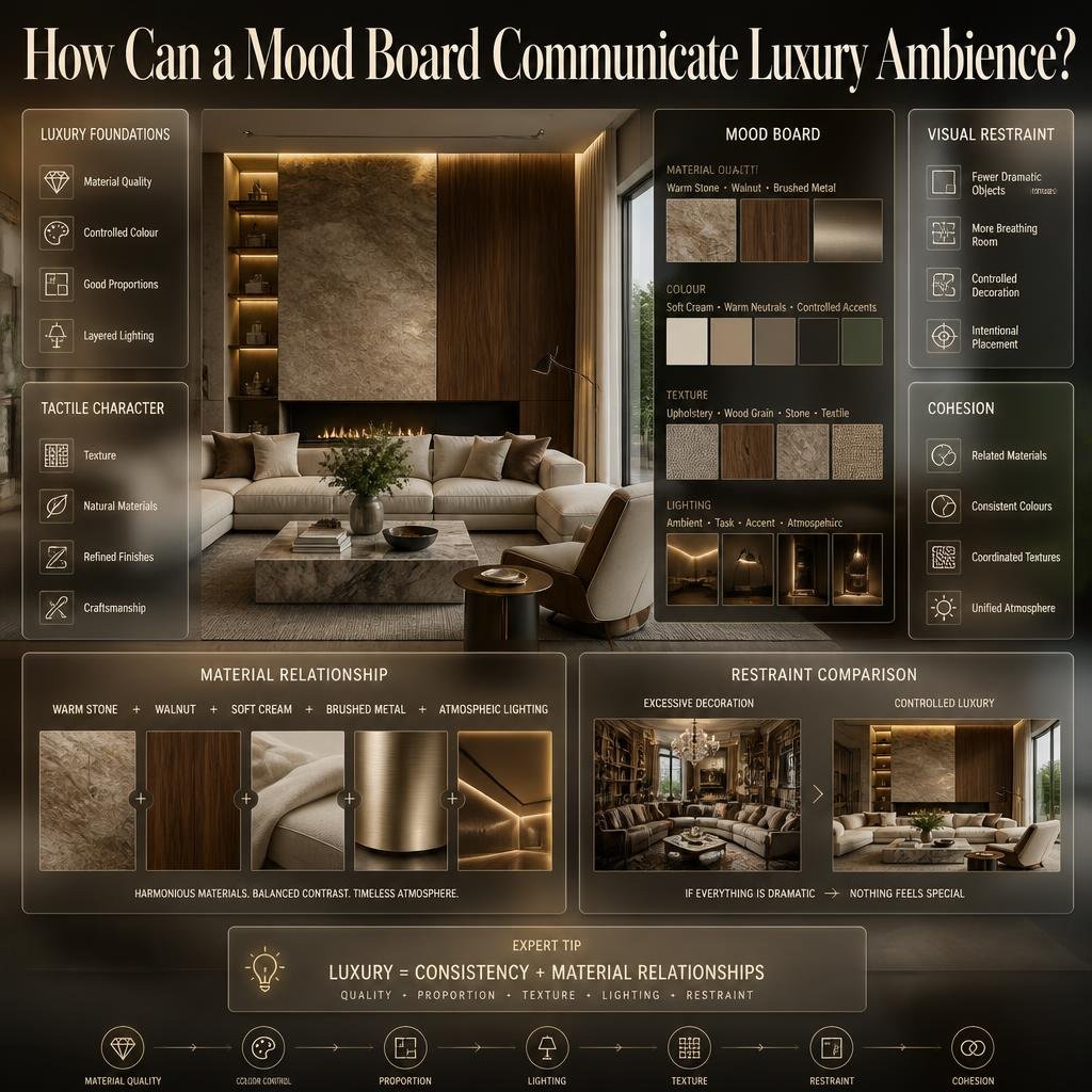
Luxury isn’t simply about expensive furniture.
A luxury mood board should communicate:
- Material quality
- Controlled colour
- Good proportions
- Layered lighting
- Texture
- Visual restraint
- Craftsmanship
- Cohesion
For example, a board could combine:
Warm stone + walnut + soft cream upholstery + brushed metal + atmospheric lighting
without using excessive decoration.
This is where restraint becomes important.
If every item is dramatic, nothing feels special.
For inspiration on creating a sophisticated atmosphere, Luxury Ambience can be incorporated into the research stage.
⭐ Expert Tip: Luxury is often communicated through consistency and material relationships rather than the number of expensive-looking objects in the room.
Can Mood Boards Help With Connected Living and Smart Homes?
Yes.
Modern homes increasingly combine interior design with technology.
A mood board for a connected home might include visual references for:
- Integrated lighting
- Hidden speakers
- Smart controls
- Charging areas
- Concealed cables
- Motorized window treatments
- Media systems
- Smart storage
The important principle is that technology should support the interior rather than visually dominate it.
For example, a television wall can be designed around the room’s architecture instead of simply placing a screen on an empty wall.
For related ideas, Connected Living can help connect technology with everyday interior planning.
How Do You Make a Mood Board Match the Way You Live?
A common mistake is designing for a photograph rather than for real life.
Your mood board should reflect how the room will actually be used.
Ask:
- Do children use the room?
- Are pets present?
- Do you entertain frequently?
- Do you work from home?
- Do you need hidden storage?
- Do you prefer minimal maintenance?
- Does the room receive strong sunlight?
- Do you need flexible furniture?
- Is the space used throughout the day?
A beautiful white sofa might look perfect in a reference image, but it may not be practical for a household that needs highly durable upholstery.
A mood board should therefore communicate lifestyle as well as appearance.
For practical home-planning inspiration, Why Home Improvement Is Important can be considered alongside the visual planning process.
How Do Mood Boards Work With Home Accessories?
Accessories are usually added toward the end of the design process, but they still deserve representation on the mood board.
Useful references can include:
- Vases
- Artwork
- Cushions
- Throws
- Mirrors
- Sculptural objects
- Books
- Plants
- Decorative trays
The purpose isn’t to choose every accessory immediately.
Instead, the board should establish the type of accessories that belong in the room.
For example:
Organic ceramics + linen textiles + natural wood objects
creates a different atmosphere from:
Glossy metallic objects + mirrored surfaces + bold geometric artwork.
When you’re ready to explore finishing details, Home Accessories can support the styling stage.
Can Mood Boards Be Used for Outdoor and Garden Design?
Absolutely.
The same principle works outside the home.
A garden mood board can include:
- Outdoor furniture
- Planting style
- Paving
- Lighting
- Timber
- Stone
- Planters
- Water features
- Shade structures
- Colour palette
For example, a relaxed contemporary garden might use:
Natural stone + warm timber + soft planting + neutral outdoor furniture + subtle lighting.
A mood board makes it easier to understand whether all these elements belong together.
If you’re exploring outdoor planning, Robert MyGardenAndPatio can be used as an additional reference for garden and patio-related ideas.
You can also explore Can I Design My Own Garden? when deciding how much of the planning you can realistically handle yourself.
How Can Mood Boards Help With Room-by-Room Design?
One mood board can establish the overall home direction, but individual rooms may require their own boards.
For example:
Living room
Focus on:
- Seating
- Lighting
- Flooring
- Colour
- Entertainment
- Accessories
Bedroom
Focus on:
- Bed
- Bedding
- Storage
- Lighting
- Privacy
- Calmness
Kitchen
Focus on:
- Cabinetry
- Worktops
- Hardware
- Appliances
- Lighting
- Flooring
Bathroom
Focus on:
- Tiles
- Fixtures
- Vanity
- Mirrors
- Lighting
- Surface finishes
The individual boards should still feel connected.
That doesn’t mean every room must look identical.
Instead, repeat selected elements such as:
- Wood tone
- Metal finish
- Accent colour
- Flooring
- Lighting language
- Architectural details
For broader room-by-room planning, Room-by-Room Design Hub can help organize the process.
What Are the Most Common Mood Board Mistakes?
1. Adding too many images
More inspiration doesn’t automatically mean more clarity.
Why it happens: Beginners don’t want to remove ideas they like.
Why it’s harmful: The board becomes visually confusing.
How to avoid it: Keep only references that communicate a meaningful part of the concept.
2. Choosing images only because they’re beautiful
A photograph can be beautiful while being completely unsuitable for your project.
Better approach: Ask what specific information the image provides.
Does it show a colour? Material? Furniture shape? Lighting idea? Layout? Texture?
If it provides nothing useful, remove it.
3. Ignoring scale
A huge room with dramatic furniture can make a small apartment look deceptively easy to design.
Always consider:
- Room dimensions
- Ceiling height
- Furniture proportions
- Walking space
- Window position
4. Mixing incompatible styles
Eclectic interiors can work, but accidental mixing often looks messy.
If you combine traditional, industrial, minimalist and glamorous references, identify the connecting element.
It could be:
- Colour
- Material
- Proportion
- Shape
- Architecture
5. Forgetting function
A room should not simply resemble the inspiration images.
It must work for the people using it.
6. Ignoring lighting
A colour can look completely different under different lighting conditions.
Always consider natural and artificial light.
7. Selecting materials only by appearance
A material’s performance matters.
Ask:
- Is it durable?
- Is it easy to clean?
- Does it scratch?
- Does it stain?
- Is it suitable for moisture?
- Will it age well?
8. Copying someone else’s room
Inspiration is useful.
Copying isn’t the objective.
The best mood boards identify what you like and translate those qualities into a design suited to your own space.
How Can You Make a Mood Board Look Professional?
A professional-looking mood board doesn’t need complicated software.
It needs hierarchy.
Start with one or two strong hero images.
Then support them with:
- Colour swatches
- Material references
- Furniture
- Lighting
- Texture
- Detail shots
Avoid making every image the same visual size.
Create a clear hierarchy so the viewer immediately understands the main direction.
A simple structure might look like this:
            MAIN ROOM IMAGE
                   ↓
     COLOUR   MATERIAL   FURNITURE
        ↓         ↓          ↓
   TEXTURE    LIGHTING    DETAILS
The board should feel intentional rather than randomly assembled.
What Is a Good Mood Board Colour Palette?
A good palette is one that supports the intended atmosphere and gives the room enough variation without creating visual noise.
A practical palette can include:
Base colour
The dominant background tone.
Secondary colour
A supporting shade used across furniture or textiles.
Accent colour
A smaller amount used to create interest.
Material colour
Natural tones coming from wood, stone or metal.
For example:
| Role | Example |
|---|---|
| Base | Warm ivory |
| Secondary | Soft taupe |
| Accent | Deep olive |
| Material | Natural oak |
| Metal | Brushed bronze |
The exact colours aren’t important.
The relationships are.
How Do You Know If Your Mood Board Is Working?
Put the board aside for a few minutes and return to it later.
Then ask yourself:
Does the board tell one clear story?
If you immediately understand the intended atmosphere, that’s a good sign.
If you notice several unrelated styles fighting for attention, edit it.
Another useful test is to describe the board without naming individual products.
For example:
“It feels warm, quiet, natural and contemporary.”
If that’s easy to say, the concept is probably clear.
If you need several paragraphs to explain what the board means, it may need simplification.
What should you include in an interior design mood board?
A professional interior design mood board should include the visual elements that define how the finished space is expected to look and feel. The most useful components are a focused colour palette, furniture direction, materials, textures, lighting references, flooring or rugs, wall finishes, and a few carefully selected room images. Current professional guidance commonly recommends combining these elements rather than relying on room photographs alone.
The important point is selection rather than quantity. A mood board isn’t supposed to become a collection of everything you like. Each element should communicate something useful about the proposed design.
A strong board can include:
Hero or inspiration image – establishes the overall atmosphere.
Colour palette – shows the dominant, supporting and accent tones.
Furniture references – communicates shapes, proportions and visual weight.
Material samples – such as wood, stone, marble, metal or glass.
Textiles – linen, wool, boucle, velvet or other upholstery directions.
Lighting references – shows both fixture style and desired atmosphere.
Flooring and wall finishes – establishes the foundation of the room.
Accessories and artwork – adds personality without taking over the concept.
Short notes or labels – explains why a particular element was selected.
For example, if you’re creating a warm contemporary living room, your board might combine warm ivory walls, natural oak, soft beige upholstery, aged bronze, textured linen and warm ambient lighting.
The board then tells a consistent story: warm, natural, sophisticated and comfortable.
⭐ Professional tip: Don’t use five different sofa photographs just because you like them. Choose one or two references that clearly communicate the shape and character you’re looking for. Use the remaining space to show materials, lighting, texture and colour relationships.
How do you create a mood board for interior design?
Creating a useful mood board starts before you open Canva, Pinterest or any design software. First decide what you’re actually trying to achieve. Define the room, its purpose, the people using it, and the feeling you want the space to create.
A practical process is:
Room purpose → inspiration → editing → colour → materials → furniture → lighting → final review
This approach prevents the common mistake of collecting hundreds of attractive images without developing a clear design direction. Recent interior-design guidance similarly emphasizes defining the brief, gathering references, identifying repeated patterns and editing the collection before finalizing the board.
Start with the room
Be specific.
Instead of creating a board called:
“My Dream Home”
create something like:
“Warm Contemporary Living Room”
or:
“Calm Natural Bedroom With Oak and Linen.”
A defined scope makes the board much easier to control.
Choose three to five descriptive words
For example:
Warm — Calm — Natural — Contemporary
These words become your filter.
When you find an image, ask:
Does this image support at least one of these ideas?
If it doesn’t, don’t automatically add it.
Collect more than you need
During the inspiration stage, collect room images, materials, colours, furniture, lighting and textures freely.
Then edit.
Professional mood-board guidance often recommends reducing a larger inspiration collection to a much tighter group of meaningful references.
Look for repetition
This is one of the most valuable stages.
You may discover that you’re repeatedly choosing:
Warm wood
Rounded furniture
Cream walls
Natural fabrics
Soft lighting
Muted green
Aged metal
Those repetitions reveal your design direction more accurately than a style label alone.
Build the final board
Once the pattern becomes clear, arrange the strongest elements together.
Put the most important visual reference where it immediately establishes the mood. Then use smaller colour, material, furniture and detail references to support it.
📌 Quick tip: Before buying paint, furniture or expensive finishes, use the mood board as a decision filter. If a new item doesn’t support the established direction, pause before purchasing it.
What is the difference between a mood board and an inspiration board?
An inspiration board is generally used to explore possibilities, while a mood board is more focused on communicating a specific design direction.
This distinction is important because many homeowners confuse collecting inspiration with actually making design decisions.
An inspiration collection might contain:
A modern kitchen
A traditional bedroom
A colourful dining room
A luxury hotel
A minimalist apartment
A rustic garden
You may love every image individually.
But they may not belong in the same project.
A mood board takes that broader inspiration and begins to answer:
What exactly am I trying to create?
For example:
Inspiration stage
You save:
Cream interiors
Walnut furniture
Green walls
Curved sofas
Brass lighting
Stone surfaces
Large artwork
Mood-board stage
You decide:
Warm contemporary + walnut + soft cream + muted olive + aged brass + tactile fabrics
Now the ideas have become a design direction.
That is why a finished mood board should normally be more edited and intentional than a raw inspiration collection. Professional guidance also distinguishes the mood board as a tool for communicating a coherent vision to clients, teams or other project participants.
A simple way to remember it:
Inspiration gives you possibilities.
A mood board helps you choose a direction.
⚠ Common mistake: Don’t treat Pinterest, Instagram saves or screenshots as the finished design. They are excellent sources of inspiration, but the real value comes from identifying the patterns and editing them into one coherent concept.
How many images should a mood board have?
There isn’t one universal number because the appropriate amount depends on the size and complexity of the project. What matters more than the image count is whether every reference contributes useful information.
For a homeowner working on a single room, a focused board might contain roughly 10–20 meaningful visual references, while a more detailed professional presentation can contain more when it includes materials, finishes, furniture and product information.
Some current interior-design guidance suggests narrowing a larger collection to around 15–30 strong references, while other approaches deliberately reduce the final concept to a much tighter set. The common principle is the same: edit heavily and remove repetition.
Think about the board in terms of information, not numbers.
For example, a living-room mood board might need:
2–3 overall room references
2 furniture references
3–4 material or texture references
3–5 colour references
1–2 lighting references
1 flooring or rug reference
1–2 artwork/accessory references
That’s already enough to communicate a strong direction.
Too few references
If the board contains only one room photograph and one colour swatch, it may not provide enough information for practical decision-making.
Too many references
If you have 60 room photographs, 15 sofas, 20 lamps and dozens of unrelated colours, the board becomes difficult to interpret.
The goal is visual clarity.
⭐ Expert advice: After creating the first version, remove anything that repeats an idea already communicated elsewhere. If three images all say “warm natural wood,” you probably don’t need all three.
A good test is to ask:
If I remove this image, will I lose an important piece of information?
If the answer is no, remove it.
Are mood boards still useful for modern interior design in 2026?
Yes, and their role has become even more practical as homeowners have access to huge amounts of online inspiration and digital design tools.
The challenge today isn’t finding ideas. It’s filtering them.
There are endless images of kitchens, bedrooms, living rooms, furniture, colour palettes and luxury interiors available online. Without a clear system, that abundance can make design decisions harder rather than easier.
Current 2026 interior-design coverage is emphasizing warmer neutrals, natural materials, richer textures, softer metallic finishes, layered lighting and more character-driven interiors.
A mood board helps you decide which of those directions actually belongs in your home.
For example, you may notice that warm neutrals are popular, but that doesn’t mean you need to make your entire home beige.
Your board could instead translate the broader direction into:
Warm white walls + walnut + muted olive + textured linen + aged bronze
That creates a contemporary result while still reflecting personal taste.
Modern mood boards can also be more detailed than traditional collages. Digital boards can combine:
Real product images
Colour references
Material samples
Furniture
Lighting
Floor finishes
Textures
Notes
Product information
Room photography
This makes the board useful throughout the design process rather than only at the inspiration stage.
However, there is one important limitation: a mood board isn’t a substitute for technical planning.
A photograph cannot tell you whether a sofa will physically fit through your doorway. A colour image cannot guarantee how paint will look under your home’s natural lighting. A beautiful kitchen reference doesn’t confirm that the cabinetry dimensions, plumbing, electrical requirements or budget will work.
So the professional approach is:
Mood board → design direction → measurements → samples → detailed decisions → implementation
Use the mood board to establish the creative direction, then verify every real-world decision separately.
📌 Final professional tip: Don’t ask whether your mood board looks impressive. Ask whether it makes your next design decision easier. If it clearly tells you what colours, materials, furniture shapes, textures and atmosphere belong in the room—and what doesn’t belong—you’ve created a useful mood board.
Conclusion
A well-planned mood board can turn a collection of scattered ideas into a clear interior design direction. Instead of choosing colours, furniture, materials, lighting, and accessories separately, it allows you to see how those decisions are expected to work together before you commit to them.
The most effective approach is to start with the purpose and feeling of the room, then build around a focused colour palette, complementary materials, appropriate furniture, layered lighting, and carefully selected textures. You don’t need hundreds of images. You need the right references that communicate a consistent idea.
Most importantly, your mood board should reflect your actual space and lifestyle, not simply reproduce a beautiful room you’ve seen online. Consider room size, natural light, maintenance, storage, comfort, functionality, budget, and the way the space will be used every day.
Use your mood board as a decision-making tool throughout the project. When you’re unsure about a new colour, furniture piece, finish, or accessory, compare it with the established direction. If it supports the concept, it has a place in the conversation. If it creates unnecessary visual conflict, reconsider it.
A successful mood board doesn’t predict every detail of the finished interior. It gives the project a strong visual foundation while leaving enough flexibility for practical decisions. When inspiration is carefully edited and connected through colour, material, proportion, texture, and atmosphere, the final space feels more intentional, balanced, and personal.
Leave a Reply