
Introduction
Choosing the right color combinations can completely change the way a home looks and feels. Yet many people struggle with the same question: Which colors actually work together, and how much of each color should I use?
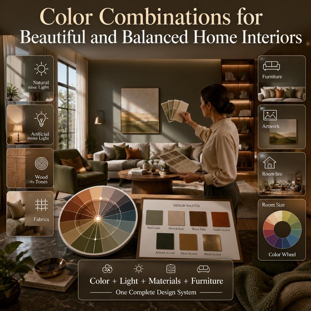
A color that looks beautiful on a screen may feel completely different once it reaches your walls. Natural light, artificial lighting, flooring, furniture, wood tones, fabrics, artwork, and even the size of a room can change how a color appears.
At DesignMode24 Interior Design, the goal is to approach interior choices as a complete design system rather than selecting isolated colors. A good palette should work with the room, not fight against it.
This guide explains how to choose color combinations for real homes, how the color wheel works, how to combine paint with furniture and materials, how to create palettes for different rooms, how to use bold colors without overwhelming a space, and how to avoid the most common color mistakes.
What Are Color Combinations?
Color combinations are the relationships created when two or more colors are used together in an interior.
They can be subtle, such as warm white with beige and light wood, or dramatic, such as deep navy with warm orange accents. The important point is that successful color combinations are not simply about choosing colors that look attractive individually.
They are about how colors behave together.
A successful palette considers:
- Hue
- Tone
- Shade
- Saturation
- Contrast
- Undertone
- Natural light
- Artificial lighting
- Furniture
- Flooring
- Materials
- Room size
- Room function
- Visual balance
The color wheel provides a useful framework for understanding relationships between colors. It separates primary, secondary, and tertiary colors and helps designers identify harmonious, tonal, and contrasting combinations.
For example, blue may look beautiful on its own, but the final result changes depending on whether it is combined with crisp white, warm beige, natural oak, brass, charcoal, terracotta, or green.
That is why choosing a color should never happen in isolation.
Why Do Color Combinations Matter in Interior Design?
Color is one of the fastest ways to change the visual character of a room.
A room with pale neutral colors can feel open and understated. A room with deeper colors can feel more intimate. Warm colors can introduce energy and visual warmth, while cooler palettes can create a calmer atmosphere.
But color also performs practical design functions.
It can help:
- Define different zones
- Highlight architectural features
- Make a small room feel more open
- Give a large room more intimacy
- Connect separate spaces
- Emphasize furniture
- Create a focal point
- Balance strong materials
- Add personality
- Establish a mood
This is why color planning should happen alongside the broader Interior Design process rather than being treated as an afterthought.
A beautiful sofa, expensive flooring, or carefully selected lighting can still feel disconnected if the surrounding colors do not support them.
💡 Pro Tip: Do not ask only, “Do I like this color?” Ask, “Does this color work with everything that is already in this room?”
That single question can prevent many expensive decorating mistakes.
How Do You Choose the Right Color Combination?
There is no universal palette that works for every home.
The best starting point is the room itself.
Before choosing colors, examine what you already have and identify the elements that are difficult or expensive to replace.
These may include:
- Flooring
- Kitchen cabinets
- Countertops
- Large sofas
- Built-in wardrobes
- Stone surfaces
- Wooden furniture
- Curtains
- Rugs
- Architectural details
If the floor is warm oak, for example, selecting an extremely cool gray for every other surface may create unnecessary tension.
Instead, you could use a softer neutral that respects the warmth already present.
Start With the Largest Fixed Element
A common professional approach is to begin with the strongest permanent feature.
This could be:
- A stone countertop
- A wooden floor
- A large rug
- A patterned sofa
- A statement artwork
- Kitchen cabinetry
Look carefully at the colors inside that element.
A rug may contain cream, olive, brown, and muted blue. Those colors can become the foundation for the room.
You do not need to use every color.
Choose one dominant color, one supporting color, and one accent.
Decide How You Want the Room to Feel
Color should support the function of the space.
For a bedroom, you might prefer:
- Soft blue
- Muted green
- Warm beige
- Cream
- Dusty rose
For a dining room, you may want:
- Terracotta
- Deep green
- Warm brown
- Navy
- Rich cream
For a home office, you might choose:
- Soft gray
- Green
- Navy
- Warm white
- Natural wood
The purpose of the room should influence the intensity and temperature of the palette.
Dulux similarly recommends beginning with the mood you want to create and then using existing fixtures and furnishings as sources of color inspiration.
What Is the 60-30-10 Color Rule?
The 60-30-10 rule is a simple way to distribute colors within a room.
A typical interpretation is:
| Color Role | Approximate Amount | Typical Use |
|---|---|---|
| Dominant | 60% | Walls, large surfaces |
| Secondary | 30% | Furniture, curtains, larger decorative elements |
| Accent | 10% | Cushions, artwork, accessories |
The rule is not a mathematical requirement. It is a starting framework that helps prevent every color from competing equally for attention.
For example, imagine a living room with:
- 60% warm off-white
- 30% muted olive
- 10% terracotta
The off-white establishes the visual background.
Olive gives the room identity through furniture, curtains, or a rug.
Terracotta then appears in smaller details such as cushions, artwork, ceramics, or accessories.
The result can feel intentional without requiring every object to match.
The 60-30-10 approach has also been discussed by professional color and interior design sources as a useful method for balancing dominant, secondary, and accent colors.
⚠ Common Mistake: Treating 60-30-10 as an exact rule.
You do not need to measure your room with a calculator.
The real purpose is to create hierarchy.
What Is a Color Wheel and How Does It Help?
A color wheel shows relationships between colors.
The traditional wheel includes:
- Primary colors
- Secondary colors
- Tertiary colors
Primary colors are commonly represented as red, blue, and yellow. Secondary colors are created from combinations of primary colors, while tertiary colors sit between primary and secondary colors.
You do not need advanced color theory to use the wheel.
You simply need to understand a few basic relationships.
Monochromatic Color Combinations
A monochromatic palette uses different versions of one basic hue.
For example:
- Pale blue
- Medium blue
- Deep navy
Or:
- Cream
- Beige
- Camel
- Brown
This approach creates continuity without requiring strong contrast.
It works particularly well when you want a calm, sophisticated interior.
Because the colors are closely related, texture becomes more important.
A monochromatic beige room can look flat if everything has the same texture.
Instead, combine:
- Linen
- Wood
- Wool
- Stone
- Metal
- Glass
The differences in texture create visual depth.
What Are Analogous Color Combinations?
Analogous colors sit next to one another on the color wheel.
Examples include:
- Blue + blue-green
- Green + yellow-green
- Yellow + orange
- Blue + purple
These combinations generally create a connected visual flow because the colors share relationships on the wheel.
A blue-green palette, for example, can combine:
- Soft blue walls
- Deep green upholstery
- Teal accessories
The key is controlling intensity.
If every color is extremely saturated, the room may feel visually aggressive.
Instead, consider:
- One stronger color
- One muted supporting color
- One lighter version
⭐ Expert Tip: When using neighboring colors, vary their depth and intensity rather than using three equally strong shades.
What Are Complementary Color Combinations?
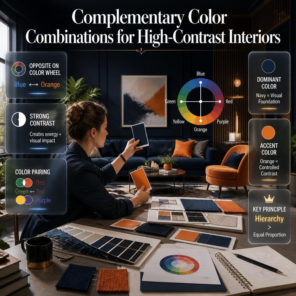
Complementary colors sit opposite each other on the color wheel.
Examples include:
- Blue + orange
- Green + red
- Yellow + purple
These combinations create stronger contrast.
That makes them useful when you want a room to have energy and visual impact.
However, complementary colors do not need to be used in equal amounts.
A navy room with small touches of warm orange can feel much more sophisticated than a room divided equally between navy and bright orange.
The secret is hierarchy.
Use one color as the visual foundation and allow the complementary shade to create controlled contrast.
Dulux describes contrasting colors as colors positioned opposite each other on the wheel and emphasizes proportion when using them in interiors.
What Is a Split-Complementary Color Scheme?
A split-complementary palette starts with one main color and uses the two colors beside its complementary color.
It offers contrast without making the palette feel as direct as a traditional complementary scheme.
For example, instead of pairing blue directly with orange, you might introduce warmer yellow-orange and red-orange variations.
This can be useful when you want:
- Contrast
- More variety
- A sophisticated palette
- Multiple accent opportunities
It is especially helpful when a direct complementary pairing feels too strong.
What Is a Triadic Color Combination?
A triadic palette uses three colors spaced relatively evenly around the color wheel.
This can create a lively and balanced result.
However, triadic palettes can become overwhelming if all three colors are used at full intensity.
A better approach for residential interiors is often to soften two of the colors.
For example:
- Deep muted blue
- Soft warm yellow
- Dusty red
The result has personality without becoming visually chaotic.
What Are Warm and Cool Color Combinations?
Colors are often described as warm or cool.
Warm palettes commonly include:
- Red
- Orange
- Yellow
- Warm beige
- Terracotta
- Warm brown
Cool palettes commonly include:
- Blue
- Green
- Violet
- Blue-gray
But the situation becomes more interesting with neutrals.
A gray can be warm if it contains beige or brown undertones.
A white can feel cool if it has blue or gray undertones.
This is why simply labeling a color “white,” “gray,” or “beige” is not enough.
How Do Undertones Affect Color Combinations?
Undertones are subtle colors underneath the main visible color.
This is one of the biggest reasons two seemingly similar colors can clash.
For example:
A warm beige can work beautifully with:
- Cream
- Camel
- Warm oak
- Brass
- Terracotta
But placing it next to a very blue-based gray may make the beige appear yellow or muddy.
Similarly, a cool gray may work better with:
- Blue
- Charcoal
- Cool white
- Silver
- Black
How to Identify an Undertone
Compare the color against a pure white surface.
Then place it beside:
- Warm cream
- Cool gray
- Natural wood
- Black
The hidden undertone becomes easier to notice.
📌 Quick Tip: Never choose several neutral paint colors simply because they all look “neutral.” Compare their undertones before putting them together.
How Does Lighting Change Color Combinations?
Lighting can completely change the appearance of color.
Natural daylight changes throughout the day.
Morning light may feel different from afternoon light.
Artificial lighting can also alter how a paint color appears.
That means you should never judge a wall color from a tiny online image alone.
Test the actual color in the room.
Look at it:
- In the morning
- During the afternoon
- At night
- Under ceiling lights
- Near windows
- In shaded corners
A color that looks perfect beside a window may feel much darker on another wall.
This is especially important with:
- Dark colors
- Warm whites
- Gray
- Green
- Blue
- Beige
💡 Pro Tip: Paint a large sample area instead of testing only a tiny square. A larger sample gives you a better understanding of how the color behaves across the room.
Best Color Combinations for a Living Room
The living room usually contains more visual elements than many other rooms.
You may have:
- Sofa
- Coffee table
- TV unit
- Rug
- Curtains
- Artwork
- Lamps
- Cushions
- Plants
Because there are so many elements, the palette should create relationships between them.
Warm Neutral + Olive + Natural Wood
This combination creates an earthy atmosphere.
Use:
- Warm white or beige walls
- Olive green upholstery or curtains
- Natural wood furniture
Then add small touches of black or brass.
Cream + Navy + Warm Tan
This works well when you want a more classic appearance.
Use cream as the background.
Add navy through:
- Sofa
- Accent chair
- Curtains
- Artwork
Then introduce tan leather or natural wood.
White + Charcoal + Terracotta
This creates stronger contrast.
Keep the white dominant.
Use charcoal for larger furniture.
Bring terracotta through cushions, ceramics, artwork, or a rug.
Best Bedroom Color Combinations
Bedrooms generally benefit from colors that do not feel visually aggressive.
Soft Green + Cream + Natural Wood
Green can connect the room with nature while cream prevents the palette from becoming too dark.
Dusty Blue + Warm White + Beige
This creates a soft layered palette.
The important part is choosing a warm white rather than an extremely cold white if the room contains warm wood.
Taupe + Cream + Deep Brown
This works particularly well for a sophisticated neutral bedroom.
Instead of using multiple unrelated browns, keep the undertones consistent.
Best Kitchen Color Combinations

Kitchen palettes need to work with hard materials.
Consider:
- Cabinets
- Countertops
- Backsplash
- Flooring
- Appliances
- Hardware
White + Natural Wood + Green
This combination works well when you want a kitchen that feels fresh but not overly sterile.
Cream + Warm Gray + Brass
A soft cream can make the room feel welcoming.
Warm gray provides contrast.
Brass introduces a small metallic accent.
Navy + White + Natural Wood
Navy cabinets can become the dominant feature.
White walls or backsplash keep the room visually open.
Natural wood prevents the palette from feeling too cold.
Best Bathroom Color Combinations
Bathrooms often have limited space, so contrast needs to be controlled.
Consider:
- Warm white + beige + brushed brass
- Soft gray + white + natural wood
- Green + cream + stone
- Charcoal + warm white + oak
If the bathroom is small, avoid introducing too many high-contrast colors.
Instead, create interest through:
- Tile texture
- Stone patterns
- Metal finishes
- Towels
- Lighting
- Mirrors
Best Home Office Color Combinations
A home office should feel visually comfortable while still having enough character.
Good combinations include:
- Sage green + cream + oak
- Navy + warm white + walnut
- Soft gray + beige + black
- Muted blue + natural wood + off-white
The desk, shelving, artwork, and lighting should be considered part of the palette.
A wall color should not be selected before considering the furniture.
How Do You Match Colors With Wood?
Wood introduces its own color temperature.
Light oak often feels:
- Warm
- Natural
- Soft
Walnut tends to feel:
- Deep
- Rich
- Sophisticated
Dark wood can make a room feel more grounded but may also increase visual weight.
When selecting paint around wood, compare undertones.
Warm wood generally works naturally with:
- Cream
- Beige
- Olive
- Terracotta
- Warm gray
Cooler woods or gray-washed finishes can work with:
- Soft white
- Blue-gray
- Charcoal
- Muted green
The goal is not necessarily to match the wood.
It is to create a relationship with it.
For more detailed decisions about finishes and surfaces, use a broader Material Selection approach so color and material are considered together.
How Do Flooring and Wall Colors Work Together?
Flooring is visually significant because it covers a large surface.
A very dark floor can make a room feel heavier.
A light floor can create a brighter foundation.
One practical approach is to create a gradual visual transition.
For example:
Dark floor → medium wall → light ceiling
Or:
Light floor → medium wall → lighter ceiling
This creates hierarchy.
The ceiling does not always have to be pure white, either.
A soft warm white may work better when the overall palette is warm.
How Do You Use Color in Small Rooms?
Small rooms do not automatically require white walls.
The real issue is visual weight.
A small room can use darker colors successfully when:
- Lighting is adequate
- Furniture is controlled
- The palette is cohesive
- Contrast is intentional
If you want the room to feel visually open, consider:
- Light walls
- Similar-colored trim
- Limited contrasting furniture
- Reflective surfaces
- Large mirrors
- Consistent flooring
You can also use one darker accent instead of several.
For practical home changes and simple improvements, the Home Improvement section can support the broader planning process.
How Do You Use Color in Large Rooms?
Large rooms can often handle deeper colors and stronger contrast.
If everything is white, a large room may feel unfinished or disconnected.
You can introduce:
- Darker furniture
- Large artwork
- Deep accent walls
- Stronger rugs
- Contrasting curtains
- Statement lighting
But large rooms still need visual hierarchy.
A common mistake is thinking that a large room means you should use every color you like.
It does not.
Large spaces benefit from repetition.
If navy appears in the sofa, repeat a small amount of navy in artwork or accessories.
That creates visual connection.
How Do You Connect Color Between Different Rooms?
Open-plan homes create a special challenge.
You do not necessarily want every room to have the same color.
Instead, create a color story.
For example:
Living room:
- Cream
- Olive
- Wood
Dining area:
- Cream
- Olive
- Terracotta
Kitchen:
- Cream
- Wood
- Dark green
The rooms are different, but the repeated colors create continuity.
This is particularly useful when moving from one space to another.
For a broader room-by-room approach, explore the Room-by-Room Design Hub when planning how the palette should evolve throughout the home.
How Do You Build a Color Palette Step by Step?

A professional-looking palette does not need to be complicated.
Step 1: Identify the Fixed Elements
Look at:
- Flooring
- Cabinets
- Countertops
- Large furniture
- Doors
- Existing tiles
Do not ignore these colors.
Step 2: Select the Dominant Color
This is usually the background.
It might be:
- Warm white
- Beige
- Soft gray
- Cream
- Muted green
Step 3: Choose the Secondary Color
This creates more identity.
Use it on:
- Sofa
- Curtains
- Rug
- Cabinetry
- Accent furniture
Step 4: Select the Accent
The accent should be smaller.
Use it through:
- Cushions
- Artwork
- Decorative objects
- Lighting
- Ceramics
Step 5: Add a Material Layer
Color becomes more sophisticated when paired with texture.
Consider:
- Wood
- Stone
- Linen
- Wool
- Metal
- Glass
Step 6: Test the Palette
Put the samples together.
Do not evaluate them individually.
You are looking for the relationship between them.
If you need help organizing the practical decorating process, the guide on How to set up my home decoradtech can complement this planning stage.
How Can DIY Projects Help You Test Color Combinations?
You do not need to repaint an entire room to discover whether a palette works.
Start small.
Try:
- Painting a small side table
- Creating a sample board
- Changing cushion covers
- Adding artwork
- Painting a shelf
- Testing a small feature wall
- Updating decorative objects
This makes it easier to evaluate the combination before making a larger commitment.
If you enjoy doing projects yourself, DIY Home Projects can be useful when turning small color ideas into practical changes.
⚠ Common Mistake: Testing a color only under one lighting condition.
Always evaluate it in the actual environment where it will be used.
How Can Nature Inspire Color Combinations?
Nature provides some of the easiest palette references.
Think about:
- Forest green + brown
- Sand + cream + blue
- Olive + beige
- Terracotta + green
- Sky blue + warm white
- Stone gray + muted green
These combinations often feel natural because they are already visible in landscapes.
This approach can also help connect indoor spaces with balconies, patios, terraces, and gardens.
If your home includes outdoor areas, Garden Tips Decoradhouse can provide another perspective for coordinating natural colors and outdoor surroundings with your interior palette.
The objective is not to make the inside and outside identical.
Instead, repeat subtle colors.
For example:
A garden contains deep green foliage and warm terracotta pots.
You could repeat green through an indoor cushion and terracotta through a ceramic vase.
The connection is subtle but effective.
How Does Home Improvement Affect Color Choices?
Color decisions often happen during larger renovation projects.
If you are changing:
- Flooring
- Kitchen cabinets
- Wall finishes
- Doors
- Built-ins
- Lighting
then color should be considered before the work begins.
Changing paint after expensive materials have been installed can limit your choices.
It is usually easier to choose paint around the permanent materials than to choose expensive permanent materials around a paint color you selected impulsively.
For larger projects, Home Upgrading Mintpalment can fit naturally into the planning stage where aesthetic upgrades and practical improvements need to work together.
How Can Smart Lighting Change Your Color Palette?
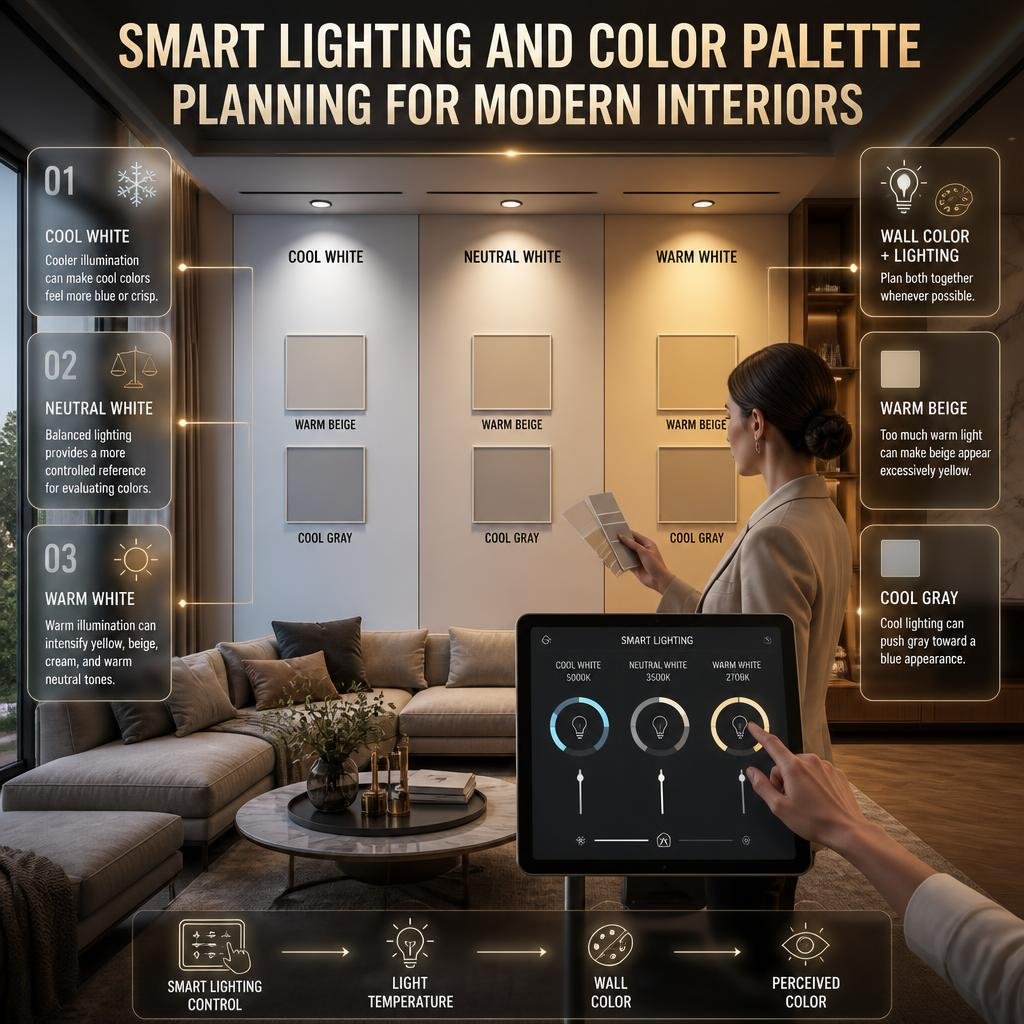
Modern homes increasingly use adjustable lighting.
That means one room may be exposed to different color temperatures throughout the day.
For example:
- Cool white lighting
- Neutral white lighting
- Warm white lighting
can make the same wall appear different.
This is why lighting should be part of color planning.
If you are building a smart interior, Home Smart Decoradtech can be considered alongside your visual design decisions.
The important principle is simple:
Choose the wall color and lighting together whenever possible.
A beautiful warm beige may look excellent under warm lighting but become excessively yellow if the lighting is too warm.
Similarly, a cool gray may appear almost blue under cool lighting.
What Simple Home Hacks Can Improve a Color Scheme?
Sometimes you do not need a complete redesign.
Small changes can significantly improve an existing palette.
Try:
Repeat One Accent Color
If a room has one blue artwork, repeat a small amount of blue in:
- Cushions
- Books
- Ceramics
- A vase
Change the Soft Furnishings
Curtains, rugs, and cushions are relatively easy ways to adjust color.
Add Natural Texture
Wood, woven baskets, linen, and plants can soften a palette.
Reduce Competing Colors
If a room feels chaotic, remove a few colors before adding anything new.
The Home Hacks Decoradtech resource can complement these smaller changes when you want practical ways to improve an existing space without immediately starting a major renovation.
How Do You Create Personalized Color Combinations?
A home should not look like a showroom where every decision follows a trend.
Your personal preferences matter.
Ask yourself:
- Which colors do I naturally enjoy?
- Which rooms make me feel comfortable?
- Do I prefer warm or cool interiors?
- Do I like contrast?
- Do I prefer subtle palettes?
- Which materials do I already own?
- How much maintenance am I comfortable with?
Personalization does not mean using your favorite color everywhere.
Instead, it means finding a sophisticated way to introduce it.
If your favorite color is deep green, for example, you could use:
- Green kitchen cabinets
- Green artwork
- Green cushions
- Green plants
- Green bathroom accessories
You do not need green walls in every room.
For more ideas around making an interior reflect the people who live there, explore Personalized Spaces.
How Do You Choose Paint Colors Without Making the Room Look Flat?
Paint is only one part of the palette.
A room can have beautiful wall color but still look flat if everything else has the same visual intensity.
Create variation through:
- Texture
- Furniture
- Lighting
- Artwork
- Wood
- Stone
- Fabric
- Metal
For example, a beige room can contain:
- Light beige walls
- Cream curtains
- Camel sofa
- Dark brown wood
- A muted green plant
- Brass lighting
The colors are related, but the room still has depth.
When planning paint specifically, the Paint Color category can be useful for exploring paint-focused decisions without treating paint as the only design element.
How Should You Use Current Color Trends?
Color trends can provide inspiration, but they should not control your entire home.
A trend may look excellent in a professionally photographed room because of:
- Lighting
- Furniture
- Architecture
- Camera settings
- Styling
- Room proportions
Your home may have completely different conditions.
Instead of copying a trend exactly, extract one idea.
For example:
Trend:
Deep earthy green walls.
Your interpretation:
Use muted green cushions and artwork instead.
Trend:
Warm brown interiors.
Your interpretation:
Introduce walnut furniture and caramel textiles.
Trend:
Bold red accents.
Your interpretation:
Use a small red artwork or decorative object.
This gives the room a contemporary feeling without making it dependent on a short-lived trend.
You can keep an eye on broader design developments through latest news DecoratorAdvice, but always translate trends into something appropriate for your own space.
Color Combinations for Different Interior Styles
Different design styles often have recognizable color directions, but none of them requires a rigid palette.
Modern Interiors
Modern interiors can work with:
- White
- Gray
- Black
- Warm wood
- Muted accent colors
The focus is often on clean contrast and controlled repetition.
Contemporary Interiors
Contemporary interiors can combine:
- Warm neutrals
- Charcoal
- Deep green
- Navy
- Terracotta
- Natural materials
The palette can evolve more freely.
Minimalist Interiors
Minimalist rooms benefit from restrained palettes.
Consider:
- Warm white
- Beige
- Light gray
- Natural wood
- Soft black
The goal is not simply using fewer colors.
It is reducing unnecessary visual competition.
Natural Interiors
Natural palettes often combine:
- Green
- Brown
- Cream
- Sand
- Terracotta
- Stone
Texture becomes especially important.
What Are the Most Common Color Combination Mistakes?
1. Choosing Colors Before Considering the Room
A beautiful color can fail if it does not work with the existing environment.
Better approach: Start with fixed elements.
2. Using Too Many Accent Colors
Every object does not need a new color.
Better approach: Repeat a small number of accent colors.
3. Ignoring Undertones
Two neutrals can clash even when both look neutral.
Better approach: Compare undertones under actual lighting.
4. Copying Online Images Exactly
A palette designed for one room may not suit another.
Better approach: Adapt the idea to your architecture and lighting.
5. Using Equal Amounts of Every Color
Equal distribution can make colors compete.
Better approach: Establish dominant, supporting, and accent roles.
6. Forgetting Materials
Paint does not exist by itself.
Better approach: Look at wood, stone, flooring, fabric, and metal finishes.
7. Choosing a Color Only in the Store
Store lighting can be very different from home lighting.
Better approach: Test samples at home.
8. Making Every Room Identical
A cohesive home does not require identical rooms.
Better approach: Repeat selected colors and vary the supporting palette.
9. Adding Color When the Real Problem Is Clutter
Sometimes a room feels wrong because there are too many competing objects.
Better approach: Edit the room before introducing more color.
10. Following Trends Too Literally
Trends change.
Better approach: Borrow ideas rather than copying complete rooms.
How Do Professionals Build a Balanced Color Palette?
A practical professional process can be broken into five stages.
Stage 1: Understand the Room
Look at:
- Size
- Ceiling height
- Windows
- Natural light
- Existing finishes
- Furniture
- Function
Stage 2: Identify the Visual Anchor
Find the element that already attracts attention.
It could be:
- A rug
- Artwork
- Sofa
- Kitchen island
- Fireplace
- Flooring
Build around it.
Stage 3: Establish Color Hierarchy
Choose:
Dominant → Secondary → Accent
This creates order.
Stage 4: Introduce Texture
Use materials to prevent the palette from becoming visually flat.
Stage 5: Test Before Finalizing
Observe the colors at different times.
A professional-looking palette is usually the result of comparison and adjustment rather than one spontaneous decision.
A Practical Color Combination Decision Table
| If You Want… | Consider… |
|---|---|
| Calm atmosphere | Soft blue, green, cream |
| Warm atmosphere | Beige, terracotta, brown |
| Modern contrast | White, charcoal, black |
| Natural feeling | Green, wood, beige |
| Elegant atmosphere | Taupe, cream, deep brown |
| Energetic room | Blue, orange, warm yellow |
| Soft bedroom | Dusty blue, cream, beige |
| Sophisticated living room | Olive, warm white, walnut |
| Bright kitchen | Cream, wood, soft green |
| Dramatic room | Navy, warm white, brass |
These are starting points, not strict formulas.
The same colors can behave differently depending on their exact tone, saturation, lighting, and surrounding materials.
How Can You Tell If a Color Palette Is Finished?
Before committing to the final design, ask:
- Do the colors share compatible undertones?
- Is one color clearly dominant?
- Is there enough contrast?
- Does the room still feel comfortable?
- Does the palette work in daylight?
- Does it work at night?
- Does it complement the flooring?
- Does it work with furniture?
- Are accents repeated naturally?
- Does the palette support the room’s purpose?
- Does it connect with nearby rooms?
- Does it feel personal rather than copied?
If you answer yes to most of these questions, the palette is likely moving in the right direction.
What Are the Best Color Combinations for Interior Design?
The best color combinations are the ones that create balance between the walls, furniture, flooring, lighting, and decorative elements rather than simply combining attractive colors. For many homes, combinations such as warm white with natural wood, beige with olive green, cream with navy, soft green with warm neutrals, or charcoal with off-white provide a strong starting point. The final choice should depend on the room’s natural light, size, existing materials, and the atmosphere you want to create.
A professional palette usually has a clear visual hierarchy. One color acts as the foundation, another supports it, and a smaller accent color adds character. This prevents the room from looking either completely flat or excessively busy.
Useful points to consider:
Start with permanent elements such as flooring, countertops, cabinets, and large furniture.
Choose one dominant color before selecting accent shades.
Keep undertones compatible, especially when combining neutrals.
Use stronger colors in smaller quantities when you want controlled contrast.
Repeat accent colors in different parts of the room to create visual connection.
Always judge the palette under the actual lighting in your home.
How Do I Choose a Color Combination That Works With My Furniture?
The easiest way to choose a color combination around furniture is to treat your largest existing pieces as part of the palette rather than trying to make the walls work independently. A sofa, wooden floor, rug, kitchen cabinets, or stone countertop can already contain several useful colors. Identify those tones first, then choose wall and accent colors that support them.
For example, if your living room has a warm brown sofa and natural oak furniture, a cool blue-gray wall may create unnecessary tension. A warm off-white, soft beige, muted green, or earthy neutral may connect more naturally with the existing materials. On the other hand, if the furniture is predominantly charcoal, black, or cool gray, softer whites and cooler muted colors may provide a more consistent foundation.
The goal is not to make every color match exactly. Good interiors usually have relationships between colors, not identical colors everywhere.
Useful points to consider:
Start with the largest furniture item.
Look closely at the undertone of wood, leather, fabric, and stone.
Avoid choosing paint before considering permanent materials.
Use accessories to introduce colors that are not practical for large surfaces.
Create contrast when everything feels too similar.
Use repeated colors to make separate furniture pieces feel connected.
What Is the 60-30-10 Rule for Color Combinations?
The 60-30-10 rule is a practical method for distributing color throughout a room. The basic idea is to use approximately 60% of the space for a dominant color, around 30% for a secondary color, and about 10% for an accent. It is better understood as a visual-balance guideline than a strict decorating formula.
For example, imagine a bedroom with warm cream walls and ceiling as the dominant background. Natural beige or taupe could appear through the bed, curtains, and rug, while muted green could be introduced through cushions, artwork, plants, and small accessories. The colors do not need to be measured precisely; what matters is that one shade clearly feels dominant while the others play supporting roles.
This approach is particularly useful when you like several colors but are unsure how to use them without making the room feel chaotic.
Useful points to consider:
60% is generally the visual foundation.
30% provides supporting color and depth.
10% works well for stronger accents.
The percentages do not need to be mathematically exact.
You can adjust the proportions depending on the room.
A dominant neutral with smaller bold accents is often easier to control.
Texture and materials can create additional variation without introducing more colors.
How Do I Know If Two Colors Work Well Together?
Two colors usually work well together when their undertones, intensity, temperature, and visual weight create a comfortable relationship. Simply placing two popular colors next to each other does not guarantee a successful result. A beige with a strong yellow undertone, for example, may look awkward beside a blue-based gray, even though both are considered neutral colors.
The easiest way to test a combination is to look at the actual samples together in the room. Place paint samples beside your flooring, furniture, curtains, countertops, and other permanent materials. Then observe them at different times of day. Natural daylight, shadows, and artificial lighting can change how the colors appear.
Pay particular attention to highly saturated colors. A strong color may look attractive as a small sample but become overwhelming when used across a large wall.
Useful points to consider:
Compare colors side by side rather than judging them separately.
Check warm and cool undertones.
Test colors against existing flooring and furniture.
Look at samples in morning, afternoon, and evening light.
Consider the size of the surface where each color will be used.
Use muted versions when a combination feels too intense.
Test large samples before committing to a full room.
How Many Colors Should I Use in One Room?
There is no fixed number of colors that every room should contain, but a controlled palette usually works better than giving every object its own unrelated color. A practical starting point is one dominant color, one supporting color, and one accent, with different shades and materials adding depth.
For example, a living room might use warm white as the main background, olive as the supporting color, and terracotta as a small accent. The same palette can then appear through different materials: cream walls, an olive sofa, natural wood, a terracotta cushion, and artwork containing small amounts of the same colors.
This approach gives the room variety without making it visually fragmented. If a space already contains several colors through flooring, artwork, furniture, and accessories, adding another accent may not be necessary. Sometimes removing one competing color creates a bigger improvement than adding something new.
Useful points to consider:
Begin with three main color roles rather than three strict colors.
Use different shades of the same color for additional depth.
Repeat important colors in more than one location.
Let wood, stone, metal, and fabric contribute visual variation.
Avoid giving every decorative object a different accent color.
If the room feels chaotic, remove competing colors before adding new ones.
Keep the overall palette connected to adjoining rooms in open-plan homes.
Conclusion
Choosing the right color combinations is not simply about picking colors that look attractive on a paint chart. A successful color palette should work with the room’s natural light, furniture, flooring, materials, proportions, and the way the space is actually used. When these elements work together, a room feels balanced, comfortable, and intentional rather than randomly decorated.
The most effective approach is to start with what already exists in the room. Look at your flooring, sofa, curtains, cabinetry, artwork, wood tones, and other permanent features before choosing wall colors. From there, build a palette with a clear dominant color, supporting shades, and carefully selected accents.
You also do not need to follow every color rule rigidly. The color wheel, 60-30-10 rule, warm and cool color principles, and undertone matching are useful starting points, but the final result should suit your home and personal taste.
Before committing to a full room, test your chosen colors in the actual space. Check them in morning, afternoon, and evening light, because the same color can look noticeably different throughout the day.
Most importantly, think beyond trends. A fashionable color combination may look impressive in a photograph but feel uncomfortable in your everyday environment. A thoughtful palette should support your lifestyle, complement your existing décor, and continue to feel right over time.
When you understand how colors interact with light, materials, furniture, and proportions, choosing a palette becomes much easier. Instead of guessing which shades might work together, you can make confident design decisions that create a home that feels cohesive, personal, and visually balanced.

Leave a Reply