
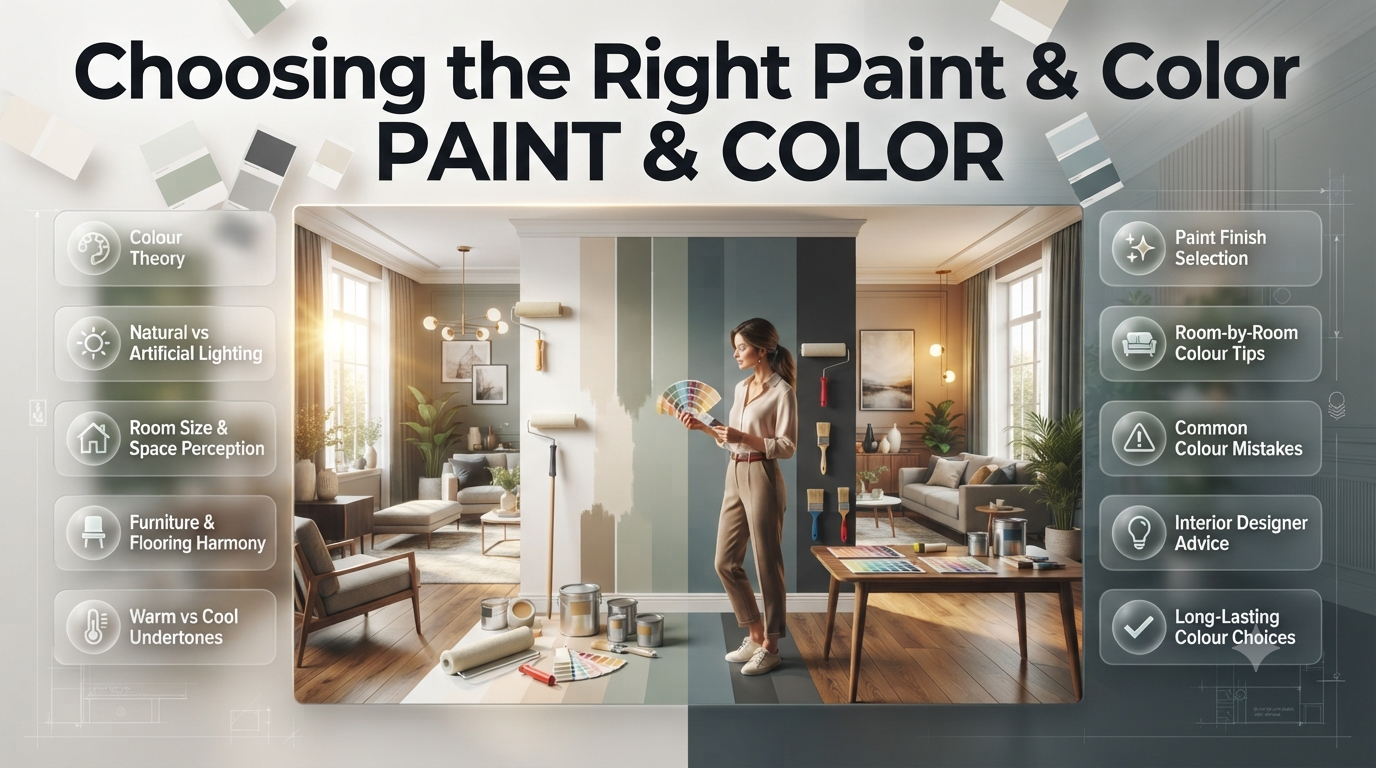
Choosing the right paint & color seems simple—until you’re standing in front of hundreds of paint swatches that all look almost identical. A colour that appears warm and inviting in the showroom may look dull, cold, or overly bright once it’s reaches your walls. Lighting, room size, furniture, flooring, and even ceiling height all influence how a colour appears.
Many homeowners spend significant time and money repainting rooms simply because the original colour didn’t produce the atmosphere they expected. The good news is that these costly mistakes are entirely avoidable when you understand the principles behind colour selection.
Whether you’re refreshing a single bedroom, renovating an entire house, or designing a brand-new interior, selecting the right paint colour affects far more than appearance. It influences mood, comfort, productivity, resale value, and how spacious or cosy each room feels.
In this complete guide, you’ll learn everything from colour theory and paint finishes to professional designer techniques, room-specific recommendations, common mistakes to avoid, and practical examples that help you make confident decisions. You’ll also discover expert tips used by experienced interior designers to create beautiful, balanced interiors that remain stylish for years.
What Is Paint & Color?
Paint & color refers to the combination of decorative coatings and carefully selected colours used to improve the appearance, mood, and functionality of interior or exterior spaces. Choosing the right paint involves selecting the appropriate colour, finish, durability, and application method to suit each room’s purpose and lighting conditions.
Paint is much more than a decorative finish. It protects surfaces while creating an atmosphere that influences how people experience a space every day.
A thoughtfully selected colour palette can make a compact apartment feel larger, create warmth in an open-plan living area, or transform a home office into a productive workspace.
If you’re exploring broader home renovation ideas, you may also find useful inspiration in Home Improvement.
Why Paint Colour Matters More Than Most Homeowners Realise
Many people choose colours based solely on what looks attractive on a sample card. Professional designers take a much broader approach.
Before selecting any paint colour, they consider:
- Natural daylight
- Artificial lighting
- Room orientation
- Ceiling height
- Flooring materials
- Furniture colours
- Window size
- Existing décor
- Lifestyle
- Future resale appeal
These factors determine whether a colour enhances or diminishes a room.
| Factor | Effect on Paint Colour |
|---|---|
| Natural light | Makes colours appear brighter or cooler |
| Warm LED lighting | Adds yellow tones |
| Cool white lighting | Makes blues and greys stronger |
| Dark flooring | Can make walls appear darker |
| White trim | Increases colour contrast |
| Large windows | Colours appear lighter during daytime |
| Small rooms | Dark colours may feel enclosed |
| High ceilings | Allow stronger colours without overwhelming the room |
Real-Life Example
Imagine two homeowners purchasing the exact same soft beige paint.
Home A:
- South-facing room
- Large windows
- White flooring
Result:
A bright, warm, elegant appearance.
Home B:
- North-facing room
- Limited daylight
- Dark wood flooring
Result:
The same beige appears dull and slightly grey.
The paint didn’t change—the environment did.
💡 Pro Tip
Always test paint samples on multiple walls and observe them in the morning, afternoon, evening, and under artificial lighting before making a final decision.
Understanding Colour Theory
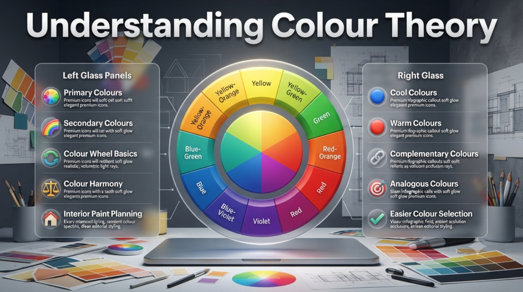
Professional designers rarely choose colours randomly. Instead, they use colour theory to create harmony and balance.
The colour wheel helps explain relationships between colours.
             Yellow

     Yellow-Green     Yellow-Orange

 Green                         Orange

 Blue-Green                 Red-Orange

      Blue              Red

           Blue-Violet
                 Violet
Understanding these relationships makes colour selection much easier.
Primary Colours
The foundation of all colour combinations.
- Red
- Blue
- Yellow
These colours cannot be created by mixing other colours.
Secondary Colours
Created by combining primary colours.
| Combination | Result |
|---|---|
| Red + Blue | Purple |
| Blue + Yellow | Green |
| Yellow + Red | Orange |
Tertiary Colours
Produced by mixing primary and secondary colours.
Examples include:
- Blue Green
- Yellow Green
- Red Orange
- Blue Violet
- Yellow Orange
- Red Violet
These colours create sophisticated interior palettes.
Warm Colours vs Cool Colours
One of the most important design concepts is understanding colour temperature.
Warm Colours
Warm colours include:
- Red
- Orange
- Gold
- Cream
- Terracotta
- Warm Beige
- Mustard
These colours create:
- Comfort
- Energy
- Warmth
- Cosiness
- Conversation-friendly spaces
Best used in:
- Living rooms
- Dining rooms
- Family rooms
Cool Colours
Cool colours include:
- Blue
- Green
- Grey
- Aqua
- Sage
- Teal
These colours encourage:
- Calmness
- Relaxation
- Focus
- Cleanliness
Perfect for:
- Bedrooms
- Bathrooms
- Home offices
| Warm Colours | Cool Colours |
|---|---|
| Inviting | Relaxing |
| Cosy | Spacious |
| Energetic | Peaceful |
| Great for entertaining | Great for resting |
🏡 Interior Designer Advice
Rather than choosing only warm or only cool colours throughout your home, create balance. Warm communal areas paired with cooler private spaces often produce the most comfortable living experience.
Neutral Colours Explained
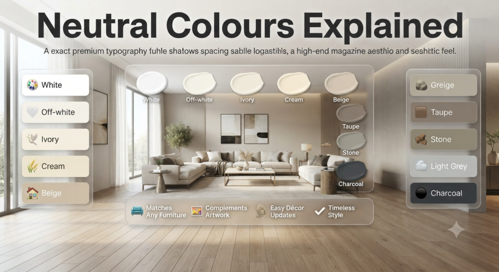
Neutral colours continue to dominate interior design because they provide flexibility and timeless appeal.
Popular neutral colours include:
- White
- Off-white
- Ivory
- Cream
- Beige
- Greige
- Taupe
- Stone
- Light Grey
- Charcoal
Neutral walls make it easier to update furniture, artwork, rugs, and accessories without repainting.
Neutral Colour Comparison
| Colour | Best For |
|---|---|
| White | Modern interiors |
| Cream | Traditional homes |
| Beige | Warm interiors |
| Greige | Contemporary design |
| Taupe | Luxury interiors |
| Light Grey | Scandinavian style |
| Charcoal | Feature walls |
Colour Psychology in Interior Design
Colour psychology studies how different colours influence emotions and behaviour. In interior design, warm colours often create energy and comfort, while cooler colours promote relaxation, focus, and calmness. Choosing colours based on a room’s purpose improves both aesthetics and functionality.
Colour affects people emotionally, often without them consciously noticing.
Blue
Associated with:
- Calmness
- Trust
- Focus
- Relaxation
Best for:
- Bedrooms
- Offices
- Bathrooms
Green
Represents:
- Nature
- Freshness
- Balance
- Wellness
Ideal for:
- Living rooms
- Reading areas
- Bedrooms
Yellow
Creates:
- Happiness
- Optimism
- Energy
Works well in:
- Kitchens
- Breakfast rooms
Use moderately, as excessive bright yellow can become visually overwhelming.
Grey
Offers:
- Sophistication
- Balance
- Modern elegance
Best paired with:
- Wood textures
- Metallic accents
- White trim
- Natural fabrics
White
Communicates:
- Simplicity
- Cleanliness
- Spaciousness
Commonly used in:
- Minimalist interiors
- Scandinavian homes
- Contemporary apartments
Black
Adds:
- Drama
- Luxury
- Contrast
- Architectural emphasis
Generally used as an accent rather than a dominant wall colour.
⭐ Expert Tip
Professionals often combine psychological effects rather than relying on one colour. For example, soft sage green walls with warm oak furniture create a room that feels both calming and welcoming.
Types of Interior Paint
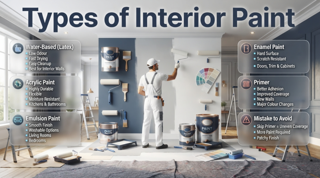
Not all paints perform the same. Selecting the right formulation is just as important as choosing the right colour.
| Paint Type | Advantages | Best Uses |
|---|---|---|
| Water-Based (Latex) | Low odour, fast drying, easy cleanup | Most interior walls |
| Acrylic Paint | Durable, flexible, moisture resistant | Kitchens, bathrooms |
| Emulsion Paint | Smooth finish, washable options | Living rooms and bedrooms |
| Enamel Paint | Hard, durable surface | Doors, trim, cabinets |
| Primer | Improves adhesion and coverage | New walls and major colour changes |
⚠ Mistake to Avoid
Skipping primer when changing from a dark colour to a light one often leads to uneven coverage, increased paint consumption, and visible patchiness.
Understanding Paint Finishes
Choosing the right finish affects durability, maintenance, cleaning, and overall appearance.
Paint Finish Comparison
| Finish | Shine Level | Durability | Best For |
|---|---|---|---|
| Flat | None | Low | Ceilings |
| Matte | Very Low | Moderate | Bedrooms |
| Eggshell | Soft | Good | Living rooms |
| Satin | Medium | Very Good | Hallways |
| Semi-Gloss | High | Excellent | Kitchens |
| Gloss | Very High | Maximum | Doors and trim |
Which Finish Should You Choose?
Flat Finish
Advantages:
- Hides imperfections
- Soft appearance
- Elegant ceilings
Disadvantages:
- Harder to clean
Matte Finish
Ideal for:
- Bedrooms
- Low-traffic rooms
- Feature walls
Produces a rich, modern appearance.
Eggshell Finish
One of the most versatile options available.
Suitable for:
- Family rooms
- Dining rooms
- Hallways
Balances durability with subtle elegance.
Satin Finish
Excellent choice for:
- Children’s rooms
- Busy hallways
- Staircases
Easy to wipe clean.
📌 Quick Tip
When choosing a paint finish, think beyond appearance. A slightly more durable finish in high-traffic areas can reduce maintenance and extend the life of your walls.
For more inspiration on creating cohesive interiors, explore Interior Design. If you’re specifically looking for colour combinations, palettes, and decorating ideas, you’ll also find valuable resources in Paint Color.
Room-by-Room Paint & Color Guide
Choosing the perfect paint & color isn’t just about selecting a favourite shade. Every room serves a different purpose, receives different amounts of natural light, and creates a different emotional experience. Professional interior designers carefully evaluate each space before recommending a colour palette.
This section explains exactly how to choose the right colours for every room, with practical examples, layout illustrations, designer advice, and real-life scenarios.
How Professionals Choose Paint Colours for Every Room
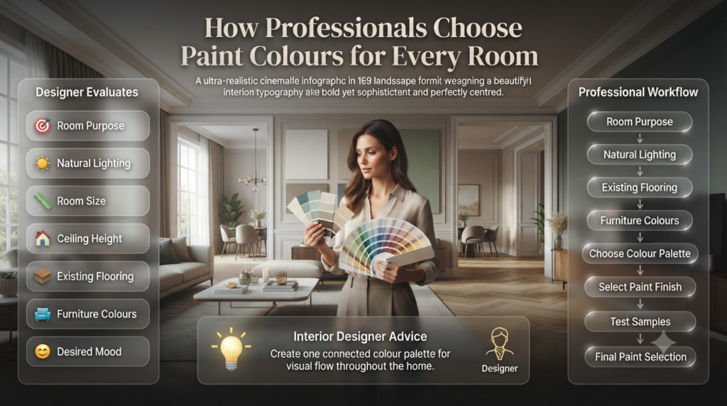
Professional interior designers choose paint colours by evaluating a room’s function, natural light, size, ceiling height, flooring, furniture, and desired mood. Rather than selecting colours in isolation, they create a balanced palette that connects every space throughout the home.
Before painting, professionals ask questions such as:
- What is this room used for?
- How much natural light does it receive?
- Which direction does it face?
- What flooring already exists?
- Are the ceilings high or low?
- What furniture will remain?
- Should the room feel larger or cosier?
- Will adjacent rooms share similar colours?
Professional Colour Planning Workflow
Room Purpose
      │
      ▼
Natural Lighting
      │
      ▼
Existing Flooring
      │
      ▼
Furniture Colours
      │
      ▼
Choose Colour Palette
      │
      ▼
Select Paint Finish
      │
      ▼
Test Samples
      │
      ▼
Final Paint Selection
🏡 Interior Designer Advice
Never select colours room by room without considering the entire house. A connected colour palette creates visual flow and makes your home feel professionally designed.
Best Paint & Color Ideas for Living Rooms
The best living room paint colours include warm whites, greige, soft beige, sage green, light grey, muted blue, and warm taupe. These colours create comfortable spaces that feel welcoming while remaining timeless enough to suit changing furniture and décor.
The living room is often the heart of the home. It should feel inviting while offering flexibility for different decorating styles.
Recommended Living Room Colours
| Colour | Style |
|---|---|
| Warm White | Modern |
| Soft Beige | Traditional |
| Greige | Contemporary |
| Sage Green | Natural |
| Taupe | Luxury |
| Light Grey | Scandinavian |
| Dusty Blue | Coastal |
Example Living Room Layout
+----------------------------------+
|              Window              |
|                                  |
|      Sofa        Coffee Table    |
|                                  |
| Accent Chair         TV Unit      |
|                                  |
+----------------------------------+
Colour Recommendation
- Walls: Warm Greige
- Ceiling: Pure White
- Trim: Satin White
- Feature Wall: Sage Green
- Flooring: Natural Oak
💡 Pro Tip
If your living room receives limited daylight, avoid dark grey walls. Instead, use light greige or creamy white to maximise brightness.
Real-Life Example
A family renovated a 25 m² living room with dark brown flooring.
Original colour:
- Dark charcoal walls
Problem:
- Room felt smaller
- Poor daylight
- Heavy atmosphere
Solution:
- Warm off-white walls
- Sage green feature wall
- White ceiling
Result:
- Room appeared approximately 30% brighter
- Furniture became the focal point
- More inviting atmosphere
Best Bedroom Paint Colours
Bedrooms should encourage rest, relaxation, and better sleep.
Strong, vibrant colours often make bedrooms feel stimulating rather than peaceful.
Best Bedroom Colours
| Colour | Mood |
|---|---|
| Soft Blue | Relaxing |
| Sage Green | Peaceful |
| Lavender | Calm |
| Warm Grey | Elegant |
| Beige | Comfortable |
| Cream | Soft |
| Dusty Green | Nature-inspired |
Bedroom Colour Layout
Headboard

████████████████████

Light Neutral Walls

Bed Linen

Soft Beige

Curtains

Warm White
Colour Combination Example
Walls:
Soft Sage Green
Ceiling:
Bright White
Furniture:
Light Oak
Accessories:
- White bedding
- Beige rug
- Wooden side tables
This palette creates a calm and balanced bedroom.
⭐ Expert Tip
Bedrooms facing east receive warm morning sunlight. Cooler paint colours like soft blue or sage green often look beautifully balanced in these spaces.
Best Kitchen Paint Colours
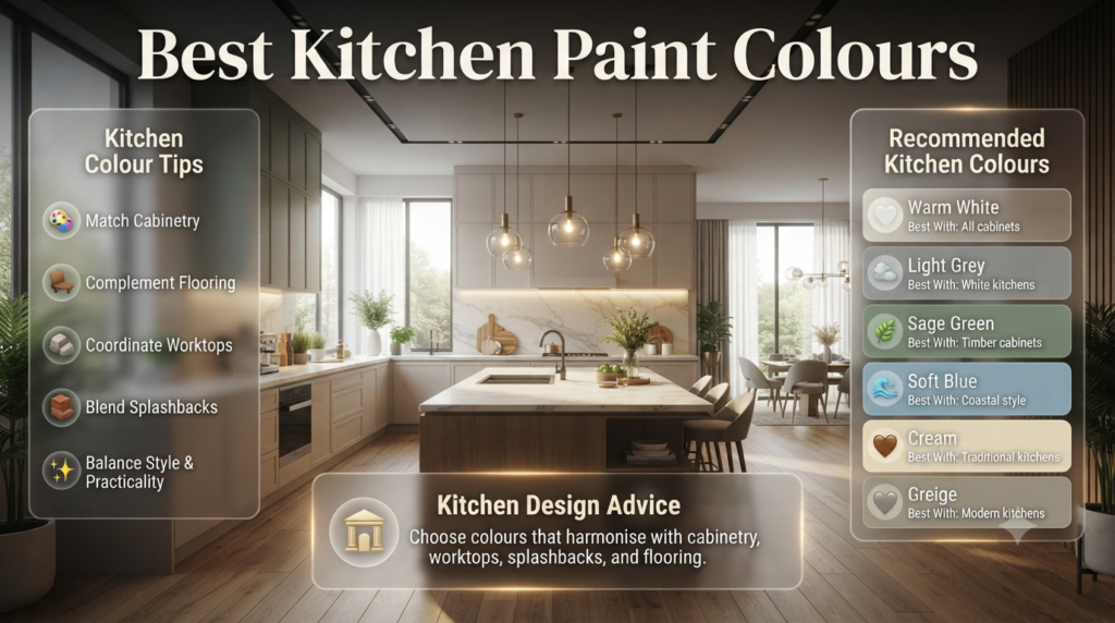
The kitchen combines aesthetics with practicality.
Paint should complement cabinetry, worktops, splashbacks, and flooring.
Recommended Kitchen Colours
| Colour | Works Best With |
|---|---|
| Warm White | All cabinets |
| Light Grey | White kitchens |
| Sage Green | Timber cabinets |
| Soft Blue | Coastal style |
| Cream | Traditional kitchens |
| Greige | Modern kitchens |
Kitchen Colour Layout
Cabinets
██████████████

Splashback

Countertop

Walls

Ceiling
Suggested Palette
- Cabinets: White
- Walls: Warm Greige
- Ceiling: White
- Island: Navy Blue
⚠ Mistake to Avoid
Do not match your walls exactly to your cabinets. Small differences in tone create depth and visual interest.
Best Bathroom Paint Colours
Bathrooms benefit from colours that feel fresh and clean.
Popular options include:
- White
- Soft Aqua
- Pale Blue
- Seafoam Green
- Light Grey
- Sand Beige
Moisture Considerations
Bathrooms should use:
✔ Moisture-resistant paint
✔ Washable finishes
✔ Satin or Semi-Gloss in humid environments
Bathroom Colour Table
| Bathroom Size | Recommended Colour |
|---|---|
| Small | White |
| Medium | Pale Grey |
| Large | Sage Green |
| Luxury Bathroom | Charcoal Feature Wall |
📌 Quick Tip
Always view bathroom paint samples under artificial lighting because bathrooms often receive less natural daylight than other rooms.
Dining Room Colour Ideas
Dining rooms can support richer colours than many other spaces.
Popular choices include:
- Olive Green
- Warm Taupe
- Deep Navy
- Terracotta
- Rich Beige
- Mushroom Grey
These colours create intimacy and warmth during meals.
Dining Room Example
Window

Dining Table

6 Chairs

Pendant Light

Feature Wall
Recommended Colour Scheme
Feature Wall
Deep Olive Green
Remaining Walls
Warm Beige
Ceiling
Bright White
Home Office Paint Colours
With more people working remotely, colour selection has become increasingly important.
Colours that encourage focus include:
- Soft Blue
- Light Grey
- Sage Green
- Muted Green
- Warm White
Avoid:
- Bright Red
- Neon Orange
- Strong Yellow
These colours may reduce concentration over long periods.
Productivity Colour Comparison
| Colour | Productivity |
|---|---|
| Blue | Excellent |
| Sage Green | Excellent |
| Grey | Good |
| White | Good |
| Yellow | Moderate |
| Red | Low |
🏡 Interior Designer Advice
If your office is also a guest room, choose versatile colours like warm grey or muted sage that feel both productive and relaxing.
Hallways and Entryways
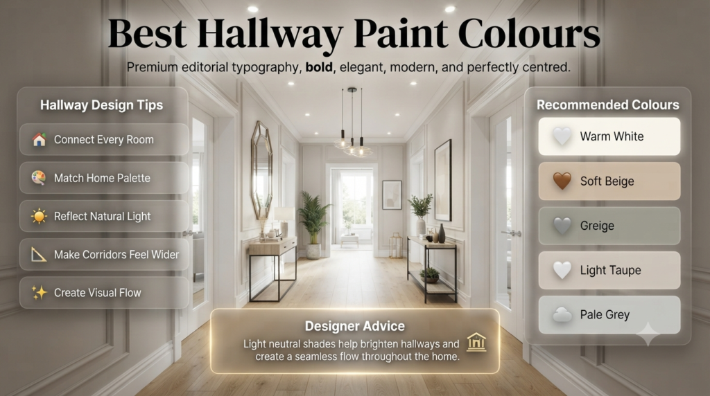
Hallways connect every room.
Their colour should complement the overall home palette.
Recommended colours:
- Warm White
- Soft Beige
- Greige
- Light Taupe
- Pale Grey
These shades reflect light and make narrow corridors feel wider.
Best Ceiling Colours
Many homeowners automatically choose pure white ceilings.
While often appropriate, designers sometimes recommend softer alternatives.
| Ceiling Colour | Best For |
|---|---|
| Bright White | Modern homes |
| Soft White | Traditional homes |
| Cream | Warm interiors |
| Pale Grey | Contemporary style |
| Sky Blue | Children’s rooms |
Ceiling Height Illusion
Low Ceiling
White Ceiling

Light Walls

↓↓↓

Feels Taller
High Ceiling
Dark Ceiling

Light Walls

↓↓↓

Feels Cosier
Accent Walls
Accent walls remain popular when used thoughtfully.
Suitable locations include:
- Behind beds
- Fireplace walls
- Television walls
- Dining room feature walls
- Reading corners
Popular Accent Colours
- Navy Blue
- Forest Green
- Charcoal
- Terracotta
- Deep Olive
- Dark Teal
Accent Wall Example
White Wall

White Wall

█████████████████
Feature Wall

White Wall
💡 Pro Tip
Limit feature walls to one per room. Multiple accent walls often compete for attention and make a space feel cluttered.
Paint Colours for Small Rooms
Light paint colours such as warm white, soft beige, pale grey, and muted pastels help small rooms appear larger by reflecting more natural light and reducing visual boundaries between walls.
Best choices include:
- White
- Cream
- Pale Grey
- Soft Blue
- Sage Green
Small Room Strategy
Light Walls

White Ceiling

Large Mirror

Minimal Furniture

↓

Feels Larger
Paint Colours for Large Rooms
Large spaces can comfortably accommodate deeper colours.
Examples include:
- Navy Blue
- Olive Green
- Charcoal
- Chocolate Brown
- Deep Taupe
Darker colours reduce the feeling of empty space and create a cosy environment.
Colour Psychology by Room
| Room | Best Emotional Effect | Recommended Colours |
|---|---|---|
| Living Room | Welcoming | Greige, Beige |
| Bedroom | Relaxation | Blue, Sage |
| Kitchen | Freshness | White, Cream |
| Bathroom | Cleanliness | Aqua, White |
| Dining Room | Warmth | Olive, Taupe |
| Office | Focus | Blue, Grey |
Popular Paint & Color Trends
Modern homeowners increasingly favour timeless colours over short-lived trends.
Current favourites include:
- Warm White
- Mushroom Beige
- Greige
- Sage Green
- Olive Green
- Dusty Blue
- Earthy Clay
- Soft Terracotta
- Natural Stone Grey
These colours work well across modern, Scandinavian, Japandi, contemporary, farmhouse, and transitional interiors.
For more inspiration on complete colour palettes and decorating ideas, visit Paint Color. If you’re planning a full renovation, you’ll also find practical guides in Home Improvement, along with broader styling ideas at Interior Design.
How to Choose the Perfect Paint & Color: A Step-by-Step Guide
Selecting the right paint & color becomes much easier when you follow a structured process. Professional interior designers rarely choose a colour based on a small paint chip alone. Instead, they evaluate the space, test samples, and consider how the colour will perform in different lighting conditions.
Step 1: Define the Purpose of the Room
The first step in choosing paint colours is identifying how the room will be used. Different activities require different moods, and colour plays a major role in creating the right atmosphere.
Ask yourself:
- Is the room for relaxing?
- Will children use the space?
- Is it a work area?
- Does it receive guests?
- Does it need to feel larger?
| Room Purpose | Recommended Colour Direction |
|---|---|
| Relaxation | Soft Blue, Sage Green |
| Productivity | Light Grey, Muted Green |
| Entertaining | Warm Beige, Greige |
| Luxury | Taupe, Charcoal, Navy |
| Family Living | Warm White, Cream |
Step 2: Evaluate Natural and Artificial Lighting
Paint never looks exactly the same throughout the day.
North-Facing Rooms
- Cooler daylight
- Choose warmer paint colours
South-Facing Rooms
- Plenty of warm sunlight
- Both warm and cool colours work well
East-Facing Rooms
- Warm morning light
- Cooler tones balance the space
West-Facing Rooms
- Warm afternoon light
- Neutral shades remain balanced
💡 Pro Tip
Paint sample boards are far more reliable than tiny colour swatches. Move them around the room for several days before making your final decision.
Step 3: Coordinate with Existing Elements
Before choosing wall colours, consider:
- Flooring
- Cabinets
- Countertops
- Curtains
- Rugs
- Furniture
- Artwork
- Wood finishes
Professional interiors always feel coordinated rather than random.
Step 4: Select the Correct Paint Finish
Different surfaces require different finishes.
| Area | Recommended Finish |
|---|---|
| Ceiling | Flat |
| Bedroom | Matte |
| Living Room | Eggshell |
| Hallway | Satin |
| Bathroom | Satin or Semi-Gloss |
| Kitchen | Semi-Gloss |
Step 5: Test Before Painting
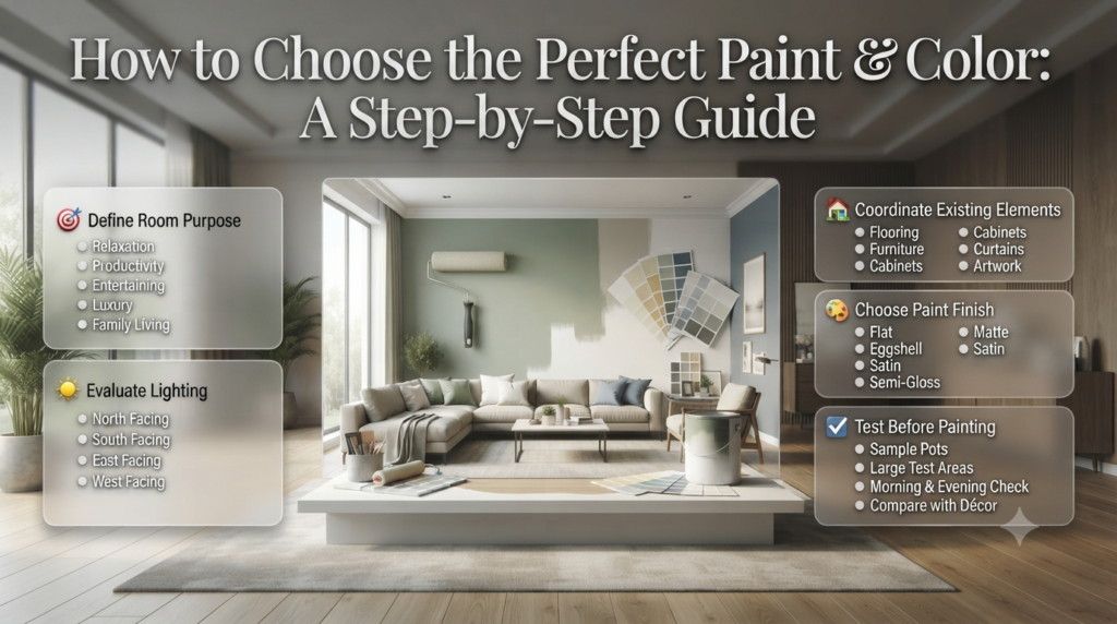
Never purchase enough paint for the entire house before testing.
Professional process:
- Purchase sample pots.
- Paint at least two large test areas.
- Observe during morning, afternoon, and evening.
- View under artificial lighting.
- Compare against furniture and flooring.
How Much Paint Do You Need?
Most interior paints cover approximately 10–12 square metres per litre per coat. Measure your wall area, subtract doors and windows, and multiply by the number of coats to estimate the amount of paint required.
Simple Calculation
Example room:
Length: 5 m
Width: 4 m
Height: 2.7 m
Wall Area:
(5 + 5 + 4 + 4) × 2.7

18 × 2.7

48.6 m²
Minus windows and doors:
Approximately 42 m²
Coverage:
10 m²/L
Required:
42 ÷ 10 = 4.2 litres
Two coats:
Approximately 8.5–9 litres
Paint Quantity Guide
| Room Size | Approximate Paint Required (Two Coats) |
|---|---|
| Small Bedroom | 5–7 L |
| Living Room | 8–10 L |
| Large Bedroom | 8–9 L |
| Kitchen | 5–6 L |
| Bathroom | 3–4 L |
Paint Buying Guide
Choosing quality paint is just as important as choosing the right colour.
What to Look For
✔ Washability
✔ Low VOC formulation
✔ Good coverage
✔ Stain resistance
✔ Mould resistance (bathrooms)
✔ Long colour retention
✔ Easy touch-up capability
Comparison Table
| Feature | Budget Paint | Premium Paint |
|---|---|---|
| Coverage | Moderate | Excellent |
| Durability | Average | High |
| Washability | Limited | Excellent |
| Colour Retention | Moderate | Outstanding |
| Finish Quality | Basic | Professional |
| Lifespan | Shorter | Longer |
🏡 Interior Designer Advice
Premium paint often costs more initially but usually requires fewer coats, lasts longer, and maintains its colour better, making it a more cost-effective investment over time.
Common Paint & Color Mistakes
Even beautiful colours can produce disappointing results when applied incorrectly.
Mistake 1: Choosing Colour in the Shop
Paint store lighting rarely matches your home’s lighting.
Solution
Always test samples at home.
Mistake 2: Ignoring Undertones
Grey isn’t always neutral.
Some greys contain:
- Blue undertones
- Purple undertones
- Green undertones
- Brown undertones
These become obvious once painted.
Mistake 3: Using Too Many Colours
A home with ten unrelated colours feels visually chaotic.
Instead:
Choose:
- One primary neutral
- Two supporting colours
- One accent colour
Mistake 4: Forgetting the Ceiling
Ceilings influence the perception of room size.
White ceilings generally create greater visual height.
Mistake 5: Following Trends Blindly
Today’s fashionable colour may feel outdated in a few years.
Balance trends with timeless neutrals.
⚠ Mistake to Avoid
Do not rely on digital screens when selecting paint colours. Phone and computer displays vary significantly and rarely represent paint accurately.
Expert Advice from Professional Interior Designers
Experienced designers follow several principles that homeowners often overlook.
1. Create Flow
Every room should connect visually to the next.
2. Limit the Palette
Many luxury homes use only 5–8 colours throughout the entire property.
3. Think About Texture
Paint is only one part of the design.
Combine it with:
- Wood
- Stone
- Fabric
- Metal
- Glass
4. Balance Light and Dark
Avoid making every room equally bright or equally dark.
Variation creates interest.
5. Invest in Preparation
Professional-looking paint begins before the first coat.
Preparation includes:
- Filling cracks
- Sanding
- Cleaning
- Priming
- Masking
⭐ Expert Tip
Professional painters often spend more time preparing surfaces than actually painting them. Proper preparation leads to smoother finishes, better adhesion, and longer-lasting results.
Paint & Color Decision Tree
Need a New Colour?
        │
        ▼
Is the Room Small?
     │          │
   Yes         No
    │           │
Choose       Plenty of
Light        Flexibility
Colours
    │
Need More Warmth?
     │
Yes → Warm Beige / Cream
No → Soft Grey / White
Printable Paint Selection Checklist
Before purchasing paint, confirm the following:
- □ Room purpose identified
- □ Natural lighting evaluated
- □ Existing furniture considered
- □ Flooring matched
- □ Ceiling colour selected
- □ Paint finish chosen
- □ Samples tested
- □ Quantity calculated
- □ Primer included (if required)
- □ Painting tools prepared
How Do I Choose a Color That Makes a Small Room Look Larger Without Just Defaulting to Plain White?
You don’t have to use plain white to make a small room feel larger. Soft neutrals, pale blues, muted greens, warm greiges, and light earthy tones reflect light while adding warmth and personality. Pairing these colours with consistent trim, strategic lighting, and minimal visual contrast creates the illusion of a more spacious room.
Many homeowners assume white is the only option for making a room feel bigger, but professional interior designers often choose subtle colours that add character without making a space feel enclosed.
Best Colours for Small Rooms
Colour
Why It Works
Best Rooms
Warm White
Bright and timeless
Living rooms, bedrooms
Greige
Adds warmth without feeling dark
Open-plan spaces
Soft Beige
Creates a cosy yet airy feel
Family rooms
Pale Sage Green
Brings nature indoors
Bedrooms, offices
Misty Blue
Enhances openness
Bathrooms, bedrooms
Light Taupe
Elegant and versatile
Dining rooms
Soft Grey
Modern and spacious
Hallways, apartments
Professional Designer Strategies
Instead of relying on white alone:
Paint walls and trim in similar tones to reduce visual breaks.
Use a lighter ceiling colour to create the illusion of height.
Choose satin or eggshell finishes to reflect a subtle amount of light.
Keep furniture proportional to the room size.
Add mirrors opposite windows to amplify natural light.
Use curtains that extend from ceiling to floor.
Small Room Visual Guide
┌──────────────────────────┐ │ Light Ceiling │ │ │ │ Soft Greige Walls │ │ │ │ Large Mirror │ │ │ │ Minimal Furniture │ └──────────────────────────┘ Result: Brighter • Taller • More Open
💡 Pro Tip
Using one continuous colour throughout connected spaces reduces visual interruptions, making your home feel significantly larger.
What Are the Definitive Top-Trending Interior Paint Colors This Year, and Why Are They Dominating?
This year’s leading interior paint colours focus on warmth, comfort, and nature-inspired living. Shades like warm greige, sage green, earthy clay, muted blue, mushroom beige, and soft terracotta are dominating because they create calming, timeless interiors while complementing modern and traditional design styles alike.
Rather than bright, bold colours, current trends favour subtle sophistication and natural materials.
Top Trending Interior Colours
Trending Colour
Why It’s Popular
Design Style
Warm Greige
Modern yet cosy
Contemporary
Sage Green
Nature-inspired
Japandi, Scandinavian
Mushroom Beige
Soft neutral
Transitional
Soft Terracotta
Earthy warmth
Mediterranean
Dusty Blue
Calm and elegant
Coastal
Olive Green
Rich and timeless
Luxury
Warm Taupe
Sophisticated
Classic
Clay Beige
Organic aesthetic
Modern Rustic
Cream White
Bright without feeling sterile
Traditional
Charcoal Accent
Dramatic contrast
Contemporary
Why These Colours Are Trending
They pair beautifully with:
Natural oak furniture
Stone countertops
Linen fabrics
Black metal accents
Brass fixtures
Textured wall décor
Indoor plants
These colours also adapt well to changing trends, making them a safer long-term investment than highly saturated or fashionable shades.
⭐ Expert Tip
Trendy colours should be introduced mainly through feature walls or décor if you’re concerned about long-term resale value. Keep the primary wall colours timeless and use accessories for seasonal updates.
How Do I Successfully Pick the Right Paint Finish (Sheen) for Different High-Traffic Zones?
The best paint finish depends on how frequently the surface is touched and cleaned. Matte finishes suit low-traffic areas, while eggshell, satin, and semi-gloss provide greater durability and are easier to clean in busy spaces like kitchens, hallways, and children’s rooms.
The wrong sheen can shorten the lifespan of your paint and make maintenance more difficult.
Paint Finish Comparison
Finish
Durability
Washability
Best For
Flat
Low
Poor
Ceilings
Matte
Moderate
Fair
Bedrooms
Eggshell
Good
Good
Living rooms
Satin
Very Good
Excellent
Hallways
Semi-Gloss
Excellent
Outstanding
Kitchens & Bathrooms
Gloss
Maximum
Excellent
Doors & Trim
High-Traffic Recommendations
Area
Recommended Finish
Reason
Hallways
Satin
Resists scuffs
Children’s Rooms
Satin
Easy to wipe clean
Kitchens
Semi-Gloss
Handles grease and moisture
Bathrooms
Semi-Gloss
Moisture resistant
Staircases
Satin
Durable against frequent contact
Utility Rooms
Satin
Easy maintenance
⚠ Mistake to Avoid
Using flat paint in busy areas often leads to permanent marks that cannot be cleaned without damaging the finish.
What Is the ’60-30-10 Rule’ in Color Psychology, and How Does It Transform a DIY Space?
The 60-30-10 Rule is a classic interior design principle that divides a room’s colour palette into 60% dominant colour, 30% secondary colour, and 10% accent colour. This creates visual balance, prevents overwhelming spaces, and helps DIY interiors look professionally designed.
Professional designers use this rule because it naturally creates harmony.
The Breakdown
60% – Dominant Colour
Usually:
Main walls
Large furniture
Flooring
Examples:
Warm White
Greige
Beige
30% – Secondary Colour
Often includes:
Curtains
Upholstery
Feature furniture
Area rugs
Examples:
Sage Green
Taupe
Light Grey
10% – Accent Colour
Adds personality through:
Cushions
Artwork
Lamps
Decorative accessories
Throws
Examples:
Navy
Mustard
Terracotta
Forest Green
Example Palette
60% Warm Greige Walls 30% Natural Oak Furniture Beige Curtains 10% Navy Cushions Black Frames Brass Accessories
Why It Works
The rule:
Prevents colour overload.
Creates a clear focal point.
Makes rooms feel intentional rather than random.
Is suitable for almost any interior style, from minimalist to traditional.
🏡 Interior Designer Advice
The 60-30-10 Rule is a guideline rather than a strict formula. You can adjust the proportions slightly to suit your room, but maintaining a dominant colour with controlled accents almost always produces a balanced result.
How Do Lighting Undertones Dramatically Change How a Paint Color Looks on the Wall?
Lighting undertones significantly affect paint colour because natural and artificial light alter how our eyes perceive pigments. The same paint can appear warm, cool, brighter, darker, or even a completely different shade depending on the room’s orientation and the type of lighting used.
This is one of the biggest reasons why paint sometimes looks different at home than it did in the showroom.
Natural Light by Room Orientation
Room Direction
Light Quality
Paint Effect
North
Cool, bluish
Colours appear cooler and darker
South
Warm, bright
Colours appear lighter and warmer
East
Warm morning light
Soft, fresh appearance
West
Warm afternoon light
Richer and more golden tones
Artificial Lighting
Light Type
Colour Temperature
Effect on Paint
Warm White (2700K–3000K)
Yellow undertone
Enhances warm colours
Neutral White (3500K–4100K)
Balanced
True-to-sample appearance
Cool White (5000K+)
Blue undertone
Strengthens cool colours
Example
Imagine painting two identical walls with the same soft greige paint.
Room A
South-facing windows
Warm LED lighting
Result:
Warm, creamy greige
Bright and inviting
Room B
North-facing windows
Cool white lighting
Result:
Cooler, slightly grey appearance
More subdued and contemporary
The paint hasn’t changed—only the lighting has.
Professional Testing Method
Paint large sample patches on multiple walls.
Observe them in the morning, midday, evening, and at night.
Turn on all regular light fixtures.
Compare the colours against flooring, furniture, and fabrics before making your final choice.
💡 Pro Tip
Never choose a paint colour based solely on a showroom display or a digital screen. Always test real paint samples in your own room, as lighting conditions have a dramatic impact on the final appearance.
Conclusion
Choosing the right paint & color is about far more than selecting a shade you like—it’s about creating a home that feels comfortable, functional, and uniquely yours. Every colour influences how a room looks, feels, and performs, while the right paint finish ensures your walls remain beautiful and durable for years to come.
Throughout this guide, you’ve explored the fundamentals of colour theory, the psychology behind different colours, the best paint finishes for every room, lighting effects, room-by-room colour recommendations, trending palettes, the 60-30-10 design rule, paint quantity calculations, professional planning techniques, and the most common mistakes to avoid. These insights provide a complete framework for making confident decorating decisions, whether you’re refreshing a single room or planning a whole-home renovation.
Remember that successful interior design isn’t about following every trend. The best interiors balance timeless neutral foundations with carefully chosen accent colours that reflect your personality and lifestyle. Always test paint samples in your own space, evaluate them under different lighting conditions, and consider how they coordinate with your furniture, flooring, and architectural features before making a final decision.
By investing time in planning and choosing quality materials, you can create interiors that are visually appealing, practical, and built to stand the test of time. A thoughtfully selected colour palette not only enhances your home’s appearance but also improves comfort, supports everyday living, and can even increase long-term property value.
For more expert inspiration, decorating ideas, and practical renovation advice, continue exploring Interior Design Mode 24. You can also discover additional home transformation guides in Home Improvement, browse professional decorating resources in Interior Design, and find more colour palettes, trends, and expert painting advice in Paint Color.
With the right knowledge, careful planning, and a well-chosen paint & color palette, you can confidently transform any space into a home that is beautiful, welcoming, and perfectly suited to your lifestyle.

Leave a Reply