
Introduction
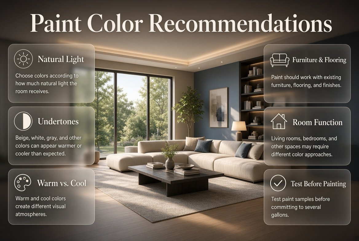
Paint Color Recommendations | Choosing a paint color can feel surprisingly difficult. You may walk into a paint store looking for a simple beige, white, green, or gray and leave with dozens of samples that all look almost identical. Then you paint one on the wall and suddenly it looks completely different from what you expected. The beige looks pink, the white looks yellow, and the gray feels cold.
That’s why good paint color recommendations should never be based on color names alone.
The right paint color depends on your room’s natural light, flooring, furniture, ceiling height, existing finishes, room function, and the atmosphere you want to create. A color that looks beautiful in a bright south-facing living room may feel completely different in a darker bedroom.
This guide takes a practical approach to choosing paint colors. You’ll learn how to select colors for different rooms, understand undertones, work with natural and artificial light, create a whole-home palette, choose between warm and cool colors, avoid common mistakes, and test your choices before committing to several gallons of paint.
If you’re planning a broader interior update, DesignMode24 Interior Design can also be useful for connecting paint choices with furniture, layouts, decorating, and overall room design.
What Are the Best Paint Color Recommendations for a Home?
The best paint color recommendations are based on the individual room rather than a universal list of “best” colors. Warm whites, beige, greige, sage green, muted blue, taupe, and earthy neutrals are versatile choices, but their success depends on lighting, surrounding materials, and the mood you want to create.
Before choosing a color, look at the room as a complete environment.
Consider:
- Natural light
- Window direction
- Flooring
- Furniture
- Curtains
- Cabinets
- Countertops
- Doors
- Trim
- Ceiling
- Room size
- Artificial lighting
- Adjacent rooms
Paint is one part of the room, not the entire design.
For example, a warm beige may look elegant beside walnut furniture and cream upholstery but may appear unnecessarily yellow next to cool white cabinetry. Likewise, a blue-gray may look sophisticated in a sun-filled room but feel cold in a naturally dark hallway.
Why Context Matters More Than the Paint Swatch
A paint card gives you an isolated color. Your home gives you an environment.
Walls reflect light from nearby surfaces, which means the same paint can change visually depending on what surrounds it. A wooden floor can warm up a neutral. Green landscaping outside a window can subtly influence how a light wall color appears. Warm bulbs can make cool neutrals look less cool at night.
This is why professional color selection begins with the room itself.
⭐ Expert Tip: Never ask only, “Do I like this color?” Ask, “Does this color work with everything that is staying in this room?”
How Should You Choose a Paint Color?
Start by identifying the fixed elements in the room, then determine the mood you want and narrow your paint options according to undertone and lighting. Test several large samples in the actual space before making your final decision.
A practical sequence is:
Existing finishes → lighting → mood → color family → undertone → sample → final color
This approach is much safer than choosing a trending shade first and trying to make everything else work around it.
Step 1: Identify What You Cannot Easily Change
Look at:
- Flooring
- Stone
- Tile
- Kitchen cabinets
- Bathroom fixtures
- Built-in furniture
- Large sofas
- Countertops
These elements should influence your paint selection.
Step 2: Decide How You Want the Room to Feel
Do you want the room to feel:
- Calm?
- Warm?
- Spacious?
- Elegant?
- Dramatic?
- Energetic?
- Natural?
- Cozy?
- Fresh?
Color becomes easier to select once the desired emotional effect is clear.
Step 3: Choose a Color Family
Instead of immediately selecting a specific paint shade, choose a family such as:
- Warm white
- Beige
- Greige
- Gray
- Blue
- Green
- Brown
- Terracotta
- Pink
- Yellow
Then narrow it down.
Step 4: Check the Undertone
Two beige colors can have completely different undertones. The same is true of white, gray, blue, and green.
Step 5: Test Before Buying
Always test the finalists in your actual room.
How Does Lighting Change Paint Color?
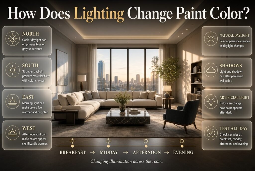
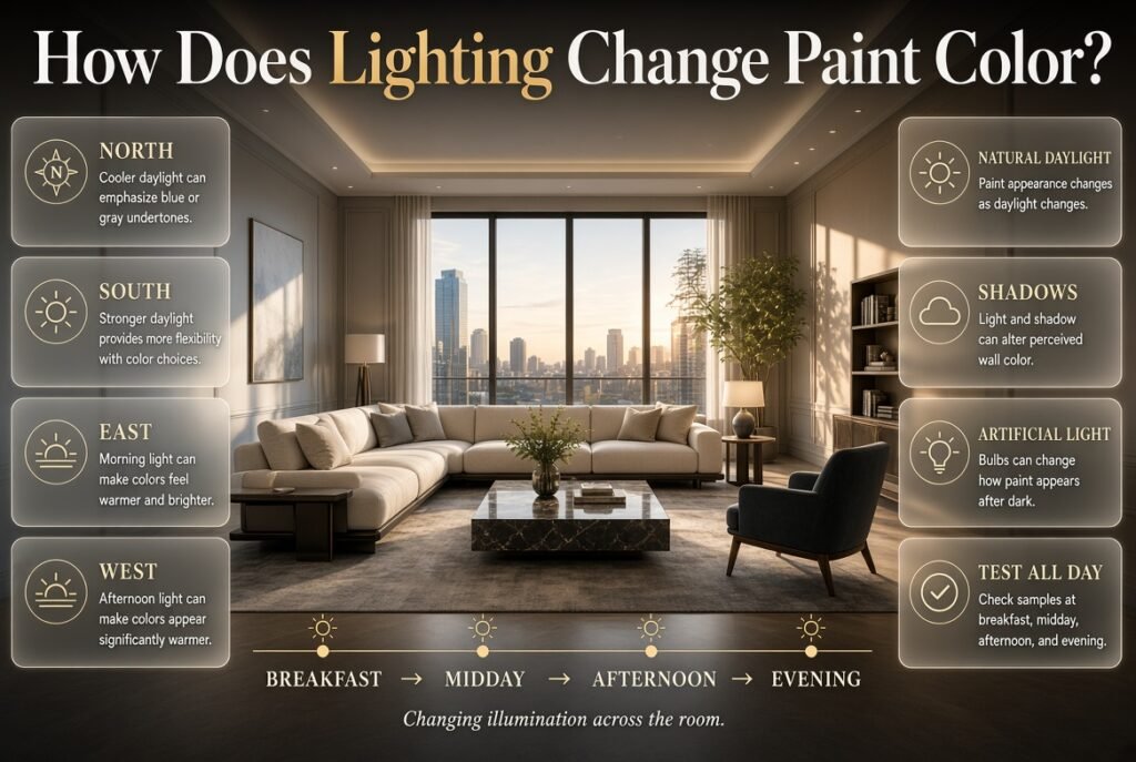
Lighting is one of the biggest factors affecting how paint looks. Natural daylight, artificial bulbs, window direction, shadows, and surrounding surfaces can all alter the perceived color of a wall.
A color doesn’t have one permanent appearance.
It changes throughout the day.
North-Facing Rooms
North-facing rooms often receive cooler, softer daylight.
This can emphasize blue or gray undertones.
Warm colors can therefore be particularly effective:
- Cream
- Warm white
- Beige
- Taupe
- Warm greige
- Soft earthy colors
A cool gray can sometimes make the room feel colder than intended.
South-Facing Rooms
South-facing rooms generally receive stronger natural light.
This creates more flexibility.
You can experiment with:
- Cool white
- Soft gray
- Blue-gray
- Sage
- Muted green
- Deeper accent colors
Strong daylight can soften the appearance of some deeper shades.
East-Facing Rooms
East-facing spaces tend to receive stronger morning light.
The room may feel warm and bright early in the day and more neutral later.
If the room is mainly used in the morning, test your paint during those hours.
West-Facing Rooms
West-facing rooms can receive intense warm light later in the day.
A color that looks balanced in the morning may appear significantly warmer in the afternoon.
Cooler or more balanced shades can help if the room already has many warm finishes.
💡 Pro Tip: Check your samples at breakfast time, midday, afternoon, and after the lights are switched on. A color that works at one time of day isn’t automatically right for the entire day.
What Are Paint Undertones and Why Do They Matter?
An undertone is the subtle color beneath the dominant color you see. Understanding undertones is essential because two apparently similar neutrals can behave very differently once they cover an entire wall.
For example, white can have:
- Yellow undertones
- Cream undertones
- Blue undertones
- Gray undertones
- Pink undertones
Beige can lean:
- Yellow
- Pink
- Gray
- Green
Gray can lean:
- Blue
- Green
- Purple
- Beige
How to Identify Undertones
Don’t examine the paint in isolation.
Place the sample next to:
- Pure white
- Flooring
- Cabinets
- Countertops
- Upholstery
- Trim
- Curtains
The undertone often becomes obvious through comparison.
Why Neutral Colors Need Extra Attention
Neutral colors are often considered “safe,” but they can actually be some of the hardest colors to choose.
A bold blue clearly announces what it is.
A subtle gray may secretly contain blue, purple, or green.
That hidden color can become much more noticeable when the paint covers four walls.
⚠ Common Mistake: Assuming all gray, beige, or white paints are neutral in the same way. Always investigate the undertone.
What Are the Best Neutral Paint Colors?
Neutral paint colors are popular because they provide flexibility and can work with many decorating styles. The most useful neutral families include warm white, cream, beige, greige, taupe, and balanced gray.
Warm White
Warm white is one of the most adaptable choices for modern homes.
It can work with:
- Natural wood
- Cream fabrics
- Brass
- Beige
- Stone
- Linen
- Traditional furniture
- Organic modern interiors
It provides brightness without the starkness of an icy white.
Cream
Cream introduces more warmth than standard white.
It can be especially attractive in rooms with:
- Wooden floors
- Antique furniture
- Warm textiles
- Traditional architecture
- Soft natural lighting
The challenge is avoiding a cream that becomes excessively yellow.
Beige
Modern beige can feel sophisticated and contemporary when its undertone is balanced.
It works particularly well with:
- Wood
- Leather
- Cream
- Natural fibers
- Black accents
- Earth tones
Greige
Greige sits between gray and beige.
It’s useful when you want something more contemporary than beige but warmer than traditional cool gray.
Greige is especially effective in open-plan homes because it can transition between different furniture and room styles.
Taupe
Taupe combines gray and brown characteristics.
It works beautifully in:
- Bedrooms
- Dining rooms
- Offices
- Libraries
- Formal living rooms
For homeowners looking for more decorating guidance around these choices, Paint Color Ideas and Inspiration provides a natural place to continue exploring color-related ideas.
What Paint Colors Make a Small Room Look Bigger?
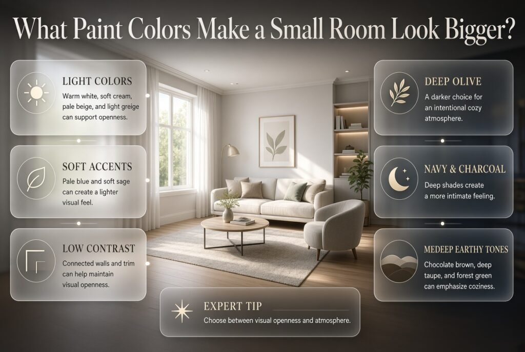
Light colors, low contrast, and consistent tones can make a small room feel more open. Soft white, pale beige, light greige, muted blue, and soft sage are useful options, particularly when walls and trim are visually connected.
However, there is an important distinction.
A small room doesn’t necessarily need to look bigger.
Sometimes you want it to feel cozy.
For a More Spacious Appearance
Consider:
- Warm white
- Soft cream
- Pale beige
- Light greige
- Pale blue
- Soft sage
Keeping the ceiling relatively light can also maintain a sense of openness.
For a Cozy Appearance
Consider:
- Deep olive
- Navy
- Charcoal
- Chocolate brown
- Deep taupe
- Forest green
A dark small room can feel intentional when lighting and furniture are carefully selected.
⭐ Expert Tip: Don’t choose paint based on room size alone. Decide whether your priority is visual openness or atmosphere.
What Are the Best Paint Colors for Living Rooms?
Living rooms require versatile colors because they accommodate many activities and often contain several competing materials. Warm neutrals, greige, sage, muted blue, and earthy shades are dependable choices.
Warm Neutral Living Rooms
Warm white, beige, cream, and greige provide a flexible backdrop for:
- Sofas
- Rugs
- Artwork
- Decorative objects
- Wood furniture
- Curtains
They’re especially useful if you like changing accessories seasonally.
Sage Green Living Rooms
Sage is popular because it introduces color without becoming overly dominant.
It works particularly well with:
- Cream
- Natural wood
- Linen
- Tan leather
- Black
- Brass
It can make a living room feel connected to nature.
Blue Living Rooms
Muted blue can produce a sophisticated and calming effect.
Blue-gray is often easier to live with than highly saturated blue because it provides color without dominating the entire room.
Earthy Living Room Colors
Terracotta, clay, olive, warm brown, and muted rust can add personality.
These shades are particularly effective when the room already includes natural materials.
For additional decorating strategies, Home Improvement offers related ideas for improving the broader environment around your chosen wall color.
What Are the Best Bedroom Paint Colors?
Bedrooms generally benefit from softer colors and lower saturation. Muted blue, sage, warm beige, dusty rose, soft taupe, and gentle gray can create a comfortable environment without overwhelming the senses.
Soft Blue
Blue is a classic bedroom color.
Choose muted or dusty versions if you want a softer atmosphere.
Pair it with:
- White
- Cream
- Natural wood
- Beige
- Linen
Sage Green
Sage is particularly effective in bedrooms because it introduces color while remaining subdued.
It pairs beautifully with natural textures.
Dusty Rose
Dusty rose is much more versatile than bright pink.
It can work with:
- Cream
- Warm white
- Beige
- Walnut
- Brass
- Soft gray
Warm Beige
Warm beige creates a timeless bedroom background.
It’s especially useful if you frequently change bedding or decorative accessories.
What Paint Colors Work Best in Kitchens?
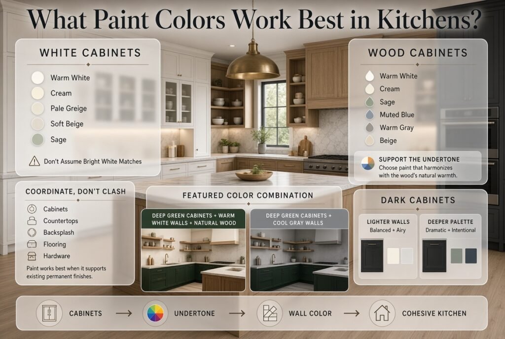
Kitchen paint should coordinate with cabinets, countertops, backsplash, flooring, appliances, and hardware. The strongest permanent finish should usually influence the paint rather than the other way around.
White Cabinets
If your cabinets are white, consider:
- Warm white
- Cream
- Pale greige
- Soft beige
- Sage
Avoid assuming that another bright white will automatically match.
Wood Cabinets
Natural wood pairs particularly well with:
- Warm white
- Cream
- Sage
- Muted blue
- Warm gray
- Beige
The objective is not necessarily to match the wood.
It’s to support its undertone.
Dark Cabinets
Dark cabinetry can be balanced with lighter walls or embraced through a deeper, dramatic palette.
For example:
Deep green cabinets + warm white walls + natural wood
can feel completely different from:
Deep green cabinets + cool gray walls
even though the cabinets remain unchanged.
What Are the Best Paint Colors for Bathrooms?
Bathrooms generally benefit from colors that look clean and work with tile, stone, fixtures, mirrors, and lighting. Soft white, pale blue, sage, blue-gray, beige, and greige are versatile choices.
However, bathroom lighting can be deceptive.
A bathroom may have little natural light and depend almost entirely on artificial illumination.
Fresh Bathroom Palette
Try:
- Soft white
- Pale blue
- Blue-gray
- Sage
- Light beige
Warm Bathroom Palette
For beige stone or warm tile:
- Cream
- Warm white
- Taupe
- Beige
- Muted olive
If you’re also updating bathroom lighting, Bathroom Hanging Pendant Lighting can help you consider how lighting and wall color need to work together.
📌 Quick Tip: Always evaluate bathroom paint under the actual lighting used around the mirror. The color may appear very different under warm bulbs than it does beside a window.
What Paint Colors Are Best for Dining Rooms?
Dining rooms are excellent places to experiment with richer colors because they don’t necessarily require the bright, open feeling expected from kitchens or family rooms.
Consider:
- Deep green
- Olive
- Terracotta
- Warm taupe
- Muted navy
- Rich beige
- Chocolate brown
A dining room with dark wood furniture can become especially elegant when paired with a deeper wall color.
The key is controlling contrast.
If both walls and furniture are dark, introduce lighter elements through:
- Curtains
- Artwork
- Table linens
- Lighting
- Upholstery
What Paint Colors Are Best for Home Offices?
Home offices need to feel comfortable but should also support concentration.
Useful options include:
- Sage
- Muted blue
- Soft gray
- Taupe
- Warm beige
- Blue-green
Highly saturated colors can be stimulating, while extremely dull neutrals may make the room feel lifeless.
A balanced middle ground usually works best.
If you’re designing a home office with furniture and storage, think about the relationship between the wall and functional pieces rather than treating paint as a separate decision.
How Do You Choose a Whole-Home Paint Color Palette?
A whole-home palette should feel connected without making every room identical. The easiest method is to establish a dominant neutral, introduce one or two supporting colors, and reserve stronger shades for selected rooms or architectural features.
For example:
Main neutral: Warm white
Secondary neutral: Greige
Natural accent: Sage
Cool accent: Muted blue
Deep accent: Olive or charcoal
This creates visual continuity.
Open-Plan Homes
Open-plan homes require extra care because multiple areas are visible simultaneously.
A dramatic red in one corner and a cool blue in another may compete visually.
Instead, use colors that share:
- Similar saturation
- Similar warmth
- Related undertones
You don’t need identical colors.
You need relationships between colors.
How Many Paint Colors Should a House Have?
There is no mandatory number of colors for an entire home. A small palette of three to five coordinated colors can be enough to create variation while maintaining continuity.
A useful approach is:
Main Color
Used in:
- Hallways
- Connecting spaces
- Large areas
Secondary Color
Used in:
- Bedrooms
- Offices
- Selected living areas
Accent Colors
Used in:
- Feature walls
- Dining rooms
- Powder rooms
- Architectural details
This gives you freedom without making the house feel visually fragmented.
Should You Use an Accent Wall?
Accent walls can still be useful when they highlight a genuine architectural or visual feature.
Good candidates include:
- Fireplace walls
- Bed walls
- Built-in shelving
- Dining room focal walls
- Architectural niches
An accent wall shouldn’t exist simply because the room needs “more color.”
Ask whether the wall already has visual importance.
Better Accent Wall Strategy
Instead of:
Random wall + random bold color
Try:
Architectural focal point + intentional accent color
For example, a deep green behind a bed can create a natural focal point while connecting with green artwork and plants elsewhere in the room.
How Should You Choose Paint for a Modern Interior?
Modern interiors often benefit from controlled color palettes rather than excessive contrast.
Consider:
- Warm white
- Greige
- Soft taupe
- Charcoal
- Sage
- Muted blue
- Earth tones
The sophistication usually comes from the relationship between materials.
For example:
Warm white walls + oak flooring + black accents + cream upholstery
can look more polished than a room filled with many unrelated colors.
If you’re pairing paint with contemporary furniture and accessories, Chairside Tables can be useful when thinking about how smaller furniture pieces contribute to the overall color balance.
How Can Decorative Objects Influence Paint Selection?
Paint should support the decorative items you plan to keep rather than forcing you to replace them.
White decorative pieces, for example, may disappear against certain pale walls but stand out beautifully against deeper shades.
If your room includes collections or light-colored accessories, White Decorative Objects can provide inspiration for creating contrast without adding another strong color.
Think in Layers
A room can contain:
Wall color → furniture → textiles → artwork → accessories
Each layer doesn’t need to match.
Instead, they should contribute to the same visual story.
Can Paint Color Support Different Interior Design Styles?
Yes. The same room can feel completely different depending on the paint palette.
Minimalist
Try:
- Warm white
- Soft beige
- Greige
- Pale gray
Modern
Try:
- Greige
- Charcoal
- Soft white
- Muted green
- Blue-gray
Traditional
Try:
- Cream
- Beige
- Taupe
- Deep green
- Navy
Organic Modern
Try:
- Warm white
- Sand
- Sage
- Olive
- Clay
Artistic or Eclectic
You can be more experimental with:
- Dusty pink
- Cobalt
- Terracotta
- Deep green
- Mustard
- Lavender
For readers exploring more expressive room styling, Art Hoe Aesthetic Room Ideas offers another example of how color can become part of a larger decorative identity.
What Are the Best Paint Colors for Children’s Rooms?
Children’s rooms give you more freedom to use personality-driven colors, but overly bright shades can quickly become visually exhausting.
Consider:
- Soft yellow
- Dusty blue
- Sage
- Muted green
- Blush
- Warm cream
- Soft lavender
Rather than painting every wall a highly saturated color, consider using a calmer base with stronger color introduced through accessories.
This approach also makes future updates easier.
If you’re designing a children’s space in a hospitality or specialized setting, Children’s Hotel Furniture provides relevant inspiration for considering how furniture, color, and function can work together.
How Should You Match Paint With Flooring?
Flooring is one of the most important factors in paint selection because it covers a large visual area and usually remains in place for years.
Warm Wood Flooring
Consider:
- Warm white
- Cream
- Beige
- Greige
- Sage
- Warm taupe
Cool Gray Flooring
Consider:
- Soft white
- Cool or balanced gray
- Blue-gray
- Muted green
- Greige
Dark Wood
Consider:
- Warm white
- Cream
- Soft beige
- Sage
- Muted blue
Stone Flooring
First identify whether the stone leans:
- Warm
- Cool
- Yellow
- Pink
- Gray
- Brown
Then choose paint accordingly.
⚠ Common Mistake: Choosing paint based on the wall color you like on Pinterest while ignoring the floor that occupies a large portion of the room.
How Should You Match Paint With Furniture?
You don’t need your wall color to match your sofa, bed, dining table, or cabinetry.
Instead, look for a relationship.
Example
Suppose you have:
- Cream sofa
- Walnut coffee table
- Beige rug
- Black metal lighting
Possible wall choices include:
- Warm white
- Greige
- Taupe
- Soft sage
A bright cool gray might technically be a neutral, but it may not complement the warmth already present.
Use Contrast Intentionally
A dark sofa can work against light walls.
A light sofa can look elegant against a deeper wall.
The goal is controlled contrast, not perfect matching.
How Should You Test Paint Colors Before Painting?
Testing is one of the most important steps in the entire color-selection process.
Step 1: Select Three to Five Colors
Don’t test twenty options.
Start with a small group of serious candidates.
Step 2: Use Large Samples
Tiny cards aren’t enough.
Large samples show how the color behaves across a larger surface.
Step 3: Test Multiple Walls
Put samples near:
- Windows
- Corners
- Furniture
- Dark areas
Step 4: Observe the Color Throughout the Day
Check:
- Morning
- Midday
- Afternoon
- Evening
Step 5: Turn On Your Normal Lights
Artificial lighting can completely change the result.
Step 6: Live With the Samples
Don’t make the decision after five minutes.
Give yourself enough time to stop reacting emotionally to the color and start evaluating how it actually works.
💡 Pro Tip: Place samples beside your flooring and major furniture. A paint color that looks beautiful alone may reveal an unwanted undertone when placed beside your sofa or floor.
What Paint Finish Should You Choose?
Paint finish affects both appearance and practicality.
| Finish | Best Use | Main Benefit | Limitation |
|---|---|---|---|
| Flat | Ceilings | Hides imperfections | Less washable |
| Matte | Low-traffic walls | Elegant appearance | Can be harder to clean |
| Eggshell | General walls | Balance of durability and softness | Not ideal for every high-moisture area |
| Satin | Busy areas | Easier cleaning | Shows more surface variation |
| Semi-Gloss | Trim, doors | Durable | More reflective |
| High-Gloss | Details | Dramatic finish | Highlights imperfections |
The finish should reflect how the room is used.
A busy family hallway may need different durability from a quiet formal dining room.
What Are the Most Common Paint Color Mistakes?
Choosing a Color From a Photograph
Why it happens: Online interiors look attractive and inspirational.
Why it’s harmful: Photography, filters, monitors, lighting, and room finishes change color perception.
How to avoid it: Use online images for inspiration, then test real samples.
Ignoring Undertones
Why it happens: People focus on the main color.
Why it’s harmful: The hidden undertone can clash with flooring or furniture.
How to avoid it: Compare samples beside permanent finishes.
Testing Only Under Daylight
Why it happens: Daylight makes color evaluation easy.
Why it’s harmful: You may spend most evenings in lighting that makes the color look completely different.
How to avoid it: Test under your actual artificial lighting.
Choosing Too Many Colors
Why it happens: Every room feels like an opportunity for something new.
Why it’s harmful: The house can lose visual continuity.
How to avoid it: Build a controlled palette.
Using Trendy Colors Everywhere
Why it happens: Trending colors look fresh and exciting.
Why it’s harmful: A color that works beautifully as an accent can become overwhelming when used throughout the home.
How to avoid it: Use stronger trends selectively.
Matching Everything Too Closely
Why it happens: Matching feels safe.
Why it’s harmful: The room can become flat.
How to avoid it: Coordinate undertones while maintaining contrast.
Forgetting the Ceiling
Why it happens: Walls receive most of the attention.
Why it’s harmful: A bright or contrasting ceiling can interrupt the intended atmosphere.
How to avoid it: Consider the ceiling part of the palette.
How Can DIY Painting Projects Affect Color Selection?
When homeowners paint themselves, color selection becomes even more important because mistakes can be expensive in both time and materials.
Before beginning, prepare the surface properly.
Check:
- Wall condition
- Previous paint
- Cracks
- Holes
- Moisture problems
- Dust
- Grease
- Uneven surfaces
If you’re planning to handle the project yourself, DIY Home Projects can provide broader inspiration for practical home updates.
A beautiful color cannot compensate for poor preparation.
Practical DIY Sequence
Clean → repair → sand where necessary → prime when appropriate → test → paint → inspect
Don’t rush directly from choosing the color to rolling paint onto the wall.
How Can Smart Storage Influence Paint Choices?
Storage changes how much wall remains visually exposed.
A room with tall shelving, wardrobes, cabinets, or built-ins may need a different color strategy from an empty room.
For example, a dark built-in against a light wall creates strong contrast. Painting both in similar tones produces a more integrated appearance.
When planning color alongside organization, Smart Storage and Organization Ideas can help you think about how storage affects the visual balance of the room.
How Can Decorating Style Change the Best Paint Color?
Paint doesn’t exist separately from decoration.
A neutral wall may feel minimalist with clean-lined furniture but traditional when combined with ornate wood furniture.
This is why the same shade can appear completely different from one home to another.
When making the final decision, evaluate:
- Furniture shape
- Textile colors
- Artwork
- Accessories
- Window treatments
- Lighting
- Architectural details
If you’re refreshing a room on a limited budget, Easy Decorating Tips for Every Budget can complement the paint-planning process by showing how smaller decorative changes can support a new color palette.
How Can Room-by-Room Planning Improve Paint Selection?
One of the biggest mistakes homeowners make is choosing colors one room at a time without considering the transition between spaces.
Instead, walk through the house mentally.
Imagine:
Entry → Hallway → Living Room → Dining Room → Kitchen → Bedroom
Ask:
- Can I see one room from another?
- Do the colors transition naturally?
- Are the undertones compatible?
- Is one color dramatically stronger than everything around it?
- Does the palette feel intentional?
For a more structured approach, Room-by-Room Interior Design Inspiration can help you think about paint as part of a complete room design rather than an isolated surface treatment.
What Should You Consider Before Choosing a Final Color?
Use this quick checklist before buying paint:
Lighting
- Does the room receive strong daylight?
- Is it naturally dark?
- What direction do the windows face?
- What artificial bulbs are used?
Existing Materials
- Is the floor warm or cool?
- What color are the cabinets?
- What is the countertop undertone?
- What furniture will remain?
Mood
- Do you want calm?
- Warmth?
- Energy?
- Sophistication?
- Drama?
- Spaciousness?
Color
- What family are you considering?
- What is its undertone?
- Is the saturation appropriate?
- Does it work with adjacent rooms?
Practicality
- Is the room high traffic?
- Does it need washable paint?
- Is the surface damaged?
- Does the chosen finish suit the space?
How do I choose the right paint color for my home?
The best paint color is not necessarily the one that looks beautiful in a showroom, on Pinterest, or in a paint-card display. It needs to work with your room’s natural light, flooring, furniture, ceiling height, existing finishes, and the mood you want to create. Start by identifying the elements you are keeping, then choose a color that complements them rather than forcing the entire room around a new wall color.
For example, a room with warm wood floors and beige furniture will usually feel more cohesive with warm whites, taupes, soft greiges, earthy greens, or muted terracotta than with an icy blue-gray. Likewise, a naturally bright room can handle deeper colors more comfortably than a dark room.
Points to consider:
Check the color in both natural and artificial light.
Identify the undertone before committing.
Consider your flooring and large furniture first.
Decide whether you want the room to feel warm, calm, fresh, dramatic, or spacious.
Test the actual paint on the wall rather than relying only on a small color card.
Professional tip: Choose the color after considering the room as a complete composition, not as an isolated wall. This simple change in approach prevents many expensive repainting mistakes.
What are the best paint colors for a living room?
The best living room paint colors are those that create a comfortable backdrop while working naturally with furniture, lighting, flooring, and decorative accents. Warm whites, soft beige, greige, muted sage, dusty blue, taupe, and earthy neutrals are particularly versatile because they can support both modern and traditional interiors.
In 2026, designers are increasingly moving away from overly stark, clinical whites and toward warmer neutrals and nature-inspired colors that make living spaces feel more inviting.
A neutral living room also gives you more freedom to introduce personality through rugs, artwork, cushions, curtains, wood tones, and accent furniture. If you want stronger character, consider using a deeper green, blue, terracotta, or charcoal on one architectural feature rather than automatically painting every wall a dramatic shade.
Good living room directions include:
Warm white: bright but softer than pure white
Greige: balanced between gray and beige
Sage green: natural and relaxed
Muted blue: calm and sophisticated
Taupe: warm, elegant, and adaptable
Terracotta: expressive and earthy
Professional tip: If your living room is open-plan, choose a wall color that can transition comfortably into the dining or kitchen area. A beautiful color that works in one room but clashes with the next can make an open layout feel visually disconnected.
What paint colors make a small room look bigger?
Light and moderately soft colors can make a small room feel brighter, more open, and less visually crowded, but pure white is not your only option. Warm off-white, light beige, pale greige, soft blue, muted green, and other low-to-medium saturation colors can create an airy appearance while adding more personality.
The key is not simply choosing the lightest possible shade. Lighting, contrast, ceiling color, trim, and the number of competing colors in the room all influence how spacious the room feels. Designers in 2026 are also challenging the old idea that every small room must be white; deeper colors can create an intentional, cozy “jewel-box” effect when used correctly.
For a small room, consider:
Warm white for a clean and bright appearance
Soft beige for warmth
Pale greige for a sophisticated neutral
Light blue for an airy atmosphere
Soft sage for a natural feeling
A darker shade when you deliberately want a cozy, dramatic room
Avoid: Using very strong contrast between the walls, trim, ceiling, and furniture if your primary goal is to make the space feel visually larger.
Professional tip: Painting the walls, trim, and sometimes even the ceiling in closely related tones can reduce visual breaks and make the room feel more continuous. The goal is to create visual flow, not simply to make everything white.
Are warm or cool paint colors better for a home?
Neither warm nor cool paint colors are automatically better. The right choice depends on the room’s lighting, existing materials, orientation, furniture, and the atmosphere you want to create.
Warm colors such as creamy whites, beige, taupe, caramel, muted terracotta, and warm greens can make a space feel welcoming and grounded. Cool colors such as blue, blue-green, and some gray tones can create a fresher, quieter, or more contemporary atmosphere. The important detail is that many colors are not purely warm or cool—they contain subtle undertones that become noticeable under different lighting conditions.
For example, a gray with a blue undertone can look noticeably cooler in a north-facing room, while the same general family of color may behave differently in stronger, warmer sunlight.
Choose warm colors when you want:
A cozy and welcoming atmosphere
Better harmony with warm wood
A softer appearance under warm lighting
A comfortable traditional or organic feel
Choose cooler colors when you want:
A fresher appearance
A calm bedroom or bathroom
Contrast against warm wood or brass
A clean contemporary aesthetic
Professional tip: Don’t judge temperature from the paint name alone. Undertones are what you actually see once the paint is on your wall. This is why sampling a color in your own room is far more reliable than choosing from an online image.
What paint colors are trending in 2026?
The strongest 2026 paint direction is less about one “must-have” color and more about creating warm, livable, nature-connected interiors. Designers and paint experts are highlighting warm neutrals, earthy colors, softened greens, rich blues, clay-inspired shades, and more sophisticated versions of white.
Blue is also having a strong moment in 2026, with Dulux Pakistan presenting an entire family of indigo-inspired shades ranging from airy light blue to deeper, meditative blue. Meanwhile, earthy colors such as terracotta, sage, taupe, caramel, and mushroom are gaining attention because they bring warmth without feeling excessively bold.
Trending directions worth considering:
Warm off-whites
Mushroom and soft taupe
Sage and muted greens
Soft or dusty blues
Deep navy and indigo
Terracotta and clay tones
Caramel and earthy browns
Muted rose and plaster-inspired tones
The smarter approach, however, is to use trends as inspiration rather than instructions. A color can be fashionable today and still be completely wrong for your home’s lighting or furniture.
Professional tip: If you want your interior to look current without needing another repaint in a year or two, choose a timeless neutral as your foundation and introduce a trend-forward color through an accent wall, bedroom, powder room, cabinetry, or smaller architectural feature.
Conclusion
Choosing the right paint color is about much more than selecting a shade that looks attractive on a color card. The best paint color recommendations come from understanding how natural light, room size, undertones, existing furniture, flooring, architectural details, and the desired mood work together. A color that looks perfect in one home can feel completely different in another, which is why context should always come before trends.
For most homes, a thoughtful palette starts with a dependable foundation such as a warm white, soft beige, greige, taupe, or another balanced neutral. From there, you can introduce personality through muted greens, sophisticated blues, earthy terracotta, deeper accent colors, or carefully selected feature walls. The goal is not to use as many colors as possible, but to create a sense of connection from one room to the next.
Before committing to a final shade, always test it in the actual space at different times of day. Pay attention to how morning sunlight, afternoon brightness, evening lamps, and surrounding materials change its appearance. This small step can save considerable time, money, and frustration later.
Most importantly, use paint trends as inspiration rather than strict rules. A timeless color that complements your home will usually serve you better than a fashionable shade that does not suit your lighting or furnishings. When color is selected with intention, even a simple coat of paint can make a room feel more comfortable, balanced, spacious, and distinctly your own.

Leave a Reply